A wordmark logo is a logo built entirely from your brand name — no icons, no symbols, just letters doing all the heavy lifting. Think Google, Coca-Cola, or Visa. These logos prove that, with the right type treatment, your name alone can become unforgettable.
In this article, we’ll break down what a wordmark logo is, why it works, and show you 20+ examples that nail the balance between simplicity and brand personality.
What Is a Wordmark Logo?
![]()
A wordmark logo is a type-based logo made from the full brand name, without symbols or initials. It focuses on typography, spacing, weight, and sometimes color to create a strong visual identity.
Unlike a lettermark logo, which uses only initials, wordmarks use the entire name, making them especially useful for new brands that need to build recognition.
They can range from elegant and high-end to bold and friendly, depending on font choices and styling. Some brands even customize each letter to make the mark entirely unique.
As a brand expert, I recommend thinking twice before choosing a pure text-based logo for your company.
While these logos can be clean and professional, many brands eventually struggle with not having a compact version of their logo for social media profiles or mobile apps. Without a shorter variation or symbol, your logo might feel limited in small-scale uses.
We’ll show you a smart example at the end of this post — how a famous brand created a small-scale logo variation to stay flexible.
Why Do Brands Use a Wordmark Logo?
Wordmarks are popular for good reason. They’re:
-
Clear and direct – No guessing, your name is your logo
-
Versatile – Scales well on business cards, websites, packaging
-
Timeless – Good typography never goes out of style
-
Ownable – You can trademark the type treatment
-
Ideal for new brands – Builds recognition quickly
This type of logo is especially useful when the name itself is catchy, short, or unique — when the words do the branding work on their own.
20+ Famous Wordmark Logos
1. Google
![]()
Simple, colorful letters in a clean sans-serif font.
Why this logo works
The Google wordmark balances professionalism with playfulness. The shifting primary colors make it feel dynamic, while the clean typography keeps it universally recognizable.
2. Coca-Cola
![]()
Flowing script letters with classic red branding.
Why this logo works
The Coca-Cola logo uses a distinctive script to evoke nostalgia and warmth. Its timeless typography reinforces heritage and emotional connection.
3. Visa
![]()
Bold uppercase letters with a subtle angled stroke.
Why this logo works
Visa’s strong logo signals trust and authority. The angled stroke adds a subtle sense of motion and progress.
4. FedEx
![]()
Geometric sans-serif letters with hidden arrow.
Why this logo works
FedEx turns typography into storytelling. The hidden arrow between the E and X hints at speed and forward movement.
5. Sony
![]()
Elegant, spaced-out serif letters in black.
Why this logo works
The Sony wordmark logo uses serif type conveys precision and sophistication. The spacing adds balance, making it look both premium and approachable.
6. Canon
![]()
Rounded serif letters with a custom red tone.
Why this logo works
Canon’s logo blends tradition and warmth. Its gentle curves reflect humanity while maintaining visual confidence.
7. Disney
![]()
Whimsical hand-drawn style with a unique D.
Why this logo works
Disney’s hand-drawn logo channels imagination. It feels personal, playful, and instantly recognizable.
8. Zara
![]()
Refined serif typography with tightly spaced letters.
Why this logo works
The Zara logo uses compressed serif typography exudes fashion authority. It’s bold, stylish, and unmistakably modern.
9. eBay
![]()
Colorful lowercase letters with playful kerning.
Why this logo works
eBay’s vibrant letterforms suggest variety and accessibility. The quirky spacing keeps the brand feeling energetic.
10. Diesel
![]()
All caps with industrial boldness and sharp edges.
Why this logo works
The Diesel uppercase design speaks to rebellion and grit. It’s intentionally bold to match the brand’s edgy tone.
11. Samsung
![]()
Clean sans-serif with soft, rounded strokes.
Why this logo works
The Samsung logo is clean and future-forward. Its gentle shapes balance tech innovation with human appeal.
12. Tiffany & Co.
![]()
Classic serif lettering in elegant uppercase.
Why this logo works
Tiffany & Co.’s wordmark uses elegance and tradition to communicate luxury. The typography feels as refined as the jewelry it represents.
13. Netflix
![]()
Tall, red sans-serif with cinematic proportions.
Why this logo works
The Netflix logo uses a strong type and color combination to command attention. It reflects energy, confidence, and on-screen presence.
14. Uber
![]()
Modern geometric font in bold black.
Why this logo works
The Uber minimalist typography reinforces speed and clarity. It looks global, functional, and designed for digital spaces.
15. Gap
![]()
Simple uppercase serif with open spacing.
Why this logo works
Gap’s straightforward design leans into American casualness. Its simplicity reflects timeless, everyday wear.
16. The New York Times
![]()
Traditional blackletter typography with historic flair.
Why this logo works
The New York Times logo anchors the brand in journalistic legacy. The blackletter style evokes trust, depth, and authority.
17. Hugo Boss
![]()
Minimal sans-serif in bold uppercase spacing.
Why this logo works
Hugo Boss wordmark logo uses sleek spacing and minimalism to signal premium fashion. It’s structured, confident, and clean.
18. Yahoo
![]()
Friendly serif with playful exclamation mark.
Why this logo works
Yahoo’s typeface feels cheerful and quirky. The exclamation point adds personality without straying from professionalism.
19. Lyft
![]()
Rounded, custom type with double looped ‘Y’.
Why this logo works
Lyft’s bubbly letters give off friendliness and approachability. It’s casual branding that feels inclusive and fun.
20. Nivea
![]()
Bold sans-serif in white, often inside a blue circle.
Why this logo works
The Nivea logo uses strong yet soft typography. Paired with its signature blue, it signals trust, care, and consistency.
21. Mozilla
A sharp, custom serif font with a subtle code reference.
Why this logo works
Mozilla logo integrates a web symbol (://) right into the name, turning technical shorthand into a smart typographic identity.
22. Skims
Soft, rounded letters that reflect comfort and body positivity.
Why this logo works
The Skims logo mirrors the product—flexible, approachable, and designed to fit. It feels human, not corporate.
23. Panasonic
A simple bold sans-serif in dark blue, highly legible at all sizes.
Why this logo works
Panasonic logo uses simple typography to emphasize reliability. It’s all function, no distraction—ideal for an electronics giant.
24. Facebook
A clean lowercase wordmark in soft white on a blue background.
Why this logo works
The Facebook logo feels casual and accessible. Its lowercase styling and familiar color scheme build everyday trust.
25. Subway
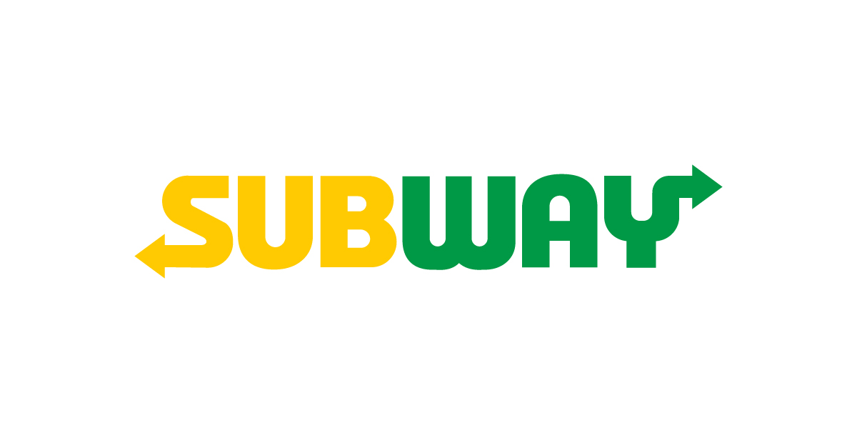
A bold, dual-color typeface with arrows on the S and Y.
Why this logo works
Subway logo cleverly adds movement into the name itself. The arrows suggest direction, speed, and freshness—all part of the brand promise.
26. Betway
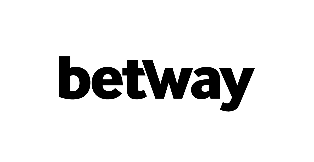
A bold black wordmark with clean, lowercase typography.
Why this logo works
The Betway logo keeps its design strong and direct. The lowercase type and geometric styling make it feel modern, balanced, and easy to adapt across digital platforms.
27. L’Oréal
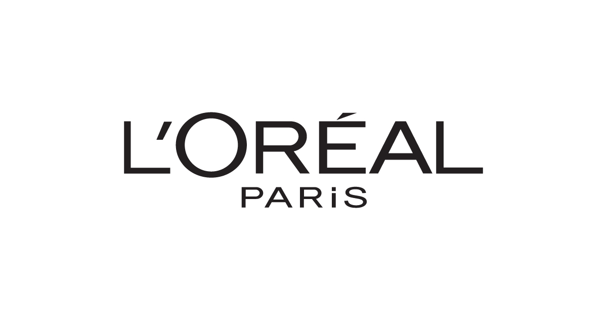
A sleek, all-caps wordmark with clean lines and a uniquely wide letter O.
Why this logo works
The L’Oréal logo conveys luxury and authority through refined typography. Its subtle accents and high-contrast font reflect the brand’s commitment to beauty, science, and sophistication.
28. Stihl
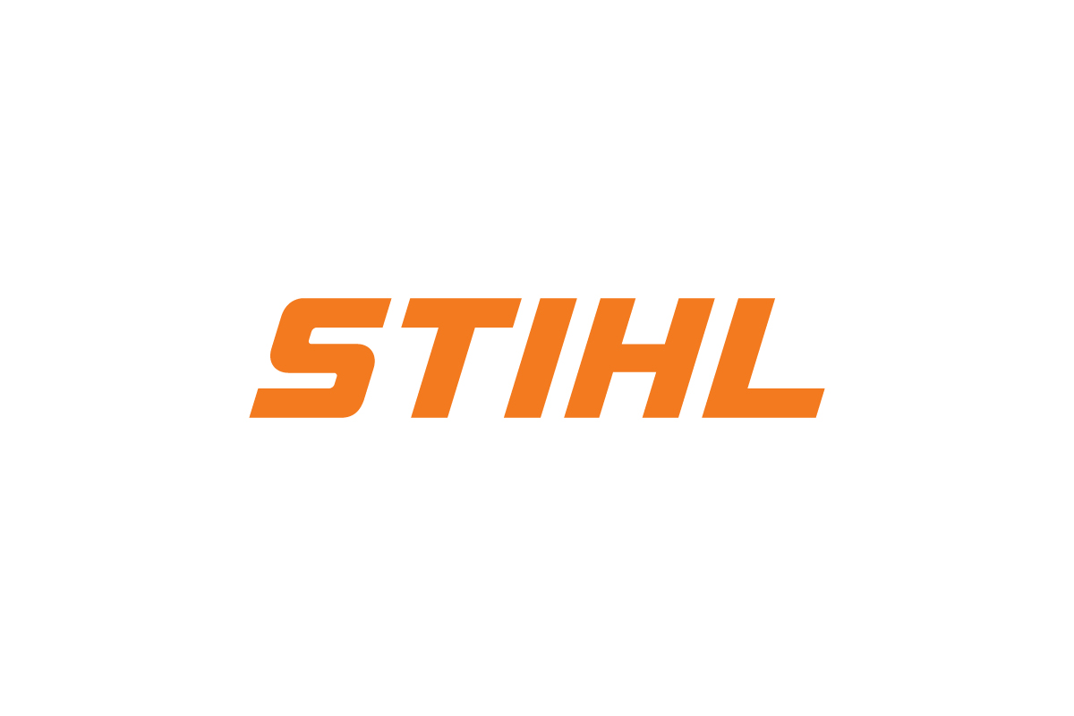
Bold white letters, all slanted forward, on an orange background.
Why this logo works
The Stihl logo feels fast and forceful—its forward-leaning type and high-contrast color capture the power and precision of professional-grade tools.
29. Nutella
![]()
A clean wordmark featuring a lowercase, two-tone design — black for “n” and red for “utella.”
Why this logo works
The Nutella logo combines simplicity with warmth through its friendly wordmark logo style. The black portion grounds the design with a sense of trust and familiarity, while the red adds energy and emotion — reflecting the brand’s Italian heritage and joyful tone. Its approachable typography mirrors the product’s comfort and accessibility, making the Nutella logo instantly recognizable across packaging, advertising, and digital spaces.
30. Wilson

A bold red wordmark with rounded lettering and a sporty, classic feel.
Why this logo works
The Wilson logo reflects trust and tradition through its clean wordmark logo design. The bright red color evokes energy and confidence, while the custom rounded font conveys approachability and heritage. Its simplicity makes it versatile — whether printed on tennis rackets, baseball gloves, or apparel — reinforcing Wilson’s reputation as one of the most iconic names in sports.
31. Hisense
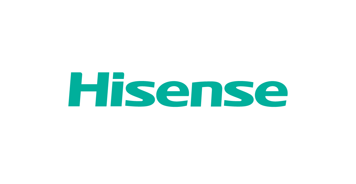
A clean turquoise wordmark built with smooth, rounded sans-serif letters.
Why this logo works
The Hisense logo uses a modern wordmark logo design that feels approachable, reliable, and technology-focused. Its rounded sans-serif typeface softens the brand’s presence, while the distinctive turquoise color adds freshness and clarity — helping it stand out in a competitive electronics market. The simplicity of the typography makes the logo adaptable across TVs, appliances, and digital interfaces, reinforcing Hisense’s identity as a forward-thinking global brand.
32. Kohler
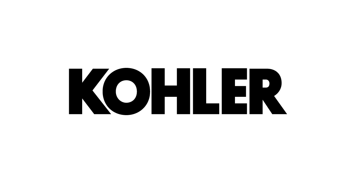
A bold black uppercase wordmark with strong, industrial letterforms.
Why this logo works
The Kohler logo relies on a confident text-based logo design that communicates durability, quality, and heritage. Its heavy uppercase typography conveys strength and precision — qualities closely associated with kitchen and bathroom products. The restrained black color palette keeps the logo timeless and versatile, allowing it to sit comfortably on everything from faucets and packaging to showrooms and digital platforms.
33. Crocs
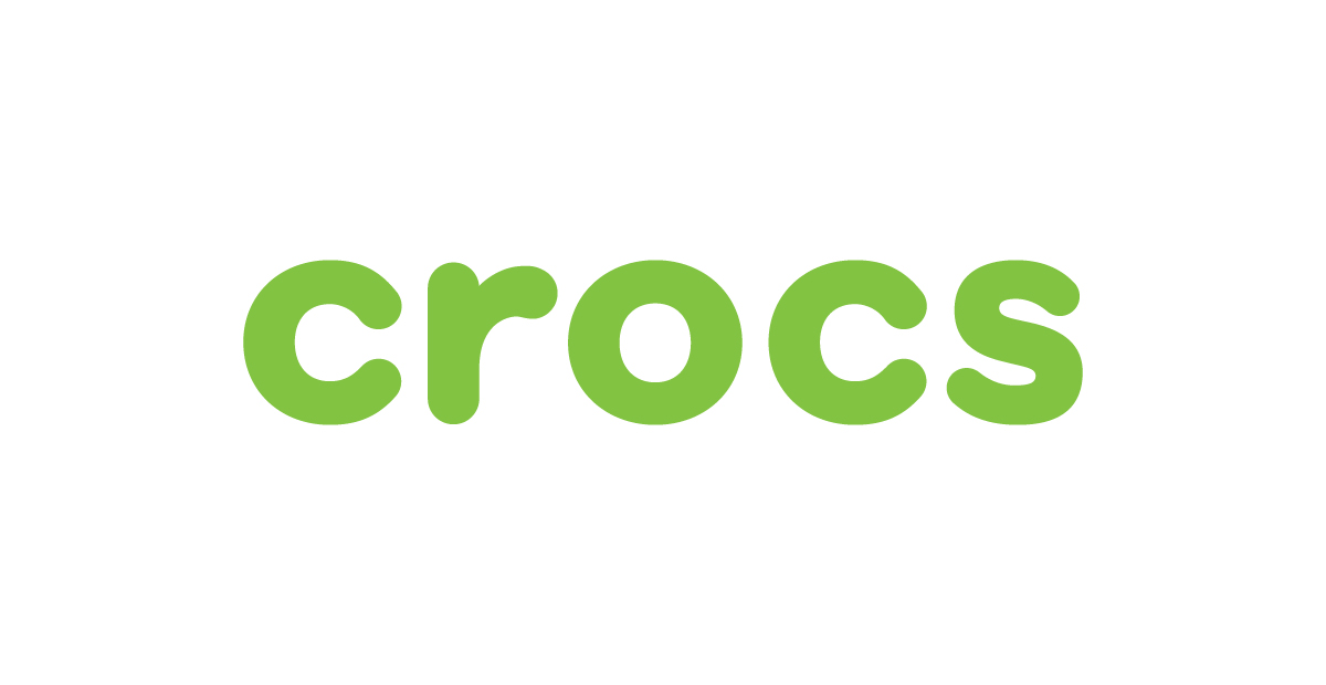
A rounded lowercase wordmark paired with a playful sandal-shaped symbol.
Why this logo works
The Crocs logo feels friendly and approachable thanks to its soft, rounded letterforms. The relaxed typography reflects comfort and everyday wear, while the simple sandal symbol adds character and supports recognition in smaller uses. Together, these elements create a flexible system that works across products, packaging, and digital platforms without feeling forced or overly complex.
Our Wordmark Logos
1. RUFO & Co
![]()
A stylish logotype with circular geometry and an elegant ampersand.
Why this logo works
The fully custom type treatment balances minimalism and flair, giving the brand a refined, timeless presence without the need for icons.
2. ROBUST
![]()
This bold, red logo commands attention with thick, evenly spaced letterforms inside a rectangular badge.
Why this logo works
The solid, all-caps approach reinforces strength, energy, and dependability — ideal for brands in fitness, equipment, or performance sectors.
3. iWIN Sports
![]()
Strong, wide lettering paired with a uniquely styled lowercase “i” in teal.
Why this logo works
This wordmark combines boldness with a fresh accent color, creating a confident, modern identity that stands out in sports and entertainment.
4. iDevice
![]()
Sleek, lowercase letters give this wordmark logo a clean and tech-savvy feel.
Why this logo works
The spacing, rounded shapes, and subtle detail in the “i” create a contemporary identity that fits perfectly within consumer electronics or app branding.
5. EQVAL
![]()
A stylized fusion of “equal” and “value” using angular, customized letterforms.
Why this logo works
With no icon necessary, this logo communicates balance and power through carefully constructed geometry — making it ideal for startups and fintech.
When to Use a Wordmark Logo?
A wordmark logo is the right choice if:
-
Your brand name is short, distinct, or easy to remember
-
You want strong name recognition without needing an icon
-
You’re just starting out and want to build brand identity through text
-
You value flexibility across digital, packaging, signage, and more
This style also works great when your name carries personality — and you don’t want anything to distract from it.
How to Design a Wordmark Logo
Designing a strong text-based logo starts with choosing the right typeface. Serif fonts feel classic and timeless, while sans-serif fonts come across as modern and clean. Next, pay close attention to letter-spacing — also known as kerning — since even minor adjustments can dramatically affect how polished your logo looks.
The use of letter case matters too. An all-caps wordmark can feel bold and assertive, while lowercase gives a more approachable, casual tone. Many brands also customize one or two letters in their logo to create something that feels unique and ownable, without adding clutter.
And finally, keep it simple. Avoid over-decoration or overly complex letterforms. The goal is clarity, memorability, and easy recognition.
Real Example: Netflix
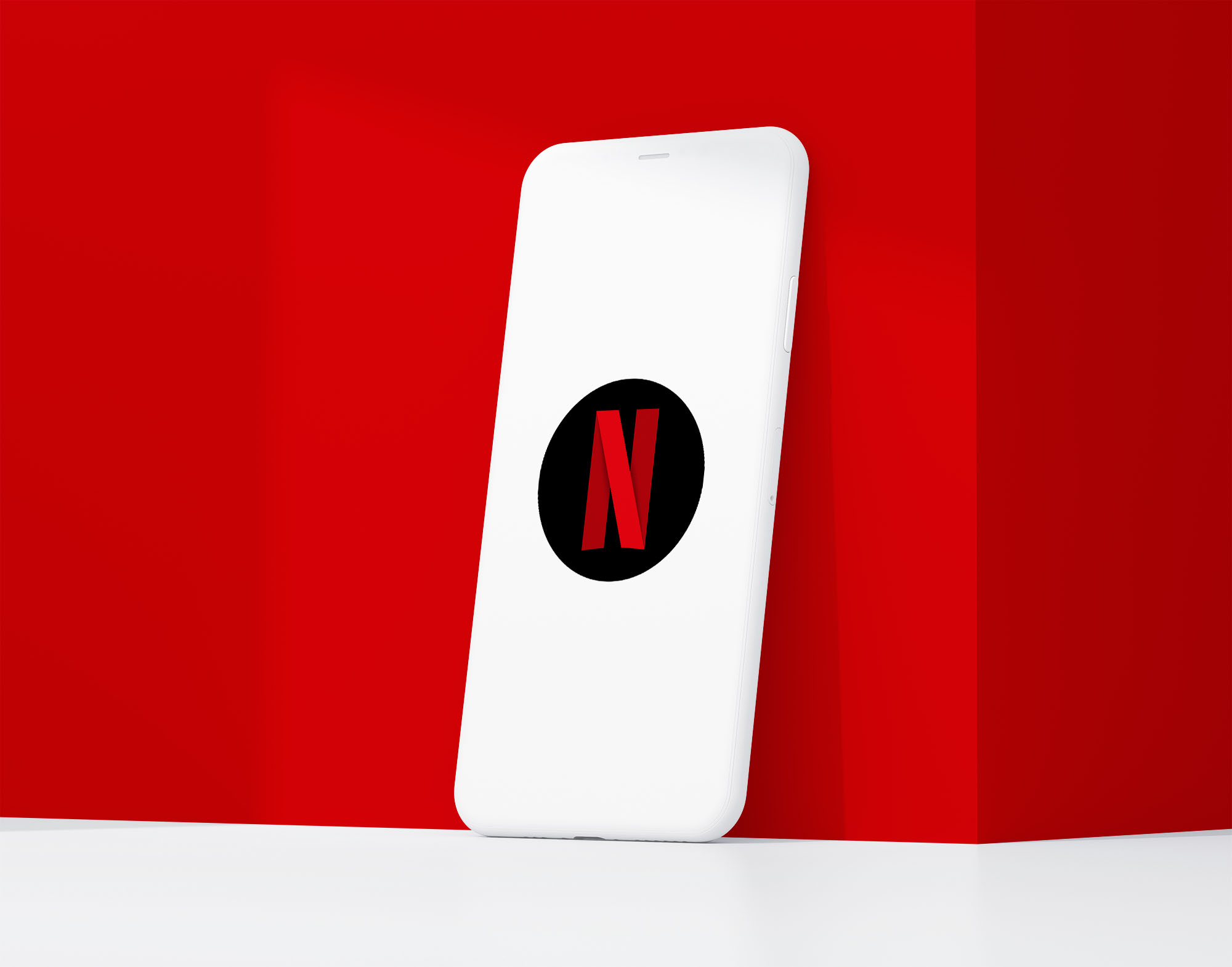
Netflix uses a wordmark logo as its primary identity, bold, simple, and instantly recognizable.
But for small-scale placements like app icons and social media avatars, the full logo wouldn’t fit or read well.
So they designed a compact version: a stylized “N” that keeps the brand recognizable even at tiny sizes.
This is a great reminder: when designing a wordmark, it’s worth creating an alternate mark — like an initial or monogram — to ensure flexibility across all formats.
Conclusion
A great wordmark logo lets your brand name speak for itself — with clarity, strength, and style. No need for icons when the type alone leaves a lasting impression.
If you’re ready to create a logo that puts your name front and center, our professional logo design services can help. We specialize in building custom wordmarks that are clean, professional, and timeless.