The Coca-Cola logo is more than a brand mark—it’s a cultural icon recognised across almost every country. Its flowing Spencerian script, red-and-white palette and timeless feel has made it one of the most enduring logos in history. In this article we’ll explore the origins, symbolism and global impact of the Coca-Cola logo and why it remains the benchmark for timeless branding.
The Coca-Cola Logo
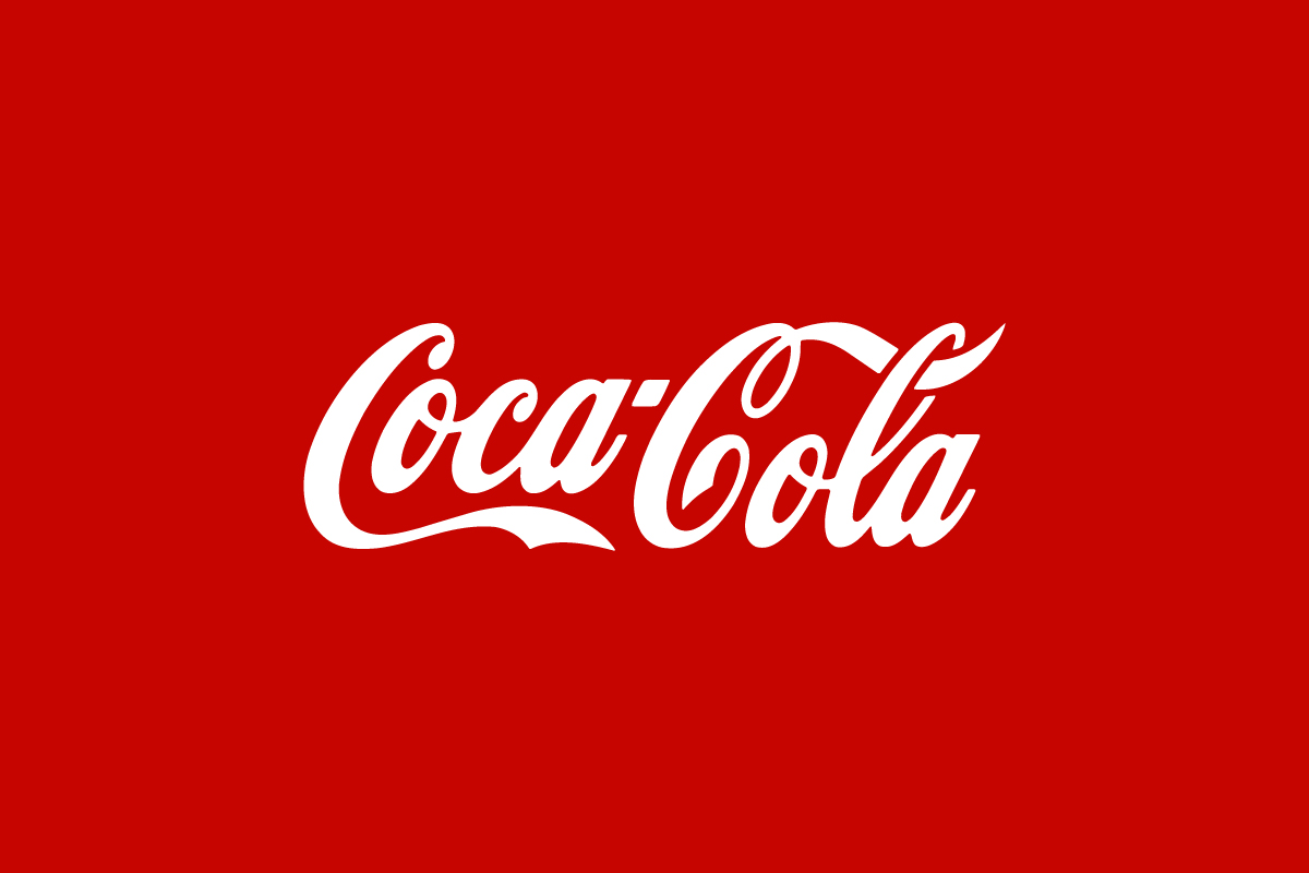
The Coca-Cola logo traces its origins to 1886, when Frank M. Robinson, John Pemberton’s bookkeeper, created the flowing Spencerian script that still defines the brand today.
From the very beginning the logo felt elegant and crafted, matching the brand’s promise of quality. Over the decades as packaging and campaigns evolved the logo itself remained remarkably consistent—locking in its place as a design icon.
What Type of Logo Is the Coca-Cola Logo
The Coca-Cola logo is a wordmark logo, written in its signature script font. Unlike brands that use emblems or symbols Coca-Cola shows the power of typography alone.
The script feels personal and handcrafted, making it instantly memorable. Its uniqueness lies not in adding symbols but in the flow of the letters which have become inseparable from the idea of Coca-Cola itself.
Design Elements and Symbolism
Several design elements explain the logo’s strength:
-
Typography: Spencerian script conveys tradition, craftsmanship and a personal touch. The looping flourishes feel warm and approachable.
-
Colour: Coca-Cola’s red is associated with energy, excitement and appetite—perfect for a beverage brand. The white script creates a crisp timeless contrast.
-
Consistency: By keeping the original design for over 130 years Coca-Cola has reinforced familiarity and trust at every customer touchpoint.
The logo represents happiness and togetherness—values that have been woven into global marketing campaigns for generations.
Logo Variations: Full vs Short Version
![]()
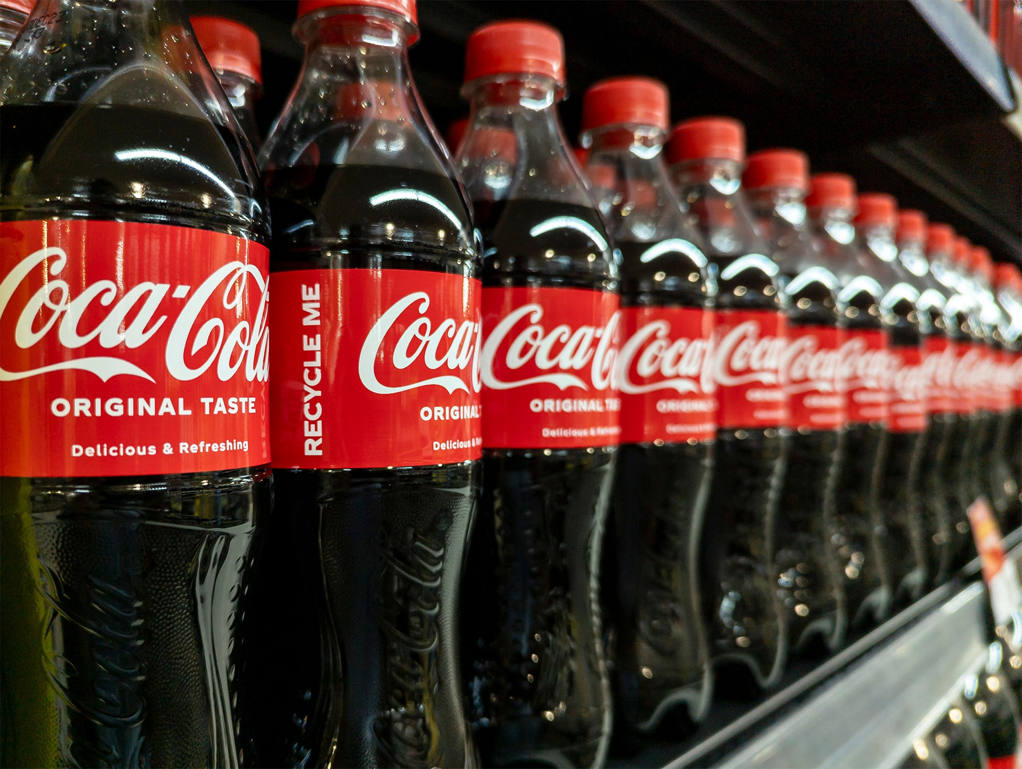
Coca-Cola mainly uses the full script wordmark. However the brand also uses short versions, such as the stylised “Coke” script, for compact spaces and informal branding.Also the packaging often features cropped or partial versions of the script where even a part of the lettering is enough for instant recognition. This flexibility proves the strength of the wordmark—every curve of the letters carries brand equity.
This kind of flexibility is intentional, not accidental, and it’s why strong brands think in systems rather than single marks. At Rabbit Logo, we design logo systems with both full and short variations in mind, ensuring brands stay recognizable whether the logo appears on large packaging, small digital interfaces, or cropped applications.
Does the Coca-Cola Logo Work in Small Sizes?
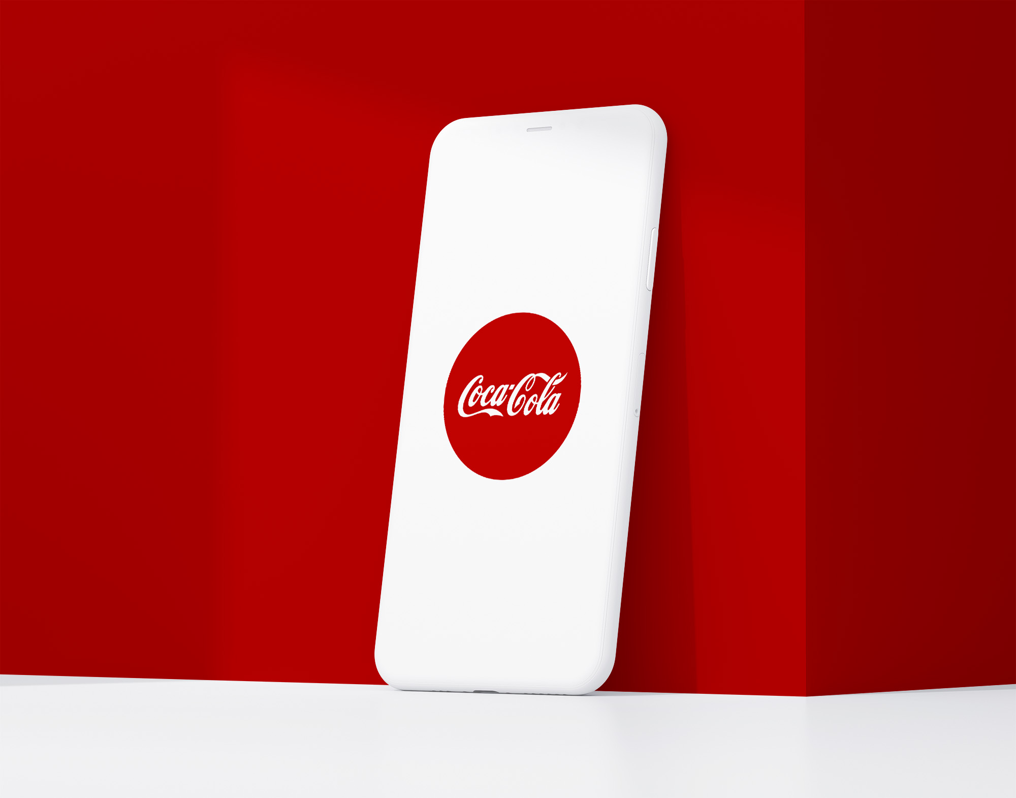
Despite the ornate typography the Coca-Cola logo works surprisingly well in small sizes. The thick script strokes and high colour contrast ensures readability on everything from bottle caps to mobile ads.
But the full flourish of the logo is best appreciated at medium or large scales while shortened versions like “Coke” help maintain clarity in smaller applications. It’s a good example of a heritage wordmark adapting for modern digital environments.
Brand Recognition & Global Impact
The Coca-Cola logo is one of the most recognised logos in the world. In a recognition test with 50 participants all 50 recognised it instantly—a rare feat for any brand.
It’s on billboards in Times Square, vending machines in Tokyo and painted murals in remote villages. More than just a drink the logo has become shorthand for American culture, optimism and global connection.
How Coca-Cola Logo Compares to Competitors
Pepsi
![]()
Pepsi uses a combination mark logo with a circular red, white and blue emblem. While modern and flexible it lacks the timeless consistency of Coca-Cola’s script.
Dr Pepper
Dr Pepper’s wordmark logo is more modern with bold sans-serif lettering. It feels energetic but doesn’t have the same warm heritage.
Sprite
![]()
Sprite’s combination mark logo is colourful and playful targeting a younger audience. It’s fresh but doesn’t have the universal, heritage driven authority of Coca-Cola’s mark.
Should They Change the Logo?
Coca-Cola has no reason to change its logo. Its longevity is part of its strength—the familiar script is more than branding; it’s a cultural touchstone. Any redesign would dilute more than a century of recognition and goodwill.
The company’s best strategy is exactly what it has always done: allow the logo to evolve subtly through context and campaigns while preserving the historic script at its core.
Conclusion
The Coca-Cola logo shows what happens when consistency meets global ambition. With elegant script, bold color, and unmatched recognition, it represents way more than a product—it represents tradition, happiness, and human connection.
Its success comes from timeless design choices paired with careful stewardship across decades. At Rabbit, we help companies build logos that capture this same sense of permanence—marks that get stronger with every generation that discovers them.