The Samsung logo is one of the biggest tech companies in the world. Known for innovation in electronics, smartphones and appliances, Samsung’s logo is surprisingly basic – just the name in bold blue letters. While the logo is clean and recognizable it hasn’t evolved as much as some of its competitors. In this post we’ll look at how the Samsung logo developed, what type of logo it is and whether it still works in a world that demands flexibility.
The Origin of the Samsung Logo
Samsung started in 1938 as a trading company. The name translates to “three stars” in Korean, a reference that shaped its earliest logo designs. These early versions often featured star icons and traditional typography, capturing the company’s heritage and aspirations.
In 1993 Samsung introduced a more refined look: a white wordmark set inside a tilted blue oval. This redesign signaled its evolution into a global tech leader, emphasizing clarity, trust and a unified visual identity.
By the early 2000s the brand removed the oval completely. What remained was a sleek, standalone wordmark—bold, minimal and modern. It’s a look that has stayed consistent ever since.
What Type of Logo Is the Samsung Logo?
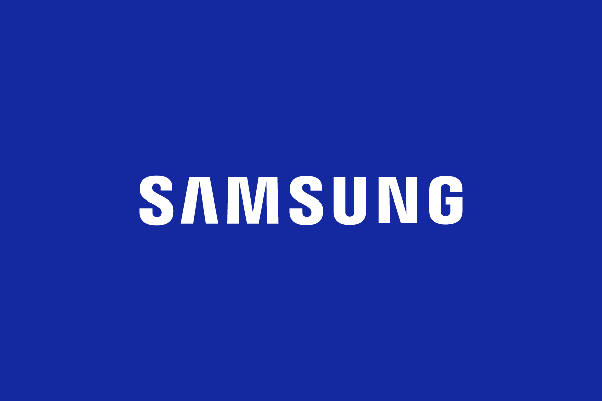
The Samsung logo is a wordmark logo, relying entirely on typography without any symbol or emblem. This type of logo focuses on brand name recognition rather than visual abstraction.
Samsung’s wordmark uses custom, geometric sans-serif letters. The wide stance and open spacing gives it stability and clarity – two qualities that support its brand as a leader in hardware and electronics.
Design Elements and Symbolism
Although simple the Samsung logo makes intentional use of visual design to reinforce its message:
-
Typography: The typeface is a bold, custom sans-serif with consistent line weight. It’s neutral and industrial which suits a brand built on hardware and engineering.
-
Color: The deep blue (#1428A0) conveys reliability, professionalism and calm – perfect for a brand that powers everything from smartphones to refrigerators.
-
Layout: Removing the oval allowed the wordmark to appear more modern and flexible in digital environments.
-
No Symbolism: Unlike its original three-star logos the modern Samsung identity avoids symbols altogether, letting the name do all the work.
It’s a logo built on consistency rather than creativity – and that’s on purpose.
Does the Samsung Logo Work in Small Sizes?
Not really. While the Samsung logo is readable at small sizes due to its thick lettering and spacing it lacks a shorthand. The company has never introduced a monogram version or icon-based variation. Brands like Netflix which use a wordmark logo solved this problem by creating a bold “N” icon for compact uses.
Samsung on the other hand doesn’t have a letter or symbol that stands out on its own. The “S” is too generic to be used independently and there’s no supporting graphic to represent the brand in tighter spaces like app icons, browser tabs or smart home interfaces.
This limitation becomes more apparent as design moves towards responsive layouts and minimalist branding. Without a secondary logo Samsung misses opportunities to express its identity more flexibly.
Brand Recognition & Global Impact
Samsung is one of the most globally recognized electronics brands, with a presence in over 80 countries and product lines spanning smartphones, TVs, home appliances, and semiconductors. The brand’s visual identity—anchored by its bold blue wordmark—plays a key role in maintaining that recognition across markets.
In a simple recognition test, 42 out of 50 testers correctly identified the Samsung logo without any supporting context. While that’s a strong number, it slightly trails competitors like Apple, whose symbol is more distinctive and easier to recall visually. Samsung’s reliance on a full wordmark may contribute to this difference, especially in regions where English is not the native language.
Still, the brand’s scale, consistency, and widespread visibility—from billboard ads to product boot screens—make the Samsung logo a familiar sight worldwide. Its impact comes more from frequency and reputation than from a highly distinctive graphic element.
How Samsung Logo Compares to Competitors
In the tech industry logo flexibility is a competitive edge. Here’s how Samsung stacks up against other global tech brands:
Apple
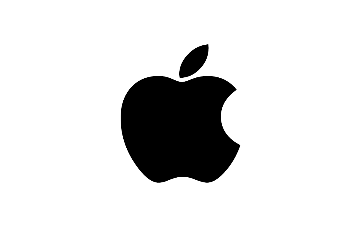
Apple logo uses a minimalist pictorial symbol—the iconic bitten apple. It works everywhere: on devices, packaging and UI elements. Unlike Samsung, Apple doesn’t need to include its name to be instantly recognized.
Sony
![]()
Sony also uses a wordmark logo, but with a classic serif font that feels more formal and legacy-driven. While it shares Samsung’s commitment to tradition it lacks the visual simplicity that defines modern branding.
LG
![]()
LG combines a red wordmark with a circular symbol that forms a stylized smiling face. This combination mark logo gives LG more versatility across product lines. Compared to Samsung LG’s branding feels more playful but also more adaptable in compact layouts.
Samsung’s logo is strong in consistency but limited in variety. In a competitive landscape that matters.
Should They Change the Logo?
Samsung’s logo doesn’t feel outdated—but it also doesn’t feel adaptive.
The typography and color still hold up and the wordmark is clean and trustworthy. But the lack of a supporting icon or abbreviated version limits the brand’s flexibility across digital environments. From smartwatches to phone apps users expect brands to have simplified marks that still communicate clearly.
If Samsung were to explore a monogram or secondary icon—something distinct and scalable—it could modernize the brand system without losing recognition. Until then the current logo remains serviceable but not future-proof.
Conclusion
The Samsung logo is a great example of a wordmark logo done right. It’s bold, simple and trustworthy—just like the company. But it also shows the problem with one-size-fits-all logos in a world where branding needs to adapt to devices and environments.
Need a logo design that’s clear and flexible? Rabbit Logo can help you create a visual identity built to perform on every screen—big or small.