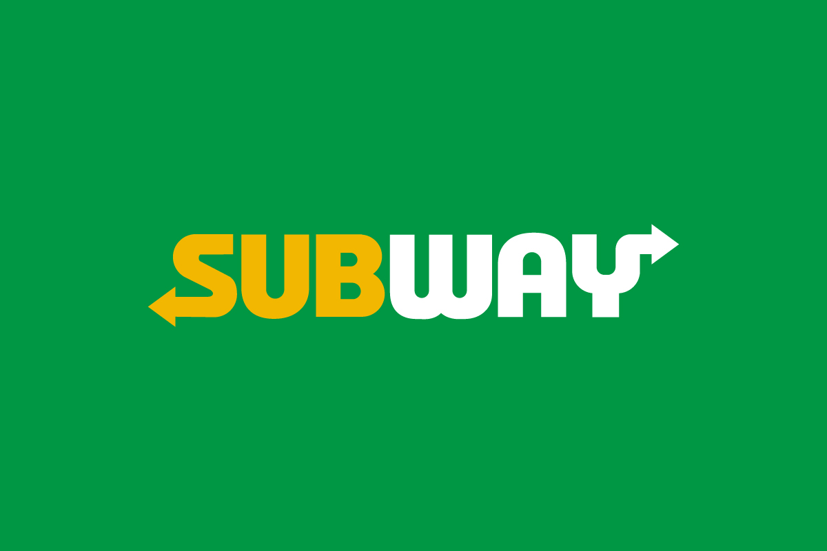
The Subway logo is one of the most recognizable wordmarks in the food industry—simple, bold, and full of motion. With arrows built into the “S” and “Y”, the logo visually represents direction and choice, echoing the brand’s “fresh and made-your-way” philosophy. It’s a design that captures movement, accessibility, and energy in just one word.
The Origin of the Subway Logo
The Subway story began in 1965, when a young entrepreneur, Fred DeLuca, teamed up with Dr. Peter Buck in Bridgeport, Connecticut, to open their first sandwich shop. Originally named Pete’s Super Submarines, the brand adopted the name Subway a few years later to create a stronger identity tied to the idea of speed, convenience, and value.
The earliest Subway logos featured simple typography and red-blue color combinations. As the brand grew into a global fast-food leader, the design evolved to highlight freshness and motion—qualities essential to its personality. The arrows in the logo became a defining element, visually symbolizing both the customer’s journey and the brand’s fast service concept.
What Type of Logo Is It?
The Subway logo is a wordmark logo, but it’s also a directional design thanks to the arrows embedded in the first and last letters.
-
The arrow in the “S” points left, representing entry—customers stepping in to begin their order.
-
The arrow in the “Y” points right, symbolizing exit—leaving satisfied with a fresh, custom-made sandwich.
Together, these arrows make the logo dynamic and interactive, turning a simple word into a story about movement and choice.
Design Elements and Symbolism
The Subway logo works because it’s built on strong, intuitive symbolism:
-
Typography: A bold, rounded sans-serif typeface gives the logo a friendly, approachable look. The letters are clean and slightly compact, reinforcing efficiency and quick service.
-
Arrows: The directional arrows create motion and meaning. They not only represent physical movement but also stand for variety and decision-making—two traits that define Subway’s “build-your-own” brand experience.
-
Colors: The bright yellow and green palette reflects freshness, nature, and optimism. Yellow evokes warmth and appetite, while green symbolizes health and balance—perfect for a brand focused on fresh ingredients.
-
Balance: The wordmark is symmetrical and well-weighted, ensuring the arrows don’t overpower the name but instead enhance its rhythm and flow.
Each element reinforces the same brand story: healthy choices, approachable service, and everyday energy.
Brand Recognition & Global Impact
The Subway logo is instantly familiar across more than 100 countries. Its cheerful colors and directional arrows make it memorable even without text translations, a key advantage for international markets.
Subway’s consistent visual identity has helped it maintain strong recognition in a competitive fast-food landscape dominated by brands like McDonald’s and Burger King. Its use of green—a color rarely seen in traditional fast food—helped position Subway as the fresh alternative long before “healthy eating” became mainstream.
Even as marketing trends shifted, the logo stayed consistent in tone—approachable, upbeat, and adaptable across signage, packaging, and digital platforms. The most recent redesign in 2016 modernized the font and flattened the design for better digital readability, while keeping the iconic arrows intact.
Does the Subway Logo Work in Small Sizes?
Yes, the Subway logo scales effectively because of its bold shapes and minimal detailing. The thick lettering keeps it legible even at small scales, while the simple color contrast ensures the arrows remain visible.
The compact proportions make it ideal for everything from sandwich wrappers to mobile app icons—proving that simplicity and functionality can go hand in hand.
How Subway Compares to Competitors
McDonald’s: The golden arches logo focuses on iconic symbolism rather than typography. Subway’s strength lies in its wordmark—more personal and expressive.
Burger King: Uses a combination mark with text between bun shapes, suggesting flavor and fullness. Subway’s cleaner design emphasizes motion and freshness instead.
Panera Bread: The script emblem of Panera conveys artisanal warmth, while Subway’s block lettering communicates accessibility and modern convenience.
Should They Change the Logo?
Not at all. The current Subway logo strikes the perfect balance between personality and professionalism. The arrows are instantly recognizable and full of meaning, while the colors feel modern and timeless.
Any redesign that removes the directional elements or alters the color palette would risk losing the logo’s distinct energy and symbolic storytelling. The current design already captures what makes Subway special—freshness, flexibility, and forward motion.
Conclusion
The Subway logo is a great example of how typography and symbolism can merge to tell a brand’s story. With its arrows representing choice and direction, and its vibrant colors reflecting health and positivity, it embodies everything the company stands for.
It’s a design that proves simple ideas—when executed smartly—can travel far. At Rabbit Logo, we help brands create logos that do exactly that: designs that communicate purpose, spark emotion, and stay relevant across generations.