Types of logos play a critical role in shaping how a brand is seen, remembered, and trusted. A logo isn’t just a design—it’s the face of your brand. Before a customer sees your product or hears your message, they’ll see your logo. And the type you choose sets the tone.
Understanding the different types of logos helps businesses choose a design that fits their goals and industry. From wordmarks to emblems, each logo style serves a specific purpose — and choosing the right one is easier with guidance from an experienced logo design team like Rabbit Logo.
In this guide we’ll cover 9 essential logo types—timeless formats and creative modern styles like negative space and retro design. Whether you’re a designer or building your own brand, this breakdown will help you choose a logo that speaks clearly and sticks.
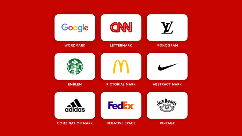
Quick Logo Types Breakdown
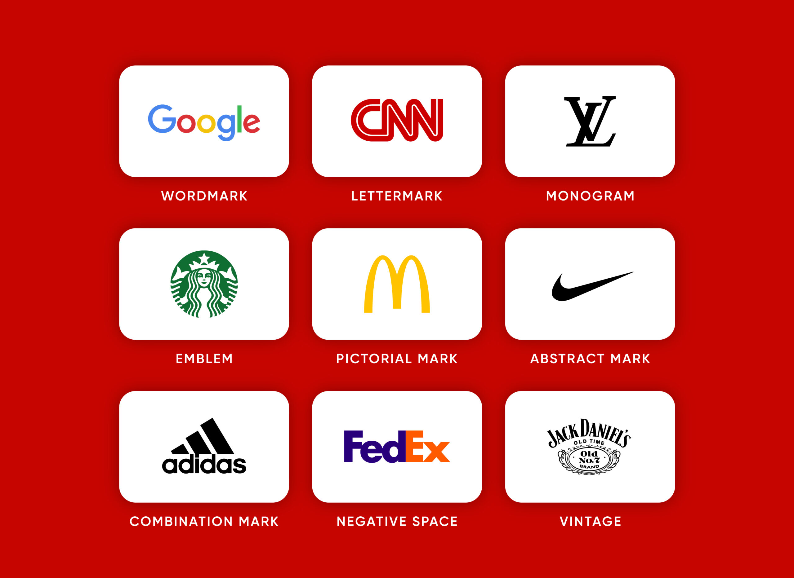
Before we dive in, here’s a quick rundown of the most common logo types:
-
Wordmark – Brand name in stylized text (e.g. Google)
-
Lettermark – Initials only, clean and compact (e.g. CNN)
-
Monogram – Interlocked or stylized initials (e.g. Louis Vuitton)
-
Emblem – Text inside a symbol or badge (e.g. Starbucks)
-
Pictorial Mark – Literal image or icon (e.g. McDonald’s)
-
Abstract Mark – Unique geometric symbol (e.g. Nike)
-
Combination Mark – Symbol + text together (e.g. Adidas)
-
Negative Space Logo – Uses empty space to form hidden imagery (e.g. FedEx)
-
Vintage / Retro Logo – Nostalgic, handcrafted aesthetics (e.g. Jack Daniel’s)
Let’s get into each one.
1. Wordmark
![]()
Definition: A wordmark logo is a logo made up of just the brand name, in a custom or simple way, like Google did. It relies purely on typography to establish brand identity, with no added symbols or icons.
Why it works: Wordmarks are clean, direct and memorable—especially when the name itself is short and distinct.
Best for:
-
Startups and new brands looking to build name recognition
-
Companies with unique or short names
-
Brands with a modern or minimalist aesthetic
Examples:
-
Google – simple sans-serif, colorful personality
-
Coca-Cola – elegant script that feels timeless
-
FedEx – precise, efficient, with a hidden arrow in the negative space
Pro tip: Typography is everything in a wordmark. The wrong font can make a strong name feel forgettable.
2. Lettermark
![]()
Definition: A lettermark logo is a logo made from the initials of the brand name.
When to use it: If your brand has a long name (like “International Business Machines”), a lettermark shortens it while maintaining a professional look.
Examples:
-
IBM – bold, industrial, authoritative
-
HBO – clean and instantly recognizable
-
CNN – tight and efficient
Wordmark vs. Lettermark: Lettermarks use initials; wordmarks use the full name. Both are text-based but serve different needs.
3. Monogram
![]()
Definition: Many people don’t know the difference between a monogram and a lettermark, but a monogram logo is when the initials are connected and interwoven into a single mark.
Why it’s powerful: It adds sophistication, customization and often subtle symbolism.
Examples:
-
Louis Vuitton – classic, upscale, interlocking letters
-
Chanel – mirrored Cs, iconic and symmetrical
-
Gucci – overlapping Gs, elegant and instantly recognizable
Want to see how negative space elevates a monogram? Read our deep dive on the Lando Norris logo.
4. Emblem
![]()
Definition: An emblem logo is a design where the text is enclosed within a solid shape—typically a circle, badge, or shield—creating a unified, often traditional mark that feels official and timeless.
Why brands use it: Emblems feel official and timeless. They’re often used by universities, sports teams and heritage brands.
Strengths:
-
Feels established, trustworthy
-
Great for physical products and packaging
-
Excellent for vintage or artisanal brands
Weaknesses:
-
Not always scalable (can be hard to read at small sizes)
Examples:
-
Starbucks – mermaid emblem with evolving typography
-
Harley-Davidson – rugged badge that suits the brand tone
-
NFL – classic American sports identity
5. Pictorial Mark
![]()
Definition: A pictorial logo (also called a brand mark or logo symbol) uses a literal icon to represent the brand without text. Famous examples include McDonald’s Golden Arches or Apple’s apple symbol. A strong pictorial logo becomes instantly identifiable even without words.
Why it works: It’s simple and universal. Over time a pictorial mark can become deeply associated with the brand.
Best for:
-
Brands with global ambitions
-
Brands that want to simplify over time (think Apple dropping the word “Apple”)
Examples:
-
Apple – a literal apple with a bite
-
Twitter – the blue bird
-
McDonald’s – the golden arches
Note: These marks require brand recognition. Most companies pair them with a wordmark at first. This type of logo may be hard to pull off for new or small brands without a supporting wordmark.
6. Abstract Mark
![]()
Definition: An abstract logo uses a symbol that doesn’t represent anything literal—yet becomes iconic and instantly recognizable through repeated brand association.
Why it’s unique: Abstract marks are one-of-a-kind. They give designers total freedom to create a shape that captures brand energy, tone and movement.
Examples:
-
Pepsi – a swirling globe of red, white and blue
-
Nike – the swoosh, evoking motion and speed
-
Airbnb – abstract heart + location + “A” in one form
Good for: Brands that want to own a distinct, non-literal visual space.
This type of logo can become iconic over time, but may need early support from typography or explanation.
7. Combination Mark
![]()
Definition: A combination mark logo combines pictorial and wordmark styles into one custom logo, blending a recognizable symbol with your brand name for maximum impact and versatility.
Why it’s the most popular logo type: It offers the best of both worlds—text for clarity and a symbol for flexibility.
Ideal for:
-
Brands that are just launching
-
Companies looking for both recognition and style
-
Those planning to drop the text later and keep the symbol
Examples:
-
Adidas – name with the three stripes
-
Lacoste – crocodile + wordmark
-
Burger King – stylized name sandwiched in a bun shape
Bonus: Combination marks make great brand systems—you can separate the elements for use on different platforms.
8. Negative Space Logo
![]()
Definition: A logo that uses the empty space between or inside letters to reveal a hidden image or message.
Why it’s powerful: It adds surprise, intelligence and depth. It also increases engagement—viewers spend longer looking, then feel rewarded once they “get it.”
Examples:
-
FedEx – hidden arrow between the E and X
-
WWF – the panda shape formed from pure black-and-white space
-
Lando Norris – the number 4 hidden in the LN monogram
Explore more examples in our negative space logo article.
Use case: Great for brands that want to stand out without being loud. Works well for modern tech, fashion and creative industries.
9. Vintage / Retro Logo
![]()
Definition: A vintage logo embraces elements from the past—featuring distressed textures, bold serif fonts, and classic badge-style layouts that evoke nostalgia and timeless character.
Why it works: It taps into nostalgia and conveys authenticity, craftsmanship and heritage.
Visual cues:
-
Serif or script fonts
-
Weathered or grainy textures
-
Shield shapes, ribbons and ornamental framing
Examples:
-
Jack Daniel’s – ornate lettering in a vintage whiskey label style
-
Coca-Cola – still uses the original script
-
Brooklyn Brewery – circular badge and vintage type
Good for:
-
Breweries, barbershops, coffee brands
-
Apparel lines with heritage or Americana
-
Local businesses that want to feel established from day one
Tip: Vintage logos work well in print, signage and packaging—but may need simplified versions for digital.
Conclusion
A great logo isn’t just about what looks good—it’s about what feels right for the brand’s story, audience and future.
Now you know the 9 types of logos so you can make a more intentional branding decision that matches your tone, audience and goals.
And sometimes the real power lies not in what’s shown but in what’s hidden. So whether you’re designing your own brand or just looking for inspiration, understanding these logo types is the first step to making a mark that lasts.