So you want to design a logo? Well, many businesses, startups and creatives start here. A logo is more than decoration – it’s the visual representation of what a company stands for. When done well it communicates values, builds trust and creates instant recognition.
While many people begin by trying to design a logo themselves, working with an experienced team like Rabbit Logo helps turn ideas into a clear, scalable mark. This step by step guide explains the process from defining your brand to finalising a scalable mark. Whether you’re sketching ideas on paper or using design software these steps will help you understand what it takes to create a logo that lasts.
Step 1: Define Your Brand Before You Design a Logo
Before you draw a single line it’s important to understand the story behind the logo. A logo that lacks meaning quickly fades from memory. Begin by clarifying your brand’s purpose, core values, and overall character. What do you want your business to represent? Think about your ideal audience and the reactions your logo should inspire.
This stage is about clarity. A bold modern technology startup will require a completely different approach than a heritage brand rooted in tradition. When the brand message is clear the logo becomes a visual extension of that identity.
Step 2: Research Your Market and Competitors
Once you understand your own brand the next step is to research the landscape around it. Look at logos from competitors, both direct and indirect. Look at the colours, shapes and styles that dominate your industry. Which design trends are overused? Where are the opportunities to stand out?
Research helps you avoid clichés and ensures your design feels fresh. For example too many eco-focused companies use leaves or globes. Recognising these patterns early gives you the chance to create something unique. Collect inspiration but remember: the goal is originality not imitation.
Step 3: Choose the Right Logo Type
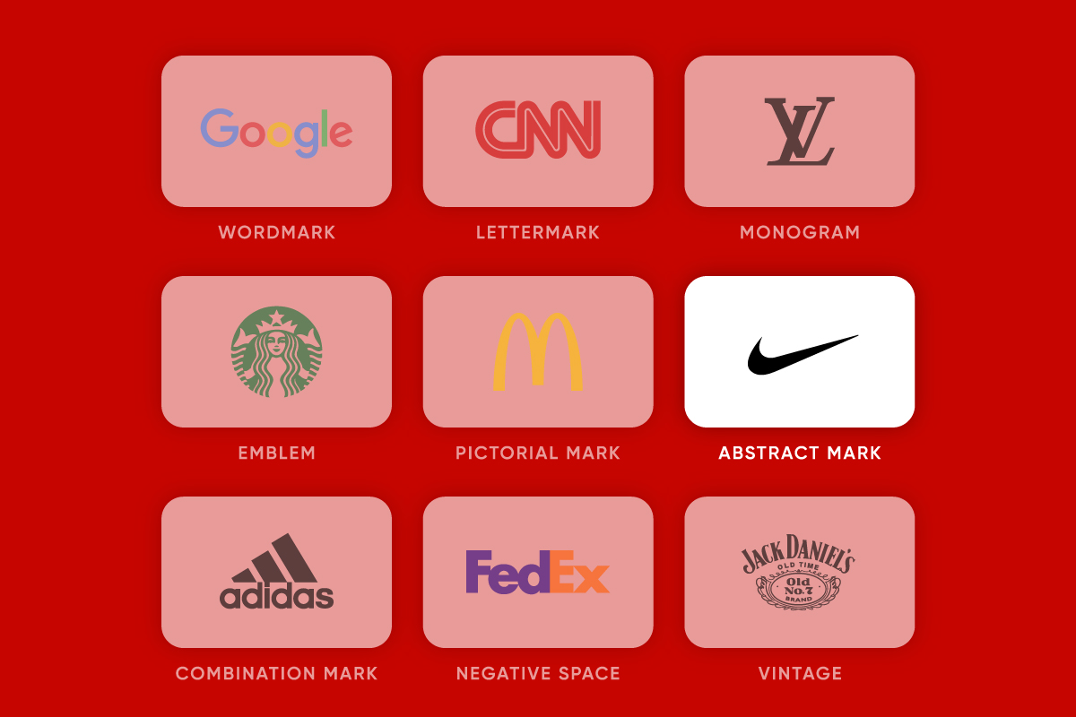
Logos aren’t all the same. Different types communicate in different ways and the style you choose should align with your brand’s goals. The main categories are:
-
Wordmark – Logos based on the full brand name in a custom typeface (e.g. Google).
-
Lettermark – Initial based logos that shorten long names into compact marks (e.g. CNN).
-
Pictorial Mark – Symbol only logos like McDonalds.
-
Abstract Mark – Geometric or conceptual shapes like the Nike swoosh.
-
Emblem – Text within a badge or seal, like Starbucks.
-
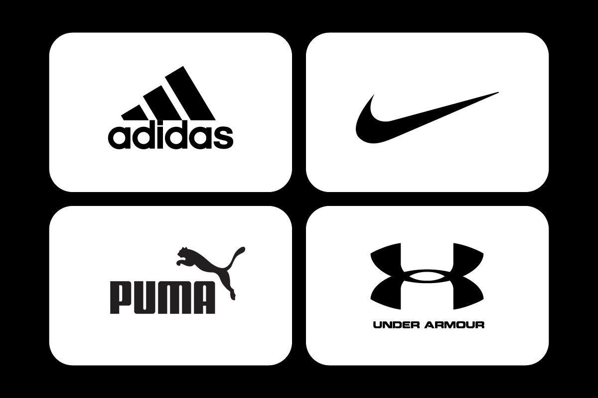
Combination Mark – Wordmark paired with a symbol, like Adidas.
Choosing the right type depends on whether you want to emphasis your name, a symbol or a combination of both. You can explore each style in detail in our types of logos guide.
Step 4: Sketch Ideas and Concepts
![]()
Every great logo starts with sketches. Even in a digital world sketching on paper helps generate ideas quickly without the constraints of software. Don’t focus on polish at this stage – focus on quantity. The more ideas you explore the more likely you are to find a direction worth developing.
Look for shapes that feel distinctive yet simple. Avoid relying on effects or details that won’t translate well in smaller sizes. Strong logos tend to be built on clean, bold structures that remain recognisable even when stripped back.
Step 5: Pick Colors and Fonts
Once you have a direction start refining your design with color and typography. These choices shape the tone and personality of the logo.
![]()
Colors carry psychological weight. Red means energy and urgency, blue means trust and professionalism, green often means growth or sustainability. The palette should reinforce your brand values while being versatile across different applications. See our logo colors guide for more.
Fonts are equally important. Sans-serif fonts create a modern and approachable feel, serif fonts convey tradition and authority. Some brands opt for custom lettering to ensure complete originality. Whatever path you choose prioritise legibility. Our article on the best fonts for logos explains this in more detail.
Step 6: Design in Vector Format
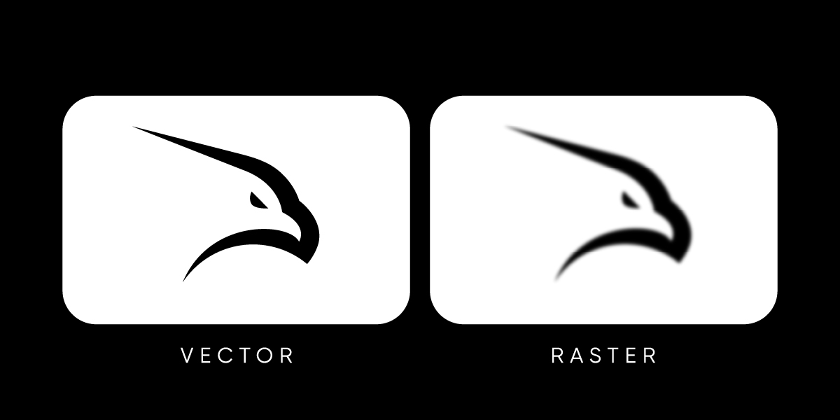
When you start designing digitally always design in vector format. Vectors are built from mathematical curves which means they can scale infinitely without losing clarity. Whether the logo appears on a giant billboard or a tiny app icon a vector file stays sharp. I am using the Adobe Illustrator program.
Formats like JPEG or PNG rely on pixels, which limits scalability. They may look fine at one size but quickly become blurry when scaled. This is why professional designers always provide logos in vector formats like AI, EPS or SVG. See our vector vs raster logos guide for more.
Step 7: Test Your Logo at Different Sizes

A logo must work in every environment. To test its versatility try it in different sizes and contexts. Print it at business-card size, view it as a favicon in a browser tab and on social media profiles. Then test it at large scale – on banners or posters.
If the design loses clarity it may need simplification. This step ensures your logo doesn’t only look good in one situation but works consistently everywhere. See our scalable logo design post for more.
Step 8: Refine and Finalise
![]()
With testing complete refine your design by adjusting proportions, spacing and alignment. Even subtle refinements at this stage can transform the final result. Create variations – a full logo with symbol and wordmark, a horizontal version and an icon-only version for compact use.
Finally export the logo in multiple formats – vector files for professional use and raster exports for web. Delivering a full set means the logo is ready for every application.
Conclusion
Creating a logo requires both creativity and strategy. It requires strategy, creativity and technical precision to produce a mark that represents a brand. While DIY approaches can help you understand the basics, the process shows why professional designers bring so much value – they combine expertise in branding, typography, and scalability to create logos that last.
For more on strategy, styles and real-world examples continue reading Logo Design: Everything You Need to Know, which goes into more detail on everything above and more.