Scalable logo design is one of the most overlooked aspects of creating a professional logo. A brand’s logo appears everywhere — from website favicons to billboards — and if it loses clarity at any size, the brand’s image suffers. At our professional custom logo design agency, we focus on designing logos that stay sharp, balanced, and instantly recognizable across every platform and medium.
In today’s digital world, scalability is no longer optional. A logo must be simple, adaptable, and recognizable at any size. The most successful brands — like Nike, Netflix, and Apple — have mastered this balance. Their marks remain instantly identifiable, even when reduced to a few pixels.
What Is Scalable Logo Design?
![]()
A scalable logo is a logo created to look clear, balanced, and recognizable even in the smallest spaces. It’s designed with simplicity and proportion in mind so it can perform just as well on tiny screens, app icons, or profile pictures as it does on large print materials.
Most modern brands include a scalable variation within their logo system — for example, a symbol-only version or monogram mark that represents the brand in compact formats. This ensures that the brand always stays recognizable, whether it appears on a smartwatch, website favicon, or product tag.
Why Scalability Matters for Every Brand
![]()
Scalability is what keeps a logo usable and recognizable everywhere your brand appears. From social media icons to clothing labels, a logo must stay readable and balanced even when reduced to a fraction of its original size.
Modern brands are seen across dozens of platforms — digital, print, and physical — and each one demands different logo sizes. A logo that looks perfect on a website header might lose its clarity on a mobile app or packaging tag. That’s why every strong brand needs a version that’s built to scale down gracefully.
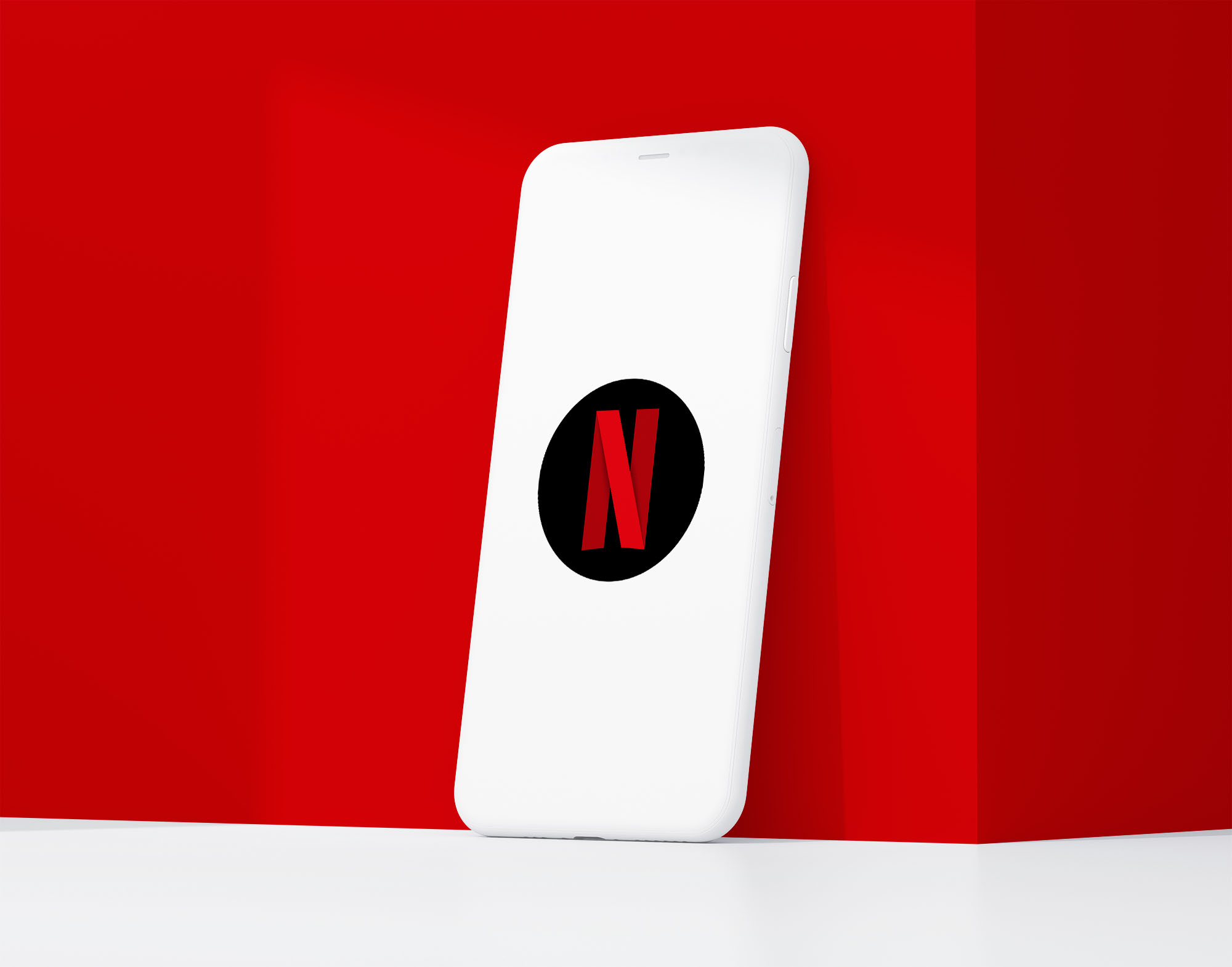
When a logo scales well, it protects brand recognition. People should still recognize your business instantly, even when the logo appears small or minimal. This is why companies like Netflix, Apple, and Nike create simplified versions of their main logos that remain clear and iconic in compact spaces.
A scalable logo is not just a smaller logo — it’s a strategically adapted design that preserves what makes the brand memorable, no matter where it appears.
Key Principles of Scalable Logo Design
![]()
The most important element of a scalable logo is its icon — the simplified mark that can represent the brand in limited spaces. Without an icon or short version of the logo, true scalability becomes almost impossible.
For example, the Starbucks logo is iconic in full size, but the detailed siren mark doesn’t work well as a favicon or app icon — it loses clarity at very small scales. This is why many brands design a secondary, simplified version that keeps their core shape recognizable.
To build a logo that performs well across all sizes, designers focus on these key principles:
1. Strong Icon or Symbol – Create a simple, distinctive mark that stands on its own. This is the foundation of scalable design and should remain recognizable even when reduced to a few pixels.
2. Simplicity – Keep shapes minimal and avoid thin lines or small decorative elements. Complexity is the enemy of clarity at small sizes.
3. Shape Balance – Focus on a balanced, identifiable silhouette. The overall shape should remain familiar whether large or small.
4. Contrast – Make sure the logo stays visible against both light and dark backgrounds. High contrast helps it pop in all contexts.
5. Adaptable Layout – Build flexible variations, such as full, stacked, or icon-only versions, to maintain usability across different formats.
When a logo includes a strong, clean icon, it becomes far easier to create versions that scale effectively. That’s what separates scalable logos — like Apple’s symbol or Netflix’s “N” — from designs that lose their impact in small spaces.
How to Test a Logo’s Scalability
Testing is just as important as designing. Once a logo is created, it should be evaluated across real-world scenarios to ensure reliability.
-
Shrink Test: Reduce the logo to common small sizes like 16×16 px or 32×32 px (favicon or app icon). If it loses clarity, it needs simplification.
-
Monochrome Test: Remove color and test the logo in black and white. A scalable logo should work through form alone.
-
Background Test: Place it on various backgrounds — solid colors, textures, and images — to confirm contrast and visibility.
-
Real-World Test: Preview the logo on common applications: browser tabs, social media profiles, email headers, and mobile screens.
These tests simulate how the logo performs in real use, not just in design software.
Famous Examples of Scalable Logos
Nike
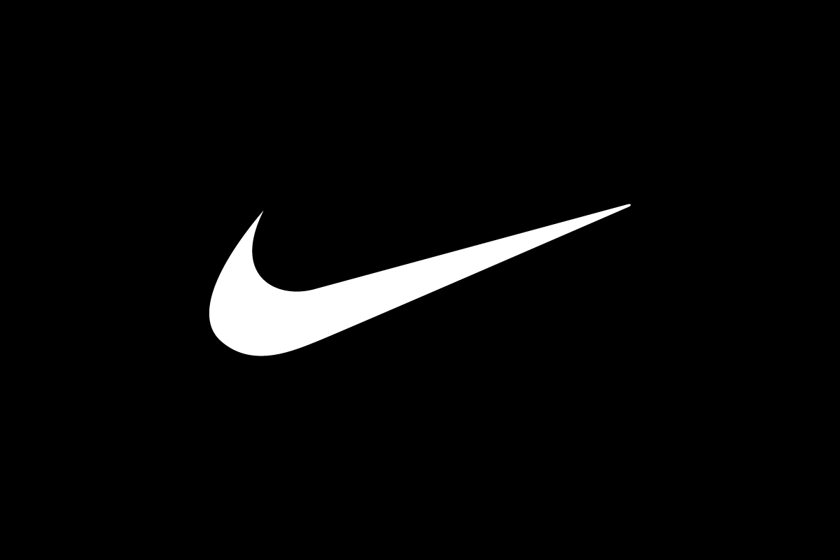
The Nike swoosh is the ultimate example of scalability. Its bold, minimal form holds up across every medium — from sneakers and billboards to app icons.
Netflix
![]()
Netflix’s visual system includes two versions: the full wordmark and the standalone “N” ribbon. The single letter mark works perfectly in small digital spaces while maintaining the brand’s color and motion identity.
Apple
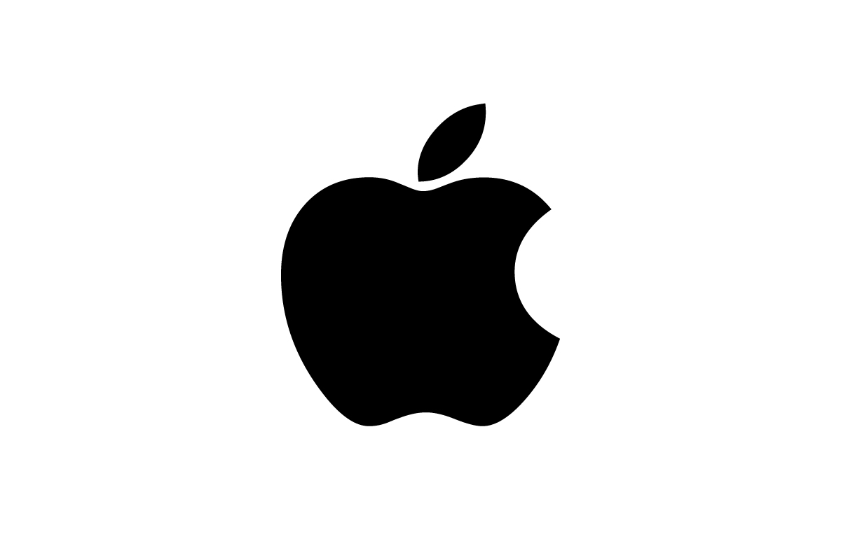
Apple’s bitten apple silhouette demonstrates how a simple shape can become iconic. Its consistent proportions make it instantly recognizable across products and advertising.
Each of these brands proves that simplicity and adaptability are timeless design strategies.
How Rabbit Designs Scalable Logos
At Rabbit, scalability is part of every project from the first sketch. Each logo is tested for legibility at small sizes and clarity at large scale. The goal is to ensure a consistent experience across every format — from digital use to physical products.
For example:

The Eagle sportswear logo was designed as a bold pictorial mark that works on apparel, tags, and athletic gear.

The Grow logo uses minimalist typography and negative space to maintain balance even at reduced sizes.
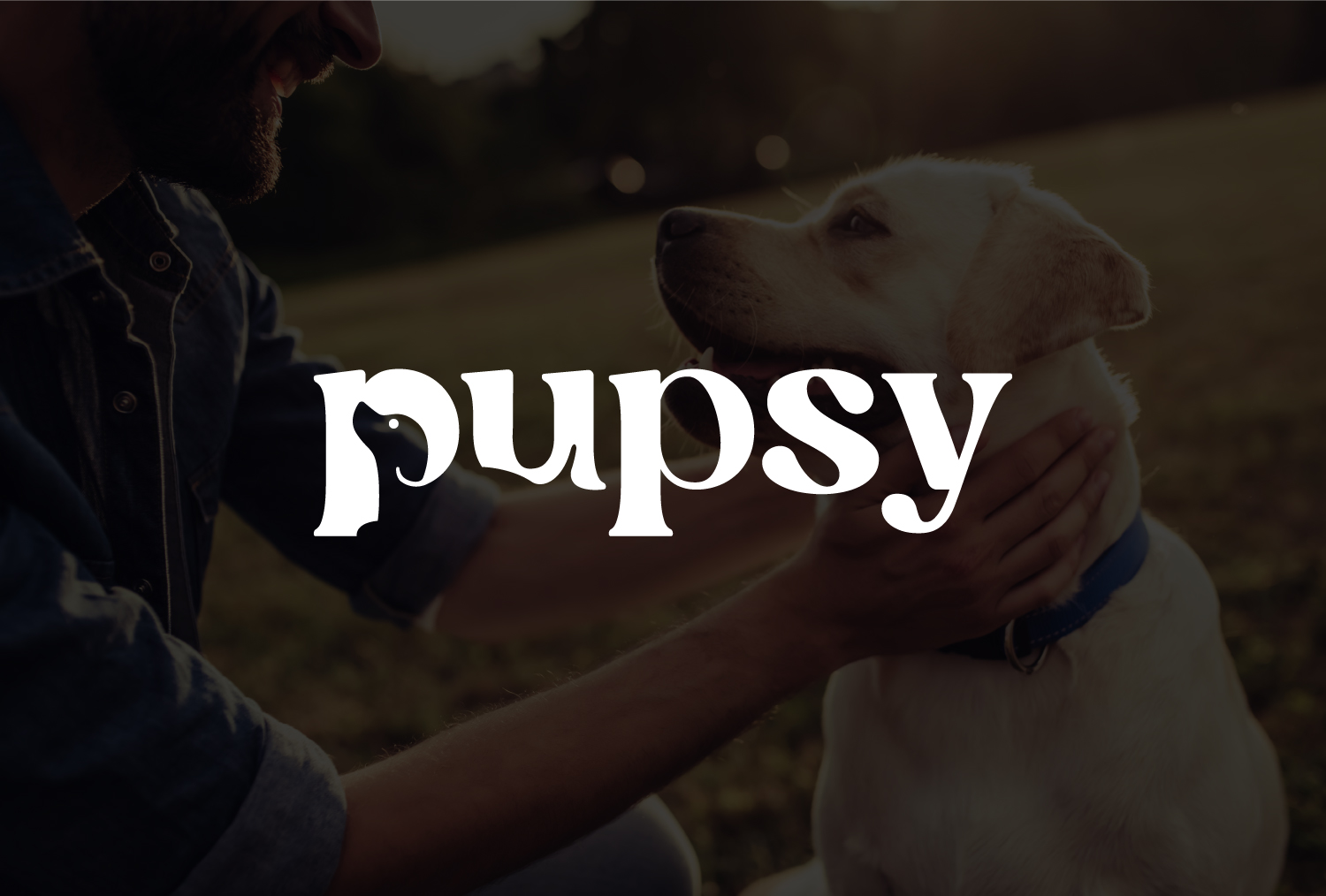
The Pupsy logo features a friendly, rounded wordmark that prints clearly on packaging and digital screens alike.
You can see more examples of scalable, real-world branding in our works.
Responsive and Scalable Logos in Practice
Many modern logos today are responsive, because most brands build complete logo systems rather than relying on a single static design. These systems usually include:
-
Full logo — with text and symbol used for print, ads, or large displays.
-
Symbol or icon logo — a simplified version used for small spaces like app icons, favicons, or profile pictures.
When brands use the symbol version for smaller applications, that mark becomes the scalable part of the system. It’s created as a clean vector design that stays sharp and recognizable at any size.
In reality, there’s rarely one logo used across every channel. Instead, brands design flexible sets of scalable elements that work together.
Take Netflix as an example: the company doesn’t use its full wordmark for app icons. Instead, it created a unique “N” logo, perfectly shaped for small digital formats. This lettermark works as the scalable symbol, while the full wordmark serves as the primary version for print and marketing.
On the other hand, FedEx is one of the few major brands that uses only one logo design across all channels. The same wordmark appears on trucks, packaging, websites, and even small app icons. While this approach keeps consistency, it’s not the most optimal for smaller sizes — the full wordmark becomes less legible when scaled down. Still, FedEx continues to use it because of its strong global recognition and simplicity.
This contrast shows how different brands approach scalability. Some, like Netflix, design multiple responsive variations to stay versatile. Others, like FedEx, rely on the strength of a single scalable wordmark. Both strategies work — as long as the design remains clear, balanced, and consistent at every scale.
Common Mistakes to Avoid
Even experienced designers sometimes overlook scalability. Here are the most frequent pitfalls to avoid:
-
Too Many Details: Intricate lines or textures vanish at smaller sizes.
-
Tiny Typography: Overly small text becomes unreadable when reduced.
-
Heavy Gradients or Effects: These may distort when printed or viewed at low resolutions.
-
No Alternate Versions: Using only one layout limits flexibility for different platforms.
-
Ignoring Real Use Cases: Always preview how the logo appears on social media, packaging, or mobile apps before finalizing.
Avoiding these mistakes ensures your logo looks as professional on a smartphone as it does on a billboard.
Should You Redesign Your Logo to Improve Scalability?
If your logo looks blurry on small screens, loses detail in print, or feels unbalanced in large formats, a redesign might be necessary.
At Rabbit, we often help clients update outdated or overly detailed logos into clean, scalable versions that align with modern design standards. A scalability-focused redesign ensures that your brand stays professional, adaptable, and future-proof.
Conclusion
Scalable logo design is about more than technical precision — it’s about building a visual identity that remains strong and clear wherever it appears. In a world where brands live across countless screens and surfaces, scalability defines professionalism.
When a logo is simple, balanced, and adaptable, it becomes timeless. The best marks don’t rely on size to make an impact — they rely on clarity, confidence, and consistency.