When your new logo is complete, the next question always comes up: Which file formats do I actually need?
A logo isn’t just one file — it’s a collection of formats made for different purposes. The same design must look perfect on a website, a T-shirt, a business card, and a billboard. Sending the wrong file type can make even the best logo appear blurry or distorted.
In this guide, we’ll break down the most common logo file formats, explain when to use each, and show why professional designers always deliver multiple versions.
Why Logo File Formats Matter
![]()
Every format serves a specific purpose. Some preserve crisp detail for print, others ensure fast loading online. Using the wrong one often leads to pixelation, loss of color accuracy, or awkward scaling.
A professional logo package usually includes several file types for both print and digital use. This ensures your logo always stays sharp, consistent, and flexible — no matter where it appears.
When handled correctly, your logo remains one of the few brand assets that can travel across every medium without compromise.
Understanding Vector vs. Raster
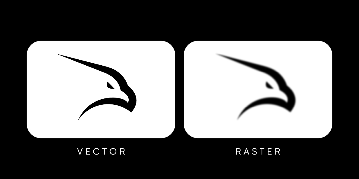
Before you can decide which formats to use, it’s important to understand the two main categories of image files: vector and raster.
-
Vector files are made of mathematical paths. Because they’re built with mathematical precision, a logo in this format keeps its crisp edges at any size — from a tiny favicon to a large billboard. Typical vector formats include AI, EPS, SVG, and PDF.
-
Raster files are made of pixels. When resized beyond their original dimensions, they lose clarity and become blurry. Common raster formats include PNG and JPG.
In professional logo design, the vector version is considered the master file. From it, designers export raster formats for specific uses like websites, presentations, or social media.
For a deeper dive, see our Vector vs Raster Logos guide.
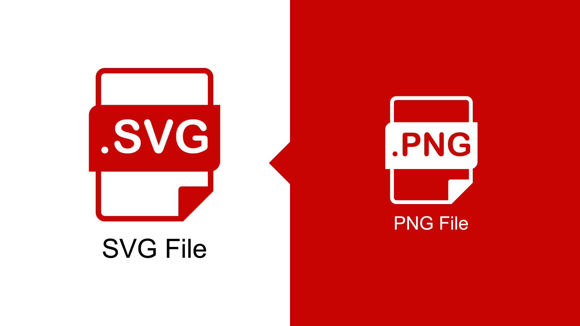
Is PNG a Vector File?
No — PNG is not a vector file. It’s a raster image, made up of pixels rather than scalable paths. PNGs are ideal for digital use because they support transparency and display crisp detail on screens, but they can’t be resized infinitely without losing quality.
If you enlarge a PNG too much, it will become blurry or pixelated. For projects like printing, signage, or any large-scale branding, always use a vector format such as AI, EPS, SVG, or PDF. These files maintain sharp edges and accurate proportions at any size.
Common Logo File Formats Explained
![]()
There isn’t one “perfect” format for all situations — the list below explains the most popular ones and when they work best.
-
AI (Adobe Illustrator) – The editable master file used by designers. It contains vector data and supports infinite scaling.
-
EPS (Encapsulated PostScript) – An industry-standard vector format widely accepted by printers and sign manufacturers.
-
SVG (Scalable Vector Graphic) – A lightweight vector file used for websites and apps. It stays sharp on any screen and supports simple animations.
-
PDF (Portable Document Format) – A flexible format that often includes vector data. Great for sharing and printing because anyone can open it.
-
PNG (Portable Network Graphic) – A raster format that uses pixels instead of paths and supports transparent backgrounds. Ideal for digital use, such as websites, presentations, and overlays.
-
JPG (JPEG) – A compressed raster file. Good for web previews or email attachments but not suitable for resizing or printing.
Each of these files serves a specific purpose, and together they form the complete toolkit for modern branding.
File Formats for Web and Digital Use
![]()
For online use, formats like SVG, PNG, and JPG deliver the best balance between clarity, speed, and compatibility across browsers and devices.
-
SVG is the gold standard for websites and apps. It’s vector-based, scales without distortion, and loads quickly. Modern browsers fully support it, making it perfect for responsive logos and icons.
-
PNG is ideal when you need transparency, such as logos placed over colored backgrounds or photographs.
-
JPG works well for situations where file size matters, like social media or email marketing, but it should always be exported from a vector master file to preserve quality.
When preparing digital assets, remember that most logos appear at small sizes. Designing with scalability in mind — as explained in our Scalable Logo Design article — ensures the mark remains clear and recognizable.
Is SVG Better Than PNG?
Yes — SVG is better than PNG for logos in most cases, especially online. SVG files are vector files, meaning they can scale without losing quality. They’re lightweight, load fast, and look crisp on every screen resolution — from small mobile icons to large web banners.
Meanwhile, PNG is pixel-based, so it’s only ideal when you need transparency in static images (like website overlays or social posts). Whenever possible, use SVG for web and digital branding — it’s the modern, flexible format designed for scalability.
File Formats for Print and Production
![]()
Print materials require precision. The best choices for this purpose are AI, EPS and PDF
-
AI and EPS are vector formats used by designers and printers because they maintain perfect edge sharpness.
-
PDF works across both design and print workflows and ensures accurate colors when exported correctly.
When preparing for print, always work in CMYK color mode rather than RGB, which is used for screens. Sending a raster file or RGB image to a printer can lead to dull or inaccurate colors.
How Professionals Deliver Logo Files
When you hire a professional logo designer or agency like Rabbit, you don’t just receive one file — you receive a complete logo package. This package ensures your brand is prepared for every use case, from digital applications to high-end printing.
A standard delivery set usually includes:
-
Vector files: AI, EPS, PDF, SVG (master and editable versions).
-
Raster files: PNG (transparent background) and JPG (standard, flattened version).
-
Color variations: full color, black, white, and sometimes grayscale.
-
Orientation options: horizontal, vertical, and icon-only versions.
This combination guarantees your logo always appears crisp, no matter the platform.
How to Organize Logo Files for Clients
Delivering the right file types is only half the job — organizing them clearly ensures clients can use their logo confidently without confusion. A simple folder structure makes every version easy to find and prevents accidental misuse.
Here’s an example of how professionals at Rabbit Logo organize final logo packages:
-
/Logo/ – Main logo variations.
– /Web/ – RGB PNG and JPG files optimized for online use.
– /Color/ – Full-color versions for websites and digital applications.
– /Black-and-White/ – Simplified versions for monochrome digital use.
– /Print/ – CMYK vector formats (AI, EPS, PDF) for professional printing.
– /Color/ – Full-color versions for printed materials.
– /Black-and-White/ – Solid or one-color versions for limited-color printing. -
/Symbol/ – Icon-only versions of the logo.
– /Color/ – Full-color mark.
– /Black-and-White/ – Solid or outline-only versions for limited-color applications. -
/Fonts/ – Typeface files used in the logo design (licensed when applicable).
-
/Color-Codes/ – Reference sheet with brand color values in HEX, RGB, CMYK, and Pantone formats.
-
/Guidelines/ – Logo usage rules, spacing, background restrictions, and minimum size recommendations.
-
/Social-Media-Kit/ – Pre-sized logo versions for platforms like Instagram, LinkedIn, and YouTube.
Each file is clearly named for quick identification, such as:Rabbit_Logo_Black_CMYK.ai or Rabbit_Logo_FullColor_RGB.png.
This organization ensures anyone — from a web developer to a print vendor — can find the correct file instantly. When clients receive their logo package in this format, it reinforces professionalism and long-term usability.
Common Mistakes to Avoid
Even experienced teams sometimes mishandle logo files. These are the most frequent issues that lead to poor results:
-
Sending only raster files to printers (causes blurriness).
-
Using RGB files for print instead of CMYK.
-
Forgetting to export transparent versions for digital use.
-
Compressing files too heavily, resulting in quality loss.
-
Inconsistent naming (e.g., “logo_final_final2.png”).
-
Ignoring scaling — always test how the logo looks in small applications like favicons or social media icons.
By keeping your files organized and labeled clearly, you’ll save time and protect brand consistency.
Conclusion
Logo file formats are the backbone of professional branding. They determine how your mark appears in every environment, from digital screens to printed materials. Knowing when to use each format — and keeping your vector masters safe — ensures your logo always looks professional, crisp, and consistent.
The best design isn’t just about creativity; it’s about technical precision. Managing your logo files properly means your brand will look as strong on a phone screen as it does on the side of a building.