A logo design is more than just a graphic—it is the visual foundation of a brand. For businesses of every size, the logo is often the first element customers notice, shaping perceptions before a single word is spoken. A well-crafted design can communicate trust, professionalism, and personality in an instant, while a weak logo risks being forgotten or overlooked.
If your business is ready to invest in a lasting visual identity, partnering with a professional logo design agency ensures that your brand mark isn’t just attractive, but scalable, adaptable, and built to perform in every context. This guide explores everything you need to know about logo design: what makes a good logo, how much it should cost, which colors and fonts to choose, and how to create a design process that leads to success.
What Is Logo Design?
At its core, logo design is the process of creating a visual symbol that represents a business, organization, or product. A logo is more than an image or text—it serves as the central marker of a brand, distilling identity, values, and vision into a single recognizable form.
What makes logo design unique is that it blends creativity with strategy. A strong logo must be visually appealing, but also meaningful and functional. It communicates trust, builds recognition, and works seamlessly across applications—from business cards to billboards, digital platforms to product packaging. To achieve this, a logo must be simple, scalable, and adaptable, turning what might appear to be just a mark into a powerful, lasting brand asset.
Why Logo Design Matters for Every Business
A logo is often the first impression a business makes, setting expectations about quality, professionalism, and credibility. A weak design can unintentionally signal inexperience, while a strong one communicates confidence and reliability. More than a decorative mark, a logo becomes shorthand for everything the company represents—instantly recalling not just a name, but also the values and experiences tied to it.
As companies grow, a well-designed logo design provides consistency across every touchpoint. From packaging and advertising to apps and digital platforms, it acts as the visual thread that ties everything together. This consistency builds recognition, loyalty, and differentiation, helping businesses stand out in crowded markets and expand into new opportunities with confidence.
What Makes a Good Logo?
Not every logo is created equal. Some designs fade quickly into the background, while others become iconic symbols recognized around the world. The difference lies in a set of principles that define what makes a logo successful. These principles apply across industries and styles, whether the design is a simple wordmark or a complex emblem.
-
Simplicity – Clean, uncluttered logos are easier to recognize and reproduce across all formats.
-
Memorability – The best logos leave a lasting impression after only a brief glance.
-
Versatility – A good logo adapts to different sizes, colors, and platforms without losing clarity.
-
Relevance – The design reflects the brand’s personality, audience, and industry.
-
Timelessness – Instead of chasing trends, great logos remain effective for decades with only minor refinements.
When these principles are combined, a logo moves beyond decoration and becomes a true brand asset—instantly recognizable and built to last.
Different Types of Logos Explained
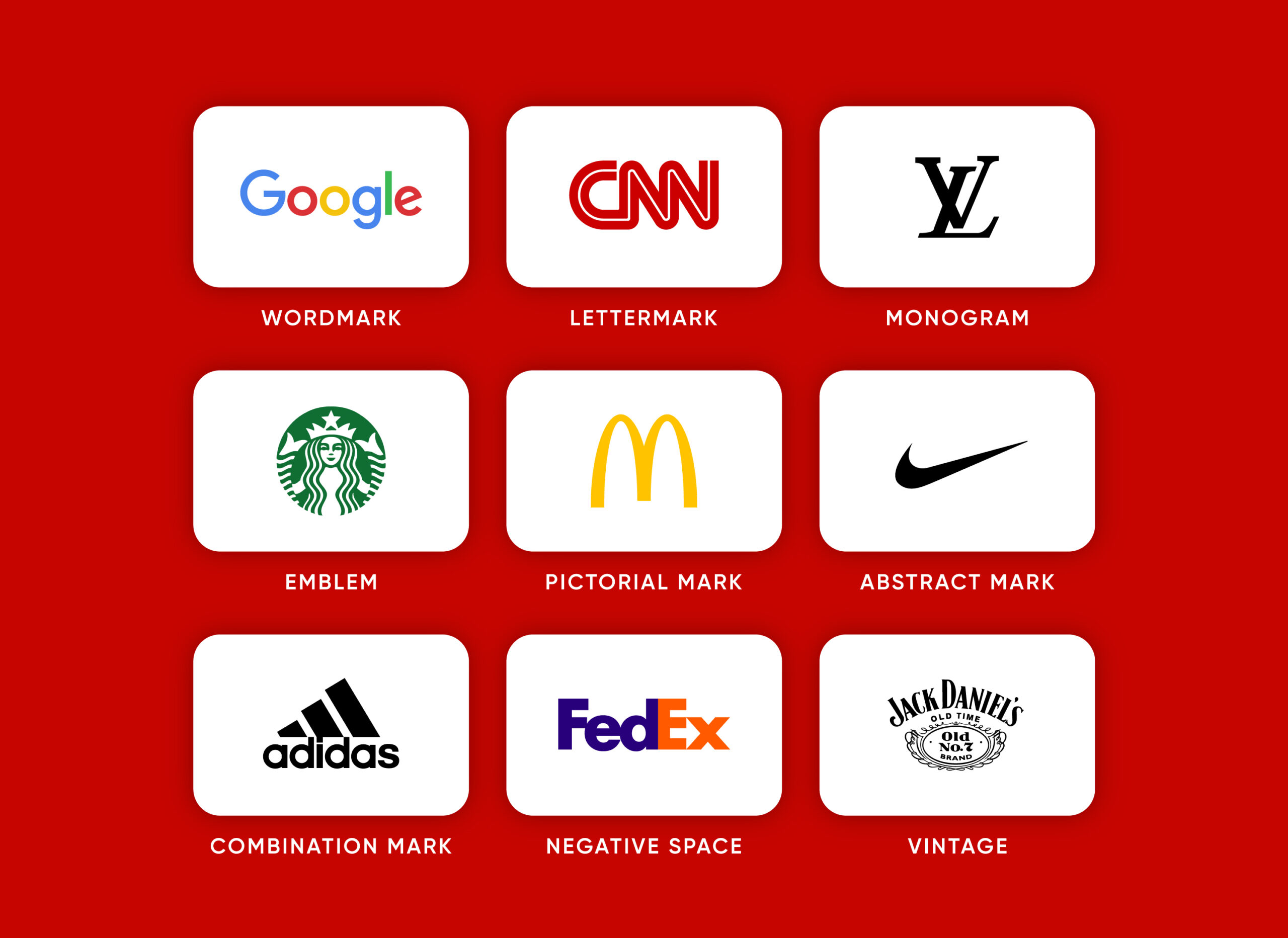
Before a designer even starts sketching, they’ll think carefully about where the logo will be used. The intended applications often guide the choice of style. For example, if a company is building a sportswear brand, a pictorial logo is often recommended. This way, the symbol can stand alone on apparel—like on sneakers, caps, or jerseys—while still being recognizable without the full wordmark. Thinking ahead about usage ensures the logo isn’t just attractive, but also practical for the brand’s real-world needs.
Over time, designers have developed several distinct logo types, each with its own strengths. Choosing the right one depends on a brand’s goals, personality, and audience. Below are the main categories of logos. If you’d like a deeper breakdown of each style, take a look at our types of logos guide.
-
Wordmark
A wordmark uses only the brand’s name in a distinctive typeface. Wordmarks are ideal for companies with short, memorable names. -
Lettermark
Lettermarks reduce long names into initials, making them simple and compact. This style is often used by businesses with lengthy names. -
Monogram
Similar to lettermarks, monograms combine initials into a single elegant mark. -
Emblem
An emblem places text inside a symbol or badge, creating a traditional look. Emblem logos are often used by schools, sports teams, or institutions with long histories. -
Pictorial Mark
A pictorial mark uses a recognizable image or icon. These marks work best when a symbol alone can stand for the brand. -
Abstract Mark
Abstract logos use shapes or forms that don’t represent real objects but still carry meaning. Abstract marks are highly versatile and unique. -
Combination Mark
A combination mark pairs a wordmark with a symbol, offering flexibility in use. Many modern brands use this style for its balance of clarity and symbolism. -
Negative Space
Negative space logos hide a second meaning within the design. These designs are clever, memorable, and often spark recognition once discovered. -
Vintage
Vintage logos embrace old-fashioned typography and design motifs. This style is popular with brands that want to highlight heritage and craftsmanship.
How Much Does a Logo Cost?
![]()
The cost of a logo can vary widely, depending on how it is created and who designs it.
-
DIY tools and templates: $0 – $50+
At the lowest end, there are DIY logo makers or generic templates that cost little to nothing. While inexpensive, these often result in overused designs that fail to set a business apart. Many companies start here but quickly realize the limitations once they need a logo that scales across different applications. -
Freelance designers: $50 – $250+
Freelancers typically charge anywhere from a few dozen to a few hundred dollars, depending on their experience and portfolio. This option provides more customization than templates, but the quality and professionalism can vary. Some freelancers deliver strong results, while others may lack the research, strategy, or adaptability needed for long-term branding. -
Professional agencies: $250 – $2,500+
At the highest level, professional design agencies often charge several hundred to several thousand dollars for a complete logo design package. While this is a larger investment, it usually includes in-depth research, brand strategy, scalable variations, and usage guidelines. For businesses competing in crowded markets or building a long-term brand, this ensures the logo is not only unique but also designed to perform across every platform.
I remember when I started my freelance career back in 2014—those early projects shaped the approach I use today. If you’d like to know more about that journey, you can check the full story on our About Rabbit page.
Logo Colors and Fonts: The Foundation of Style
A logo’s design is shaped not only by its structure but also by its stylistic choices. Among these, color and typography carry the most influence. Both affect how a logo is perceived and how effectively it communicates with its audience.
Choosing the Right Logo Colors

Color is one of the most powerful tools in logo design. It shapes emotion, signals brand personality, and even influences consumer behavior. Blue is often linked to trust and professionalism, making it a common choice for financial institutions and tech companies. Red conveys energy and urgency, while green is associated with growth, health, or sustainability.
The most effective logos use colors strategically rather than decoratively. A brand like Coca-Cola relies on a bold, consistent red that is instantly recognizable across the globe. In contrast, Google embraces a playful mix of primary colors to reflect creativity and openness. The right palette should not only look appealing but also align with the brand’s values and audience expectations. I often use tools like coolors.co to explore and generate palettes, making it easier to find combinations that align with brand values.
Selecting Fonts That Define a Brand
Typography is equally important. The typeface used in a logo helps establish tone—whether formal, playful, modern, or traditional. Sans-serif fonts, such as those used by tech brands like Google, often feel clean and approachable. Serif fonts, seen in logos like The New York Times, suggest tradition and authority. Custom or hand-drawn fonts add personality and exclusivity, making a logo stand out.
A strong font choice also ensures legibility at all sizes. Since logos appear in everything from large outdoor signage to tiny app icons, a typeface must remain clear under all conditions. The best logo fonts balance aesthetic style with practical readability, reinforcing the brand message without distracting from it.
Logo Design in a Digital-First World
As brands increasingly operate in digital spaces, logo design must adapt to the realities of small screens, responsive layouts, and high-resolution displays. The most successful logos are designed with scalability in mind and built in formats that guarantee sharpness and clarity across every application.
Scalable Logo Design for Modern Platforms
One of the biggest challenges in digital branding is ensuring that a logo works across vastly different sizes. A mark that looks striking on a billboard may lose detail when shrunk to the size of a mobile app icon. This is where scalable logo design becomes essential. By creating multiple variations within a logo system—such as a full wordmark, a simplified version, and an icon-only mark—brands ensure their logos remain effective everywhere.
Companies like Instacart, Netflix, and Nike demonstrate how scalability strengthens recognition. Instacart’s carrot symbol is clear even when displayed at just a few pixels, while Nike’s swoosh is so simple and iconic that it works across every size. Designing with scalability in mind means thinking beyond aesthetics and focusing on function in real-world use cases.
Vector vs. Raster Logos
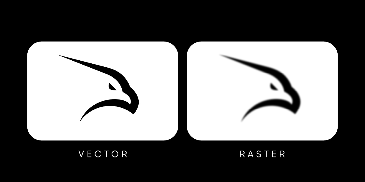
Equally important is the format in which a logo is designed. Professional logos are always created in vector format, using mathematical curves that allow the design to scale infinitely without losing quality. Whether the logo appears on a massive outdoor display or a tiny icon, vector graphics remain crisp and sharp.
In contrast, raster logos are pixel-based, meaning they lose resolution when resized. A raster file may look fine on a website but quickly becomes blurry when enlarged. For this reason, vectors (commonly saved as .AI, .SVG, or .EPS files) are the industry standard, while raster files (.JPG or .PNG) are reserved only for final exports. Choosing vector over raster ensures a logo is future-proof, adaptable, and ready for every platform.
When to Rebrand or Refresh Your Logo
Every logo is created with a purpose, but that purpose may change over time. As markets evolve and businesses grow, the visual identity that once felt fresh can begin to look outdated or misaligned with current goals. The key decision many companies face is whether to pursue a full rebrand or simply refresh their existing logo.
A logo refresh involves small updates—adjusting typography, simplifying shapes, or modernizing colors—while keeping the essence of the original mark intact. This approach works well for brands with strong recognition that don’t want to alienate existing customers. For example, Google has refined its wordmark several times over the years, introducing cleaner lines and better scalability without losing its familiar look.
A rebrand, on the other hand, is a more dramatic change. It often means replacing the logo entirely to reflect a new direction, audience, or brand identity. Companies like Burberry and Mastercard have embraced full rebrands in the past decade to reposition themselves for the modern market. The choice between refresh and rebrand depends on context, but both approaches show that logos are living assets, meant to evolve alongside the businesses they represent.
How to Create a Logo Design Process That Works
![]()
A strong logo isn’t an accident—it’s the result of a clear, repeatable logo design process. The steps below keep creativity focused, ensure stakeholder alignment, and produce a mark that performs in every context.
-
Discovery & Goals
Align on business objectives, audience, competitors, tone, and success criteria. Define where the logo must live (app icon, packaging, signage) and what it must communicate. -
Research & Positioning
Audit competitor logos and adjacent categories to map visual clichés and whitespace. Translate brand strategy into visual territories (modern/minimal, heritage/serif, geometric/tech, etc.). -
Creative Direction (Moodboards)
Build 2–3 distinct directions with typography, color palettes, shapes, and reference work. Secure buy-in on direction before drawing—this reduces expensive pivots later. -
Concept Development (Sketching)
Generate lots of quick sketches exploring symbols, wordmarks, and combination marks. Prioritize ideas that are simple, distinctive, and scalable; discard everything that relies on effects. -
Digitization & Refinement (Vector)
Redraw the strongest concepts in vector. Refine proportions, spacing, and optical corrections; test one-color, reversed, and high-contrast variants. Establish clear space and minimum size. -
Typographic & Color Systems
Select primary/secondary typefaces and finalize a flexible palette (RGB/HEX, CMYK, Pantone). Ensure accessibility contrast and provide monochrome/inverted options for difficult backgrounds. -
Performance Testing (Real Contexts)
Stress-test at tiny sizes (favicon/app icon), medium (navigation, email header), and large (OOH). Print tests, screen tests, and motion tests if animation is planned. Iterate until legible everywhere. -
Trademark & Practical Checks
Run preliminary clearance (name/mark conflicts), check domain/social availability if relevant, and validate that strokes and counters won’t fill in at small sizes or on low-quality prints. -
Guidelines & Handoff
Document usage rules: correct/incorrect applications, color specs, layout lockups, spacing, and file naming. Deliver master assets: .AI/.EPS/.SVG (vector) and .PNG/.JPG exports, plus icon sets. -
Rollout & Governance
Plan a phased launch (digital first, then print), update templates, and assign ownership for ongoing compliance. Revisit annually to refine without eroding recognition.
A process like this protects creativity with structure—so the final logo is not just beautiful, but durable, accessible, and ready for every place your brand shows up.
Famous Logo Examples for Inspiration
Some of the world’s most iconic companies prove just how powerful a well-designed logo can be. Each of these marks demonstrates different principles of simplicity, versatility, and memorability.
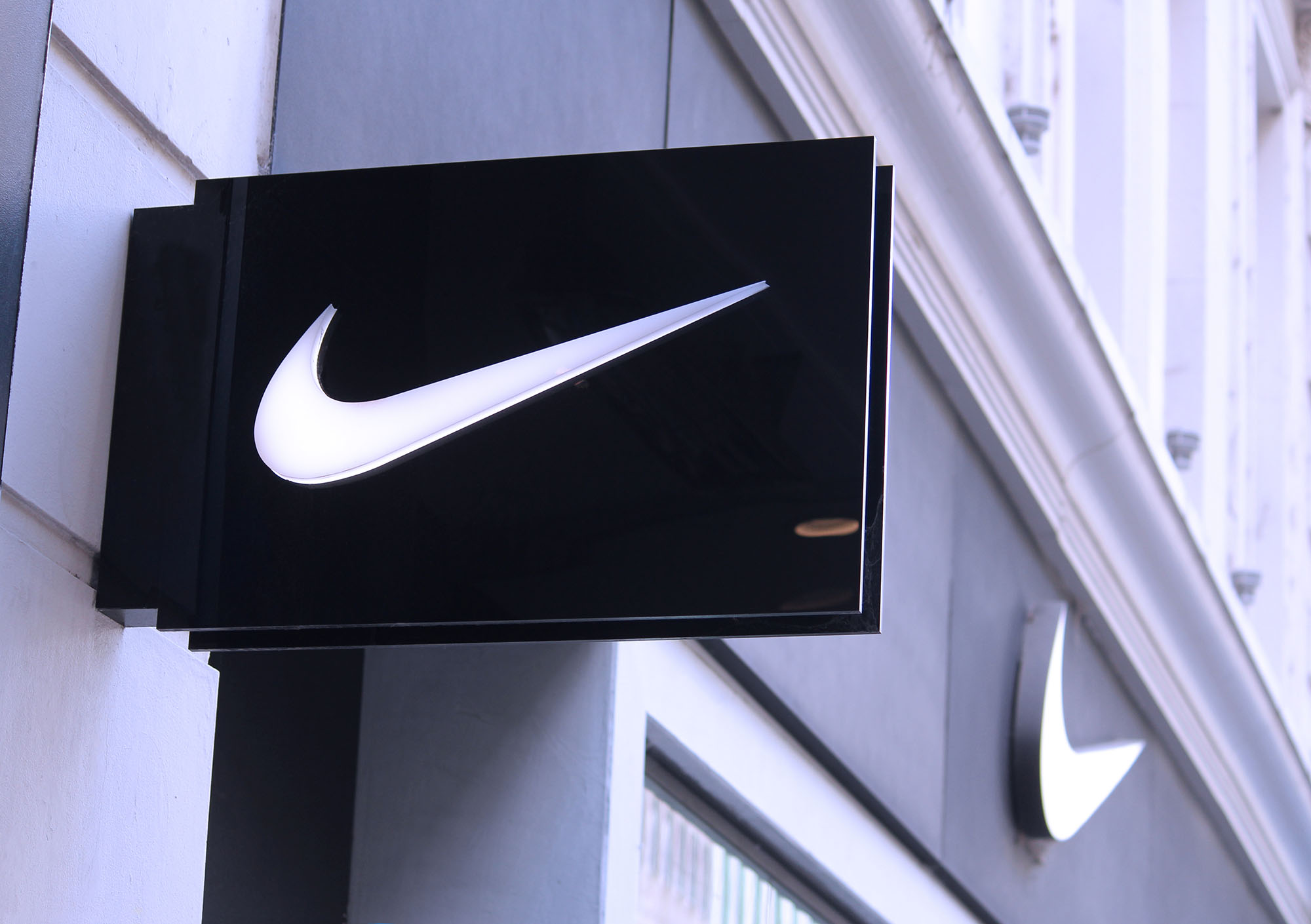
Nike
![]()
The Nike Swoosh logo is one of the most recognized logos worldwide. Its abstract shape conveys movement and speed, perfectly aligning with the brand’s athletic focus. The swoosh works on its own, in any size, and across every product line.
Apple
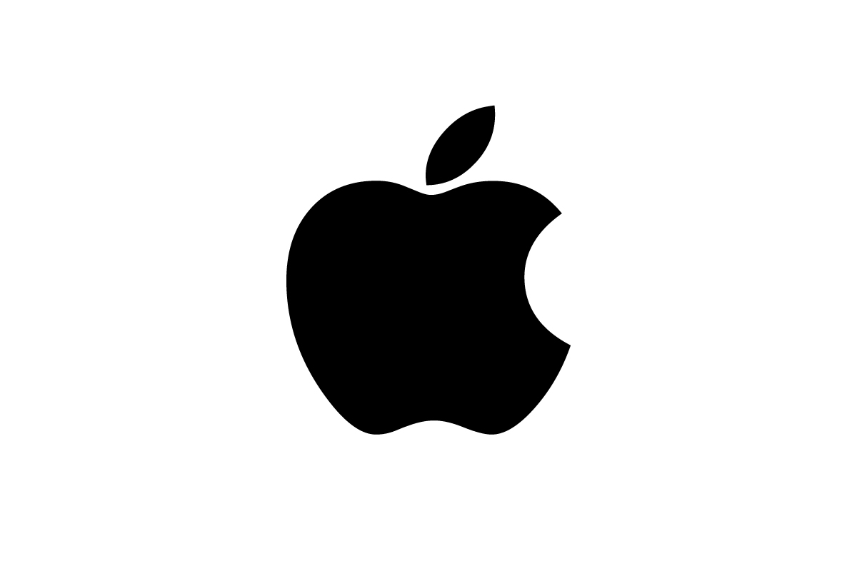
Apple’s bitten apple is both simple and symbolic. The shape is universally recognizable, while the bite detail prevents confusion with a cherry or other fruit. Its clean form adapts effortlessly across devices, packaging, and retail environments.
FedEx
![]()
FedEx’s wordmark hides a forward-pointing arrow in the negative space between the E and X. This clever design reinforces the brand’s promise of speed and precision. It’s a perfect example of how simplicity and subtle symbolism can combine for lasting impact.
![]()
Google’s colorful wordmark shows how typography alone can carry a brand. The playful mix of primary colors conveys creativity and accessibility, while the simplicity of the sans-serif font ensures clarity across all platforms.
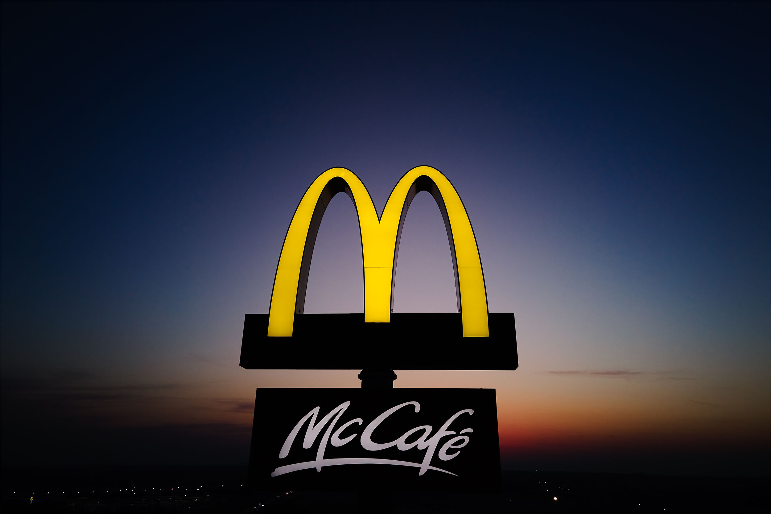
McDonald’s
![]()
The golden arches have become synonymous with fast food worldwide. Whether paired with the wordmark or standing alone, the arches are bold, memorable, and instantly associated with the brand.
Adidas
![]()
Adidas relies on its three-stripe system, which appears in multiple variations across products and campaigns. From the trefoil to the performance logo design, the stripes tie every version back to the same core identity.
These examples highlight that while logos come in many forms, the most successful ones share key traits: simplicity, clarity, and the ability to adapt across contexts without losing recognition.
Logo Examples from Rabbit
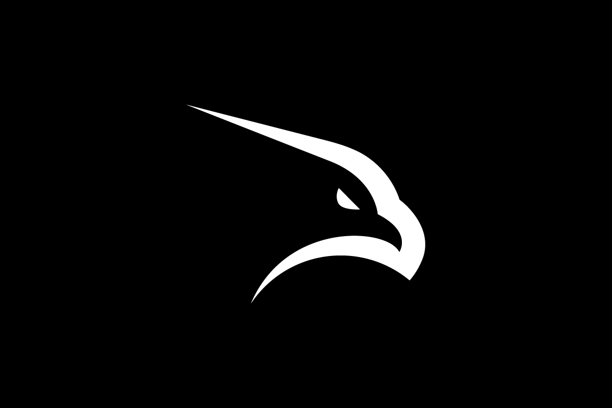
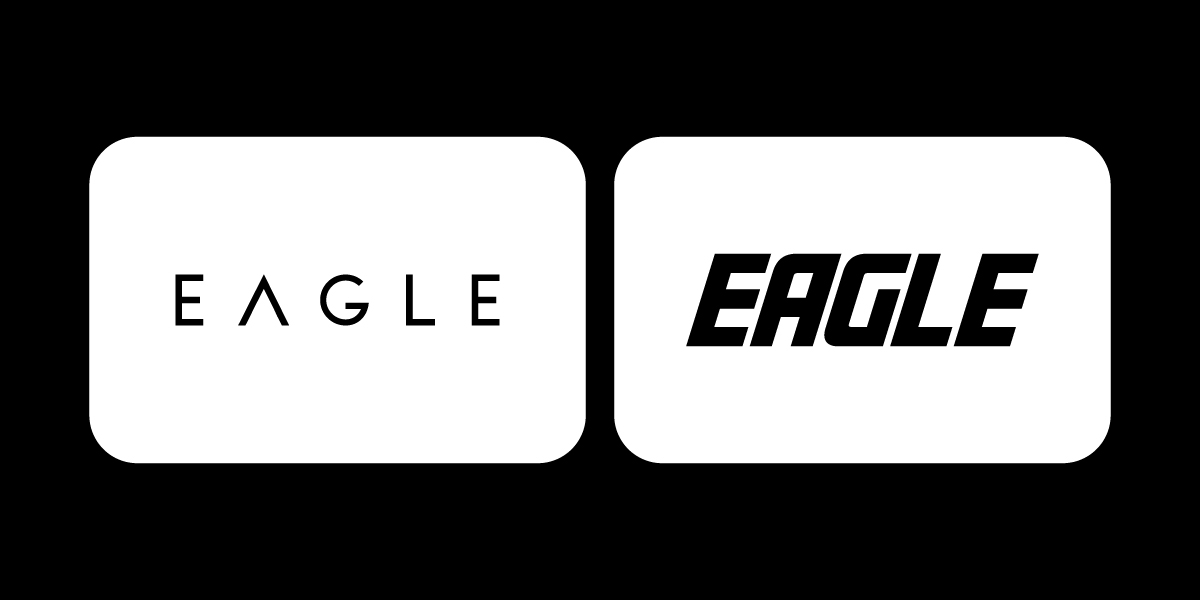
Eagle
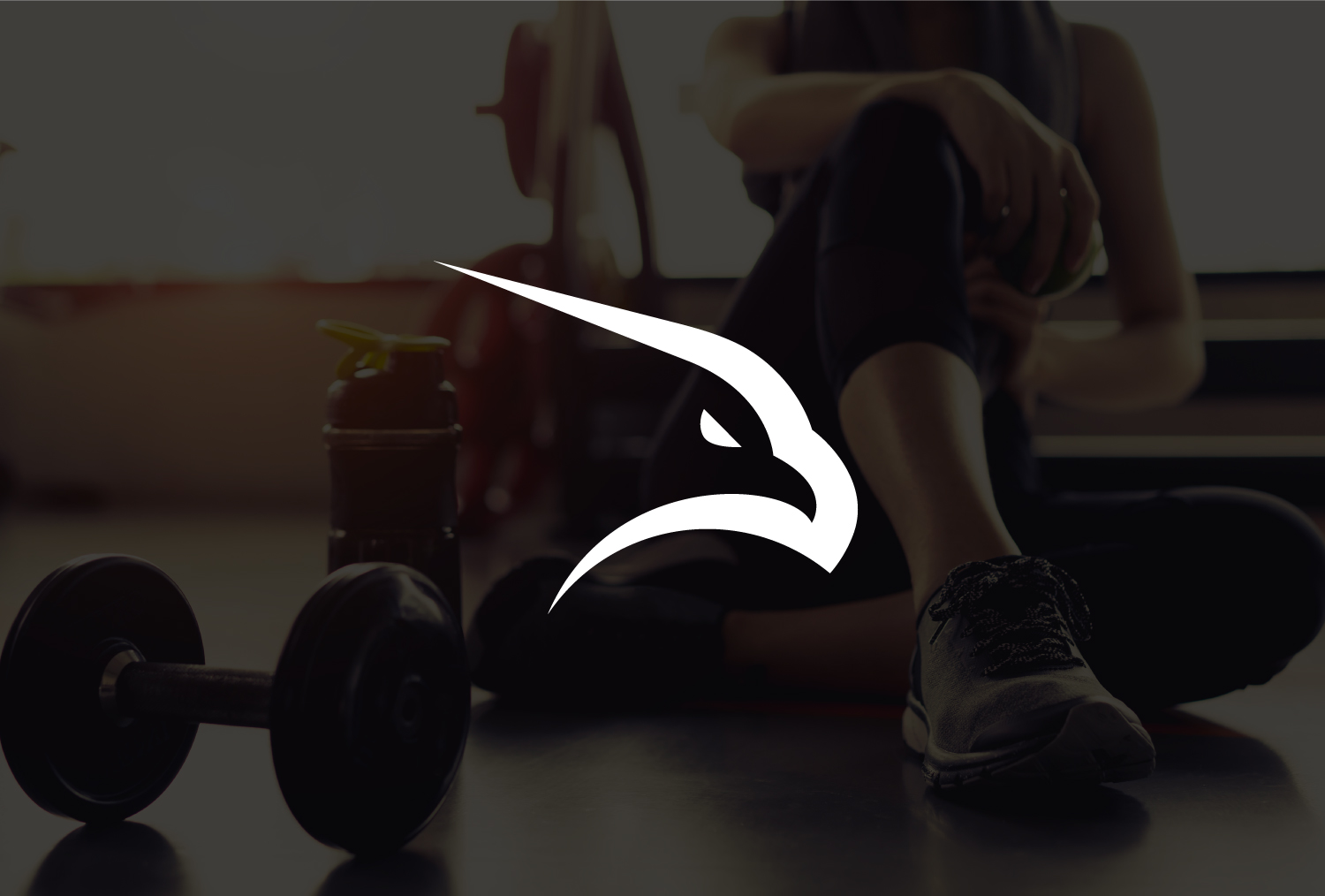
A sharp, angular eagle head designed for a sportswear brand. Its clean outline creates a bold mark that scales well on apparel, from gym gear to lifestyle wear.
Pupsy
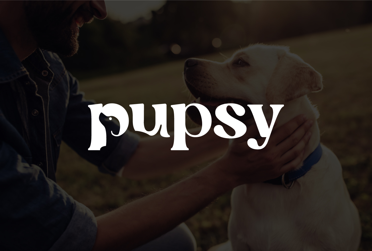
Playful typography paired with a warm tone for a pet company. The rounded lettering feels approachable while still being distinct and professional.
Walus Engineering
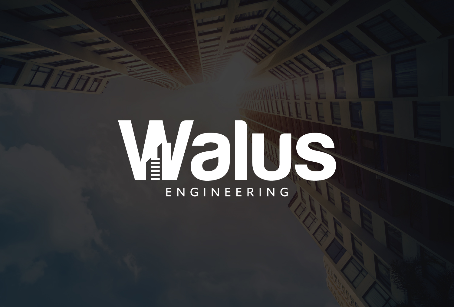
A modern wordmark with geometric structure, reflecting precision and strength. The letter detailing suggests engineering innovation while keeping the design versatile.
Grow
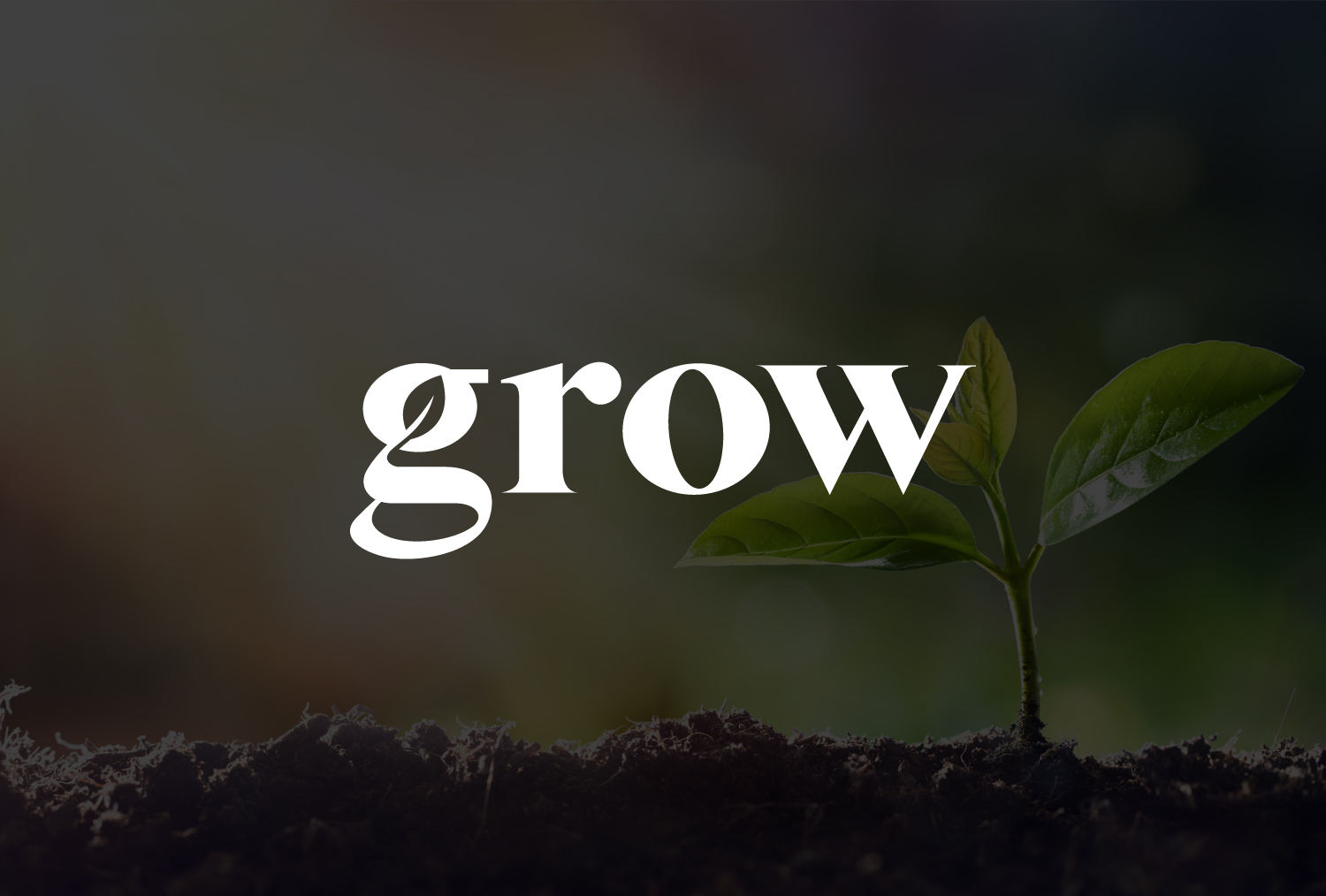
Minimalist typography paired with a leaf concept, symbolizing growth and sustainability. This logo design works across digital platforms while reinforcing eco-focused values.
Shopsy

A clean, contemporary wordmark for a retail platform. The slight curve in the font conveys friendliness and accessibility, ideal for e-commerce use.
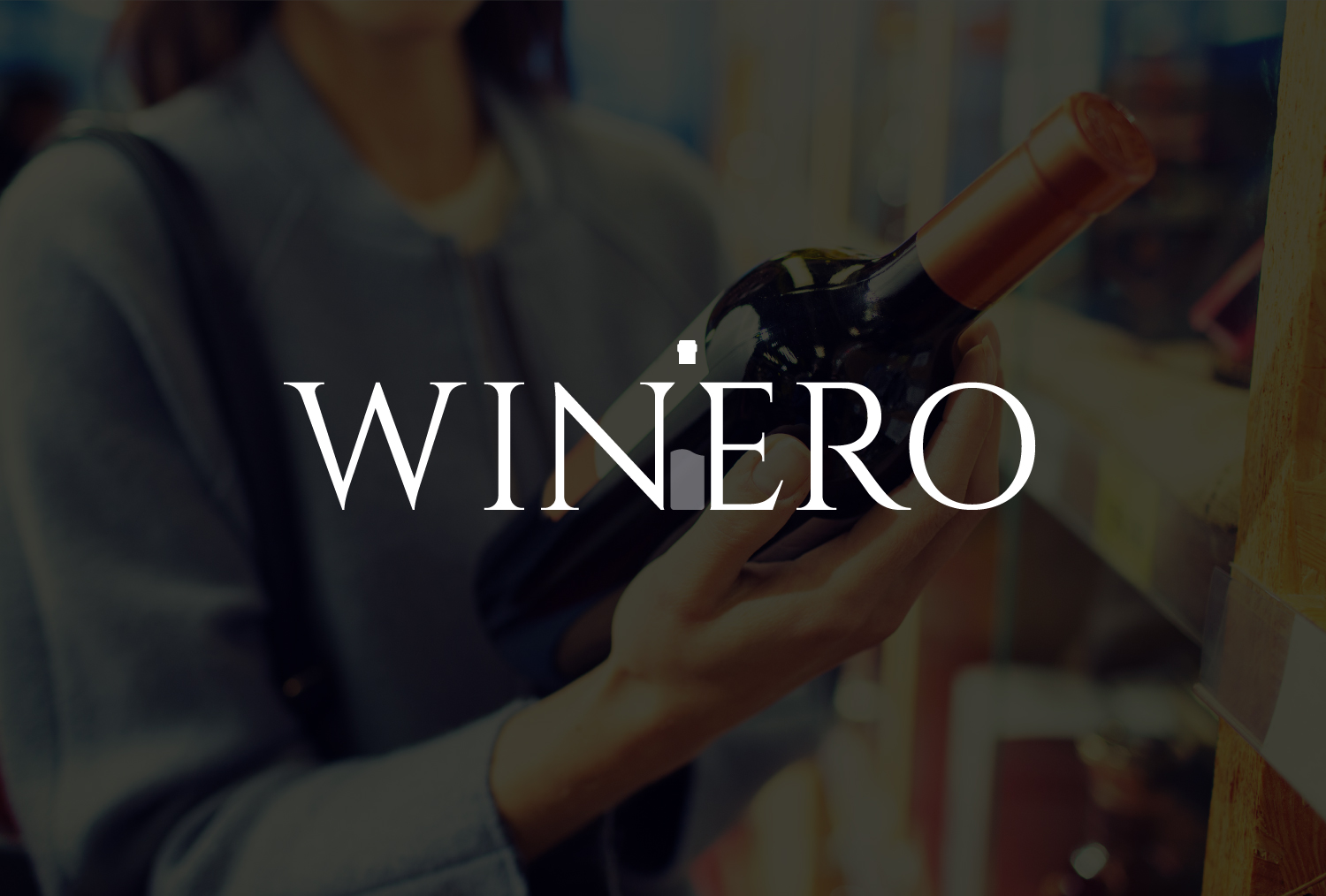
Winero
Elegant serif typography designed for a wine brand. Its refined styling communicates sophistication and heritage, making it memorable in premium markets.
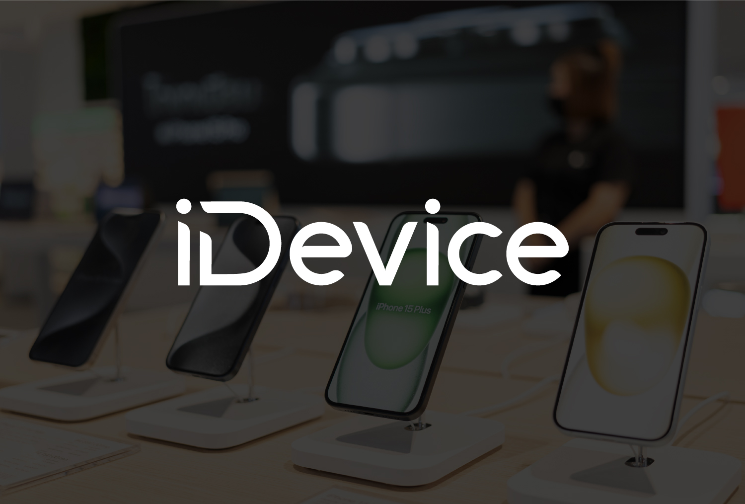
iDevice
A sleek, tech-inspired wordmark with a modern font. The design feels innovative and adaptable, aligning perfectly with digital-first products.
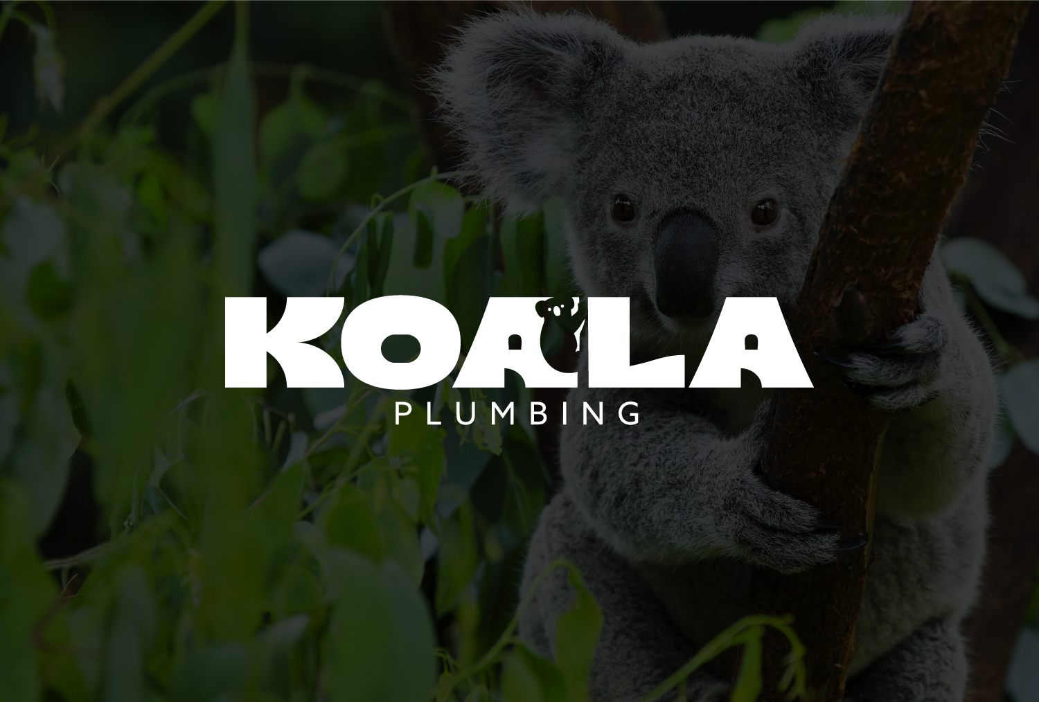
Koala Plumbing
Bold wordmark supported by a subtle koala graphic. The friendly character adds memorability while the strong typography communicates reliability.
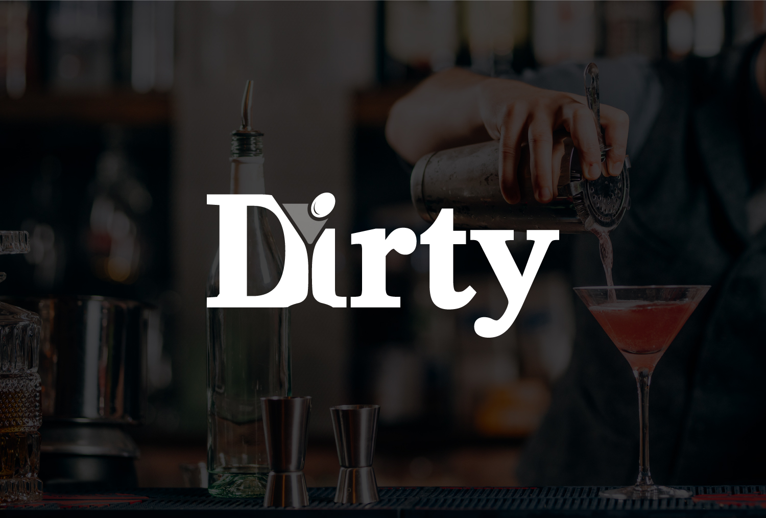
Dirty
A striking wordmark with vintage-inspired type for a cocktail brand. Its confident lettering creates a stylish yet approachable look for hospitality use.
Yips
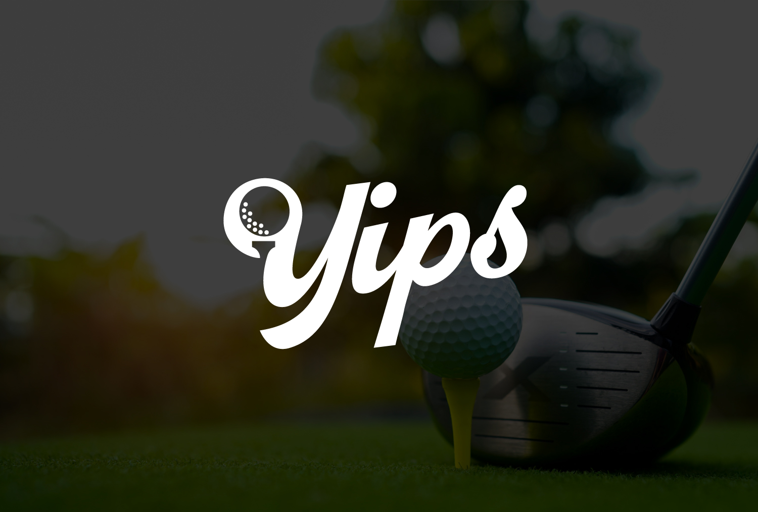
A script-style wordmark with a golf ball integrated into the “Y.” The playful detail makes it sporty and distinctive, ideal for a recreational audience.
To see more of our work in action, explore Rabbit logo design works. It includes projects across industries—from fashion and hospitality to tech and wellness—showing how a strong logo adapts to different brand personalities and platforms.
Conclusion
Logo design is far more than a creative exercise—it is the foundation of how a brand is recognized and remembered. A well-crafted logo combines simplicity, adaptability, and meaning, ensuring it works across every platform and stands the test of time. From colors and typography to scalability and versatility, each decision in the design process contributes to how effectively a logo communicates a brand’s values.
The world’s most successful companies show that strong logos are not only visually appealing but also strategically built to endure. Whether through the clever use of negative space, the boldness of a wordmark, or the adaptability of a system, these designs prove that logos are investments in clarity and consistency. For any business, understanding the principles of effective logo design is the first step toward building a brand that lasts.