Emblem Logo blends typography and imagery inside a single, unified shape—usually a badge, crest or seal. It’s a logo style that’s bold, timeless and rooted in tradition. From universities to breweries to car brands, emblem logos have a sense of heritage and authority that few other styles can match.
In this post we’ll break down what makes emblem logos unique, why brands still use them today and share 20 examples. We’ll also show how we approach emblem logos at Rabbit Logo, where we create distinctive logos for brands that want to make a big impact.
What Is an Emblem Logo?

Emblem logo is a design where the symbol and the name are locked together inside a single shape—like a shield, circle or banner. The text isn’t floating beside or under the icon. Instead everything is integrated into one mark.
This is what makes emblem logos different from combination mark logos where the text and icon are often separate and can be rearranged. With an emblem it’s all one piece—almost like a modern day family crest.
That built in unity gives the design structure, formality and gravitas. You often see emblem logos used by government agencies, schools, sports clubs and brands that want to evoke tradition or authority.
Why Brands Use an Emblem Logo
A well designed emblem logo offers more than just looks. Here’s why it works:
-
Built in tradition: It feels timeless which helps signal stability, trust and experience.
-
Compact impact: Since the logo is enclosed it fits well on everything from packaging to uniforms to merchandise.
-
Hard to imitate: Its complexity and integration makes it harder for copycats to replicate.
-
Instant storytelling: The unified shape can feel like a stamp or seal—perfect for conveying identity in one glance.
It’s a strong choice for brands that want to appear established, dependable, or bold—qualities we regularly design for at Rabbit Logo, where emblem marks are built to communicate authority and clarity at a glance.
20 Famous Emblem Logo Examples
1. Harley-Davidson
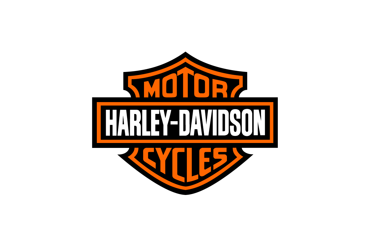
The Harley-Davidson logo features bold typography locked into a shield, creating a rugged, no-nonsense identity that mirrors the brand’s biker heritage.
Why this logo works
Its compact, badge-like shape makes it ideal for leather jackets, fuel tanks, and patches—instantly communicating rebellion and strength.
2. Starbucks
![]()
This emblem logo combines a twin-tailed siren and circular framing to build a visual that feels both mythic and modern.
Why this logo works
The enclosed layout reinforces brand consistency across cups, packaging, and signage, while the central icon builds recognition worldwide—making the Starbucks logo one of the most memorable symbols in modern branding.
3. Paramount Pictures

A mountain surrounded by stars inside a circular frame.
Why this logo works
It feels cinematic and historic. The enclosed shape gives it the feel of a stamp, reinforcing legacy and authority in entertainment.
4. UPS
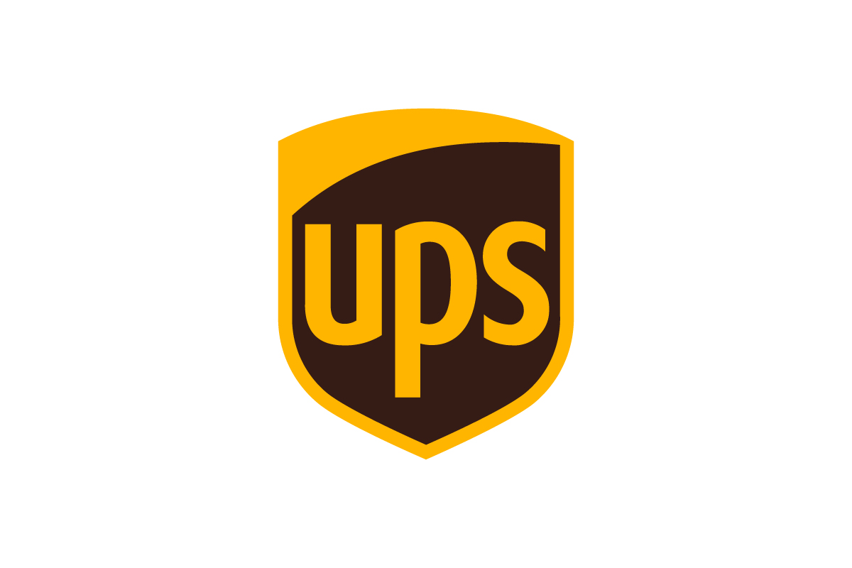
The UPS logo features a gold shield enclosing the brand’s initials in bold, clean typography.
Why this logo works
Its shield format creates a sense of protection, reliability, and structure—key traits for a global shipping brand. The design functions as both a badge and a promise of secure delivery.
5. Warner Bros.
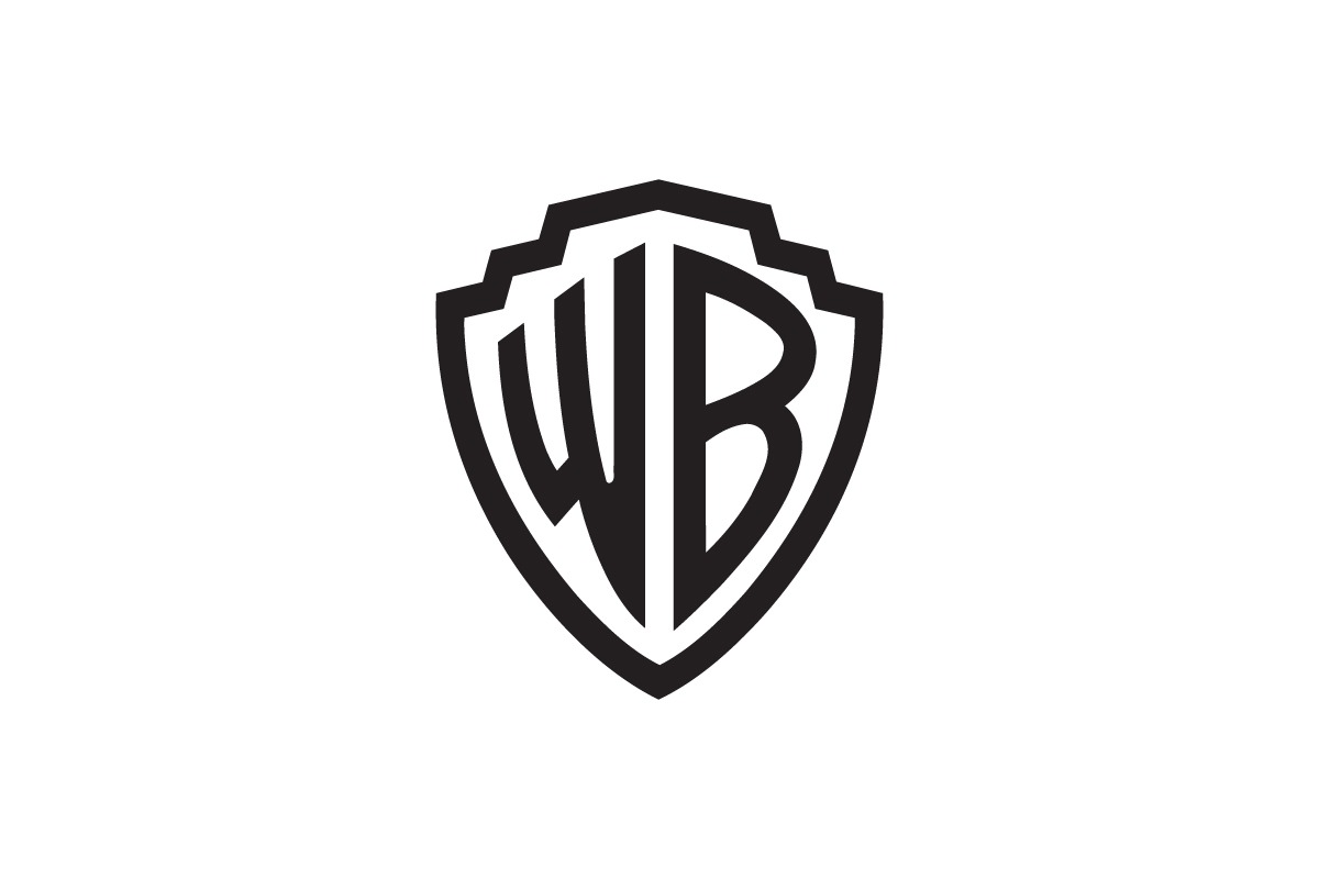
The Warner Bros shield has been a staple of the entertainment world for decades, blending initials and geometry into one unified icon.
Why this logo works
It feels cinematic and grand, instantly tying the brand to Hollywood history and studio prestige.
6. BMW

BMW’s emblem logo uses a circular badge filled with a blue-and-white checkered symbol, evoking Bavarian roots and motion.
Why this logo works
The unified format builds luxury appeal while retaining clarity even at small sizes—ideal for wheel hubs and marketing materials.
7. Stella Artois
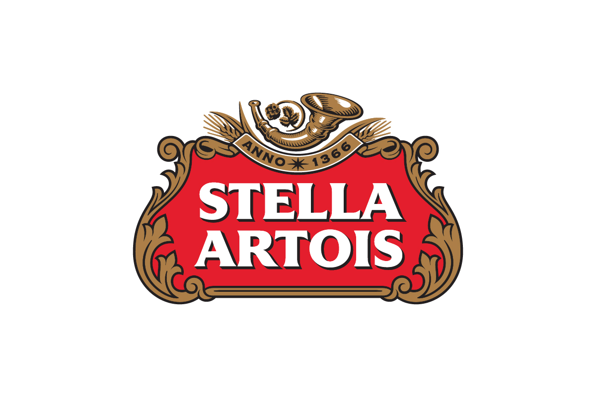
A highly ornate emblem logo with baroque framing, serif typography, and a horned detail that elevates the brand’s historic roots.
Why this logo works
It looks like a label from the past, conveying craftsmanship and European brewing tradition.
8. NFL
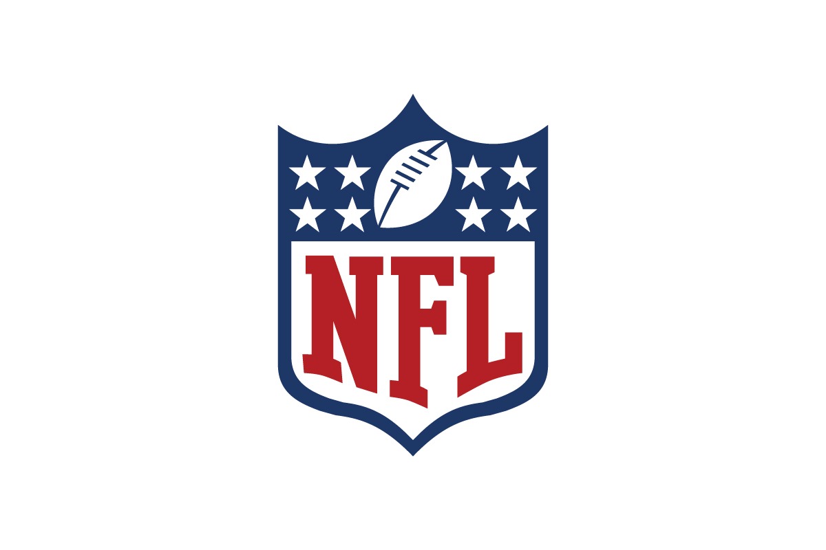
The NFL shield combines stars, typography, and a football symbol into one powerful crest.
Why this logo works
It’s designed like a seal of authority—ideal for licensing, uniforms, and nationwide fandom.
9. Ducati
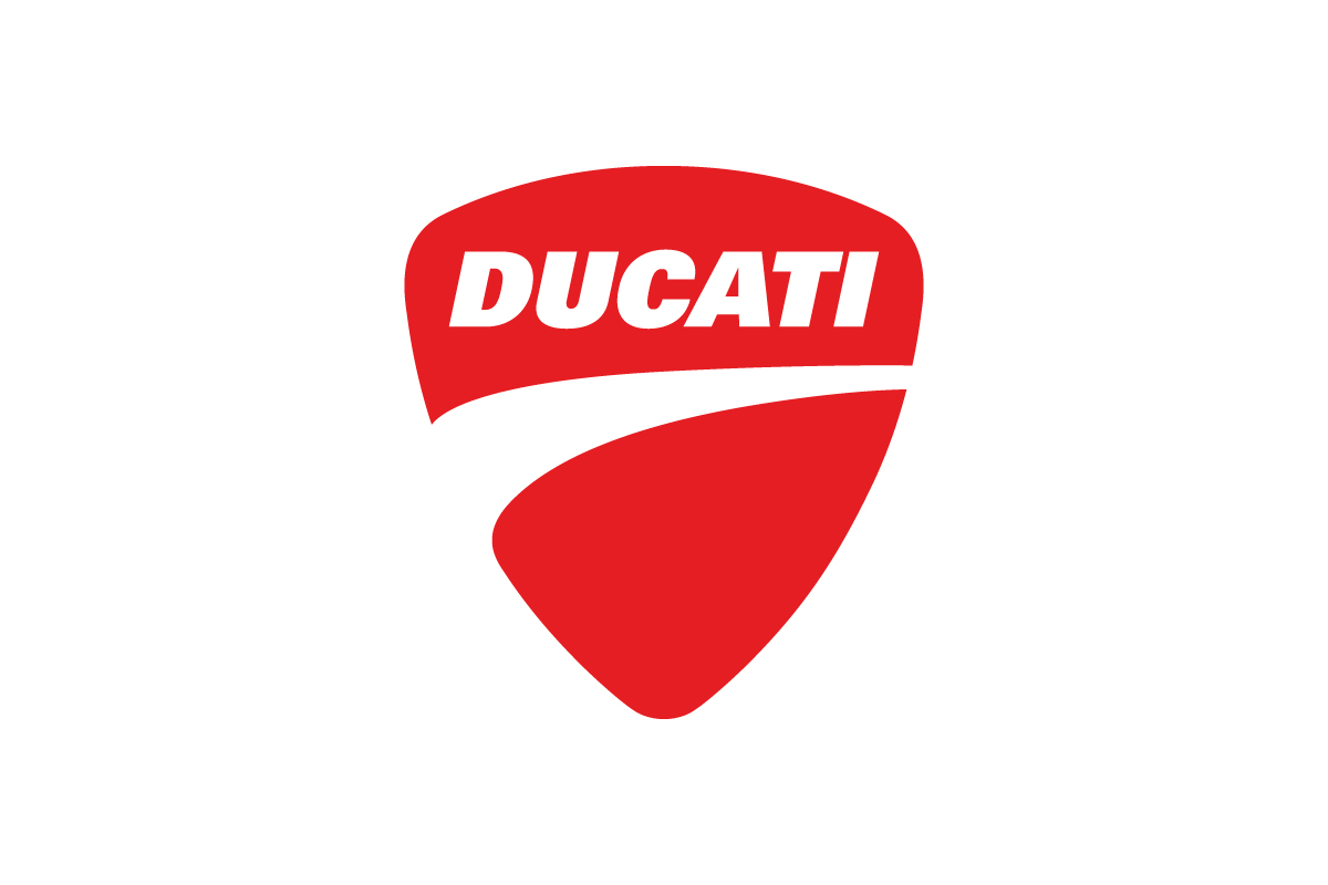
This sleek motorcycle logo wraps modern typography into a rounded triangle emblem.
Why this logo works
Its bold angles and closed shape scream speed and innovation while staying true to the racing heritage.
10. Roland Garros

A circular emblem featuring the initials “RG” with a tennis-inspired negative space design.
Why this logo works
The Roland Garros logo perfectly embodies the spirit of the French Open through an elegant emblem logo format.
11. Alfa Romeo
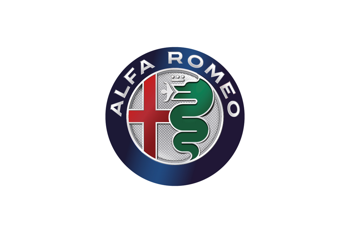
This emblem logo layers a serpent and a red cross inside a circular seal, packed with symbolic meaning.
Why this logo works
It’s mysterious, intricate, and unmistakably Italian—ideal for a high-end, historic car brand.
12. Jack Daniel’s
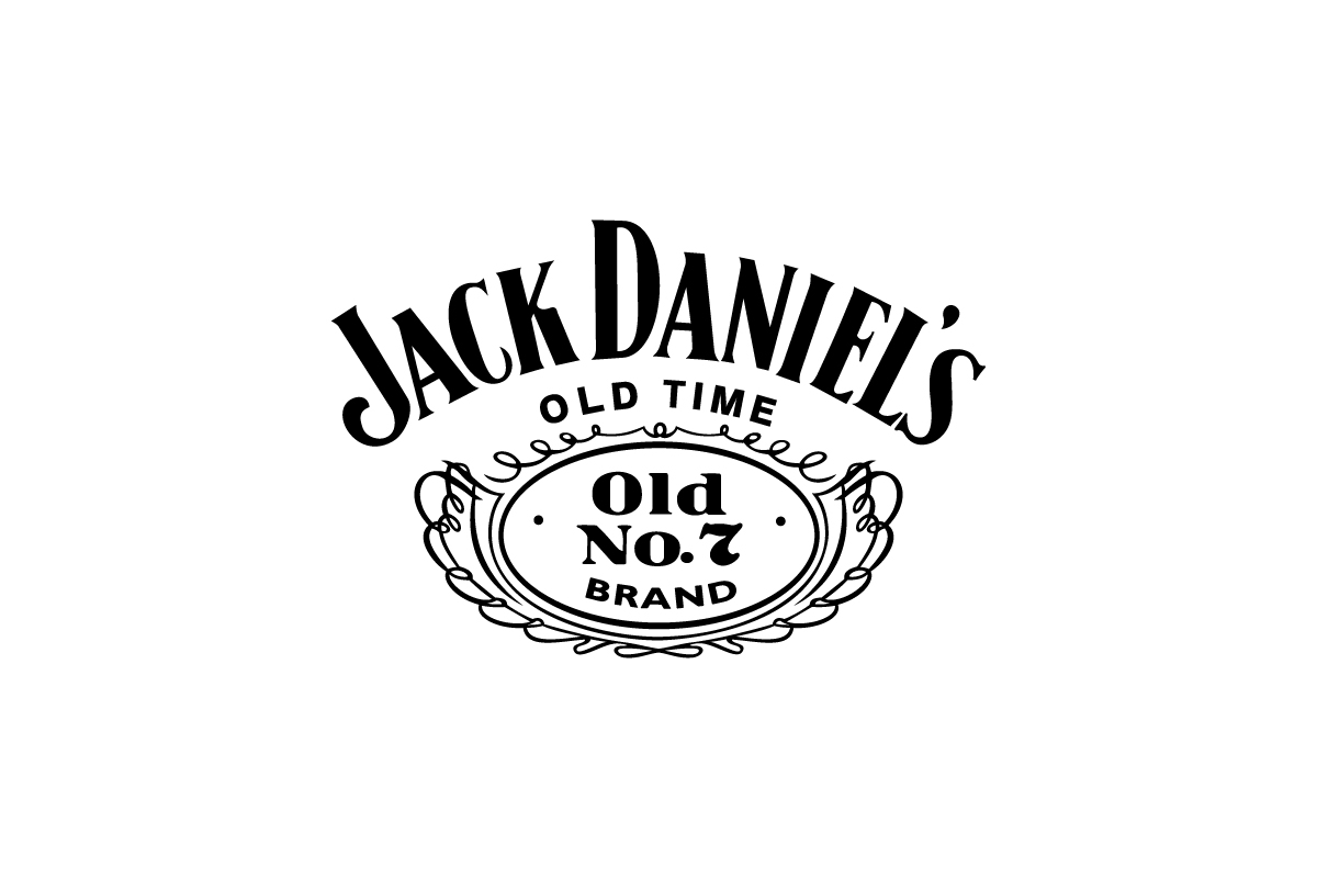
Framed by an ornate, vintage border, this whiskey brand’s logo is a standout emblem.
Why this logo works
It conjures old saloon charm while remaining legible and iconic across bottle labels and merchandise.
13. NHL
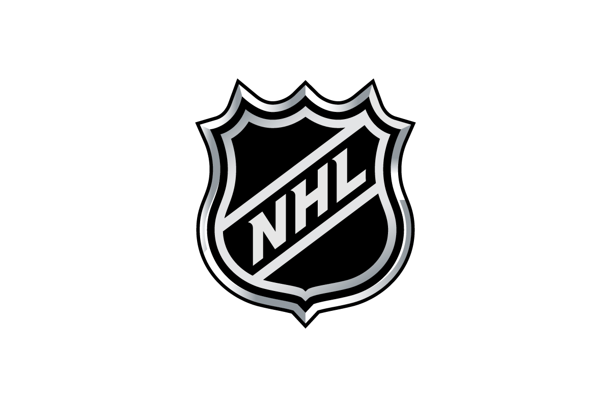
A sharp, diagonal shield bearing the initials “NHL” in bold lettering.
Why this logo works
The shape gives it a competitive, official edge—perfect for a sports league’s seal of approval.
14. Porsche

The Porsche emblem logo takes the shape of a detailed crest, combining elements from the city of Stuttgart with a coat of arms that radiates heritage.
Why this logo works
Its intricate, shield-based design reflects precision, legacy, and exclusivity—key values of a luxury automotive brand.
15. Lamborghini
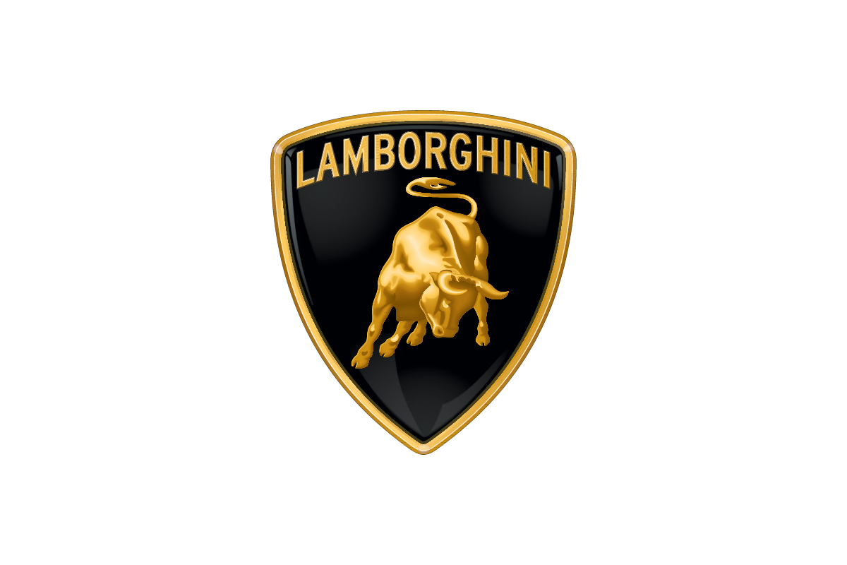
A golden bull inside a shield with bold serif lettering.
Why this logo works
It evokes power, elegance, and heritage—all contained within a heraldic-style crest that screams luxury performance.
16. Manchester United
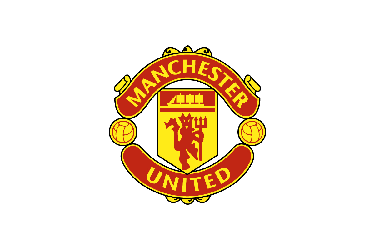
The football club’s logo features a full crest with icons, text, and banners.
Why this logo works
It’s steeped in tradition, with visual elements that reflect the team’s history and city pride. A true sports emblem.
17. Yale University

A classic emblem logo, the Yale crest integrates typography and symbolism inside a formal shield.
Why this logo works
The structured format reflects academic tradition and authority, ideal for printed diplomas, merchandise, and signage.
18. Burger King
![]()
Text sits snugly between two bun shapes, forming a fun, circular emblem.
Why this logo works
Its unified design made it instantly readable and visually consistent across wrappers, signs, and commercials.
19. Paulaner

A circular badge with a monk illustration and bold, uppercase text around the rim.
Why this logo works
It blends Bavarian heritage with brand storytelling, making it perfect for bottles, taps, and merchandise.
20. University of Oxford

A shield with an open book and Latin motto, enclosed in a classic academic crest.
Why this logo works
This timeless design signals history, scholarship, and prestige—everything an educational institution aims to convey.
Emblem Logos by Rabbit
1. Blanco
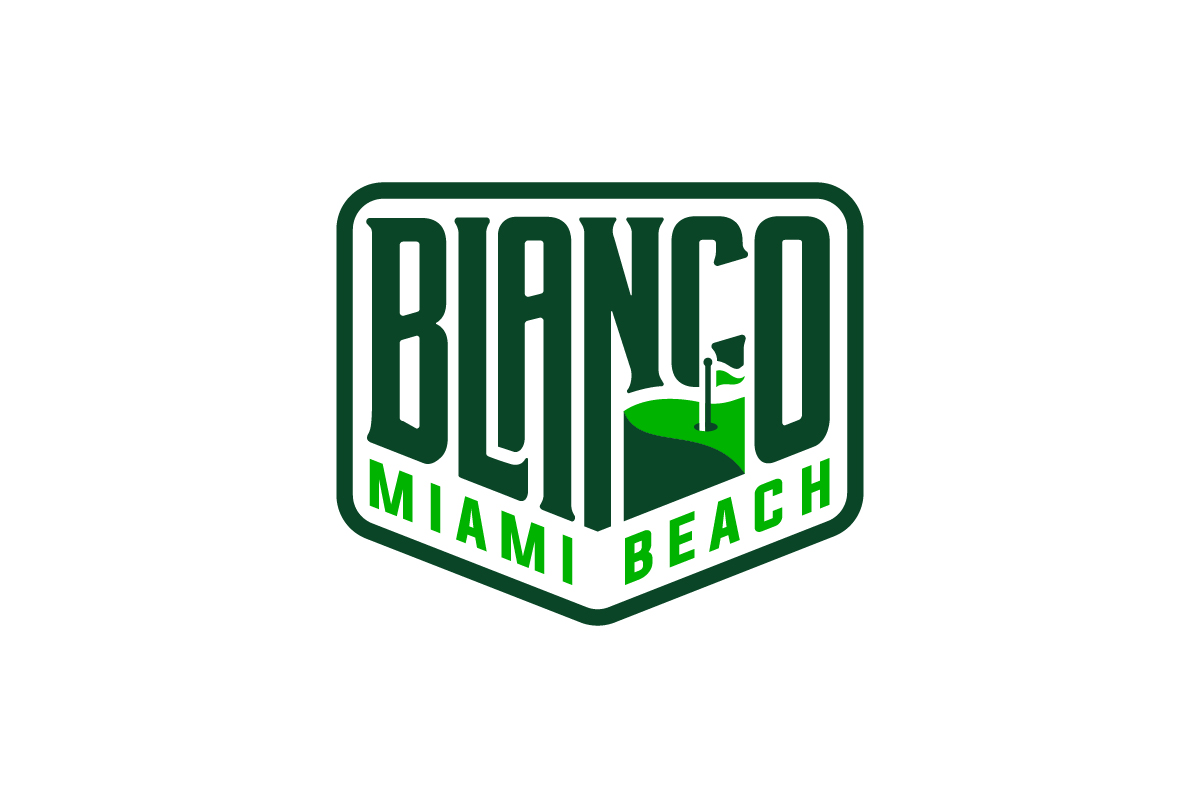
This emblem logo combines bold, blocky typography within a structured badge, giving it a confident and grounded feel.
Why this logo works
The enclosed layout enhances brand recognition and adds weight, making it ideal for packaging, signage, and merchandise in retail or industrial spaces.
2. Liberty Leaders

The logo features a Liberty Bell icon and stylized lettering locked into a circular frame—evoking classic symbolism with a modern twist.
Why this logo works
It blends authority and inspiration in one cohesive mark, perfect for educational, civic, or nonprofit use where leadership and trust are key themes.
3. Oh No Bagels
![]()
The logo places playful typography inside a circular badge, with a stylized bagel graphic integrated into the shape.
Why this logo works
Its round structure mirrors the product itself, while the enclosed layout makes it perfect for stickers, storefronts, and packaging—creating a fun yet cohesive identity.
When Should You Use an Emblem Logo?
Use an emblem logo when your brand needs to feel:
-
Established and authoritative — perfect for law firms, schools and institutions
-
Timeless and classic — ideal for luxury, automotive or heritage products
-
Visually cohesive — when your logo will appear on patches, caps or packaging
-
Detailed and layered — if your brand has story rich or legacy driven identity needsIt’s also a good choice for brands that want to convey strength without going minimal.
Tips for Designing an Emblem Logo
-
Start with a shape — circles, crests and shields create structure
-
Unite the elements — don’t treat the icon and name as separate pieces
-
Use bold details — your logo should still be readable when scaled down
-
Symmetry is key — balance is crucial for badge style marks
-
Test across mediums — make sure it works in embroidery, print and digital
Conclusion on Emblem Logos
Emblem logos aren’t just a nod to tradition — they’re a bold way to communicate identity. With their enclosed shapes and unified layouts they feel complete, intentional and authoritative.
Whether you’re building a heritage brand or just want a logo that has presence and polish the emblem style delivers clarity and impact. Designed well it becomes more than a mark — it becomes a symbol of trust.