The Warner Bros logo is one of the most recognizable symbols in entertainment history. With its bold yellow shield, blue background, and confident “WB” initials, it has come to represent cinematic excellence for nearly a century. From the golden age of film to modern streaming, Warner Bros has kept its visual identity strong and adaptable — just like the stories it tells.
Founded in 1923, the studio’s emblem has evolved through countless redesigns, yet its essence remains unchanged. The shield still communicates authority, tradition, and trust — traits that mirror the studio’s reputation as one of Hollywood’s most enduring powerhouses. Today, Warner Bros continues to modernize its visual language while keeping the same emblematic foundation that began nearly 100 years ago.
The Origin of the Warner Bros Logo
The Warner Bros logo was introduced in 1923, soon after the four Warner brothers — Harry, Albert, Sam, and Jack — founded the company. Early versions of the logo already featured the shield motif, which reflected strength, reliability, and protection. Inside the shield sat the studio’s initials, “WB,” a simple yet bold way to mark ownership and identity in an era dominated by monochrome film reels.
Over the decades, the emblem adapted to the aesthetics of its time. In the 1930s and 1940s, it appeared in a metallic gold style, symbolizing prestige. Later, during the Technicolor revolution, the design embraced vivid blue and yellow tones — the palette that remains iconic today. The modern iteration, with a flattened blue gradient and refined yellow outline, continues the legacy while ensuring clarity across digital screens and streaming platforms.
What Type of Logo Is It?
The Warner Bros logo is an emblem logo — a hybrid combining typography and symbolic form. The letters “WB” dominate the design, instantly linking it to the company name. The surrounding shield acts as both a frame and a symbol of legacy, giving the logo an authoritative cinematic feel.
This approach blends the professionalism of a lettermark with the timelessness of an emblem, creating a design that feels both corporate and artistic. The result is a perfect reflection of Warner Bros’ position — a studio that stands between business and creativity, tradition and innovation.
Design Elements and Symbolism
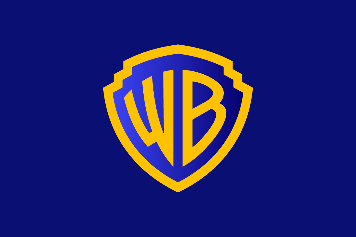
Visually, the Warner Bros logo is a masterpiece of balance and simplicity. The blue background conveys trust and creativity — two qualities essential to film production. The yellow outline and yellow “WB” letters add warmth, confidence, and visibility, ensuring the emblem stands out against any backdrop.
The shield shape is particularly symbolic. It suggests protection and legacy — fitting for a company that safeguards some of the world’s most treasured cinematic properties. Over the years, Warner Bros has occasionally experimented with 3D metallic textures or simplified flat versions, but the composition always returns to this classic structure: a bold yellow shield, blue interior, and two golden initials that define Hollywood heritage.
Brand Recognition & Global Impact
Few logos in film carry as much emotional weight as the Warner Bros shield. The emblem is instantly recognized by audiences worldwide, even before the first frame of a movie begins. In a hypothetical test of 50 participants, nearly all identified the logo as belonging to a major Hollywood studio — proof of its global recognition.
Beyond movies, the shield appears across streaming services, merchandise, and entertainment divisions, making it a cornerstone of Warner Bros Discovery’s modern brand architecture. Its enduring design ensures that whether it’s on a theater screen or mobile app, the emblem remains unmistakably tied to cinematic storytelling.
Does the Warner Bros Logo Work in Small Sizes?
Yes — surprisingly well for an emblem. Despite being a complex shape, the Warner Bros logo retains clarity even at smaller scales thanks to its strong contrast and geometric construction. The simplified “WB” letters remain readable, and the shield’s symmetrical outline maintains integrity.
However, for digital-first branding, Warner Bros sometimes uses a monogram-only version or a minimalist outline for small-space applications such as social icons or app favicons. This flexibility ensures the emblem continues to function effectively across both traditional and digital contexts.
How Warner Bros Compares to Competitors
Paramount Pictures – Paramount’s mountain emblem logo emphasizes grandeur and cinematic heritage, but it relies more on illustration. Warner Bros, by contrast, achieves memorability through minimalism — a shield and two letters that are universally identifiable.
Universal Pictures – Universal’s globe emblem suggests global reach and storytelling without borders. While Universal focuses on scale, Warner Bros projects a sense of legacy and authority rooted in Hollywood tradition.
Columbia Pictures – The Columbia emblem logo features the famous torch-bearing woman, symbolizing enlightenment and hope. Compared to this figurative approach, Warner Bros maintains a cleaner, more corporate mark — one that prioritizes recognizability and versatility.
Should They Change the Logo?
There’s little reason for a major redesign. The Warner Bros logo has evolved subtly to fit modern design standards, including flat versions and adaptive layouts, without losing its core identity. The 2019 refresh by Pentagram introduced a sleeker shape and simplified gradient, improving scalability across digital platforms while honoring its heritage.
Any drastic change could risk alienating audiences who associate the shield with generations of beloved films. Instead, the current direction — refinement over reinvention — is the right strategy for a brand built on trust, history, and cinematic emotion.
Conclusion
The Warner Bros logo stands as a timeless symbol of storytelling, creativity, and Hollywood prestige. Its bold yellow shield and blue background are instantly recognizable, combining the warmth of tradition with the confidence of modern design.
For nearly a century, the logo has protected the Warner Bros name just as the shield suggests — through decades of industry shifts, technological change, and artistic evolution. Its simplicity, symmetry, and color harmony keep it relevant in every era.
At Rabbit, we understand why this design works: it’s adaptable, meaningful, and steeped in heritage — everything a strong logo should be. Whether you’re creating a cinematic emblem or a minimalist wordmark, thoughtful design choices can turn a simple mark into a lasting symbol of excellence.