The Harley Davidson logo is one of the most enduring and recognizable marks in the world of motorcycling—and branding overall. Known for its bold shield shape and striking typography, it reflects everything the brand stands for: freedom, rebellion, and American craftsmanship. In this article, we’ll explore how the logo evolved, why it continues to resonate across generations, and how a custom logo design company like Rabbit helps businesses craft logos that carry legacy and power—just like Harley-Davidson’s.
The Origin of the Harley Davidson Logo
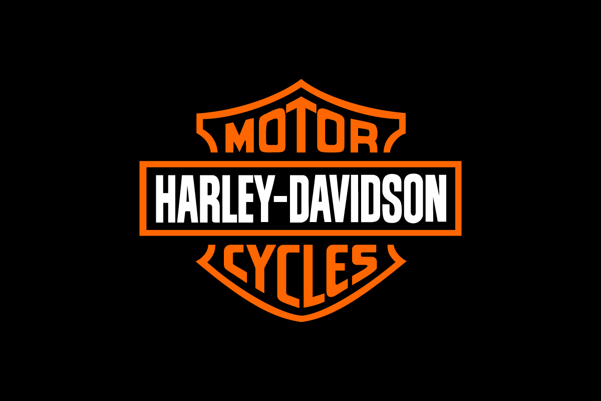
The Harley Davidson logo was first introduced in 1910, just seven years after the company was founded in Milwaukee, Wisconsin. The original design already featured the now-famous “bar and shield” shape—a visual metaphor for strength and protection. It became a registered trademark in 1911 and has remained the brand’s signature ever since.
While the logo has seen small refinements in color and line work, the core structure has remained largely unchanged for over a century. This consistency has helped build an almost mythic level of recognition around the logo, especially among motorcycle enthusiasts.
What Type of Logo is the Harley Davidson Logo?
The Harley Davidson logo is a classic emblem logo, where the text and symbol are fully integrated into a single, contained shape. This type of logo is traditionally used by institutions and heritage brands to convey authority and prestige.
In Harley’s case, the emblem structure reinforces the brand’s legacy and mechanical toughness. The thick outlines and layered bar-and-shield layout make it feel like a badge of honor—one that riders wear with pride on jackets, helmets, and tattoos.
Design Elements and Symbolism
Every part of the Harley-Davidson logo is built for impact:
-
Shape: The shield implies protection, reliability, and masculine strength. The horizontal bar across the center acts as a visual anchor and brand banner.
-
Typography: The bold, blocky lettering uses all caps to create presence and command. It’s aggressive but legible—matching the brand’s rugged image.
-
Color: Orange and black are the brand’s primary palette. Orange signals energy and individuality, while black adds toughness and contrast.
Together, these elements tell the story of a brand that doesn’t just sell motorcycles—it sells attitude, heritage, and identity.
Logo Variations: Full vs Short Version
![]()
Harley Davidson’s primary logo remains the full bar-and-shield emblem with the “Motor” and “Cycles” banners—a bold, instantly recognizable mark. However, for very small applications like favicons or mobile interfaces, the company sometimes uses a simplified outline of the shield with a horizontal bar across the middle.
While this minimal version fits small spaces, it lacks the distinctive typography or color that ties it clearly to the Harley-Davidson brand. As a result, it doesn’t carry the same visual equity or recognition as the full logo. Without the iconic lettering, this short version functions more as a generic shape than a true shorthand for the brand.
How Harley Davidson Logo Performs in Small Sizes
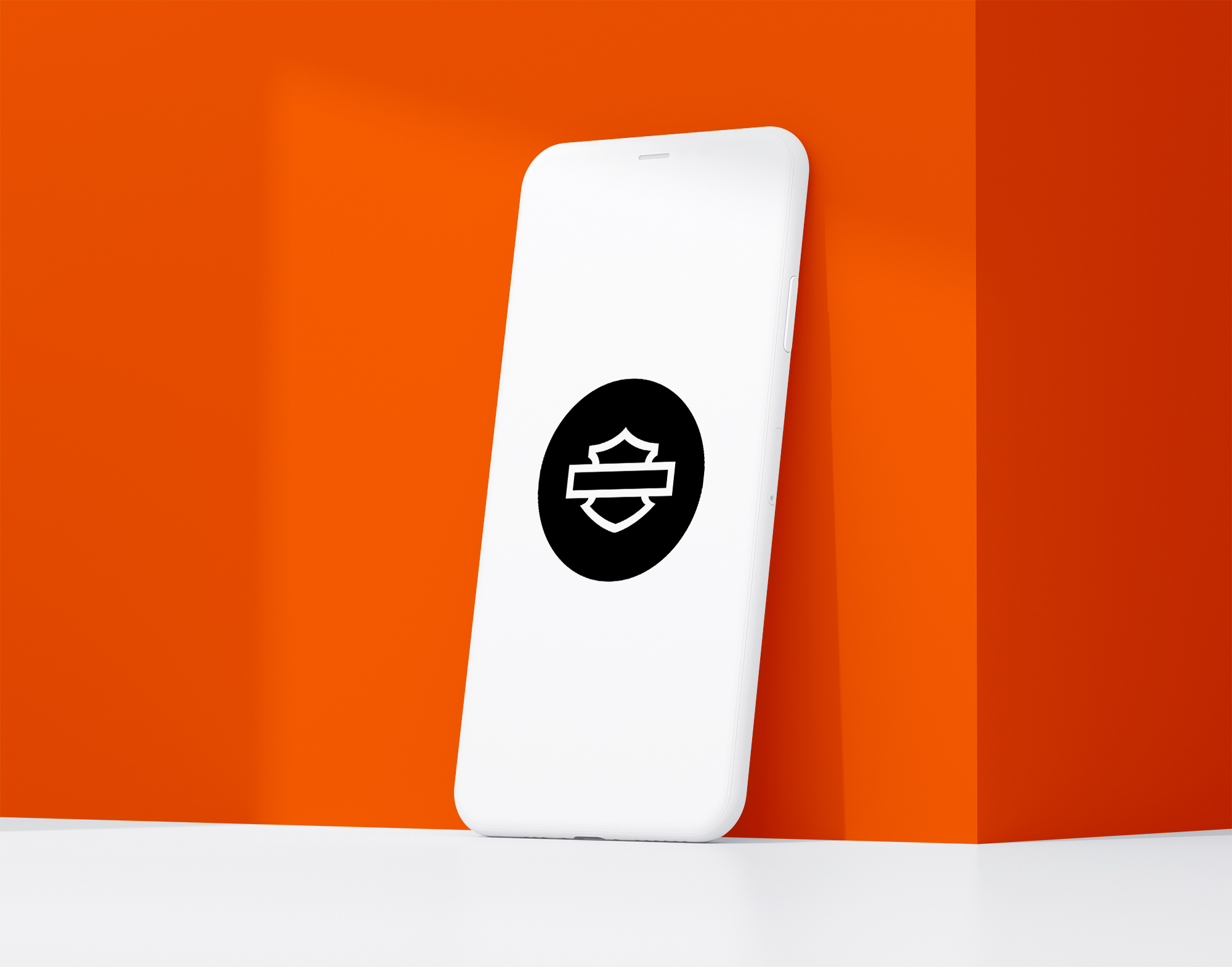
The full Harley-Davidson emblem performs reasonably well at moderate sizes thanks to its bold lines and structured layout. However, when scaled down too far—especially on mobile devices or browser tabs—the detailed lettering becomes difficult to read.
To address this, Harley sometimes uses a stripped-down shield icon as a short version. But without the brand’s name or signature orange-and-black palette, this simplified version lacks strong recognition. It feels more like a placeholder than a true standalone logo. As digital environments demand more scalable assets, Harley may need to refine or reinforce its short-mark strategy for better clarity and brand linkage.
Brand Recognition & Global Impact
Few logos carry the cultural weight of Harley-Davidson’s. It’s not just recognized in the U.S.—it’s known globally as a symbol of independence and raw mechanical power.
In a recognition test with 50 participants, 45 identified the logo immediately, even without motorcycle context. The emblem is found on bikes, clothing, keychains, mugs, and billboards—anywhere the Harley lifestyle travels.
Comparing Harley Davidson Logo with Other Brands
Indian Motorcycle
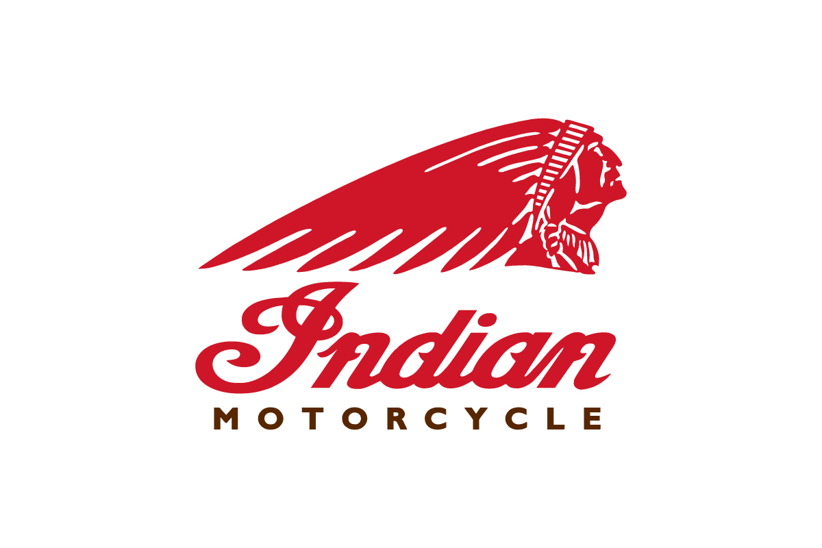
Indian’s emblem logo leans more vintage, with cursive script and a Native American icon. While it evokes history, it lacks the industrial grit and bold presence of Harley’s mark.
Ducati
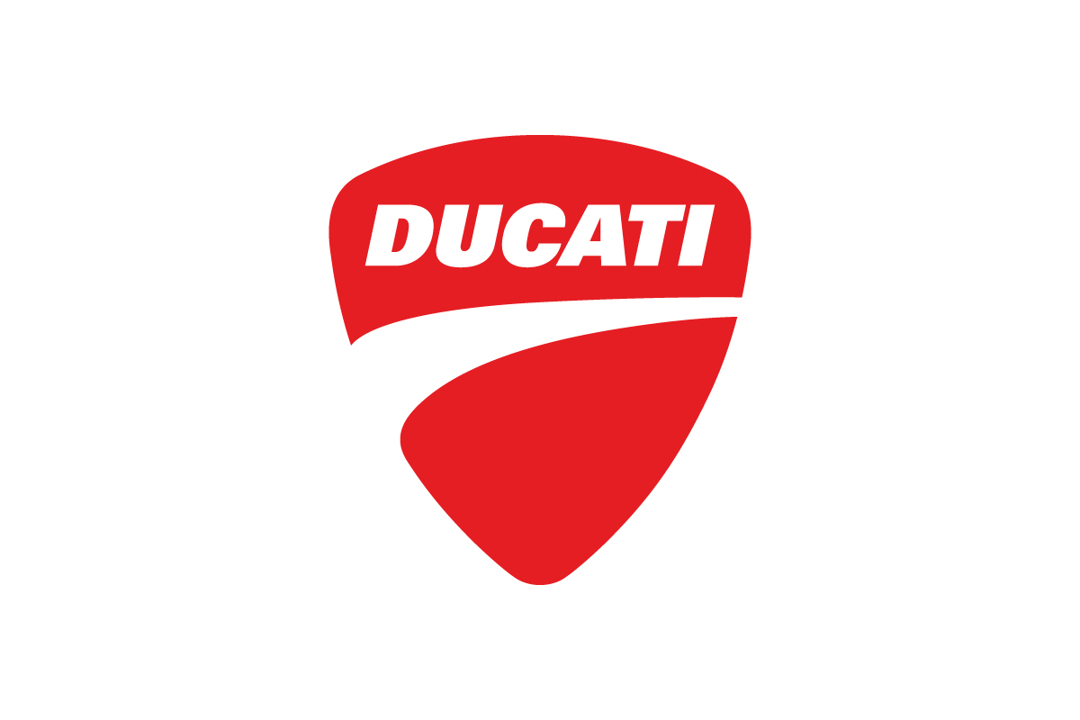
Ducati uses a modern shield logo, but it feels more streamlined and European. It’s sleek and stylish, but doesn’t carry the same rebellious spirit or visual weight.
BMW Motorrad
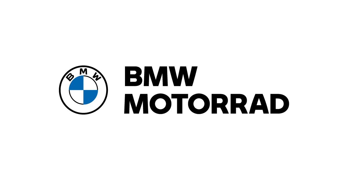
BMW’s combination mark features a simple wordmark next to the iconic BMW circle. While globally trusted, it doesn’t evoke the same sense of identity and subculture that Harley-Davidson’s emblem does.
Should They Change the Logo?
There’s no reason for Harley-Davidson to change its logo. It’s not just a mark—it’s a badge of belonging. The emblem has transcended branding to become part of motorcycle culture itself.
If anything, the brand could consider more consistent use of a short version—like the “H-D” mark—for mobile-first platforms. But any major redesign would compromise decades of equity and emotional resonance.
Conclusion
The Harley-Davidson logo is a perfect example of how a strong emblem logo can create lasting emotional connections. With its bar-and-shield design, bold lettering, and iconic color palette, it doesn’t just stand for a company—it stands for freedom, power, and American spirit.
That kind of resonance doesn’t come from flashy trends or constant updates. It comes from smart design decisions that hold up over time. At Rabbit, we help companies build logos that last—just like Harley-Davidson’s.