The Roland Garros logo perfectly captures the spirit of the French Open — refined, bold, and steeped in tradition. As one of the most prestigious tournaments in tennis, Roland Garros needed an emblem that symbolized both heritage and modernity. The result is an emblem logo that blends the initials “RG” into a timeless circular badge, embodying both the history of the tournament and the artistry of the sport.
The Origin of the Roland Garros Logo
The Roland Garros logo was redesigned to give the French Open a modern yet classic identity that reflects its standing among the four Grand Slam tournaments. It pays tribute to Roland Garros, the pioneering French aviator after whom the stadium and event are named. The redesign sought to unify elegance with the dynamic energy of clay-court tennis, using geometry and color to represent both movement and tradition.
The circular form of the logo hints at a tennis ball, while the structured inner letters echo the architectural lines of the Stade Roland-Garros in Paris.
What Type of Logo Is It?
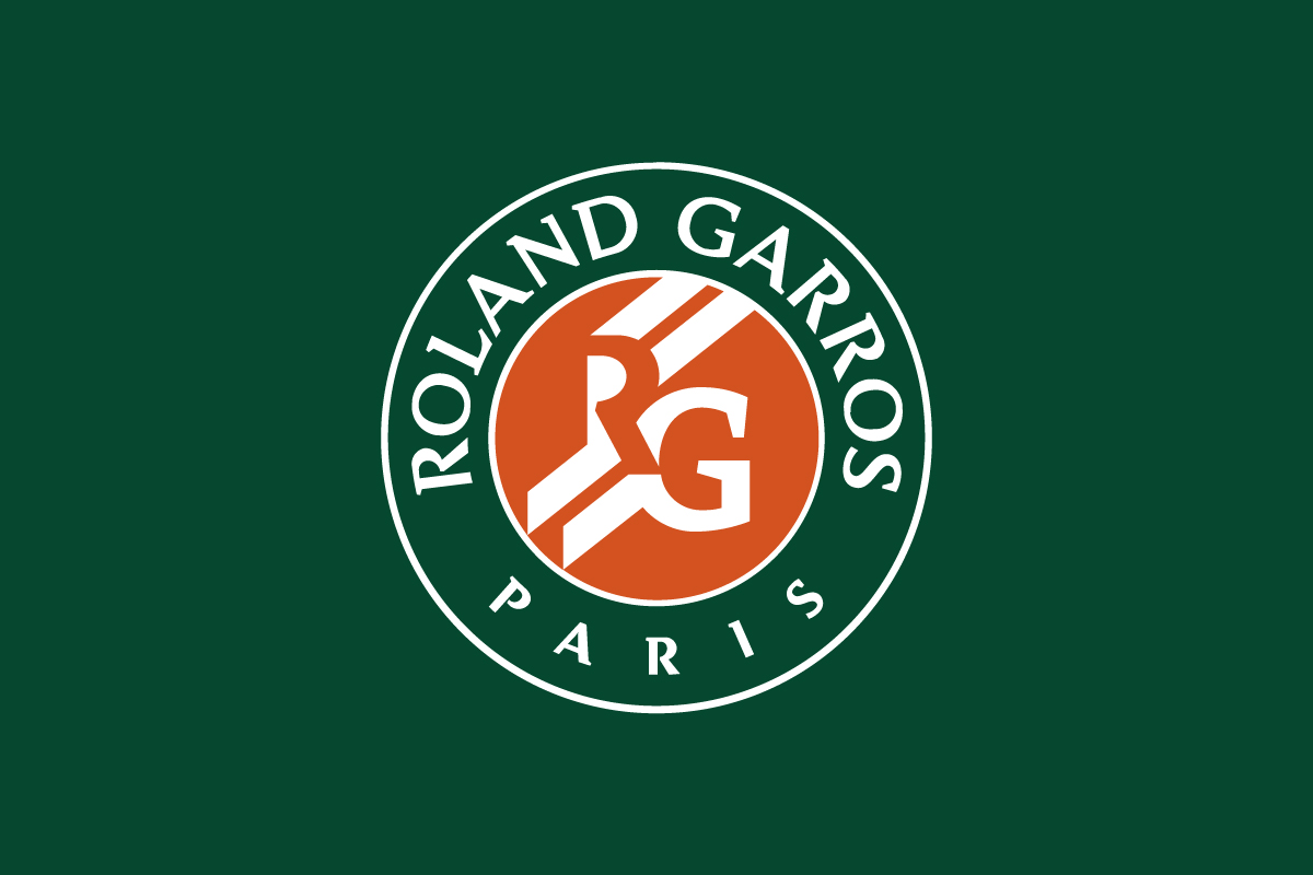
The Roland Garros logo is an emblem logo, a design style that combines text and symbol within one contained shape. In this case, the initials “RG” are enclosed within a green circle featuring the words ROLAND GARROS PARIS. The emblem structure makes it instantly recognizable and ideal for use across all tournament applications — from signage to player apparel.
Interestingly, the inner design incorporates negative space, turning the letter “R” into a sculptural form that is defined by the orange background, rather than by outlines. This subtle technique adds depth and sophistication, setting it apart from most traditional sports emblems.
Design Elements and Symbolism
-
Color Palette: The deep clay orange represents the signature surface of the French Open courts — a hue synonymous with passion, endurance, and tradition. The surrounding dark green circle adds contrast and balance, reminiscent of Parisian gardens and French prestige.
-
Typography: The serif typography used for ROLAND GARROS PARIS gives the logo a classic, timeless aura that echoes French elegance.
-
Negative Space “R”: The most distinctive feature is the “R” formed through negative space. This design decision makes the initials appear interlocked, reflecting connection, competition, and motion — the essence of tennis.
Together, these elements make the Roland Garros logo more than a symbol; it’s a design that celebrates the clay court’s legacy and the elegance of French design philosophy.
Brand Recognition & Global Impact
The Roland Garros logo is one of the most recognizable emblems in world sports. Among global audiences, its unique clay-and-green color combination immediately evokes the French Open. From digital broadcasts to merchandise, the emblem maintains visual strength across every platform.
In branding studies, tennis fans frequently associate the logo with prestige, tradition, and Parisian sophistication. It successfully positions the French Open as not just a tournament, but an enduring cultural event.
Does the Roland Garros Logo Work in Small Sizes?
Yes, the Roland Garros logo works exceptionally well in smaller applications. Its emblem structure keeps all elements unified, ensuring the RG initials remain clear even on tight surfaces like tennis balls, clothing patches, or digital icons. The negative space approach gives strong contrast, allowing the design to remain readable and iconic.
How Roland Garros Compares to Competitors
Wimbledon: Uses a wordmark and crossed-rackets emblem in purple and green, leaning toward tradition. Roland Garros, by contrast, embraces modern geometry and color minimalism.
US Open: Features a dynamic wordmark with a flaming tennis ball — energetic but less timeless. Roland Garros opts for quiet elegance over motion.
Australian Open: Adopts a minimalist combination mark (A and O), aligning closer to contemporary branding. Yet Roland Garros preserves a classic emblem feel while integrating negative space artistry.
Should They Change the Logo?
There’s no reason to. The Roland Garros emblem has aged gracefully, balancing tradition and modern minimalism with effortless precision. Its negative-space R is still one of the most inventive letter integrations in sports branding, offering both memorability and symbolism. Any drastic redesign could dilute the strong visual identity the tournament has cultivated for decades.
Conclusion
The Roland Garros logo stands as a masterclass in emblem design — a seamless blend of negative space, geometry, and historical context. The clever integration of the R and G initials creates a memorable symbol that reflects both motion and legacy.
At Rabbit, we appreciate how this logo demonstrates the power of simplicity in visual storytelling. If your brand seeks a design that balances elegance and symbolism — much like the Roland Garros emblem — our logo design agency can craft a mark that captures your story with the same level of precision and prestige.