The Starbucks logo is one of the most recognizable symbols in the world—a circular emblem featuring a twin-tailed siren that represents seduction, mystery, and timeless appeal. Beyond coffee, it has come to symbolize global culture, community, and creativity. In this post, we’ll explore how the Starbucks logo evolved from a small Seattle coffeehouse mark to a global design icon.
The Origin of the Starbucks Logo
Starbucks was founded in 1971 by three partners—Jerry Baldwin, Zev Siegl, and Gordon Bowker—in Seattle’s historic Pike Place Market. The brand’s name was inspired by Starbuck, a character from Moby-Dick, symbolizing adventure and the allure of the sea.
To reflect that maritime spirit, the founders chose a siren—a mythological mermaid known for luring sailors—as the company’s emblem. The original design, drawn from a 16th-century Norse woodcut, featured a detailed brown illustration of a bare-chested, two-tailed mermaid encircled by the words Starbucks Coffee, Tea, and Spices. It was more raw and artistic than corporate, perfectly fitting the brand’s humble beginnings.
What Type of Logo Is It?
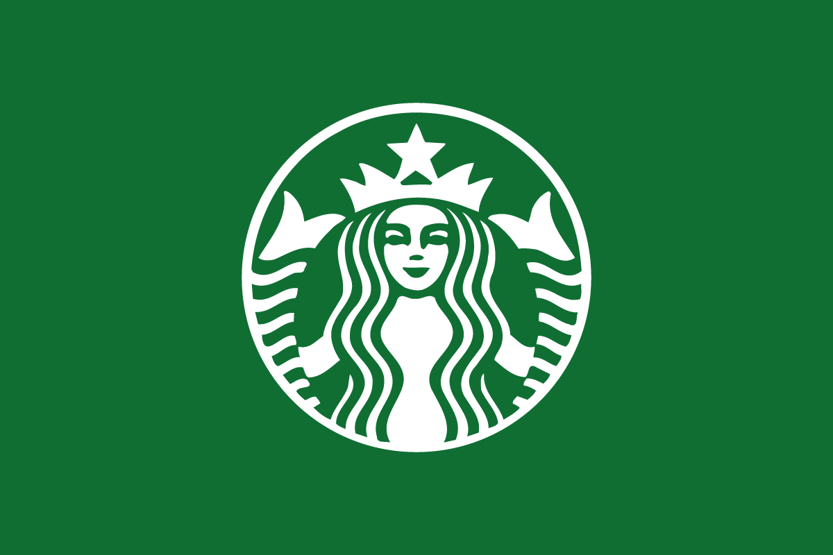
The Starbucks logo is an emblem logo, where text and imagery are enclosed within a unified circular badge. Over time, it evolved into a simplified pictorial mark, with the siren standing alone as the ultimate symbol of brand confidence.
This transition—from emblem to pure icon—represents Starbucks’ growth from a local business to a globally recognized brand. The siren no longer needs words; the image alone says it all.
Design Elements and Symbolism
Every detail in the Starbucks logo carries meaning and purpose:
-
The Siren: Symbolizes temptation, creativity, and allure—the emotional qualities associated with coffee culture. She embodies warmth and curiosity, drawing customers in just as myths say sirens drew sailors.
-
Color Palette: The signature green was introduced in 1987 and represents growth, freshness, and balance. It reflects Starbucks’ shift toward a more welcoming and environmentally conscious identity.
-
Circular Shape: Suggests unity and community—a space where people gather, talk, and connect.
-
Simplification Over Time: Each redesign removed more details and text, leaving only the essence of the symbol. The modern version from 2011 eliminated the brand name entirely, letting the siren speak for herself.
The result is a logo that blends mythology, minimalism, and meaning—rare harmony in modern branding.
Brand Recognition & Global Impact
Today, the Starbucks logo is instantly identifiable across more than 35,000 stores worldwide. Its green siren is seen daily by millions of people—from coffee cups and storefronts to mobile apps and merchandise.
In brand recognition studies, over 95% of participants correctly identified the Starbucks logo without any text, proving the strength of its visual identity. The siren has transcended language and culture, becoming a universal symbol of coffeehouse comfort.
Starbucks also invests heavily in consistent, subtle branding—not flashy campaigns, but lifestyle integration. The company’s stores, cups, and packaging all reinforce the same emotional message of warmth and belonging. That kind of brand harmony has built loyalty few companies achieve.
One of the most unexpected boosts to the Starbucks logo’s visibility came from a pop-culture moment in Game of Thrones. In 2019, viewers spotted a modern coffee cup—clearly resembling a Starbucks cup—left on a table in front of actor Emilia Clarke during a scene in the show’s final season. While HBO later confirmed it was a production mistake and not a planned placement, the internet exploded with memes and discussions. Within 48 hours, Starbucks was mentioned in tens of thousands of social posts, generating millions in estimated free publicity.
Whether accidental or not, it showed how deeply the Starbucks logo is embedded in everyday culture—so recognizable that even a quick glimpse on screen became global news.
Does the Starbucks Logo Work in Small Sizes?
Surprisingly, this is one of the few drawbacks of the Starbucks logo. The intricate lines of the siren’s face and hair lose clarity at very small scales, such as favicons or app icons. While the green circle remains recognizable, the detailed illustration doesn’t scale as cleanly as minimalist marks like the Apple logo or Nike swoosh.
Still, Starbucks manages this effectively by maintaining strong color consistency—its green-and-white palette ensures recognition even when details fade.
How Starbucks Compares to Competitors
Costa Coffee: Uses a wordmark emblem with a traditional, vintage aesthetic. Starbucks feels more modern and symbolic, while Costa emphasizes heritage.
Dunkin’: Relies on a bold wordmark logo with playful orange and pink colors. Starbucks, in contrast, leans into sophistication and timeless design.
Peet’s Coffee: Features a minimalist lettermark logo, focusing on authenticity and artisanal feel. Starbucks, however, uses storytelling and mythology to create deeper emotional appeal.
Should They Change the Logo?
No—and they likely never will. The Starbucks logo has achieved what most brands can only dream of: wordless global recognition. Every redesign has simplified the symbol, sharpening its focus on the siren while preserving its core identity.
Any major change now would risk weakening the powerful emotional connection customers have with the logo. Instead, Starbucks may continue to adapt color tones or presentation styles for digital use, but the siren herself is here to stay.
Conclusion
The Starbucks logo is a masterclass in evolution and storytelling. From its mythological roots to its clean, modern form, it embodies a journey of creativity, confidence, and cultural connection.
What makes it extraordinary isn’t just design—it’s the meaning behind it. The siren reminds us that great logos aren’t just visuals; they’re stories, emotions, and identities intertwined.
At Rabbit, the best logo design agency, we help brands craft enduring marks—logos that balance heritage and modern appeal, evoking trust and emotion in every glance.