When you see a logo made of shapes and symbols that don’t represent a real object, you’re looking at an abstract logo. Instead of showing something literal, abstract logos rely on form, movement, and geometry to communicate meaning.
In a world where brands compete for instant recognition, the abstract logo is one of the most flexible and scalable logo styles. It allows companies to express ideas like speed, innovation, trust, or connection without being tied to a single visual reference.
Think of dynamic swooshes, interlocking shapes, or symbolic marks that feel familiar even if you can’t name exactly what they represent — these designs become memorable because of consistency, not illustration.
In this post, we’ll explain what an abstract logo is, why brands choose this style, explore 20 famous examples, and share how abstract logos work in real-world branding.
What Is an Abstract Logo?
![]()
An abstract logo is a symbol-based logo that doesn’t represent a real, recognizable object. Like a pictorial logo, it relies entirely on a logomark or symbol, usually without text in its final form. The key difference is that abstract logos communicate ideas rather than literal imagery.
In many cases, abstract and pictorial logos feel similar at first glance — both can stand alone as symbols. The distinction becomes clear when you compare something like the Apple logo to the Mastercard logo. Apple uses an obvious, real-world object, while Mastercard relies on two overlapping circles to express connection, trust, and global exchange.
As a brand expert, it’s important to note that not all abstract logos are equally effective. Some of the strongest examples — like Nike, Mastercard, and Airbnb — succeed because their symbols are tied to a clear brand story and reinforced through consistent use over time. These logos didn’t rely on randomness; they built meaning into simple forms.
Today, many SaaS companies place an abstract symbol next to a wordmark, but without a distinct concept behind it, these marks often blur together. When abstract shapes lack personality or narrative, they become difficult to remember. The brands mentioned above stand out because their symbols were designed with intention — and supported by long-term brand recognition, not trends.
Why Do Brands Use an Abstract Logo?
Abstract logos give brands the freedom to:
-
Be unique – No limits from literal objects or clichés
-
Express ideas, not just things – Movement, innovation, balance or boldness
-
Scale globally – No language dependency
-
Evolve easily – Can grow with the brand’s product or mission over time
-
Stand out – Especially in competitive or creative industries
When done well an abstract logo becomes a long term visual asset — simple, iconic and instantly recognisable.
20 Famous Abstract Logos
Abstract logos distill complex ideas into simple, memorable forms. Let’s explore how some of the world’s most recognizable brands use them to convey emotion, innovation, and identity.
1. Nike
![]()
A fluid checkmark known globally as the “Swoosh.”
Why this logo works
The Nike logo suggests movement and speed through a bold, minimalist mark.
2. Airbnb
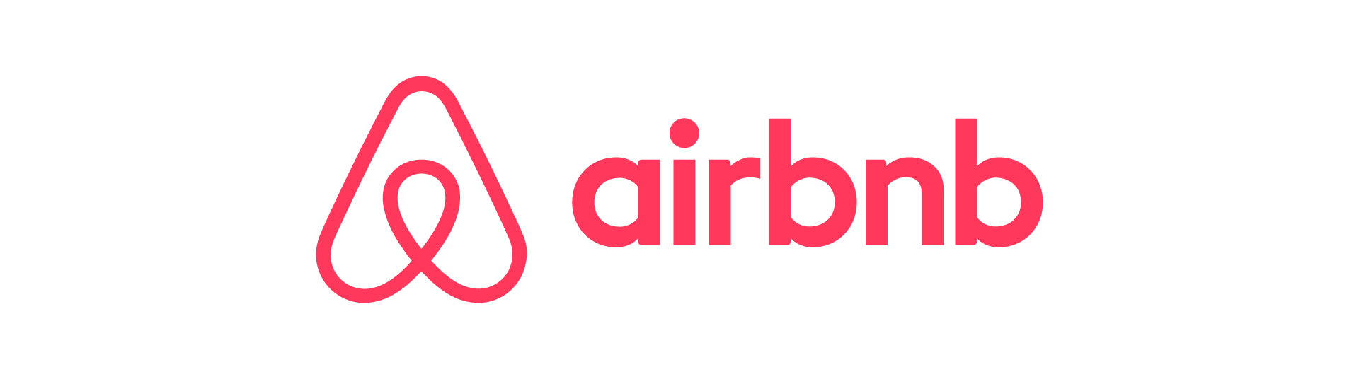
A symbol blending curves and geometry to represent belonging and connection.
Why this logo works
The Airbnb logo feels warm and versatile, balancing simplicity with a deeper message about home and human connection — all without relying on literal imagery.
3. Pepsi

A circular design with red, white, and blue waves.
Why this logo works
The movement adds energy and balance. The simple geometry remains recognizable even without text.
4. Microsoft
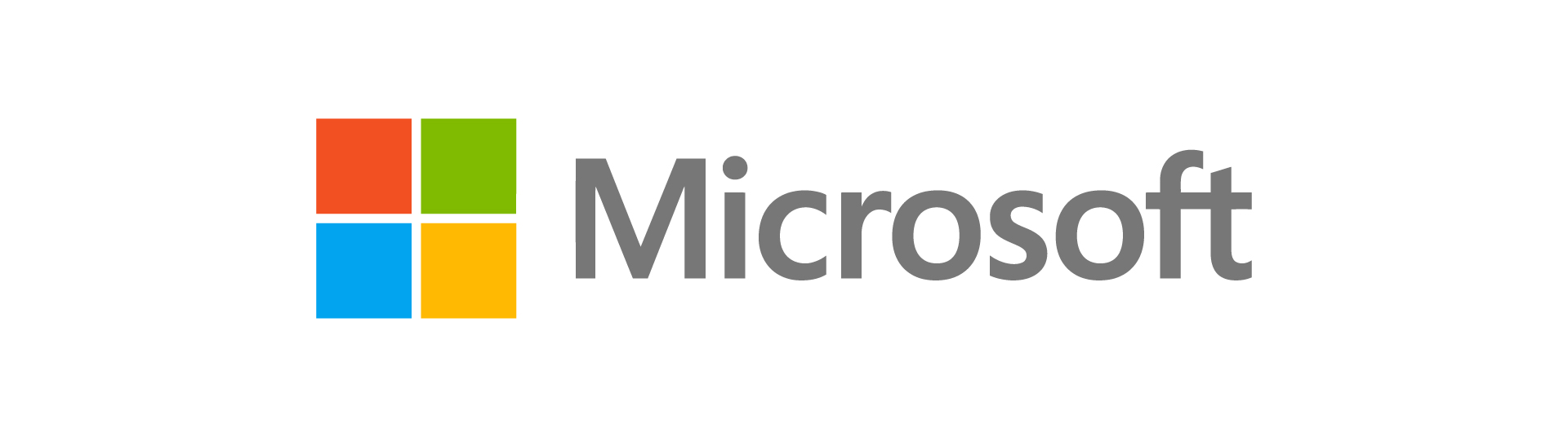
Four colored squares forming a window.
Why this logo works
The Microsoft logo reflects clarity, product range, and modular tech structure.
5. Mastercard

Two overlapping circles — red and yellow — without any text.
Why this logo works
The Mastercard logo uses overlap circles that communicate connection and trust. Its clarity holds up at small sizes and in monochrome.
6. Spotify
![]()
Three curved lines inside a green circle.
Why this logo works
The waves suggest motion and audio. The bold shape stays visible and distinctive at any scale.
7. Mitsubishi

Three diamonds arranged into a symmetrical triangle.
Why this logo works
The geometry feels strong and precise. The high contrast form is easy to recognize and reproduce.
8. Adidas
![]()
Three diagonal stripes suggesting upward momentum and progress.
Why this logo works
The upward direction suggests progress. Its minimal construction works across apparel and digital use.
9. BP

A green and yellow radial flower-like shape.
Why this logo works
The BP logo evokes clean energy and natural renewal through vibrant symmetry.
10. Google Drive

A triangle composed of green, yellow, and blue segments.
Why this logo works
The Google Drive logo suggests connectivity, storage, and simplicity with minimal geometric elements.
11. Monday.com
![]()
A playful symbol paired with wordmark.
Why this logo works
It’s friendly and approachable. The bright colors add personality, the simple shapes feel human and modern, and the clean wordmark keeps the brand professional and easy to recognize.
12. Chase Bank
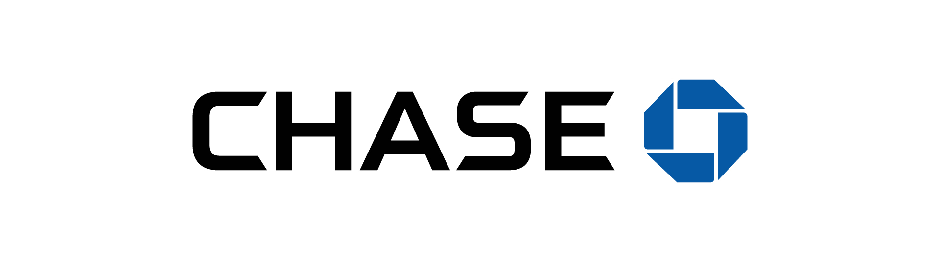
A square rotated into an octagonal symbol.
Why this logo works
The shape feels solid and secure. Its geometry stays legible without text or color.
13. Asana
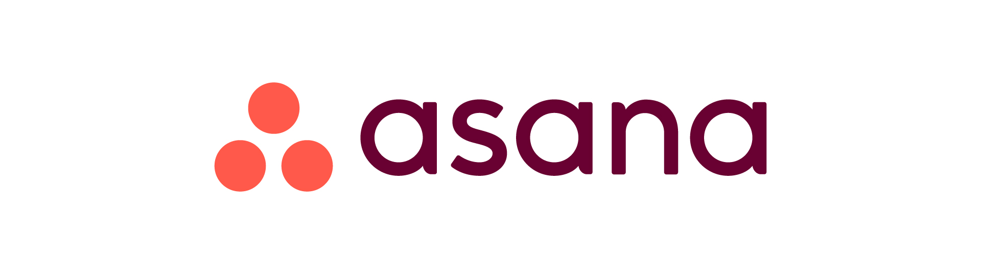
Three dots arranged into a soft triangle.
Why this logo works
The Asana logo reflects balance and collaboration through clean, human-centered geometry.
14. Beats by Dre
A circular icon with a stylized lowercase “b”.
Why this logo works
The Beats logo doubles as a headphone and letterform, making it bold and memorable.
15. Huawei

Radiating red blades forming a floral shape.
Why this logo works
The symmetry creates visual rhythm. The mark remains recognizable even when simplified.
16. Dropbox
Four diamond shapes forming an open box.
Why this logo works
The structure suggests organization. Clean edges keep it sharp across different sizes.
17. Slack
![]()
Colorful lines and dots forming a tilted cross.
Why this logo works
The layout of Slack logo feels connected and energetic. Color blocks help the mark stand out in interfaces.
18. Dell

A tilted “E” inside a bold wordmark.
Why this logo works
The Dell logo breaks convention with subtle abstraction to suggest innovation.
19. Symantec
A bold checkmark enclosed within a circular shape.
Why this logo works
The mark feels decisive and confident. Its contrast ensures visibility in any context.
20. ChatGPT

An interwoven knot-like symbol built from repeating curves.
Why this logo works
The ChatGPT logo captures a looping form that feels balanced and continuous. Its symmetry keeps the design clear at small sizes.
Our Abstract Logos
1. TerraFunds
An angular symbol that suggests both land and finance through layered geometric forms.
Why this logo works
It’s a flexible design that feels professional and modern, without relying on clichés like buildings or money.
2. Celli Collective
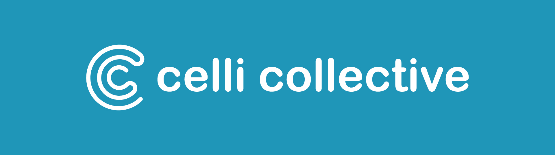
A circular “C” mark built from layered curves, paired with a modern wordmark.
Why this logo works
The symbol feels fluid and connected — an ideal match for a creative collective that values unity, rhythm, and openness.
3. Couriez
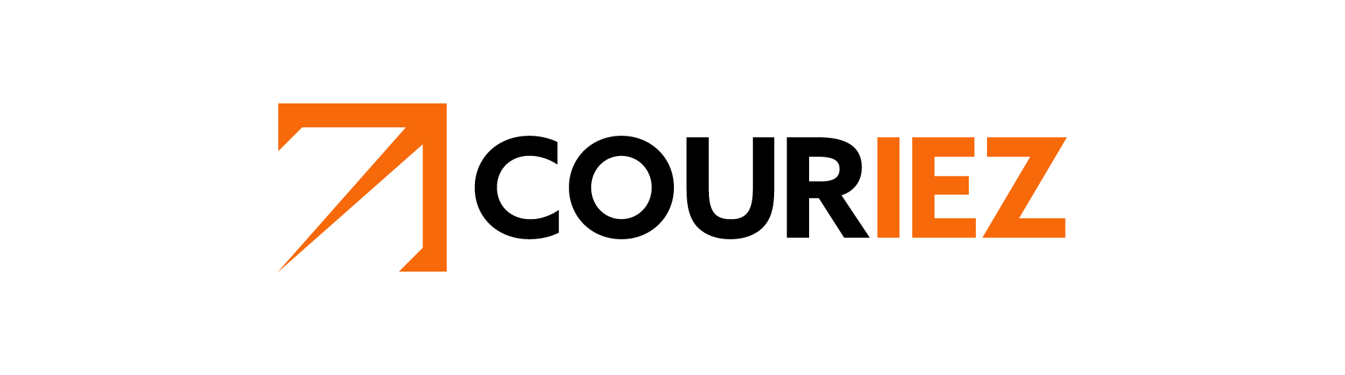
The upward arrow forms a bold abstract logo that suggests speed and direction.
Why this logo works
Its shape is energetic without being literal, perfectly suited for a logistics or delivery brand focused on forward motion.
4. MOON

The second “O” is replaced with a crescent moon — simple, abstract, and expressive.
Why this logo works
This logo blends symbolism and typography, giving the brand an identity that feels both calm and cosmic.
5. LITEEYES
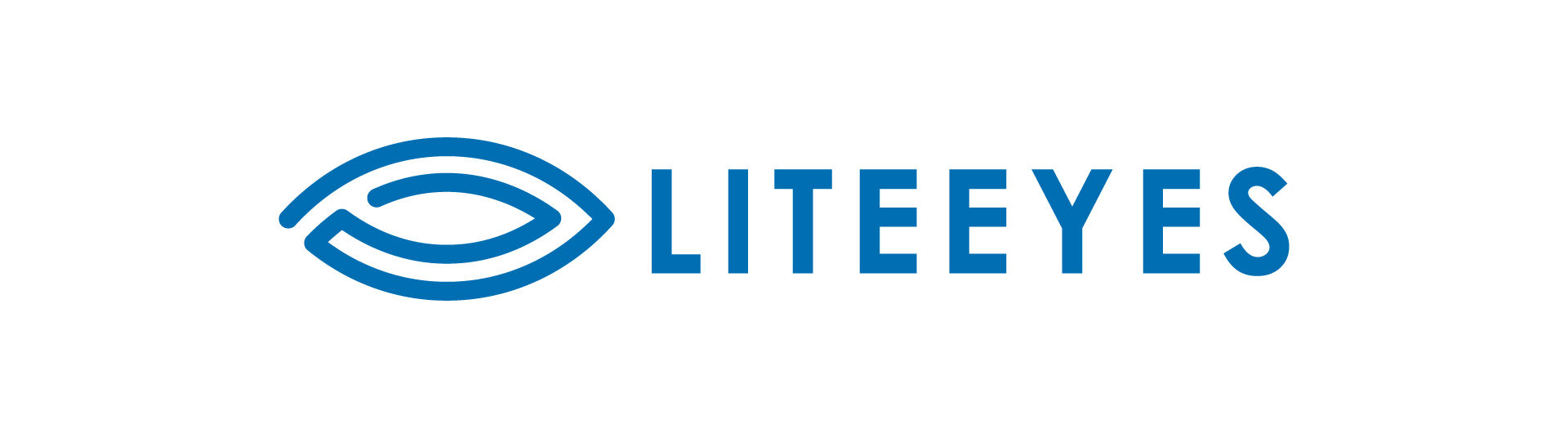
A sleek icon formed from nested ellipses, hinting at vision, tech, and motion.
Why this logo works
The abstract shape evokes clarity and speed, making it a great fit for a brand focused on smart optics or visual tech.
When to Use an Abstract Logo?
An abstract logo is the right fit if:
-
Your brand is built on ideas, values or systems rather than one product
-
You want to stand out in a crowded or traditional industry
-
You plan to operate globally or expand into new markets
-
You need a logo that feels modern, flexible and scalable
This style works well for startups, tech companies, fintech, agencies, innovation driven brands and platforms where versatility is key.
How to Design an Abstract Logo
If you’re considering an abstract logo, here’s what matters most:
- Start with meaning – Think in concepts: movement, balance, connection, precision
- Use shape psychology – Circles = unity, triangles = motion, squares = stability
- Keep it simple – Abstract doesn’t mean complex
- Test scalability – Make sure it looks great from favicon to billboard
- Make it ownable – Look for a shape or structure that no one else is using
A simple way to judge whether an abstract logo is truly working is this: can it be recognized without text next to it? If the symbol can’t stand on its own, it hasn’t earned its meaning yet.
Think about the Asana logo. The three circles work visually, but without the wordmark, most people wouldn’t know what brand they’re looking at. Now compare that to the Airbnb symbol — even without text, people instantly recognize it and say, “Ah, that’s Airbnb.” That’s the difference between an abstract shape that exists and an abstract logo that actually means something.
Working with experienced designers helps ensure abstract symbols feel purposeful, distinctive, and built to last.
Conclusion
Abstract logos give you the freedom to create something unique, memorable and scalable — without literal imagery. When done well these symbols communicate more than what you do — they show how you make people feel.
Ready to create a custom abstract logo that’s truly yours? Get in touch with our logo design agency. We’ll turn your concept into a logo that lasts.