The Airbnb logo is one of the most discussed rebrands of the modern digital era. Simple, symbolic, and emotionally driven, it represents more than accommodation—it stands for connection, community, and belonging. With its distinctive abstract symbol and friendly typography, the Airbnb logo reshaped how tech brands think about identity and meaning.
The Origin of the Airbnb Logo
Airbnb began in 2008 when Brian Chesky, Joe Gebbia, and Nathan Blecharczyk launched the company in San Francisco. What started as a simple idea—renting out air mattresses—quickly evolved into a global platform connecting hosts and travelers across the world.
In 2014, as Airbnb expanded beyond short-term stays into experiences and community-driven travel, the company introduced a new logo as part of a major rebrand. The goal was clear: move away from a purely functional identity and create a symbol that reflected emotional connection and global belonging.
That redesign marked a turning point, not just for Airbnb, but for branding in the tech industry as a whole.
What Type of Logo Is It?
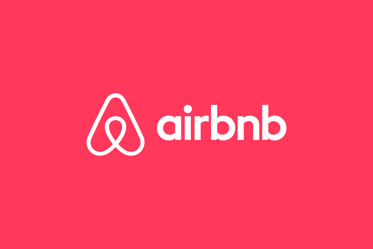
The Airbnb logo is a combination mark, made up of a custom wordmark and an abstract symbol known as the “Bélo.”
The symbol can stand alone as an app icon or be paired with the Airbnb name, giving the brand flexibility across digital and physical touchpoints. This dual-system approach allows Airbnb to maintain strong recognition while adapting easily to different contexts.
Design Elements and Symbolism
The strength of the Airbnb logo lies in its layered meaning:
-
The Bélo Symbol: The abstract mark represents four ideas combined into one shape—people, places, love, and Airbnb itself. It can be interpreted as a heart, a location pin, an “A,” or even a person with open arms, reinforcing the idea of belonging.
-
Typography: The rounded sans-serif wordmark feels friendly and approachable. Its soft curves remove any sense of corporate stiffness, aligning with Airbnb’s community-first positioning.
-
Color Palette: The signature coral-pink tone conveys warmth, openness, and human connection. It’s intentionally emotional rather than technical, helping Airbnb stand out in a crowded tech landscape.
-
Minimalism: Clean lines and simple forms ensure the logo remains modern, scalable, and adaptable across platforms.
Together, these elements create a logo that feels personal rather than transactional.
Brand Recognition & Global Impact
The Airbnb logo quickly became one of the most recognizable tech symbols worldwide. Despite early public debate around the Bélo symbol, the design ultimately succeeded in embedding itself into global culture.
In recognition studies, a large majority of users can identify the Airbnb logo without seeing the brand name—especially in mobile and app-based contexts. That level of recall shows how effectively the symbol communicates trust and familiarity.
More importantly, the logo helped Airbnb shift perception: from a booking platform to a lifestyle brand. The visual identity played a major role in reinforcing Airbnb’s message that travel is about people and shared experiences, not just places to sleep.
Does the Airbnb Logo Work in Small Sizes?
Yes. The Airbnb logo performs extremely well at small sizes, particularly in digital environments. The Bélo symbol is clean and balanced, making it ideal for app icons, favicons, and social media avatars.
The simplified shape and solid fill ensure clarity even on small screens, while the wordmark remains legible in headers, footers, and navigation menus. This scalability is one of the logo’s biggest strengths.
How Airbnb Compares to Competitors
Booking.com: Uses a straightforward wordmark logo focused on functionality. Airbnb’s symbol-driven identity feels warmer and more emotional.
Vrbo: Relies on a text-heavy logo with a more corporate tone. Airbnb’s branding feels more personal and community-oriented.
Hotels.com: Uses bold typography and color but lacks a strong standalone symbol. Airbnb’s Bélo gives it a clearer visual anchor across platforms.
Compared to competitors, Airbnb’s logo stands out by prioritizing meaning and emotion over pure utility.
Should They Change the Logo?
No. The Airbnb logo is closely tied to the brand’s mission and values. While trends in logo design continue to shift toward simplicity, Airbnb’s identity already sits in that sweet spot—modern, symbolic, and flexible.
Any major change would risk disrupting the emotional connection users have built with the brand. Minor refinements for accessibility or digital motion may happen, but the core symbol is likely here to stay.
Conclusion
The Airbnb logo is a strong example of how design can communicate values, not just names. Through a simple symbol and friendly typography, it expresses belonging, trust, and human connection—qualities that define the Airbnb experience.
It proves that modern logos don’t need complexity to be powerful. When meaning, form, and purpose align, a logo can become a global symbol. At Rabbit Logo, we help brands achieve that same clarity—working as a creative logo design agency focused on meaning, simplicity, and scalable logo systems.