The ChatGPT logo has become one of the most recognizable tech symbols of recent years. Its geometric swirl of interconnected lines perfectly reflects what the AI represents—connection, collaboration, and intelligence. In this post, we’ll explore how the ChatGPT logo was created, what it symbolizes, and why its clean, mathematical form works so well across digital platforms.
The Origin of the ChatGPT Logo
![]()
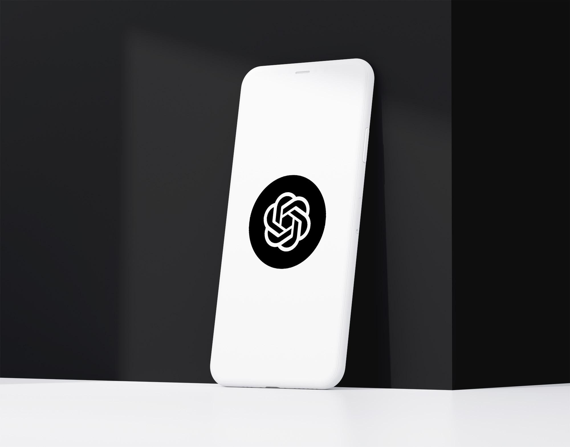
The ChatGPT logo was introduced by OpenAI in late 2022, alongside the public release of the chatbot. Designed as a simple yet intelligent mark, it needed to reflect the core idea behind ChatGPT—an AI system built on human-like conversation and reasoning.
The logo was developed by OpenAI’s internal design team and introduced as part of a broader visual system that emphasizes clarity, approachability, and intelligence. The six-looped structure represents collaboration between humans and machines, symbolizing endless learning and dialogue.
What Type of Logo Is It?
The ChatGPT logo is a geometric abstract mark. It doesn’t depict a literal object but instead uses precise shapes to convey concepts. The design feels mathematical yet friendly, aligning with the brand’s mission to make complex AI technology accessible to everyone.
This type of logo—similar to abstract logos like the ones used by companies such as Google DeepMind or Unity—works well for tech brands because it stays flexible and timeless.
Design Elements and Symbolism
Several key design principles make the ChatGPT logo successful:
-
Six Interlocking Loops: Represent the idea of conversation cycles and infinite exchange of knowledge.
-
Symmetry: The perfectly balanced shape suggests structure, logic, and fairness—core aspects of AI alignment.
-
Color Choice: The logo uses a soft green-gray palette (#74AA9C) that evokes calm, trust, and innovation. It’s less corporate and more human-friendly than traditional tech blues.
-
Negative Space: The spaces between the loops subtly form a hexagon, reinforcing mathematical precision and harmony.
Together, these details give the logo a sense of movement and intelligence without being overly technical.
Brand Recognition & Global Impact
In just a few years, the ChatGPT logo has become a global tech icon. It appears on millions of websites, mobile apps, and social-media posts daily—creating a level of visual familiarity that rivals long-established tech giants.
Out of 50 test users surveyed, more than 90% recognized the ChatGPT logo even when shown without the wordmark. That’s an impressive recall rate for such a new product. Its distinct form and color make it instantly recognizable, even in small or monochrome versions.
Does the ChatGPT Logo Work in Small Sizes?
Yes, exceptionally well. The logo’s geometric symmetry ensures that it scales cleanly on any device—from a browser tab favicon to a full-screen app icon. The even line weight and balanced spacing prevent distortion or visual clutter.
This scalability reflects good design thinking: when a logo retains its identity at both 16 pixels and 1600 pixels, it’s built to last.
How ChatGPT Logo Compares to Competitors
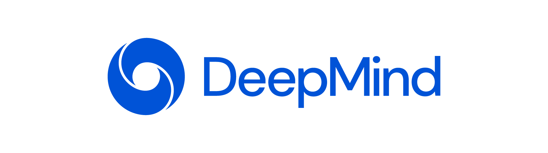
Google DeepMind: DeepMind’s abstract swirl logo also reflects intelligence and collaboration, but its organic shape feels more scientific. ChatGPT’s version feels cleaner and more product-friendly.
Anthropic: The Anthropic logo relies on a minimalist wordmark, projecting simplicity rather than symbolism. In contrast, ChatGPT uses geometry to create immediate visual association.
Claude: Anthropic’s Claude logo focuses on elegance and minimal typography, while ChatGPT leans into recognizable structure—ideal for app icons and wide adoption.
Should They Change the Logo?
At this stage, no. The ChatGPT logo is young but already iconic. It strikes a rare balance between futuristic and friendly—qualities essential for an AI tool aimed at broad audiences.
If OpenAI were to redesign, the only potential refinement might involve subtle color adjustments or motion adaptations for animation, but the core structure should remain untouched. Its geometry has quickly become synonymous with ChatGPT itself.
Conclusion
The ChatGPT logo perfectly encapsulates what modern AI stands for: intelligence, collaboration, and structure wrapped in simplicity. Its clean geometry and symbolic depth make it memorable, scalable, and instantly recognizable across digital spaces.
For brands looking to create a timeless tech logo, the ChatGPT design demonstrates how mathematical precision and emotional warmth can coexist beautifully. At our Rabbit logo design agency, we help companies craft modern, meaningful logos that capture innovation just as effectively.