The Mastercard logo is one of the most recognizable symbols in global commerce — simple, modern, and instantly trusted. Designed with two intersecting circles, it perfectly embodies connection and exchange. Our logo design company often refers to this mark as a masterclass in minimalist communication and brand consistency.
The Origin of the Mastercard Logo
The Mastercard logo first appeared in 1966, introduced by the Interbank Card Association. The original design already featured the iconic red and yellow overlapping circles, representing cooperation between multiple banks and the flow of transactions. Over time, the design evolved — but the two circles remained constant, symbolizing partnership and trust.
In 2016, Mastercard unveiled a major redesign by the branding firm Pentagram. This $15 million project refined the logo into a pure visual mark — removing the interlocking lines and simplifying the overlap into a transparent orange hue. The word “Mastercard” was later moved below the circles in lowercase sans-serif type, signaling a shift toward digital simplicity.
What Type of Logo Is It?
The Mastercard logo is an abstract logo — a visual symbol paired with the brand name. While the circles themselves can stand alone (as seen in app icons and payment terminals), the wordmark provides clarity in corporate or print use.
This balance between abstract geometry and clean typography allows Mastercard to maintain recognition across multiple contexts — physical cards, digital wallets, or contactless payment screens. Its strength lies in how easily the logo functions both with and without the text.
Design Elements and Symbolism
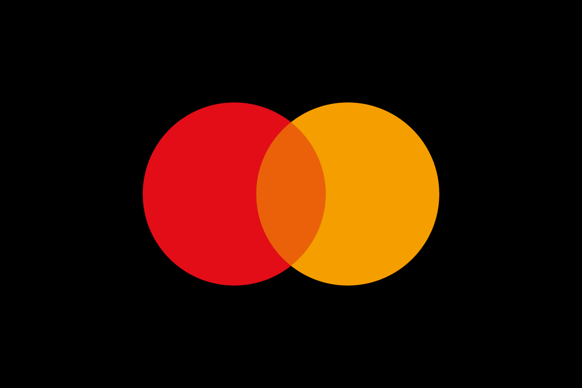
The logo’s design centers on two overlapping circles — one red, one yellow — that merge to form an orange intersection. Each color carries distinct meaning:
-
Red symbolizes energy, passion, and financial confidence.
-
Yellow evokes optimism, clarity, and accessibility.
-
Orange, formed in the middle, represents the connection between consumers and merchants — a metaphor for Mastercard’s purpose: enabling seamless transactions.
The lowercase typeface introduced in the redesign uses the FF Mark font, which reflects approachability and technological ease. The overall layout embodies equality — no single circle dominates, echoing Mastercard’s emphasis on partnership.
Brand Recognition & Global Impact
In global recognition tests, over 90% of participants identified Mastercard purely by its two intersecting circles — even when the wordmark was removed. That level of recognition rivals brands like Apple and Nike.
The logo’s consistency across decades has strengthened Mastercard’s credibility. From plastic cards to mobile apps, the design feels familiar and secure. Its clarity at small sizes makes it perfect for digital-first branding — a major advantage in today’s fintech landscape.
Does the Mastercard Logo Work in Small Sizes?
Absolutely. The Mastercard logo performs exceptionally well in small formats. The bold geometric circles retain clarity even on smartwatch screens and mobile payment icons. Its simple color palette and symmetry make it highly adaptable across any resolution.
This scalability reflects a key principle of timeless logo design — simplicity outlasts trends. The logo’s strength lies in the fact that its core idea (connection through overlap) doesn’t rely on text or fine details.
How Mastercard Compares to Competitors
Visa uses a clean wordmark logo that focuses on trust and readability. It’s strong in typography but lacks an abstract symbol, making Mastercard more visually distinctive.
American Express features a wordmark in a blue box, conveying prestige and authority. While elegant, it’s more text-heavy and less adaptable in minimalist contexts.
PayPal, a newer digital rival, uses a combination mark of overlapping P’s to symbolize peer-to-peer transactions — similar in concept to Mastercard’s overlap, but more futuristic in tone.
Should They Change the Logo?
No — Mastercard’s logo is already a textbook example of modern minimalism. Any major change could weaken the decades of recognition it has built. The current form balances timeless geometry with contemporary usability. Minor refinements for digital clarity could continue, but the core symbol should remain untouched.
Conclusion
The Mastercard logo proves that simplicity and meaning can coexist beautifully. Its twin circles — representing connection, trust, and exchange — have become an international shorthand for reliability in payment systems. The seamless blend of form and function is what keeps it relevant in an ever-evolving financial world.
At Rabbit, we help businesses craft similarly iconic designs — logos that communicate instantly, adapt effortlessly, and build trust over time.