In branding, there’s beauty in simplicity—and few logo styles do that better than the monogram logo.
By combining just two or three letters, monograms can say everything a brand stands for in the most efficient visual form possible. They’re elegant, memorable and versatile. From luxury fashion houses to elite athletes and forward thinking tech brands, monograms are a favourite across industries.
But what makes a monogram logo work? Why does something so simple feel so iconic?
In this post we’ll break down what monogram logos are, explore the design principles, show you famous examples and how to create one for your brand.
What is a Monogram Logo?
![]()
A monogram logo is a stylized design made by combining a brand’s initials—usually two or three letters—into one unified symbol.
Unlike a lettermark (which usually just arranges initials using typography), a monogram interlocks, overlaps or merges those letters into a single, graphically cohesive unit. The result is more than just readable text—it’s a piece of visual identity.
Key Features:
-
2–3 letters (e.g. LV, YSL, LN)
-
Letters are merged or interwoven
-
Focus is on form, balance and style
-
Often minimal but always intentional
Think of it as the designer’s version of initials—streamlined and symbolic.
Why Brands Choose Monogram Logos
![]()
1. They’re Elegant and Timeless
Monograms have roots in royalty, history and design tradition. They were once used on coins, crests and family emblems. Today that legacy continues in fashion, architecture and premium product design.
The simplicity of a monogram allows it to age well. It doesn’t rely on trends—it relies on clarity.
2. Monogram Logos are Scalable
From watch faces and business cards to billboards and packaging, monograms scale easily. Because they’re usually geometric and compact, they retain their integrity at small sizes.
3. They Feel Premium
Minimal design often signals confidence. When a brand simplifies its identity down to two or three letters—and still feels unmistakable—it communicates strength, elegance and refinement.
4. Monogram Logos are Perfect for Dual Identities
For individuals or founders whose initials carry weight (think: fashion designers, athletes or artists), monograms are an easy way to create personal brand marks.
Monogram vs Lettermark: What’s the Difference?
Monogram logos and lettermarks are often confused because they both use initials—but they serve different purposes and take very different design approaches.
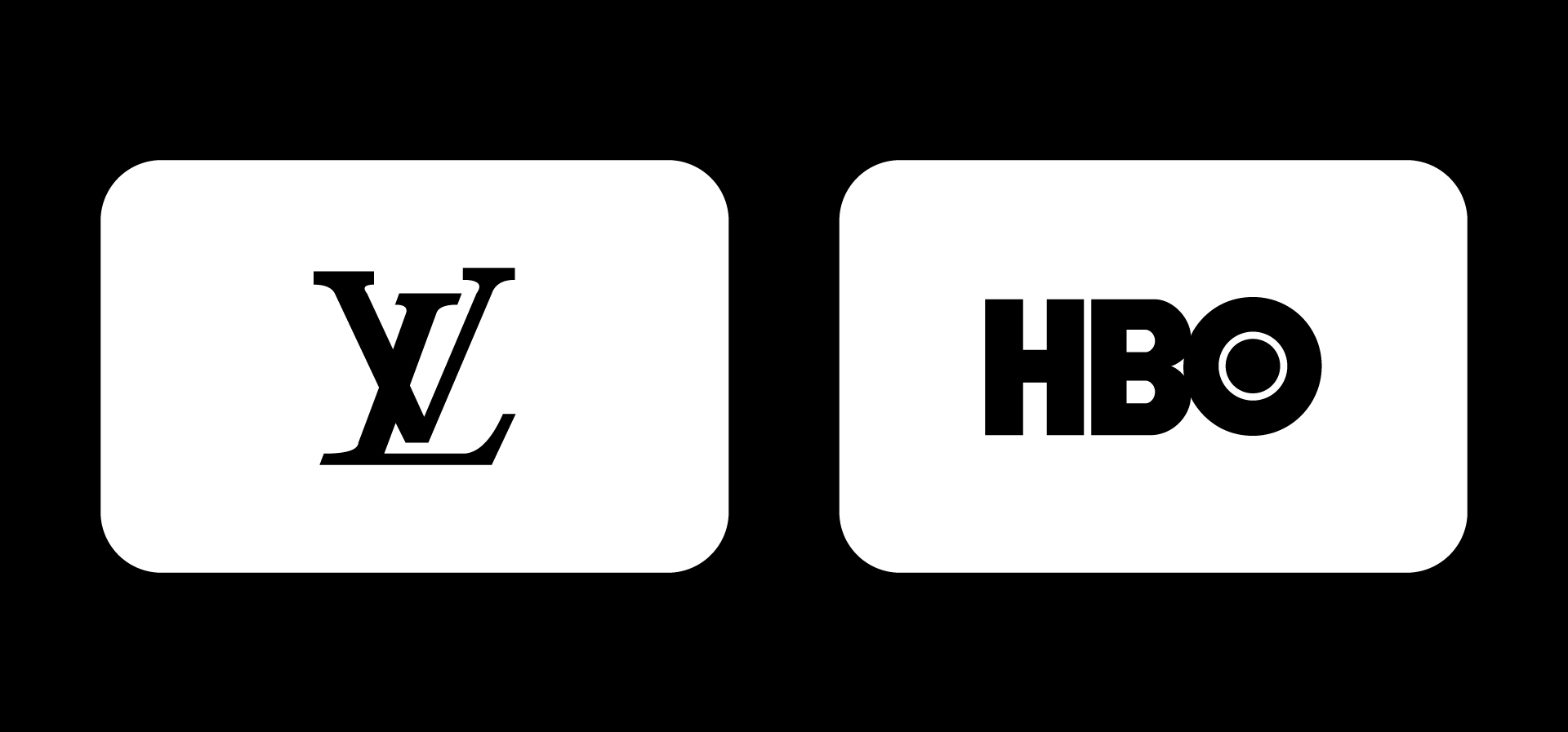
A lettermark is straightforward. It uses a brand’s initials in clean, readable typography—think of logos like IBM, CNN or HBO. The focus is on clarity and simplicity, with very little stylization. This type of logo works well for long or complex brand names that need to be shortened without losing recognition.
A monogram is more stylized. It combines the initials into a single, integrated design. Letters may be overlapped, mirrored or fused to form a distinct graphic mark. This gives the logo a more crafted and often more luxurious feel. Brands like Louis Vuitton or Chanel use monograms not just for recognition but to signal timelessness and elegance.
So while both use initials, a lettermark prioritizes readability and efficiency, while a monogram leans into style, symbolism and visual unity.
If you’re using initials as a design element (not just typography), you’re in monogram territory.
Famous Monogram Logos That Get It Right
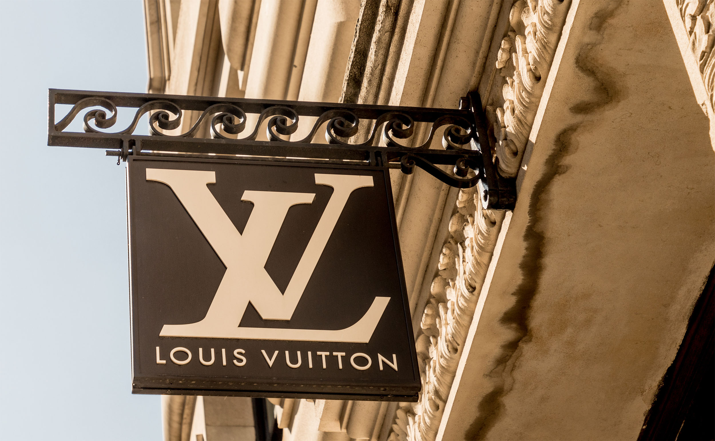
1. Louis Vuitton (LV)
![]()
One of the most iconic monograms in fashion. The interlocking “L” and “V” have become a status symbol—appearing on everything from handbags to sneakers. It’s timeless, global and unmistakable.
2. Chanel (CC)
![]()
Chanel logo contains mirrored C’s, symmetrical and luxurious. This logo doesn’t need a name—just two letters, beautifully arranged, carry the entire brand.
3. New York Yankees (NY)
![]()
The Yankees logo is a sports monogram with legendary status. Even people who’ve never watched a baseball game wear the cap. It’s bold, angular and full of heritage.
4. Lando Norris (LN)
![]()
A modern twist on monograms. The Lando Norris logo merges L and N with sharp geometry—and even hides the number 4 in the negative space.
5. Roger Federer (RF)
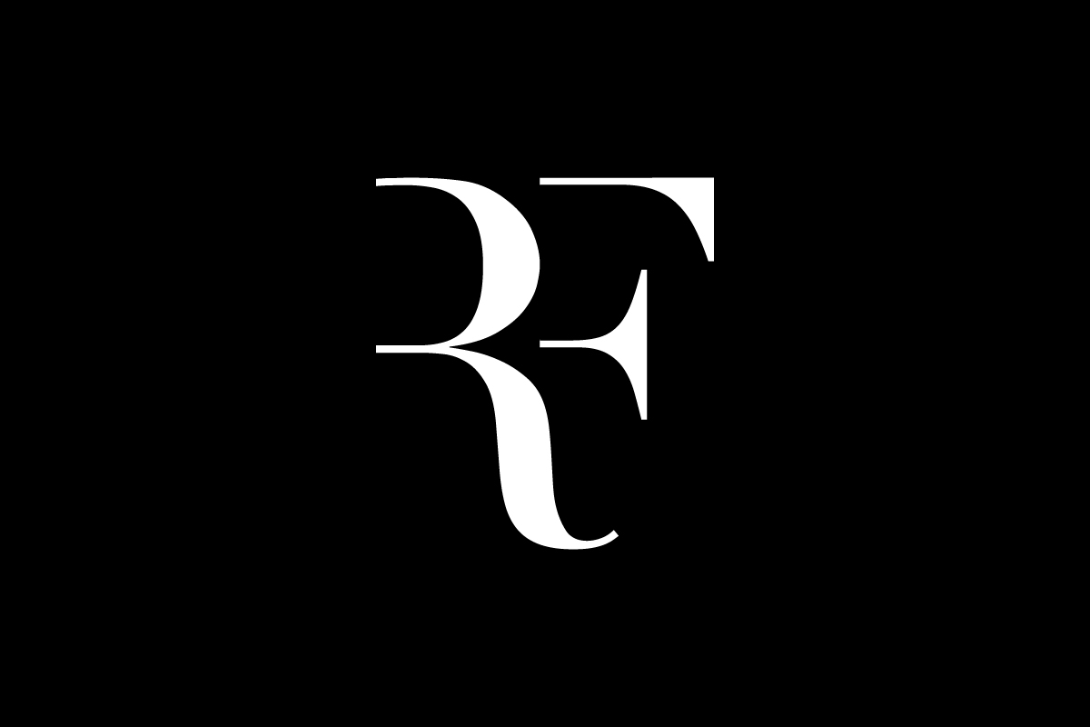
A minimalist Roger Federer’s monogram logo that radiates class and precision. The flowing “RF” intertwines elegance with confidence, just like Federer’s style on the court. It’s refined, balanced, and instantly recognizable—a timeless mark that represents excellence beyond tennis.
6. Tesla
![]()
A sleek metallic “T” shaped symbol representing innovation and futuristic design.
The Tesla logo forms an abstract representation of an electric motor, merging symbolism and technology in a single abstract logo. Its clean geometric lines and symmetry communicate precision, while the sharp point of the “T” evokes progress and forward momentum — aligning perfectly with Tesla’s vision of innovation and sustainable energy.
These examples show the range of expression a monogram can offer—from formal to futuristic.
Negative Space in Monogram Logo
![]()
One of the most powerful design techniques used in monogram logos is negative space—the “empty” areas between or around letters that can be shaped to reveal something else.
Why it works:
-
Adds cleverness and sophistication
-
Creates visual duality (letters + symbols)
-
Increases viewer engagement (“ah-ha” moment)
Lando Norris
In the Lando Norris monogram, for example, the negative space between the “L” and “N” forms the number 4—his racing number. It’s subtle, but once you see it, it adds depth.
TWJ
Another great example is the TWJ logo, a mark we designed for a client in the digital news space. At first glance, you see the bold “T” and “J” forming the outer edges—but right between them, shaped by the negative space, is a perfectly formed “W”. It’s a smart use of spatial design that balances form and function. The result feels modern, geometric and surprisingly compact for a three-letter identity.
We go deeper into this in our post on the negative space logo—where absence becomes part of the message.
These kinds of monograms don’t just look sharp—they reward the viewer for paying attention. And that’s the hallmark of great branding.
How to Design a Monogram Logo

Creating a successful monogram involves more than just choosing a font. It’s about composition, spacing and flow. Here’s a basic roadmap:
1. Start with Your Initials
Most monograms are made from 2–3 letters. Choose the ones most relevant to your brand—whether it’s your full name (e.g. RM for a personal brand) or company name (e.g. HP for Hewlett-Packard).
2. Sketch Combinations
Experiment with stacking, overlapping and mirroring. Explore how the letters interact—where can you create visual harmony or tension?
3. Focus on Balance
Monograms should feel symmetrical or intentionally asymmetric. Watch your negative space—make sure it feels intentional.
4. Simplify
Strip out unnecessary details. Think about how it would look embroidered on fabric or stamped on packaging.
5. Test in Multiple Sizes
A good monogram should work on a favicon, a hat or a billboard. Test it across a range of applications.
When a Monogram Logo Is (and Isn’t) Right for You
Great choice if:
-
You have a strong personal name or set of initials
-
You’re building a luxury, fashion or premium-feel brand
-
You want a simple, scalable mark without needing full words
-
You’re in a visual industry: design, fashion, architecture or performance
Not ideal if:
-
Your initials are hard to combine legibly
-
You’re still building name recognition (wordmarks help with memorability)
-
Your audience is more casual or mass-market focused
Monograms are powerful—but they’re not for every brand. Think strategically.
Use Cases
-
Fashion – Clothing tags, labels and embroidery
-
Luxury Goods – Jewelry, watches, leather goods
-
Sports – Athlete branding, custom merch, helmets
-
Interior Design – Signage, minimal web design, product lines
-
Tech – App icons, UI design, clean packaging
They also work beautifully in minimalist brand systems—where the monogram becomes the signature across digital and physical touchpoints.
Conclusion
The monogram logo is a timeless expression of brand identity. It’s your brand in its purest form—two or three letters, perfectly arranged.
It can be bold or delicate, classic or contemporary, literal or symbolic. And when designed well, it’s more than a logo—it’s a badge of confidence.
In a world of noise, monograms stand out by saying less—and meaning more.