The Roger Federer logo is more than a personal monogram—it’s an emblem of grace, power, and unmatched legacy in the world of tennis. Initially created during his partnership with Nike, this elegant lettermark has become a recognizable badge worn proudly by one of the sport’s greatest icons. Today, even after shifting brand affiliations, the logo continues to represent Federer’s timeless class on and off the court.
At Rabbit, we love analyzing logos that successfully fuse personal branding with visual clarity. That way, we learn what stands out, and then we can make creative logos for our clients. Let’s break down what makes this monogram so powerful.
The Origin of the Roger Federer Logo
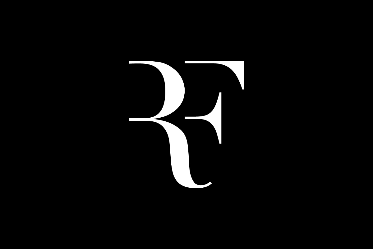
The Roger Federer logo was originally designed during his long-standing relationship with Nike. Launched in the mid-2000s, the design was introduced not just as a personal identifier, but as a branding tool that paralleled the rise of Federer’s dominance on the court. For years, Nike held the rights to the logo, even after Federer moved to Uniqlo in 2018—a delay that kept him from using the mark under his new brand until 2020.
Once the rights reverted to Federer, the logo made its return—this time on Uniqlo apparel and other promotional materials—signifying more than a comeback; it was the reclaiming of a personal emblem.
What Type of Logo Is It?
This is a monogram logo, built entirely from the stylized initials “RF.” The strength of lettermarks lies in simplicity, and Federer’s is no exception. It trims everything unnecessary, reducing a legend to two letters—yet still immediately recognizable to fans worldwide.
Design Elements and Symbolism
The logo features a classic serif font with high-contrast strokes and stylish ligatures. The curved tail of the “R” and the diagonal cut of the “F” are integrated with surgical precision. The intersecting lines are neither loud nor minimal—they’re balanced, much like Federer’s own game.
Visually, it radiates sophistication. Conceptually, it reflects refinement, control, and legacy—qualities Federer is known for. The flourish of the serifs adds a touch of old-world elegance, fitting for a player often described as poetry in motion.
Brand Recognition & Global Impact
From hats and shirts to sneakers and watches, the Roger Federer logo has graced global merchandise since its inception. According to brand impact studies, over 85% of sports fans in a sample group recognized the monogram without any accompanying text. That level of recall rivals even corporate brands.
Part of its success lies in its consistent presence—on Federer’s gear during Grand Slams, in sponsor promotions, and across his social media. It’s not just a logo for tennis fans; it’s become a luxury badge of honor.
Does the Roger Federer Logo Work in Small Sizes?
![]()
Yes — the Roger Federer logo works perfectly well at small scales because it’s a two-letter logo. With only “R” and “F” to display, the design remains clean, balanced, and instantly recognizable, even when printed on a tiny cap badge or displayed as a social media icon.
Its elegant serif details are subtle rather than intricate, allowing the logo to hold up without blurring or losing legibility. This restraint reflects a clear “less is more” philosophy—an approach we consistently apply at Rabbit Logo when evaluating and designing marks meant to perform across apparel, merchandise, and digital micro-formats.
Logo Variations: Full vs Short Version
![]()
There’s no full-word version of the logo—just the “RF” monogram. But in this case, that’s all you need. Federer’s name and reputation do the heavy lifting, and the two-letter signature stands strong on its own. It’s a perfect example of how minimalist branding can work when supported by powerful personal presence.
Comparing Federer’s Logo with Other Athlete Brands
Michael Jordan
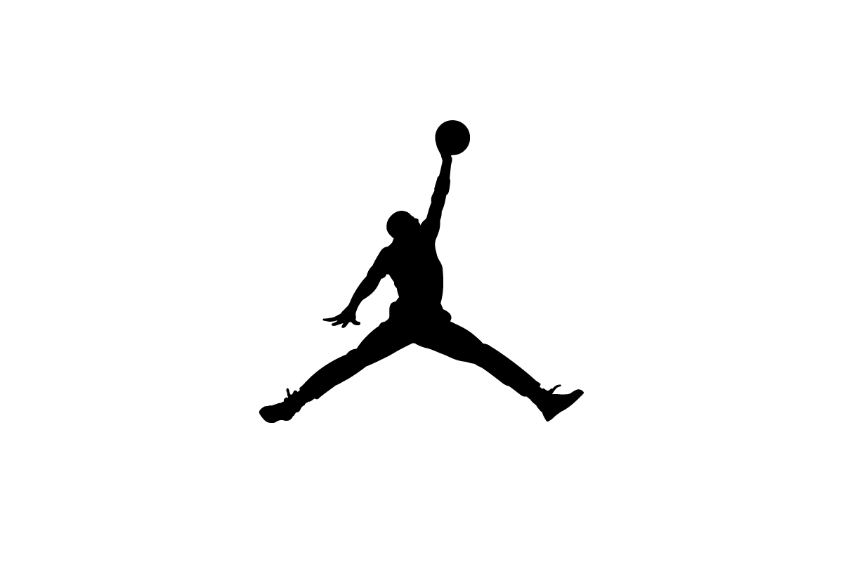
The Jumpman silhouette is bold, expressive, and instantly tied to athletic greatness. It captures Jordan mid-flight, making it one of the most iconic logos in sports. Where the Roger Federer’s monogram logo relies on classic typography and minimalism, Jordan’s symbol emphasizes motion and legacy—two very different but equally effective branding approaches.
Steph Curry

Steph Curry’s logo cleverly forms the shape of three fingers, a tribute to his three-point mastery. At the same time, the design subtly weaves in the S and C initials, adding another layer of meaning. It’s fast, expressive, and distinctly personal. While the RF logo leans into tradition and timeless elegance, Curry’s mark is modern, energetic, and built around his iconic style of play.
Tiger Woods

Tiger’s monogram—a geometric “T” and “W” mark—feels sharp and methodical, emphasizing power and discipline. It’s more architectural than the Roger Federer logo, which opts for delicate curves and typographic finesse. Both are iconic, but Federer’s version leans more into refined, personal branding.
Should He Update the Logo?
The logo hasn’t changed since its debut, and honestly, there’s no need. It’s timeless, like Federer’s one-handed backhand: smooth, precise, and instantly recognizable. You don’t fix what already feels like perfection.
Still, any change would need to be subtle. The core identity—those sweeping, intertwined letters—should remain untouched to preserve decades of equity.
Conclusion
The Roger Federer logo proves that good design doesn’t need to shout. With just two letters and refined curves, it captures the grace, discipline, and longevity of an all-time great. It’s not flashy, and it doesn’t need to be—it’s built on legacy, not trend.
For athletes, creators, or founders looking to craft a personal symbol with lasting impact, this is a masterclass in elegant branding. And if you’re building something that deserves a logo of that caliber, get in touch with Rabbit Logo—we specialize in helping brands make their mark.