The Yankees logo is one of the most recognizable symbols in sports history. Simple, bold, and instantly familiar, it represents far more than a baseball team. Over decades, the iconic interlocking “NY” has evolved into a global emblem of success, tradition, and cultural influence—recognized even by people who have never watched a baseball game.
The Origin of the Yankees Logo
The New York Yankees were established in 1901, originally known as the Baltimore Orioles before relocating to New York. As the team’s identity took shape in the early 20th century, so did its visual language.
The now-famous interlocking “NY” was first used in 1909, initially appearing on a commemorative medal honoring fallen police officers. Soon after, the design found its way onto Yankees uniforms, where it became inseparable from the team’s identity. Unlike many logos that evolve dramatically over time, the Yankees mark stayed remarkably consistent—helping cement its legendary status.
What Type of Logo Is It?
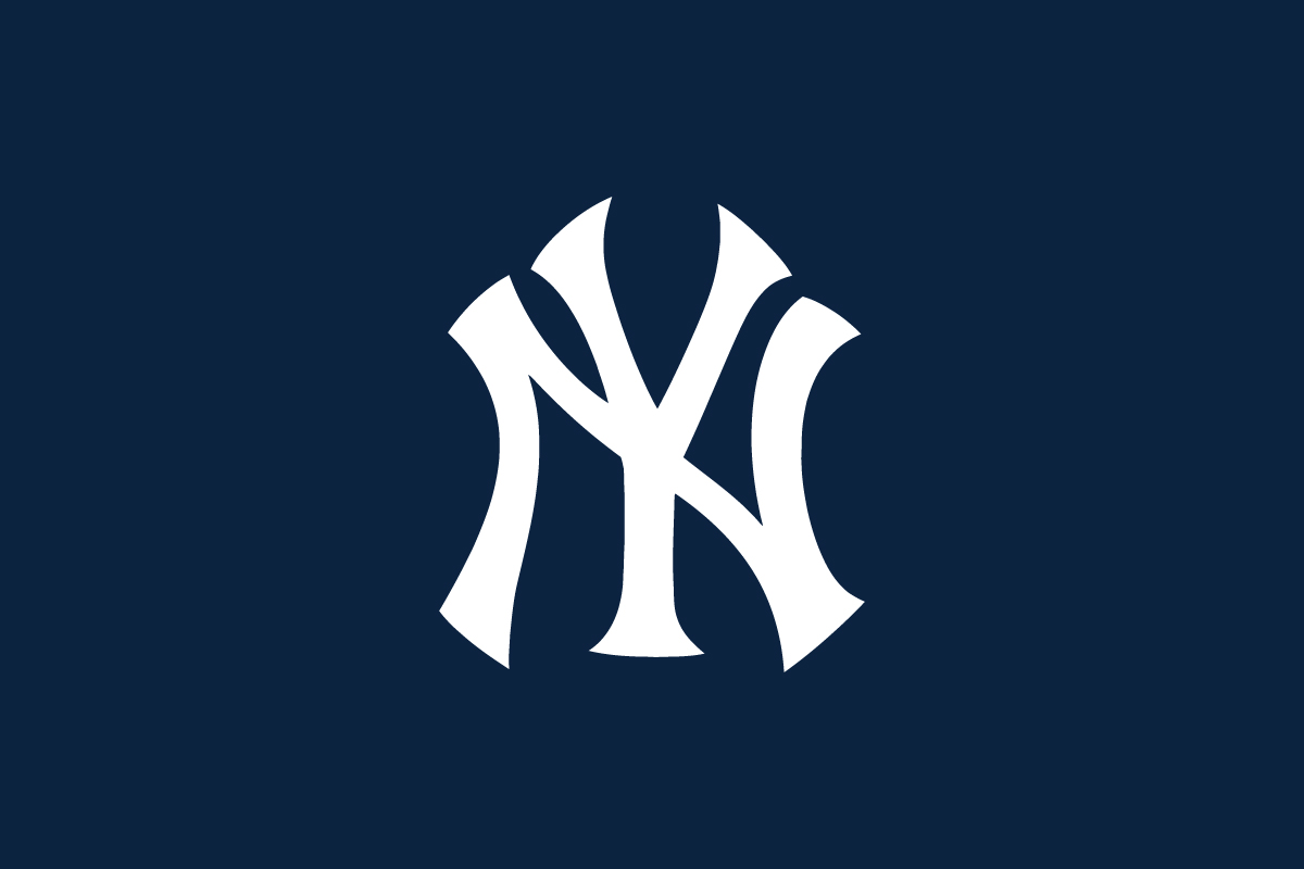
The Yankees logo is a monogram, built entirely from typography. It uses intertwined capital letters to form a compact, symbolic mark that communicates heritage and authority.
This approach is especially powerful in sports branding. By reducing the logo to two letters, the Yankees created something easy to remember, easy to reproduce, and endlessly adaptable—qualities that helped the logo transcend baseball.
Design Elements and Symbolism
The strength of the Yankees logo lies in its restraint:
-
Interlocking Letters: The overlapping “N” and “Y” symbolize unity, teamwork, and tradition. The structure feels deliberate and disciplined, reflecting the organization’s winning mentality.
-
Typography Style: The serif letterforms give the logo a classic, almost ceremonial feel. It looks authoritative rather than playful—perfect for a franchise built on legacy.
-
Color Palette: Most commonly shown in navy blue or black, the logo communicates confidence, professionalism, and seriousness. These colors reinforce the Yankees’ image as a powerhouse franchise.
-
Minimalism: No mascots, no shapes, no slogans—just two letters. This minimalism is exactly what gives the logo its timeless appeal.
Together, these elements make the Yankees logo feel permanent rather than trendy.
Brand Recognition & Global Impact
Few logos in the world rival the Yankees logo in global recognition. It appears far beyond baseball stadiums—on fashion runways, streetwear, music videos, and pop culture icons.
The interlocking “NY” has been worn by athletes, musicians, and celebrities worldwide, transforming the logo into a lifestyle symbol. In recognition studies, a vast majority of respondents can identify the Yankees logo instantly, even without context or sport association.
This success proves a critical branding lesson: consistency builds power. By resisting frequent redesigns, the Yankees allowed their logo to accumulate meaning, history, and emotional value over generations.
Does the Yankees Logo Work in Small Sizes?
Yes—exceptionally well. The compact lettermark scales effortlessly from large stadium signage to small embroidered caps. Its clear structure ensures legibility even at reduced sizes, making it ideal for merchandise, digital platforms, and accessories.
This scalability is one of the main reasons the Yankees logo works so well across fashion and lifestyle products, not just sports apparel.
How the Yankees Compare to Other MLB Logos
Los Angeles Dodgers: Uses a script wordmark that feels energetic and expressive. The NY logo is more restrained and formal, emphasizing legacy over flair.
Boston Red Sox: Features a pictorial emblem with red socks, leaning into symbolism. The Yankees rely purely on typography, which feels more timeless and authoritative.
Chicago Cubs: Uses a lettermark inside a badge, combining text and shape. The NY logo is even more minimal, making it more versatile across non-sport contexts.
Among MLB teams, the Yankees logo stands out for its simplicity and cultural reach.
Should They Change the Logo?
Absolutely not. The Yankees logo is a rare example of a design that has become untouchable. Any major change would risk weakening a century of recognition and emotional connection.
Instead of redesigning, they have wisely focused on consistent application—allowing the logo to live across uniforms, merchandise, and global collaborations without altering its core form.
Conclusion
The Yankees logo proves that true strength in design comes from clarity and consistency. With just two interlocking letters, it communicates dominance, heritage, and global influence—qualities most brands spend decades trying to achieve.
It’s not just a sports logo; it’s a cultural symbol. We believe the best logos work the same way—simple in form, powerful in meaning, and built to last. The Yankees logo is a perfect example of how timeless design can turn a brand into a global icon.