Famous logos have a weird power. A single shape or color can instantly bring back memories, emotions and even loyalty to a brand. Some logos are so ingrained in culture that they don’t need an introduction. You see a swoosh and you think of Nike. A bitten apple and you think of Apple. The world’s most famous logos didn’t get there by chance — they were designed, refined and managed to achieve global recognition. At Rabbit, we help businesses create logos with the same sense of clarity and longevity, designed to grow into powerful symbols over time.
This article will explore how some of the most well-known logos became iconic, what we can learn from their stories and why design still plays such a big role in shaping a brand’s future.
What Makes a Logo Famous?
Before we get into the stories, it helps to understand why some logos stand out from the rest. A famous logo usually checks three boxes:
-
Instant recognition – You don’t need text to know what brand it belongs to.
-
Emotional association – The design makes you feel something, whether that’s trust, aspiration or excitement.
-
Consistency over time – Even if a logo evolves, it keeps its core intact so customers never lose familiarity.
Recognition is the ultimate test. If you can identify a company without reading its name, that logo has achieved what every designer dreams of — becoming a universal symbol. But this level of recognition doesn’t happen overnight, especially for new businesses. Startups rarely succeed by jumping straight into a stand alone pictorial logo. Instead, many smart brands start with a combination mark logo — pairing their name with a symbol. Over time, as the brand gains popularity, the symbol can stand alone. Nike’s swoosh is the perfect example: what began as a supporting graphic has now become the only mark they need.
Consistency is just as important as creativity. Choosing the right brand name from the beginning ensures you won’t need to reinvent it later which can break recognition. I once watched a Champions League match and I saw the bold orange Just Eat logo on the pitch. A few months later I saw the same design paired with a different wordmark: Takeaway. For a moment I couldn’t even remember what the company was originally called. That hesitation is exactly what brands should avoid. If the logo changes too often — or if the name isn’t stable — recognition is lost and with it trust.
In short, famous logos become famous not just because they’re beautifully designed but because they’re introduced smartly, built with patience and supported by consistent brand decisions over years. Many of today’s most recognizable marks also sit within a carefully developed logo system where a company can use variations — from full combination marks to simplified symbols — without losing recognition. This flexibility ensures the logo grows with the brand while maintaining consistency across every channel.
Examples of the World’s Most Famous Logos
Now that we’ve explored what makes a logo truly iconic, it’s time to look at the brands that have mastered it. These examples show how a simple design combined with the right strategy can become a global symbol. Each one has a story worth studying — not just for its design choices but for how the brand managed consistency, evolution and recognition over time.
Nike’s Swoosh: From $35 to Billions in Brand Value
![]()
The Nike swoosh was born in 1971, sketched by a design student named Carolyn Davidson. It cost the company just $35. Yet that simple curved stroke became one of the most recognized marks in the world.
Its success lies in more than minimalism. The swoosh suggests movement, speed and momentum — everything Nike wanted athletes to feel. Decades later it still captures that essence without needing a wordmark alongside it.
Apple’s Bite of Simplicity
Apple’s famous logo has gone from a colorful rainbow in the 1970s to the sleek monochrome bite we know today. What makes it memorable is the balance of symbolism and simplicity. The apple as a shape is universal, while the bite prevents confusion with other fruits.
The shift to a flat, polished mark reflects Apple’s design philosophy: clean, futuristic and adaptable across devices. Whether it appears on a MacBook or an iPhone the logo never feels outdated.
FedEx: A Hidden Story in Plain Sight
![]()
Few famous logos spark as much delight when people notice the hidden detail. In the FedEx wordmark a subtle arrow forms between the “E” and the “x”. Designed in 1994 by Lindon Leader it’s a masterclass in using negative space.
That hidden arrow reflects speed and precision, two things customers expect from a delivery company. The brilliance is that you don’t need to consciously notice it for the design to work. But once you do you never forget it.
Adidas and the Three Stripes
![]()
Adidas has never changed its stripes. From shoes to clothes the three-stripe motif has been part of every logo — whether the trefoil leaf in the 1970s or the angled performance mark today.
The stripes are for durability and overcoming obstacles, perfect for the athletic spirit. They’re also a visual language: athletes wearing the stripes don’t just represent Adidas, they represent performance itself.
Starbucks: A Siren That Welcomes You In
![]()
Unlike Nike or Apple, Starbucks went for storytelling and mythology. Its green siren logo is nautical in origin, tied to Seattle’s port heritage. Over time the design was simplified, removing text and detail until only the siren remained.
The result is an icon that needs no explanation. When you see it you think coffee. It’s also a great example of scalability: even without words the mark works on paper cups to international storefronts.
Netflix: Designed for the Digital Age
![]()
The Netflix logo is a more recent success story. Originally a wordmark tied to its DVD-by-mail roots it evolved into the flat red “N” that dominates streaming today. The ribbon-like design works in app icons, social feeds and digital screens where space is limited.
Netflix shows how famous logos must adapt to technology. The bold “N” is built for a mobile-first world, keeping brand recognition high even when reduced to a single letter on a small screen.
Coca-Cola: A Script That Never Went Out of Style
![]()
Coca-Cola’s logo has changed little since 1886 when Frank Mason Robinson created the flowing Spencerian script. The red-and-white color scheme quickly became synonymous with refreshment and joy, reinforced by decades of advertising campaigns.
The power of the Coca-Cola mark is consistency. While competitors changed styles and symbols Coca-Cola stuck to tradition, proving that typography alone can be one of the most enduring logos of all time.
Facebook: A Wordmark That Defined an Era
When Facebook launched in 2004 its logo was just a blue wordmark. The color wasn’t arbitrary — Mark Zuckerberg is red-green colorblind so blue was the clearest option. Minor tweaks over the years have modernized the font but the overall look remains the same.This consistency helped Facebook scale trust as it grew from a college network to a global platform. Even as the parent company rebranded to Meta in 2021 the original Facebook’s famous wordmark is still recognizable worldwide.
Puma: A Leaping Symbol of Power
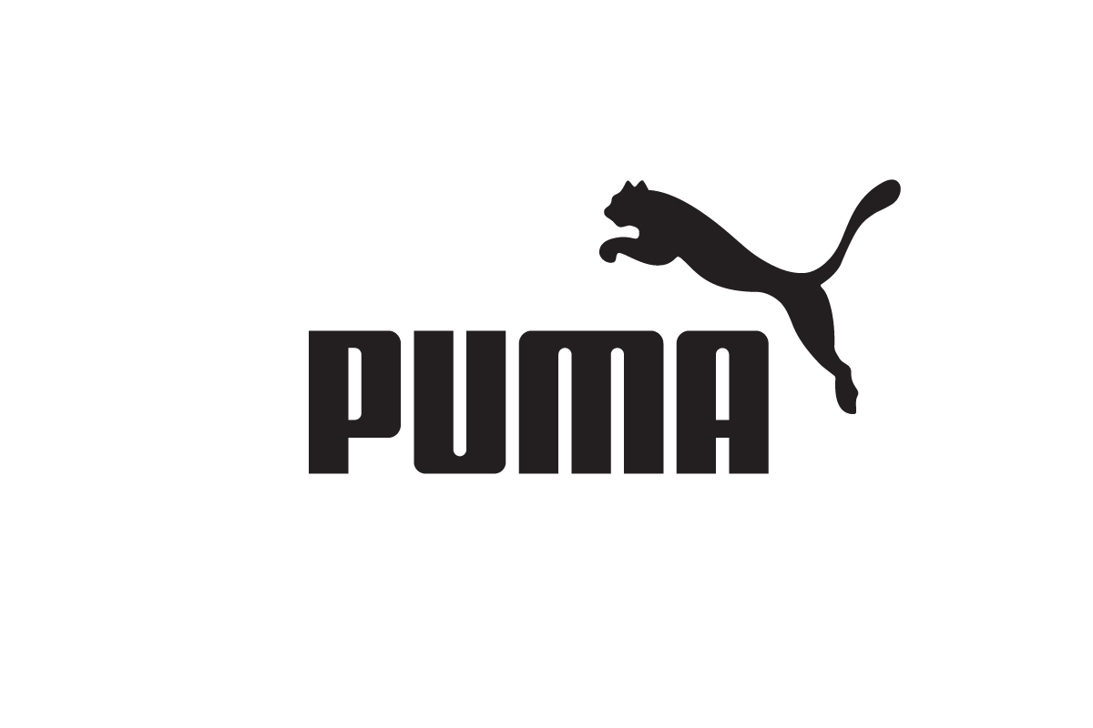
The Puma logo featuring the silhouette of a leaping cat is strength and agility in one image. Introduced in the mid-20th century it quickly became one of the most iconic animal-based sports famous logos.
Originally paired with the company’s wordmark the leaping puma has gained enough recognition to often stand alone, symbolizing speed and performance across sneakers, jerseys and international sponsorships.
Pepsi: Reinvention Never Stops
![]()
Since 1898 Pepsi’s logo has gone through more than a dozen redesigns. From decorative scripts to bold geometric shapes the brand has constantly experimented with visual identity. The one constant has been the red, white and blue globe introduced in the 1950s.
Each redesign reflects the design trends of its time, making Pepsi’s mark a mirror of the eras. While Coca-Cola stuck to tradition Pepsi went for reinvention — a strategy that kept it relevant across generations.
Amazon: A Smile That Means Everything
![]()
Amazon’s logo looks simple at first glance: a lowercase wordmark with a yellow arrow underneath. But that arrow is a smile and stretches from A to Z, representing customer satisfaction and the brand’s vast product range.
Since 2000 the famous logo has remained consistent as Amazon expanded into streaming, cloud services and technology. The combination of friendliness and hidden meaning makes it one of the most effective logos of the modern era.
Google: Colors of Fun and Simplicity
![]()
Google’s logo has always been a wordmark but its playful use of colors makes it one of the most recognized in the world. The primary colors are in sequence but the green “L” breaks the pattern, representing Google’s spirit of innovation and thinking different.
Since 1998 the logo has gone through subtle refinements, from serif fonts to the current geometric sans-serif style. Each change modernized the look while preserving the color sequence that billions of people see every day across devices.
McDonald’s and Their Two Arches
![]()
The McDonald’s logo introduced in the 1960s turned architectural design into branding. The golden arches originally framed the first restaurants but soon merged into the stylized “M” we know today. Bright yellow on red became an international signal for fast food.
The arches are one of the most recognized symbols in the world often visible from highways before the restaurant itself. Their strength is in simplicity: a single letter turned into a cultural landmark.
KFC: The Colonel’s Enduring Presence
![]()
KFC’s logo centers on the smiling portrait of Colonel Harland Sanders the company’s founder. First introduced in 1952 the image has been redrawn many times but always retains the bow tie and warm expression that symbolize Southern hospitality.
The combination of a mascot with a wordmark makes KFC’s logo a mascot logo that builds trust through personality. Even as the design modernized the Colonel remains the face of the brand connecting past traditions to present-day fast food culture.
Lululemon: The Symbol of Movement
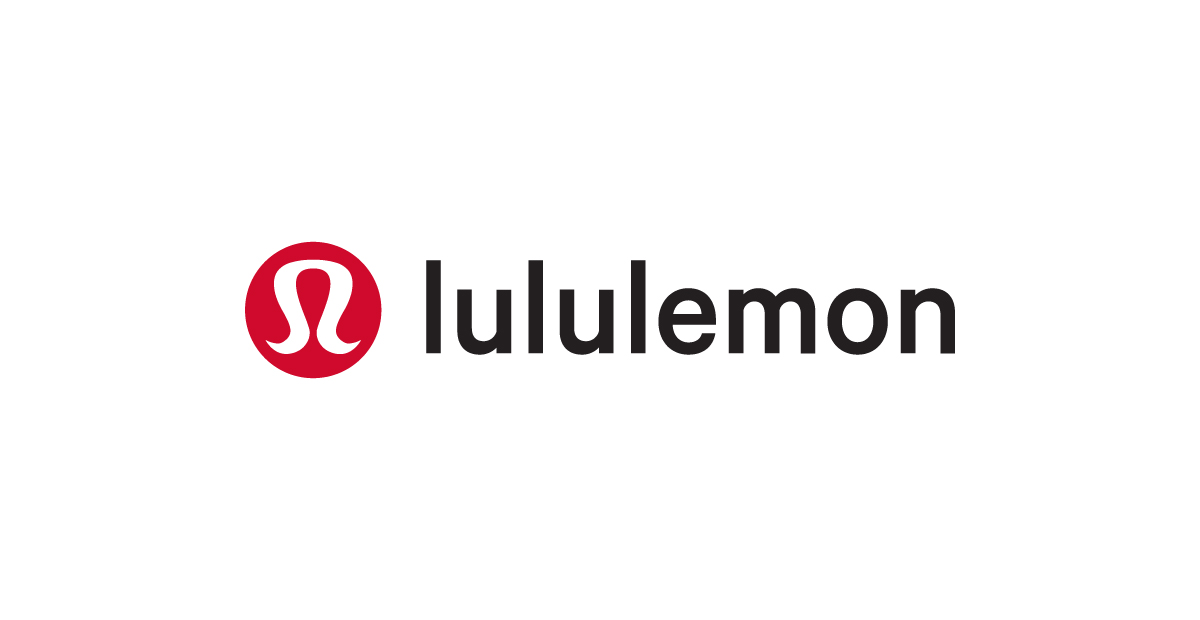
Lululemon’s logo a stylized “A” shape often mistaken for a horseshoe was designed to represent the brand’s focus on athletic apparel. Its smooth flowing lines convey flexibility and movement perfect for yoga and active lifestyles.
Despite being a relatively young brand compared to Nike or Adidas Lululemon’s symbol has become highly recognizable thanks to strong consistency across products, stores and packaging. It proves that a well-executed pictorial mark can rise quickly with the right market positioning.
Twitter: From Bird to X

For over a decade, Twitter’s light-blue bird was one of the most recognizable digitally famous logos symbolizing communication and freedom. The bird became shorthand for tweeting evolving from a detailed design to a clean silhouette.
In 2023 the brand rebranded as X shifting to a bold monochrome wordmark. While controversial the move highlights how logos can carry the weight of massive cultural shifts — from a friendly social media bird to a stark futuristic lettermark.
Lessons from the World’s Biggest Logos
Looking at Nike, Coca-Cola, Amazon and the rest, one thing becomes clear: fame doesn’t come from decoration it comes from clarity and consistency. These logos were designed with purpose refined with patience and supported by strong brand strategies over decades.A few things stand out. The first is simplification — almost every famous logo has been reduced over time to its cleanest form. Think Apple from a rainbow to a monochrome bite or Pepsi from a globe to a simple shape. Second is symbolism — the hidden FedEx arrow, Amazon’s smile or the athletic motion in the Puma leap show how subtle meaning can make a logo unforgettable. Third is adaptability — Netflix designed its “N” to work in app icons while Starbucks created a mark that scales from tiny coffee cups to international storefronts.
But perhaps the most important lesson is consistency. Logos can evolve but they rarely start over. Brands that reinvent themselves too often risk losing recognition while those that stay anchored in one strong idea — like Coca-Cola’s script or McDonald’s arches — become timeless.
From my own experience many clients today ask for logos with multiple focal points — for example a combination mark logo with a symbol plus a wordmark and then an additional “unique touch” in the text itself. I often explain that famous logos show us why less is more. They rarely split attention between two or three competing ideas. Instead they commit: either to a wordmark logo with a distinct textual flourish or to a combination mark logo where the symbol carries the personality while the text remains clean and supportive. That clarity is what makes them timeless.
Conclusion
The world’s most famous logos didn’t become famous overnight. They became cultural symbols because they were designed with intention refined with patience and supported by consistent brand strategy. From Coca-Cola’s enduring script to Nike’s swoosh and Amazon’s smile each design shows how clarity and simplicity can carry a message across generations and continents.
For businesses today the lesson is not to copy these marks but to learn from their journeys. A great logo is less about trends and more about decisions that hold up over time: choosing the right foundation committing to consistency and letting recognition grow with every use. Do that well and your logo doesn’t just represent your brand — it becomes the story people remember.