A logo system is one of the most important innovations in branding. Unlike traditional logos that are fixed, a logo system has multiple variations that adapt to different platforms while maintaining recognition. This flexible approach means a brand can be consistent across everything from mobile apps and social media icons to packaging and billboards.
In a world where attention spans are short and digital touchpoints are endless, a static logo is no longer enough. A well-designed logo system creates a balance between consistency and adaptability. If your business is considering a scalable approach to branding, working with a professional logo design company ensures your system is built to last.
What Is a Logo System?
![]()
At its core a logo system is not a single design but a framework of variations. Each version may differ in layout, scale or format but all share the same core elements. So whether a customer sees the full logo, a shortened mark or even an animated version the brand is instantly familiar.
A brand system often includes a primary logo, simplified secondary versions and standalone icons. Some brands go further and add dynamic or seasonal variations. The purpose isn’t to replace consistency but to give brands the flexibility they need in a world where visual communication is constantly changing.
Why Logo Systems Matter Today
The rise of digital has made flexibility a necessity. A logo that worked perfectly on a storefront or TV ad 20 years ago may now look cluttered on a mobile screen or unreadable as a favicon. Brands need scalable solutions that work regardless of format.
A brand system addresses this by allowing a mark to be responsive. It can shrink to small sizes, be clear across different channels and even adapt to regional or cultural contexts. By having a family of designs instead of one rigid image brands can refresh their presence without losing recognition.
Core Elements of a Strong Logo System
Every good logo system is built on a foundation of clear repeatable elements. These provide the consistency to keep a brand recognisable no matter how the logo adapts.
A strong system usually includes:
-
Primary logo – the main version that anchors the brand.
-
Secondary variations – horizontal, vertical or stacked layouts for different spaces.
-
Icon-only marks – simplified versions for mobile apps, favicons or avatars.
-
Colour options – full colour, monochrome, inverted and high-contrast versions.
-
Typography rules – typefaces that remain consistent across all versions.
-
Motion graphics – animated versions for digital-first platforms.
Together these form a flexible toolkit. The variations are never random they are connected by colour, shape and typography. This balance means brands can adapt their logos for any environment without losing recognition.
Benefits of a Logo System
A logo design system offers more than design variety – it provides strategic advantages that static logos can’t match. The first is consistency. By defining variations ahead of time brands avoid the risk of ad hoc adaptations that dilute recognition.
The second is scalability. A system makes it easier for a company to expand into new markets, products or digital channels without constantly reinventing the logo. It also means recognition across every size and format. A billboard and a mobile app icon may look different but they are clearly part of the same family.
And perhaps most importantly a system provides creative freedom. Marketing teams can experiment with seasonal or campaign specific versions while still staying within defined boundaries. This balance between structure and flexibility makes a brand mark system a long term investment in brand strength.
Famous Logo System Examples
Instacart
![]()
The Instacart logo system shows how a brand scales across contexts. The full version pairs the carrot symbol with the wordmark, the short version uses only the carrot icon. So recognition on mobile apps and large advertising campaigns.
Mastercard
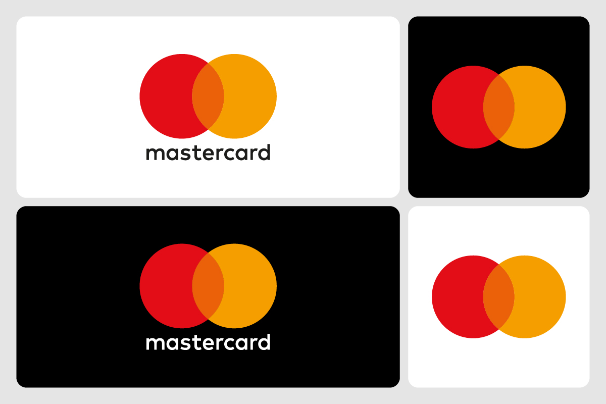
Mastercard’s simplified overlapping circles show how a brand system can evolve towards minimalism. Sometimes paired with the wordmark, sometimes standing alone the system adapts while staying clear.
Dropbox
![]()
Dropbox built a geometric identity system with multiple colours and patterns. The variations give campaign flexibility while the symbol anchors brand recognition.
Nike
![]()
The Nike visual identity system relies on the iconic swoosh. In some contexts it appears with the wordmark, in others the swoosh stands alone, proving simplicity can anchor a global system.
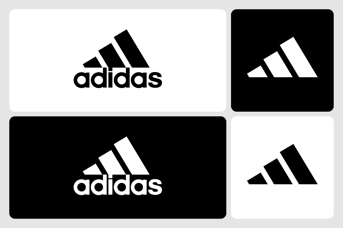
Adidas
Adidas uses multiple variations of its three-stripe system. From the classic trefoil to the performance mark, each version adapts to context while keeping the stripes as the unifying element.
Amazon
![]()
The Amazon logo design system combines a wordmark with its signature smile-arrow. In small spaces the arrow becomes a standalone icon, so the brand works across packaging, apps and digital placements.
Netflix
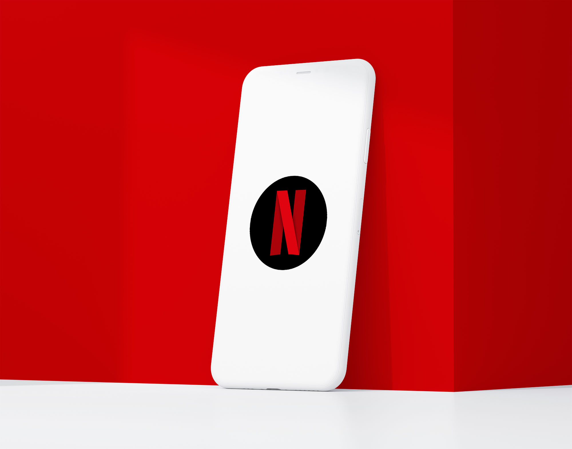
![]()
The Netflix brand system is anchored by the bold wordmark. For compact use the brand often uses the red “N” ribbon, a simplified version that has become instantly recognisable on streaming devices worldwide.
How to Create Your Own Logo System
First define the brand’s core elements – typefaces, colours and symbols that must remain the same across all variations. Then create primary and secondary layouts for different contexts.
A good system also includes simplified icons for small spaces, inverted or monochrome versions for different backgrounds and motion design for digital use. Test the system across billboards to mobile screens to ensure it’s clear and recognisable.
Finally documentation is key. A set of brand guidelines ensures everyone using the system – designers, marketers or partners – applies it correctly. Without rules even the best designed system will lose consistency.
Common Mistakes to Avoid
Brand mark systems don’t always succeed. Some fail because they have too many variations and confuse the audience about what the brand looks like. Others fail because typography or symbols are inconsistent and break the visual link between different versions.
Another common issue is overcomplication. Motion or animated versions can be cool but if they distract from recognition they undermine the purpose of the system. The same applies to logos that don’t work at small sizes. If an icon doesn’t work as a favicon or app icon the system is incomplete.
A system requires discipline. Flexibility is powerful but only when balanced with consistency.
The Future of Logo Systems
As digital-first environments grow brand systems will become even more important. Brands are already experimenting with AI driven designs that adapt to context or audience. In the near future logos may personalise themselves based on user preferences while staying within a framework.
Motion will also play a bigger role. Many companies are starting to design animated versions first with static marks as secondary. This reflects the dominance of video and interactive platforms in modern communication.
The future of branding won’t be about static symbols but intelligent systems that adapt without losing clarity.
Conclusion
A logo system is more than a design trend – it’s a solution to the challenges of modern branding. By providing consistency, flexibility and recognition across every platform it ensures brands stay strong and relevant in a digital-first world. Instacart’s scalable versions, Google’s doodles and MTV’s dynamic graphics prove adaptability is not a flaw but a feature. For businesses to stay relevant building a system is no longer a nice to have – it’s a must have.