Walking into Zara logo is like walking into a full spread in a fashion magazine. Everywhere you look, you see clothing that is accessible but classic, elegant but affordable, an aesthetic that permeates every last aspect of the fashion giant … right down to its brand identity and wordmark logo.
While the logo has received widespread accolades for its aesthetic appeal, it’s not merely a pretty design. Indeed, it carries a great deal of responsibility for conveying the company’s vision and strategy to the wider world.
That’s not to say it has remained static over the years, however. Much like the FedEx logo, it has been updated over time to reflect changes in the fashion line’s overall direction. It is our goal in this piece to take a look at those changes and see if we can draw some conclusions from them that you might apply to your own brand.
Specifically, we’ll take a look at aspects of the brand such as its history, chosen typeface, design choices across the years, and overall symbolism.
Rare is the brand that can pack so powerful a punch into a few simple letters. Let’s take a look at just how the Zara logo does it.
A Brief History of Zara’s Wordmark Logo
![]()
Among the many types of logos, the wordmark logo is one of the starkest and simultaneously the most effective.
Although it seems like quite a modern brand, it actually has a 50-year legacy in the fashion industry. Its original logo, hailing from 1975, employed simple serif letters for a casual yet chic vibe that translates into effortless simplicity. This delicate minimalism has shone through every redesign over the years.
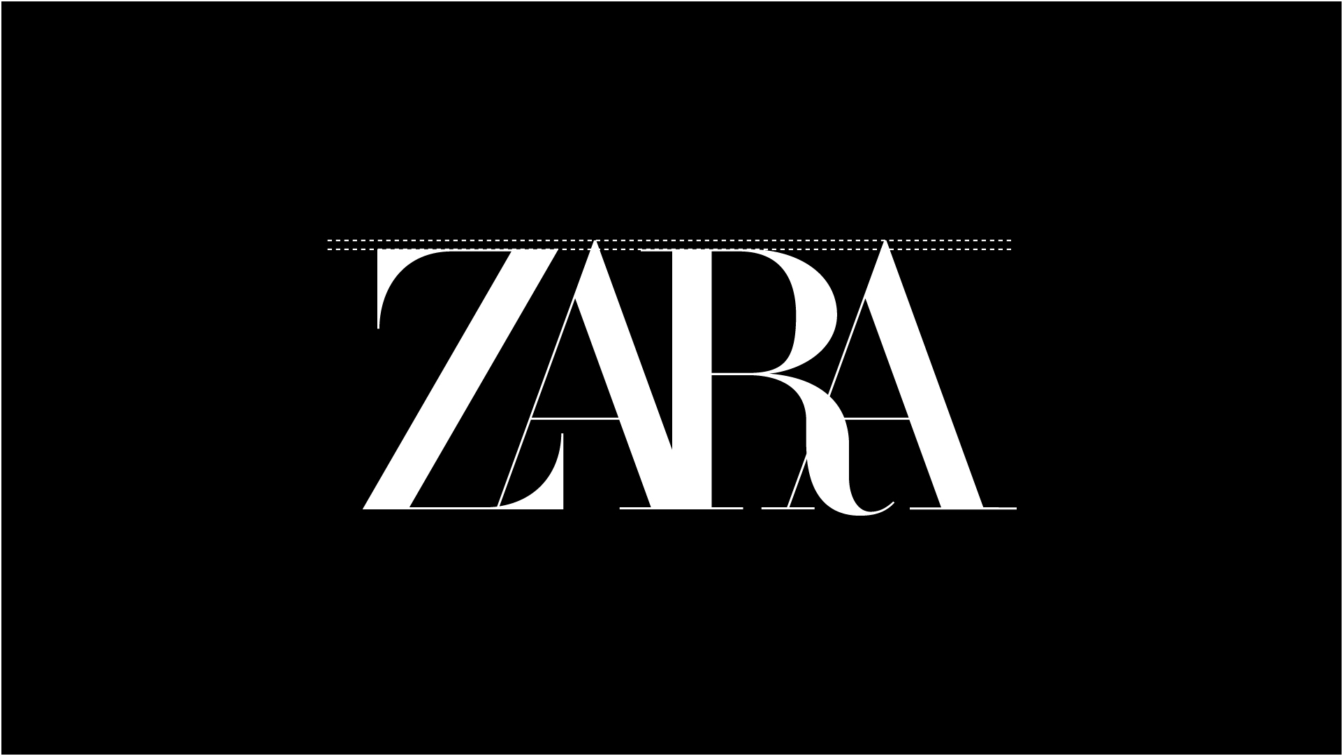
Until, that is, 2019, when the brand decided to take a bigger risk. New Zara logo made several changes, foremost among them a distinct tightening of the kerning — the space between individual letters in a word or brand name.
Indeed, the new design saw so much reduction in spacing that the letters overlapped, which changed the Zara logo significantly. Gone was the easy elegance; in its place was a wordmark logo that signaled risk and edginess, while still maintaining its high-fashion positioning.
The aura of innovation ensured that, even as the logo evolved considerably, its legacy would continue unmarred.
Yet one must ask: Is originality always a good thing?
Typography: What’s in a Letter?
One of the biggest decisions a brand must make if they’re using a wordmark is what logo fonts to employ. The right ones will elevate your brand; the wrong ones will drag it down.
Although simple lettering might seem like too straightforward a vehicle to carry that much responsibility, ‘it isn’t so. Just as the serif typeface conveyed elegance back in the ‘70s, updated logos throughout the years continued to appeal to its broad customer base, primarily composed of people looking for classy clothes at a non-outrageous price.
With clean lines, sharp angles, and a spartan feel that wouldn’t have been out of place in Roman times, the lettering creates an understated but luxurious feel. Et voilà: a brand that you know cares about the economy as much as it does about appearance.
While the font itself has maintained its sense of unhurried sophistication, however, the spacing between the letters … has not.
The new typeface, as discussed, features significant overlap between them. Designed by hotshot agency Baron & Baron, the goal was to create drama.
The result was, as it happens, rather dramatic, but not necessarily in a good way. Although the company did demonstrate its willingness to take risks and jump into the fray with other cutting-edge fashion brands, it may have come off as too willing.
Zara’s 2019 Logo Redesign Rocks Worlds
Nothing in life comes easy, not even logo design, so it’s no surprise that taking a bolder step exposed the fashion brand to some controversy over its new logo design.
Among the criticisms lobbed at it were terms such as cluttery, hard to read, and overwhelming. At the end of the day, it put style over substance, and the logo no longer held up as it once did. In pursuit of being different and standing out against the crowded fashion landscape, some said, they’d robbed itself of the simplicity that had been its distinction for nearly five decades.
This led, of course, to some people wishing for the old design back. Its previous iteration, they felt, was more representative of what they were looking for. (Arguably, their time might have been better spent looking for great outfits rather than trying to unbreak an egg, but there you have it.)
On the other hand, supporters cropped up in favor of the new logo. It was audacious, unique, and unlike other fashion brands, and that was a good thing, right? Plus, in creating controversy of any kind, Zara logo had drawn media attention, which is never a bad thing for a company looking to reinvigorate itself after half a century.
Given its desire to appear bold and innovative, the discussion certainly had its upsides.
Still, the typeface has some definite downsides.
Unusual Alignment of Letters
Zara isn’t the first company to choose unusual letter spacing to its detriment. As we’ve discussed before, the STIHL logo uses very odd kerning, resulting in an unbalanced and visually confusing design.
By varying the heights of its letters — an untraditional choice by most design standards — the fashion company risks losing the visual balance that has characterized its unadorned serif typeface for so long. And just like that, claim some, you’ve got a failed wordmark logo.
So the question becomes, should they consider standardizing the height of all its letters? Well, uniformity would go a long way toward maintaining the logo’s historical consistency of quality.
Why? Because psychology is powerful. Uneven letters can indicate uneven service and products, which is certainly no good in an industry that places a great deal of emphasis on a straight hemline.
Keeping Pace With Competitors
So, how does the Zara logo stack up with the competition?
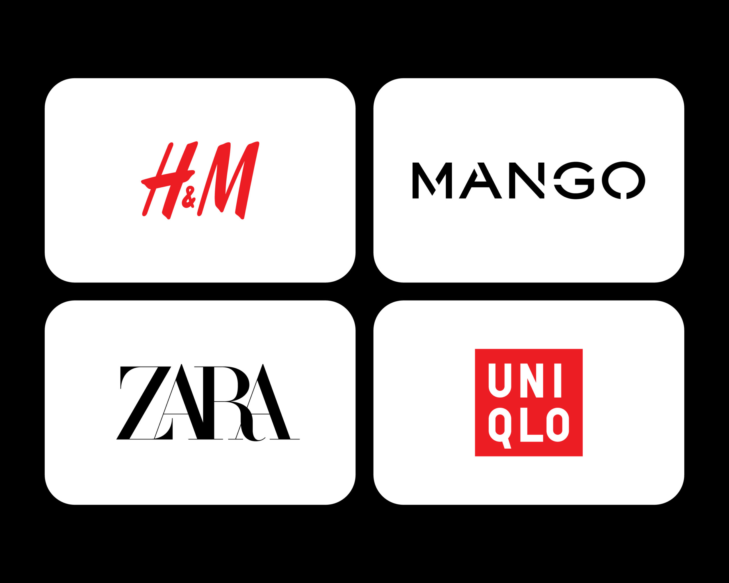
Arguably, the logo (both old and new) distinguishes the company quite well from its main competitors. To wit:
- H&M uses an italic effect to create a sense of motion and street smarts
- Mango is ultra-modern, with breaks in letters and well-utilized negative space
- Also modern and straightforward, Uniqlo’s logo reflects its comfort-forward merits
With plain, uncrowded typography, each of these brands seeks to appeal to a wide audience.
Zara logo, on the other hand, subverts expectations by taking an unconventional approach, which helps it stand out.
Making Waves Was Worth It
In the end, the new Zara logo engendered a welter of differing opinions, but together, these only served to draw a spotlight to them as a company that is unafraid to roll the dice, push boundaries, and try something completely new in the name of bringing luxurious class to their shoppers.
That’s hardly a bad thing. We’ve learned that smart design choices can shape public perception and reposition an aging brand. Thus, design experts have been forced to appreciate the new design’s success, even if it is no longer a classically beautiful logo.
If your goal, too, is to stay relevant in a crowded world, then this is the perfect case study on brand logos from which to draw.