The Colgate logo is synonymous with dental care in almost every corner of the world. Its bold red, clean typography and subtle curve all point to the brand’s mission—healthy smiles. As a heritage brand dating back to the 1800s, Colgate has managed to modernise its logo while keeping it familiar. In this post we’ll break down how the Colgate logo works, what it says and what other brands can learn from its simplicity. To understand how these principles translate into real-world branding, you can explore our logo design services, where longevity and clarity guide every design decision.
The History of the Colgate Logo
The Colgate logo has been around in some form for over a century. Launched in 1873 as one of the first commercial toothpastes, the brand has seen dozens of packaging changes—but the logo has always been about clarity and approachability.
In the early 20th century Colgate used simple serif fonts and minimal layouts. Over time the design shifted to a more modern look. In 2004 the logo went sans-serif and by 2020 it got a refinement that added a soft curve under the brand name—a smile. This subtle change reinforced Colgate’s emotional focus without needing a full rebrand.
What Type of Logo Is It?
The Colgate logo is a combination mark logo, a bold wordmark with a curved smile underneath. While the brand name is the dominant visual, the added smile reinforces Colgate’s oral health and emotional connection.
This combination allows the brand to say trust and positivity. The text says professionalism and familiarity, the smile says warmth and symbolic meaning—making the logo more than just typography.
Design Elements and Symbolism
Here are the design elements that make the Colgate logo work:
-
Color: The red has been part of the brand for decades. Red is energy, urgency and confidence—important for retail packaging. It also stands out on white bathroom shelves.
-
Typography: The current font is a modern sans-serif with slight rounding of the edges. It’s bold enough to be seen at a glance but still friendly.
-
Smile Curve: The 2020 refinement added a subtle curve under the wordmark—a smile without an icon. It says positivity without being too literal. So all together these elements make the logo feel professional and optimistic—two emotions that fit perfectly in the personal care space.
Logo Variations: Full vs Short Version
![]()
Colgate uses a combination mark logo with both the wordmark and curved smile element. On most packaging and marketing the full version is displayed prominently.
But the brand also has a short version—a red circular icon with the smile curve alone. This simplified mark is used for digital contexts like mobile apps, social media avatars and favicons. It’s clean, minimal and still ties back to the emotional promise of the full logo so Colgate can stay consistent even when space is limited.
How It Performs in Small Sizes
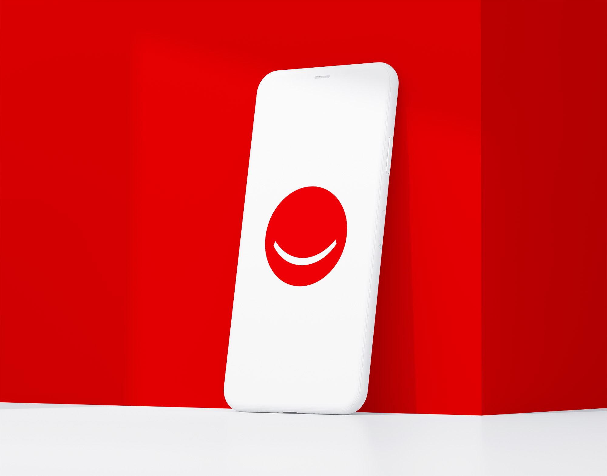
Thanks to the introduction of the short-form smile-in-circle icon the Colgate logo system performs well in small-scale applications. The bold red circle and white smile are legible even at very small sizes like app icons or browser tabs.
While the full logo is still preferred on packaging and traditional media the short version helps Colgate adapt to modern digital interfaces without losing its brand recognition. This is a smart solution for combination mark logos in a multi-platform world.
Brand Recognition & Global Impact
Colgate is a global brand sold in over 200 countries and used by billions of people. In a recognition test with 50 participants 46 recognised the logo instantly. It’s visible on billboards, retail packaging, in-store displays and digital promotions.
The brand’s consistent use of the red wordmark with the smile curve has built global recognition. Whether displayed full or as the simplified red-circle icon the Colgate logo says hygiene, health and everyday care. It’s a design system that feels familiar and adaptable and resonates with consumers everywhere.
Comparing Design with Other Brands
Crest
Crest uses a wordmark logo with blue and red colour contrast and italicised type. It feels more playful but less timeless than Colgate’s stable and confident look.
Sensodyne
Sensodyne’s wordmark logo is more clinical with a simple typeface and abstract wave symbol. It aims for sophistication but lacks the emotional warmth of Colgate’s curve.
Oral-B
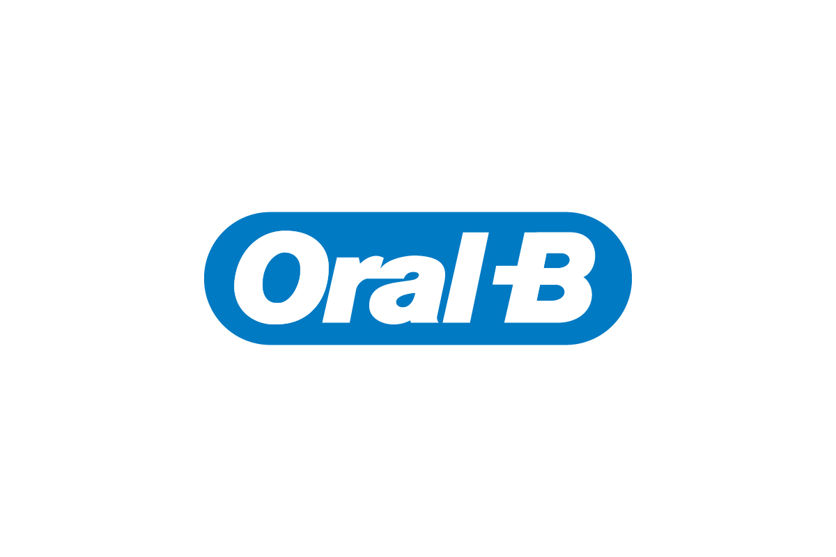
Oral-B uses a combination logo with an oval icon and bold white text. It’s strong on packaging but less versatile in standalone digital applications.
Should They Change the Logo?
Colgate don’t need to change the logo. The current combination of bold wordmark and simple smile curve is clean, modern and emotionally effective. It says trust, care and positivity—core values that fit the brand’s mission. The introduction of the short-form smile icon shows Colgate understands the need for flexibility in today’s multi-platform world.
What’s missing isn’t a redesign—it’s more branding around the short version. The red-circle smile has the potential to be as recognisable as Amazon’s smile but it needs more consistent use in marketing, app icons and brand touchpoints. With the right investment in visibility and repetition Colgate could turn this mark into an icon in its own right.
Conclusion
The Colgate logo is a great example of how a well-executed combination mark can evolve over time and remain instantly recognisable. The bold wordmark says trust and heritage, the smile element says care and confidence.
By introducing a simplified red-circle version of the smile for digital use Colgate has created a flexible logo system that works across shelves, screens and platforms. It’s proof that even long-standing heritage brands can adapt for the modern era without losing their identity. At Rabbit we help companies build logo systems that scale—just like Colgate’s.