A vintage logo isn’t just a throwback — it’s a time machine. Inspired by design styles from the past, vintage logos add warmth, authenticity and personality to modern brands. Whether you’re building a coffee shop, clothing label or craft brewery, this style taps into nostalgia while staying on-trend.
In this post we’ll explain what a vintage logo is, why it still works today and show you 20 iconic examples that embrace this classic aesthetic.
What Is a Vintage Logo?
A vintage logo is a logo style that draws from design elements of the past — typically the late 1800s to mid-1900s. It often features textured fonts, engraved illustrations, banners, seals or hand-drawn touches that evoke a nostalgic feeling.
While a pictorial logo leans toward minimal shapes and modern aesthetics, vintage logos embrace layered design — often combining expressive fonts with rich visual details. Many include wordmark logo styling with a retro twist.
A vintage logo isn’t outdated — it’s crafted with character, rooted in heritage, and full of brand personality.
Why Do Brands Use a Vintage Logo Style?
Vintage logos help brands:
-
Build emotional connections through nostalgia and authenticity
-
Stand out in a world of flat, minimal logos
-
Convey craftsmanship and attention to detail
-
Tap into cultural memory — especially for food, drink and fashion brands
-
Create a warm, trusted feel that appeals across generations
Vintage styles are especially powerful when you want your brand to feel established, artisanal or handcrafted — even if you’re just getting started.
20 Famous Vintage Logo Examples
1. Harley-Davidson
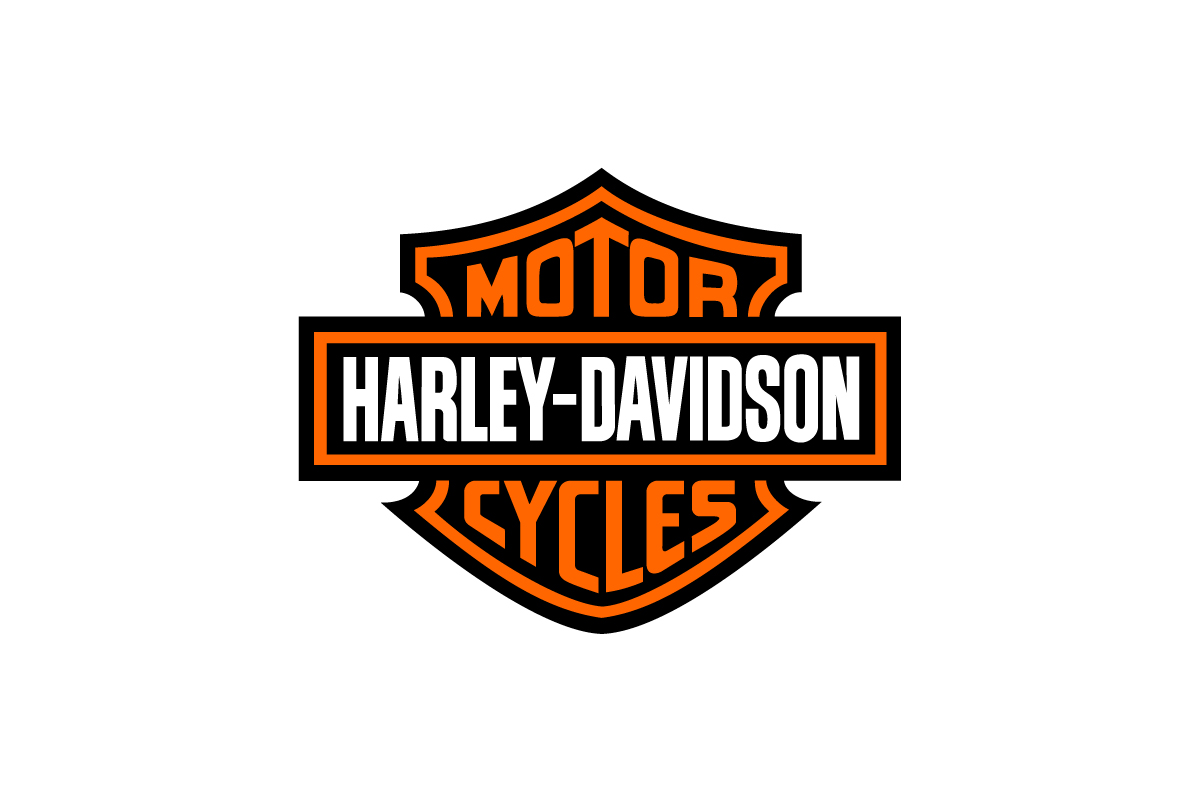
A shield style vintage logo with bold type and wings — unchanged for decades.
Why this logo works
It projects power and tradition, making it one of the most enduring logos in motorcycle history.
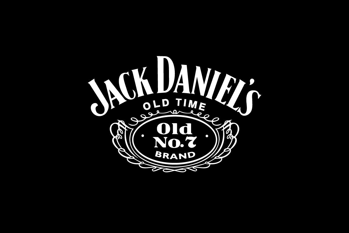
2. Jack Daniel’s
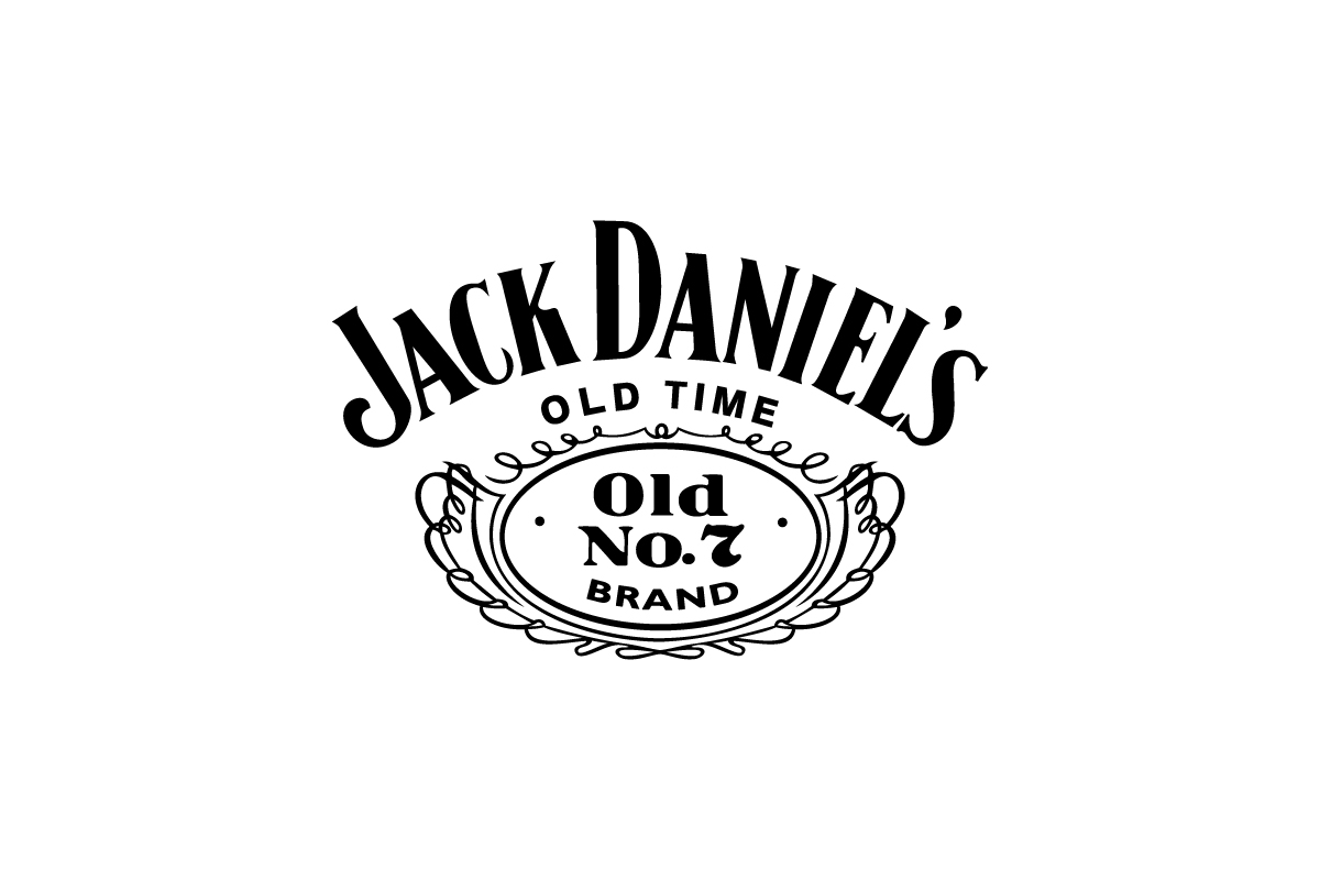
Framed lettering, scrollwork, and old-style serif type define this logo.
Why this logo works
Jack Daniel’s feels handmade and timeless — a great fit for a brand with a long history and strong roots.
3. Coca-Cola
![]()
Flowing red script that has remained mostly untouched for over a century.
Why this logo works
The hand-lettered style, color, and curvature make this logo one of the most emotionally resonant in the world.
4. Ray-Ban
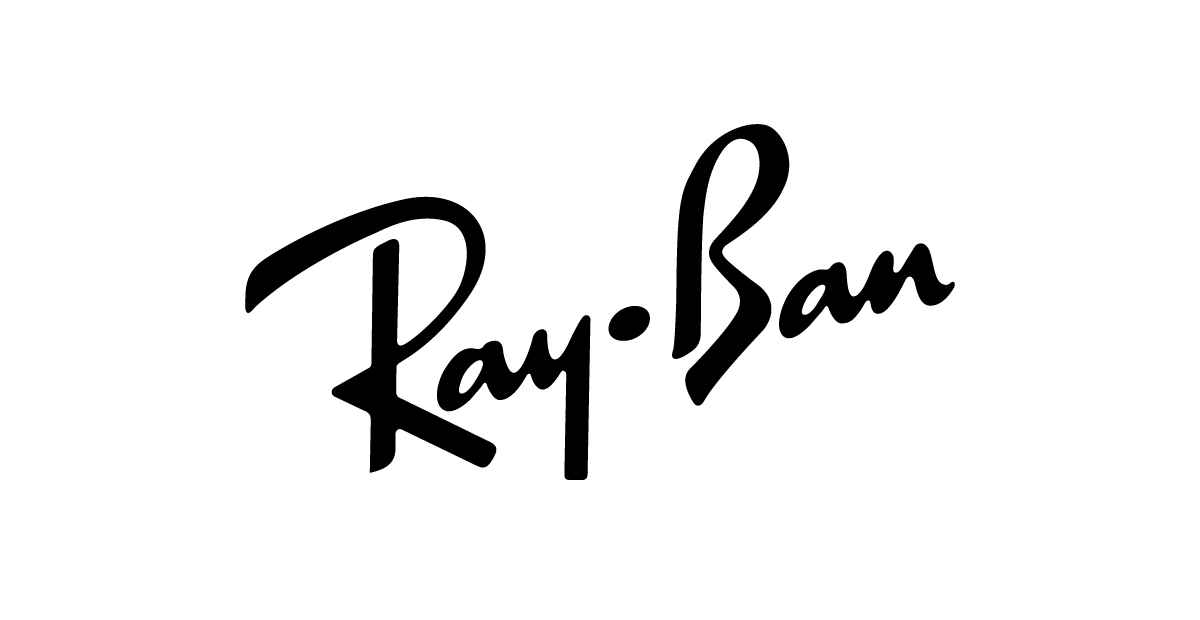
A handwritten logo with smooth, flowing letters.
Why this logo works
This logo feels cool and classic, with a simple and confident look — great for a brand with a strong history.
5. Pendleton
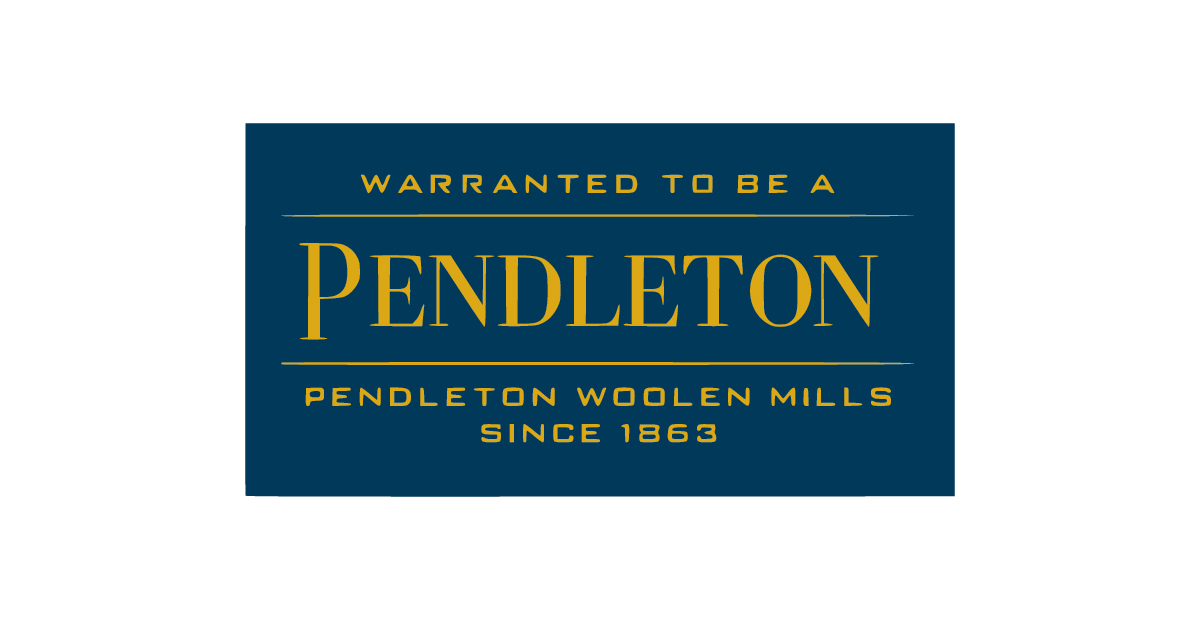
Old West-inspired letterforms and layouts give it a frontier look.
Why this logo works
It visually connects the brand to American craftsmanship and woolen textile history.
6. Stella Artois
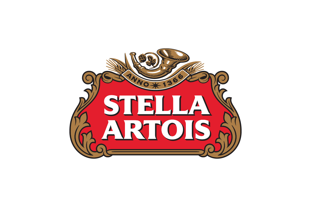
An ornate red label with serif type, gold filigree, and a horn emblem — all centered beneath “Anno 1366.”
Why this logo works
This vintage logo blends historic typography, rich detailing, and symbolic elements to evoke European brewing heritage and timeless sophistication.
7. Twinings
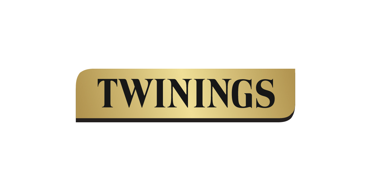
A black serif wordmark set on a gold rectangular background with rounded edges and a slight shadow.
Why this logo works
This logo blends classic typography with a label style layout, evoking refinement, warmth, and old-world craftsmanship — perfect for a heritage tea brand.
8. Chivas Regal
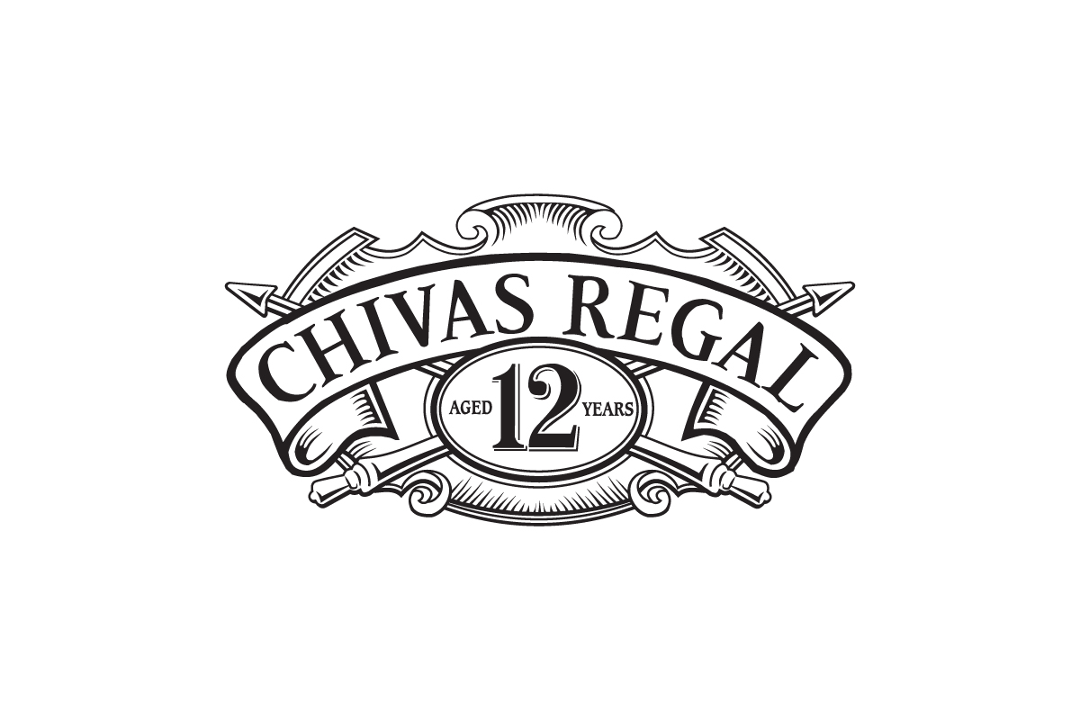
A crest style logo with ornate borders, ribbon banners, and serif typography.
Why this logo works
This vintage logo combines heritage and luxury through traditional detailing and structure — perfectly suited for a premium Scotch whisky rooted in history.
9. Birra Moretti
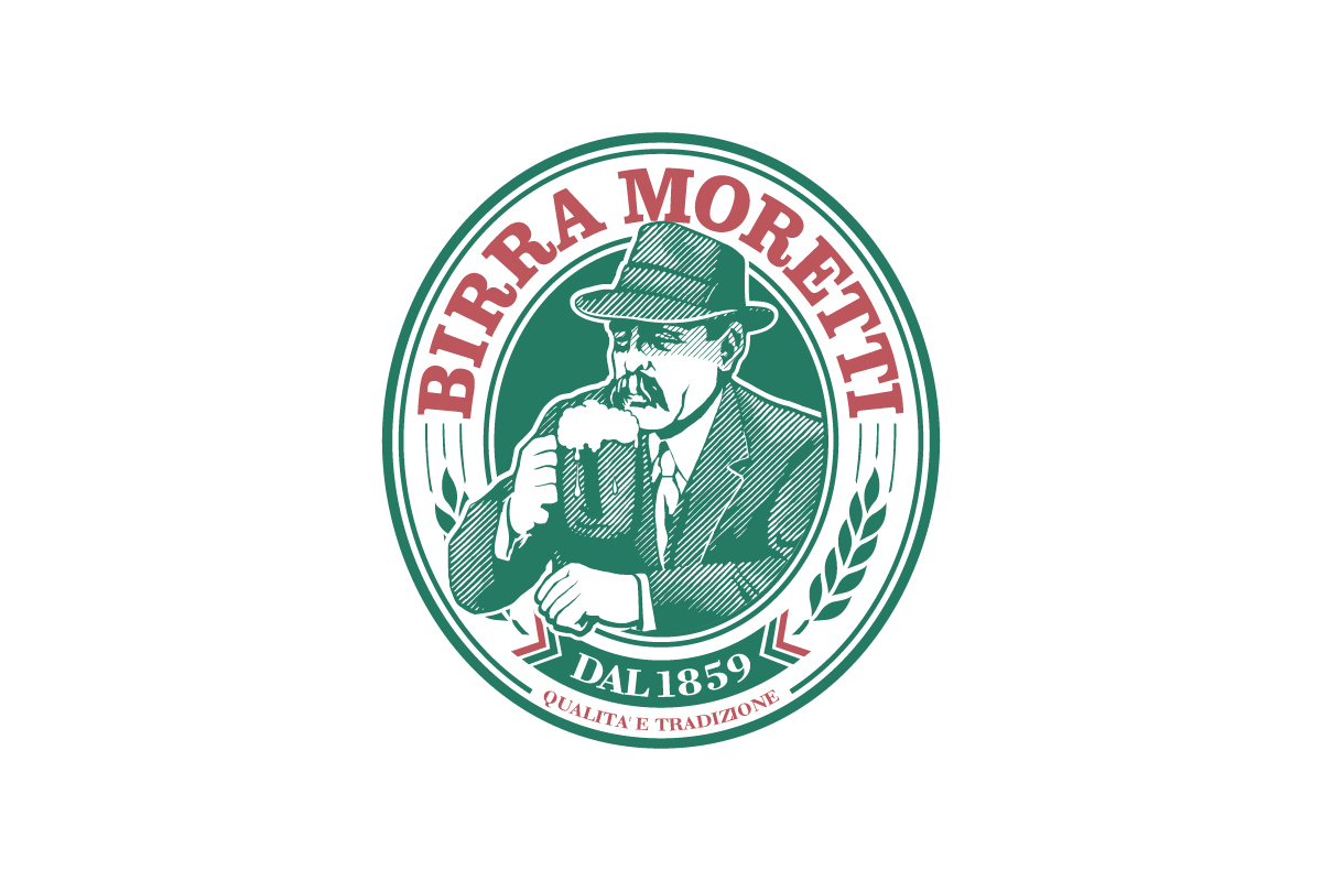
A circular badge featuring a mustachioed man in a hat, holding a beer, surrounded by serif lettering and banner accents.
Why this logo works
The logo captures Italian brewing tradition through hand-drawn illustration, classic type, and a nostalgic tavern feel that connects immediately with heritage and authenticity.
10. Campbell’s Soup
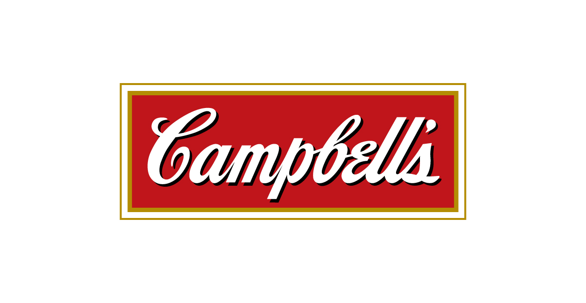
Script typography with gold medallions and layout inspired by vintage food packaging.
Why this logo works
It maintains a blend of familiarity and tradition — particularly potent because of its connections to iconic pop culture and a sense of comfort food.
11. Mutti
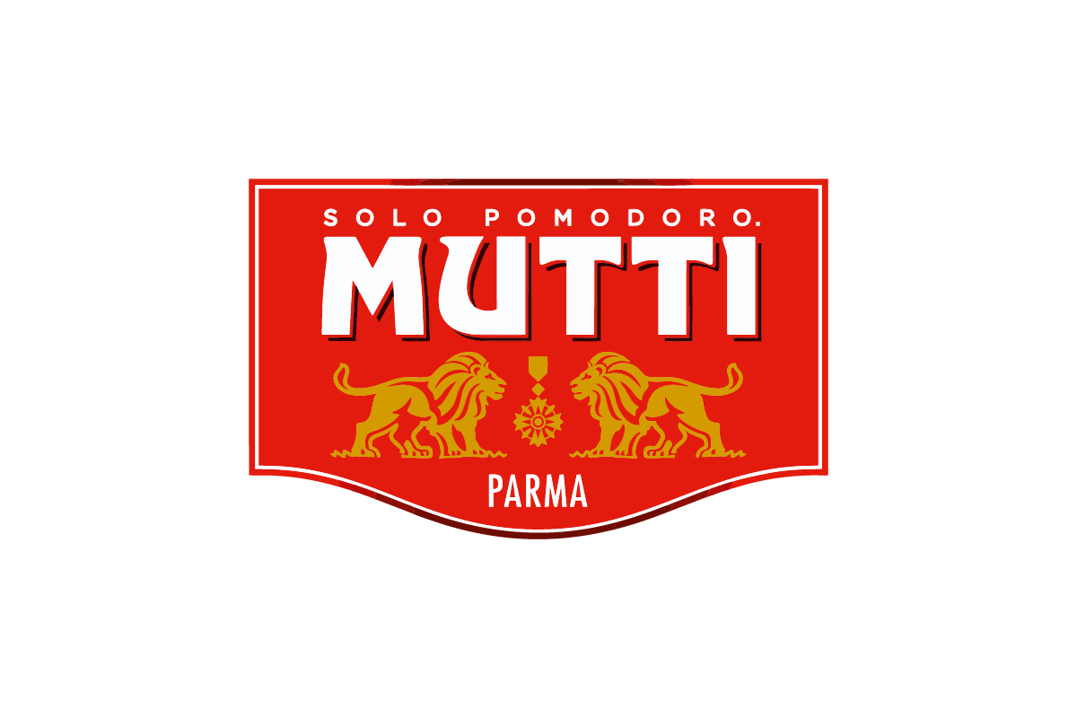
A bright red label with ornate gold flourishes, serif typography, and a crest style layout.
Why this logo works
The balance of strong color, decorative elements, and heritage type makes this a standout vintage logo — ideal for an Italian brand built on tradition and quality.
12. Jameson
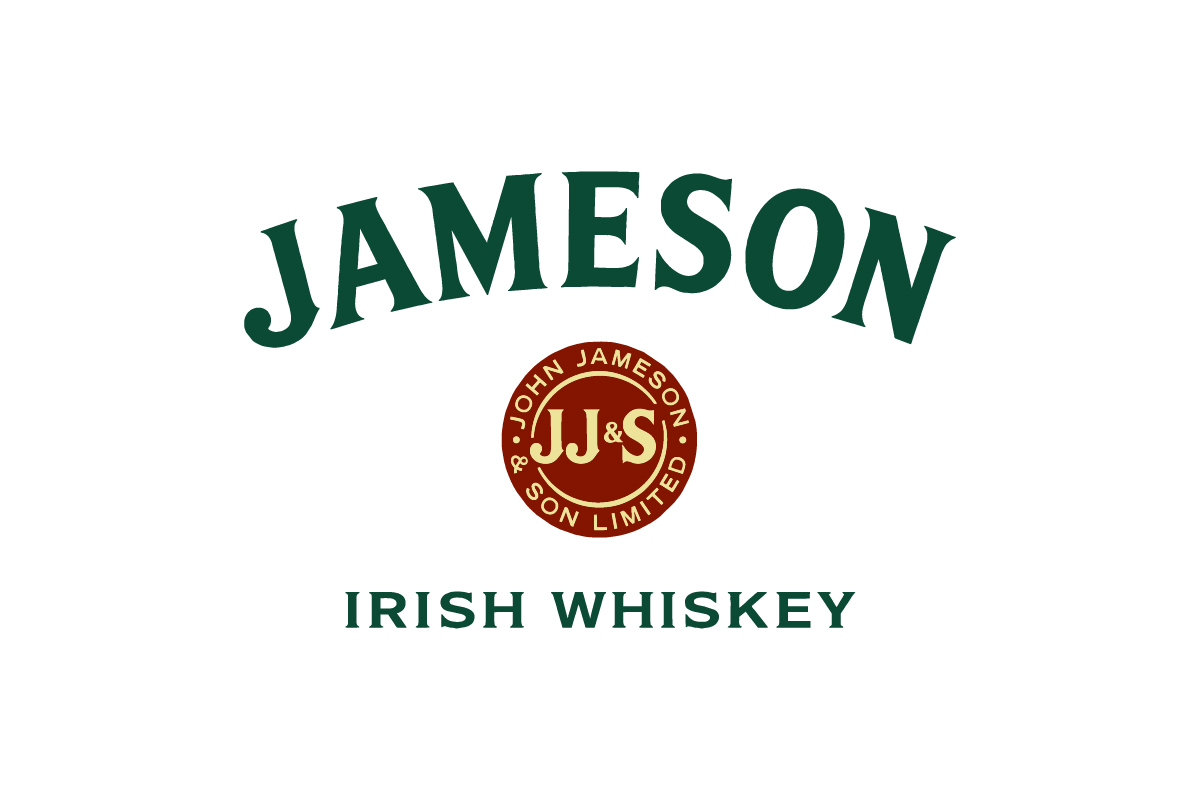
An arched wordmark in dark green paired with a red seal and clean sans serif subtext.
Why this logo works
Classic typography, emblematic layout, and heritage color choices give this vintage logo a sense of history, authenticity, and timeless Irish character.
13. The Macallan
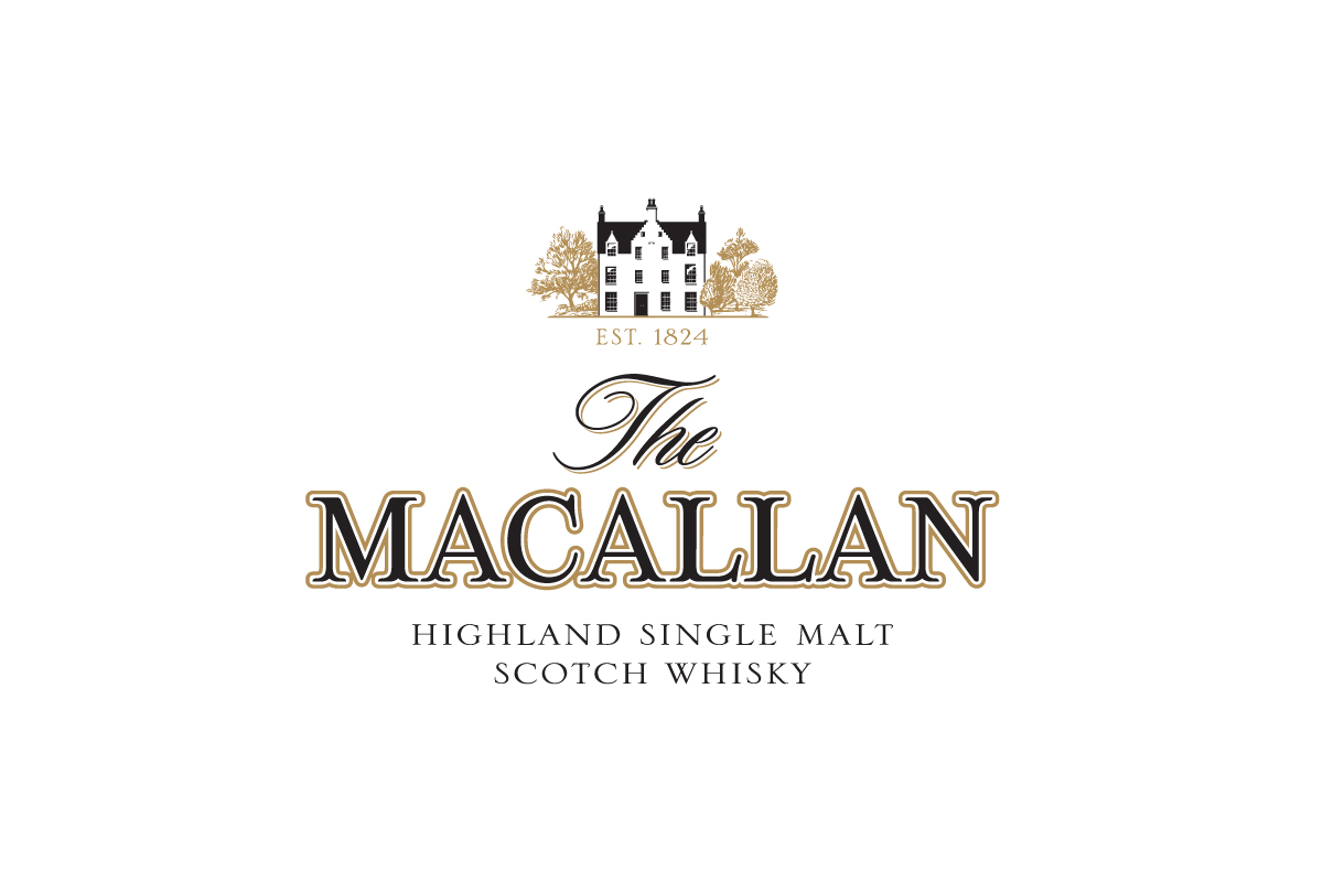
An elegant crest featuring a manor house, gold flourishes, and a refined blend of serif and script typography.
Why this logo works
This logo feels both sophisticated and storied — pairing luxurious type with heritage visuals that speak to the brand’s deep roots in Scottish whisky tradition.
14. Bass Ale
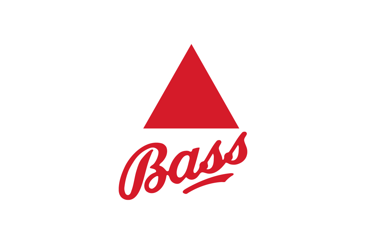
A minimal red triangle paired with serif typography, often set on cream or aged label backgrounds.
Why this logo works
As one of the world’s oldest trademarks, this vintage logo uses simplicity and heritage to its advantage — delivering instant recognition with 19th-century charm.
15. Miller High Life
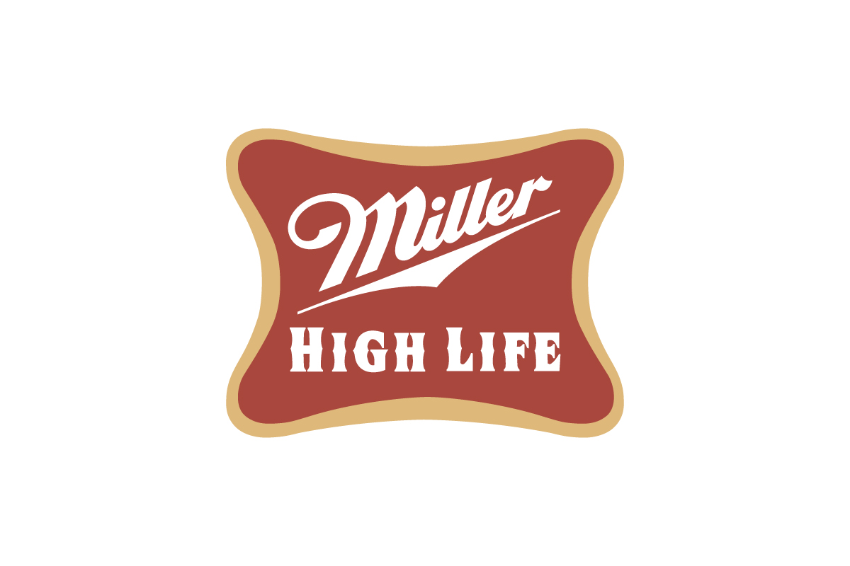
A flowing script wordmark often placed within a red trapezoid label, paired with gold accents and classic serif text.
Why this logo works
With its ornate lettering and nostalgic packaging, this vintage logo captures early 20th-century elegance — celebrating tradition and America’s “Champagne of Beers” heritage.
16. Beefeater
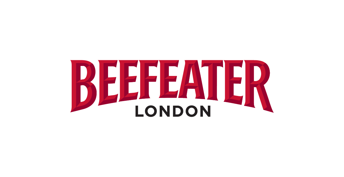
A bold, beveled red wordmark in all caps, arched slightly above a clean “LONDON” subline in black.
Why this logo works
This vintage logo uses confident, heritage typography to evoke British tradition and strength — making it instantly recognizable and anchored in gin history.
17. Schlitz
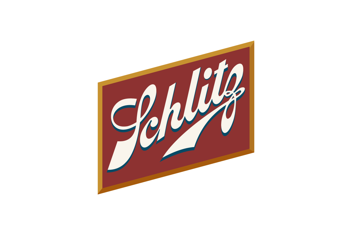
A flowing script wordmark in white, set against a slanted burgundy background with gold edging.
Why this logo works
The logo oozes mid-century charm — the bold slant, retro palette, and cursive lettering perfectly capture the classic American beer aesthetic of its era.
18. Ballantine’s
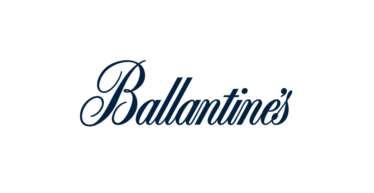
A flowing blue script logo with elegant curves and a refined sense of balance.
Why this logo works
This vintage logo combines sophistication and heritage through calligraphic style — instantly evoking old world whisky tradition and premium craftsmanship.
19. Pabst Blue Ribbon
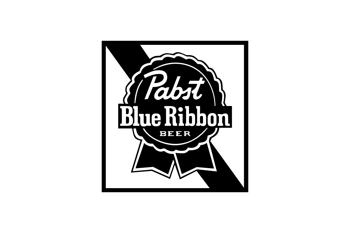
A bold, all-caps wordmark with beveled lettering, paired with arched and stacked type that reinforces its heritage roots.
Why this logo works
The logo captures the feel of 19th-century bourbon craftsmanship through layered typography, serif strength, and a confident layout that feels built to last.
20. Old Forester
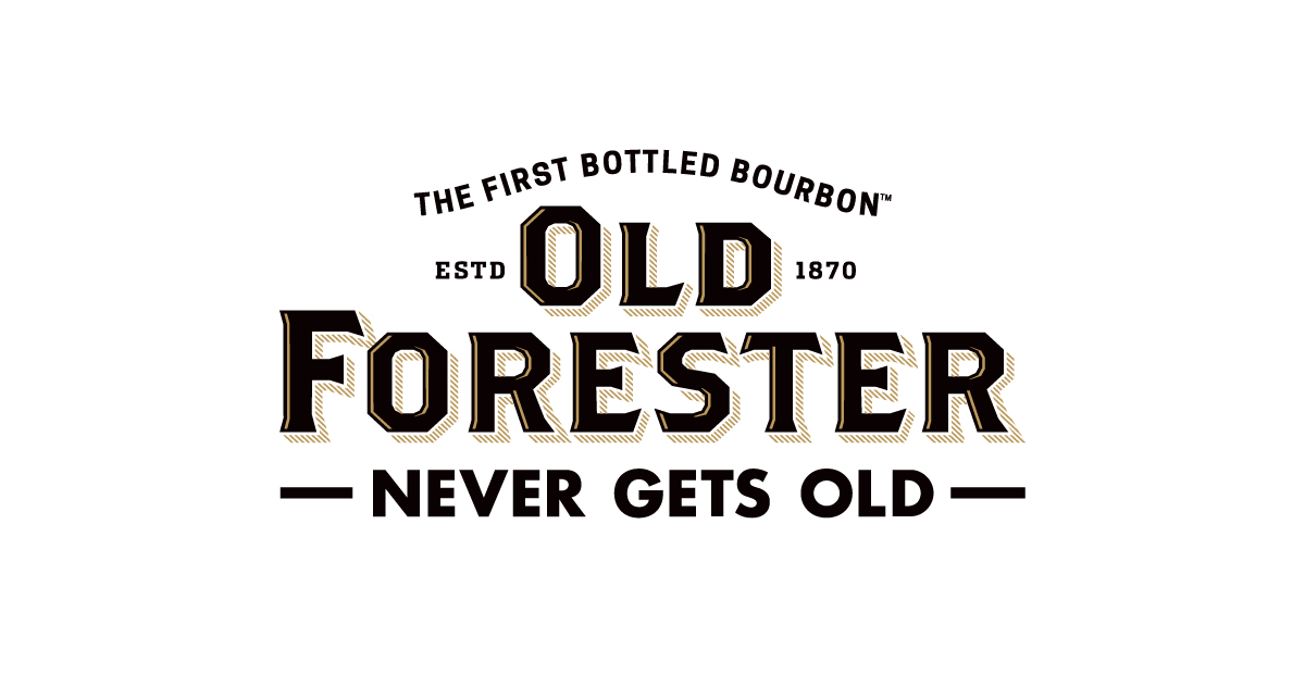
A bold ribbon badge with block serif typography, all framed in a strong diagonal square.
Why this logo works
This vintage logo combines Americana charm with award inspired visuals — making it instantly recognizable and steeped in classic beer branding tradition.
Vintage Logos by Rabbit
1. Liberty Leaders

A distressed badge-style logo with a bold Liberty Bell icon and circular text layout.
Why this logo works
The vintage logo style uses rough textures and patriotic symbolism to create a strong, historic feel — perfect for a brand focused on leadership, legacy, and American roots.
2. Blanco Miami Beach
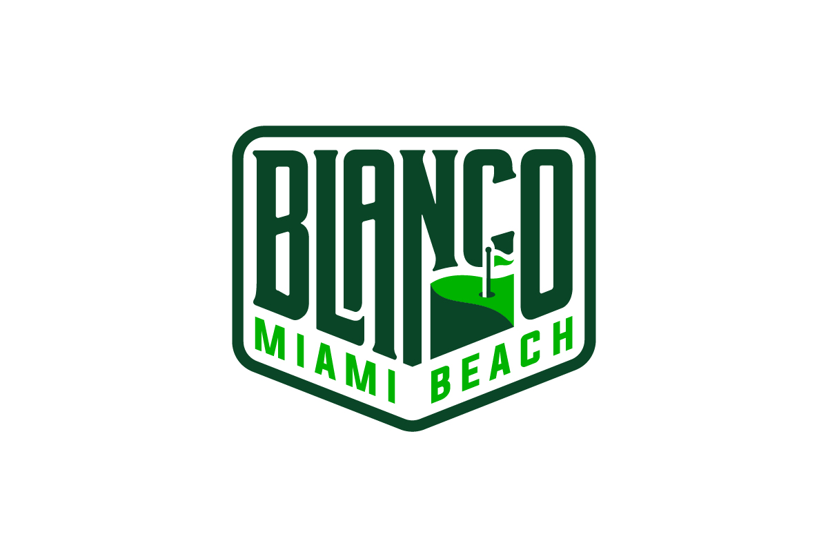
A tall, condensed wordmark inside a badge frame, with a golf flag cleverly integrated into the letter “C.”
Why this logo works
This vintage logo combines retro type with a playful visual twist — the built-in golf icon adds character while reinforcing the brand’s sporty, coastal identity.
When Should You Use a Vintage Logo?
A vintage logo is ideal if:
-
You want to convey craftsmanship, heritage or authenticity
-
Your brand leans into nostalgia, handmade goods or tradition
-
You want a logo that feels textured, layered and emotional
-
Your industry values storytelling — e.g. food, drink, fashion or lifestyle
Vintage logos are especially popular with brands that want to stand apart from clean, corporate minimalism — and instead feel rooted, handmade and real.
Tips for Designing a Great Vintage Logo
-
Use classic fonts – Think slab serifs, scripts or typewriter styles
-
Add texture – Subtle distress, halftones or engraving can help
-
Think in badges or seals – Circular or crest layouts work well
-
Incorporate heritage details – Dates, locations or founders’ names
-
Balance detail with readability – Don’t let vintage style swamp clarity
Conclusion
A great vintage logo brings history, warmth and character to your brand. It tells a story — not just of your business but of the culture and time it’s from.
If you’re looking for a logo design company that can bring that timeless character to life, Rabbit is here to help. Our team specializes in crafting unique, handcrafted logos rooted in authenticity and built to last.
Let’s create something unforgettable.