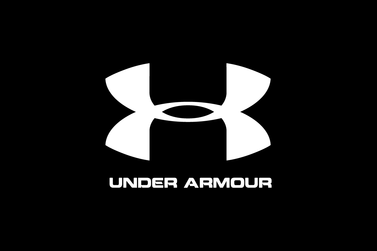
The Under Armour logo is bold, clean and powerful. In a world full of swooshes and stripes, this sharp monogram helped Under Armour carve out its identity as a no nonsense brand for serious athletes. From locker rooms to billboards, the logo is a symbol of performance and grit.
What makes it effective is its engineered simplicity. By combining just two letters—“U” and “A”—the brand created a mark that feels stable, strong, and precise. It isn’t trying to look fast or flashy; it’s built to look tough, just like the gear it represents—a design mindset we often apply at Rabbit, as a professional logo design services company focused on clarity, strength, and long-term recognition.
The Origin of the Under Armour Logo
Under Armour started in 1996, founded by Kevin Plank, an ex-college football player with a simple goal: make athletic gear that stayed dry and performed better. The original idea for the name was “Body Armor,” but a fortunate naming mix-up led to “Under Armour,” which stuck.
The logo itself came together just as organically. By merging the letters “U” and “A” into a single, balanced mark, the brand created a bold visual identity that felt built—not just designed. From the very beginning, the logo reflected strength, structure and high-performance intent.
Over time the logo has appeared in different lockups—with or without the wordmark—but the core monogram has remained the same since day one.
What Type of Logo Is the Under Armour Logo
Under Armour uses a monogram logo, a single graphic mark formed by combining the letters “U” and “A”. It’s not stylized text and it’s not a symbolic icon—it’s a fusion of initials that forms its own shape.
The logo also functions as a combination mark when paired with the bold wordmark in branding materials, product labels or campaigns. But in most cases—especially on apparel—the monogram stands alone.
Design Elements and Symbolism
The Under Armour logo reflects its brand DNA in every line and proportion:
-
Monogram: The symmetrical “X”-like mark formed by the letters “U” stacked over “A” gives the logo structure and balance. It looks like armor—solid and impenetrable.
-
Typography: When used the wordmark appears in bold uppercase sans-serif type, reinforcing the idea of strength and impact.
-
Color: Black or white mostly, with red or metallic on products. Bold and masculine.
-
Style: Every part of the logo is sharp, geometric and centered—no softness, no curves for flair. Built to feel fast and strong.
No ambiguity or hidden meaning. The Under Armour logo says toughness right away, with zero decoration.
Does the Under Armour Logo Work in Small Sizes?
Yes—and this is one of its greatest strengths.
Because the logo is a compact, geometric monogram, it scales perfectly across all formats: tags, labels, favicons, app icons and more. It doesn’t rely on a long wordmark or detailed symbol. Even at thumbnail size the logo holds its shape and meaning.
That’s critical for a brand that appears on everything from socks to stadiums. Whether printed tiny on an armband or stitched into a cleat, the logo always delivers a sharp, recognizable presence.
Brand Recognition & Global Impact
Under Armour may not be as big as Nike but it has built strong recognition—especially in North America and performance-focused markets.
In a group of 50 testers, 39 recognized the Under Armour logo without any text or context. The strongest awareness came from male audiences 18-35 and active lifestyle consumers. The logo is heavily associated with football, basketball and military-style training—sports where strength and mental toughness are front and center.
Even in markets where Under Armour has smaller market share, the logo still gets attention because of its simplicity and repetition across athletic apparel and media.
How Under Armour Compares to Competitors
Nike
![]()
Nike is fluid, abstract and universal. It says speed. Under Armour’s logo is angular and strength-driven—less about motion, more about stability and force.
Adidas
![]()
Adidas has multiple logos (three stripes, trefoil, mountain icon) all supported by its strong wordmark. They go into lifestyle and streetwear, Under Armour goes into high-performance athletics.
Puma
Puma’s leaping cat is a pictorial logo that speaks to agility and style. Under Armour’s logo feels more industrial and structured—aimed at athletes who want intensity over elegance.
Should They Change the Logo?
No.
The Under Armour logo still does what it was meant to do—stand for strength, performance and athletic discipline. It’s scalable, simple and effective. The brand may evolve its product lines but the logo doesn’t need to change.
Introducing a new symbol or altering the current mark would likely dilute the brand’s recognition especially among long-time fans.
Conclusion
The Under Armour logo is a proof that bold and focused design can go a long way. With its geometric monogram and technical sharpness it fits perfectly into the high-performance world the brand represents. It’s just strong—and that’s the point.
For sports brands or performance-driven startups, it’s a reminder that when your logo is designed with clarity and confidence the result can last for decades.