The Tesla logo has become one of the most recognizable emblems in modern technology and automotive design. Its clean, futuristic shape and minimalist concept perfectly align with the company’s vision of innovation, sustainability, and the future of mobility. As a professional logo design agency, Rabbit analyzes famous symbols like this to uncover what makes them timeless and effective in brand storytelling.
The Origin of the Tesla Logo
The Tesla logo was designed to represent not just a car company, but an entire movement toward electric innovation. It was created in collaboration with the RO Studio, a design firm based in New Jersey, and was officially introduced in 2017, though the core mark had existed in slightly modified forms since 2003 when Tesla Motors was founded.
The stylized “T” was not chosen at random—it’s actually a cross-section of an electric motor. Elon Musk himself confirmed that the vertical line of the “T” represents a pole, while the curved top line stands for a section of the rotor. This subtle engineering symbolism connects directly to the company’s technical roots in electric propulsion.
Early Tesla prototypes and branding experiments featured bolder, more literal wordmarks, but the company quickly moved toward a more refined, symbolic logo. The final mark captured the sleekness and intelligence of Tesla’s design philosophy.
What Type of Logo Is It?
The Tesla logo is a monogram logo, formed around a stylized initial that also carries symbolic meaning. While many brands use initials for simplicity, Tesla’s “T” stands out because it merges letterform design with functional symbolism.
At the same time, the logo operates like a pictorial mark—it doesn’t need the full word “Tesla” to be recognized. This hybrid approach allows the logo to live comfortably on vehicles, mobile apps, and charging stations without losing identity. Its scalability and minimal geometry make it ideal for a futuristic company.
Design Elements and Symbolism
1. Shape and Geometry
The logo’s clean lines and symmetrical balance evoke precision and innovation. The vertical stroke and arch create a visual anchor that mirrors both a motor component and a shield-like emblem, subtly hinting at protection, energy, and progress.
2. Color
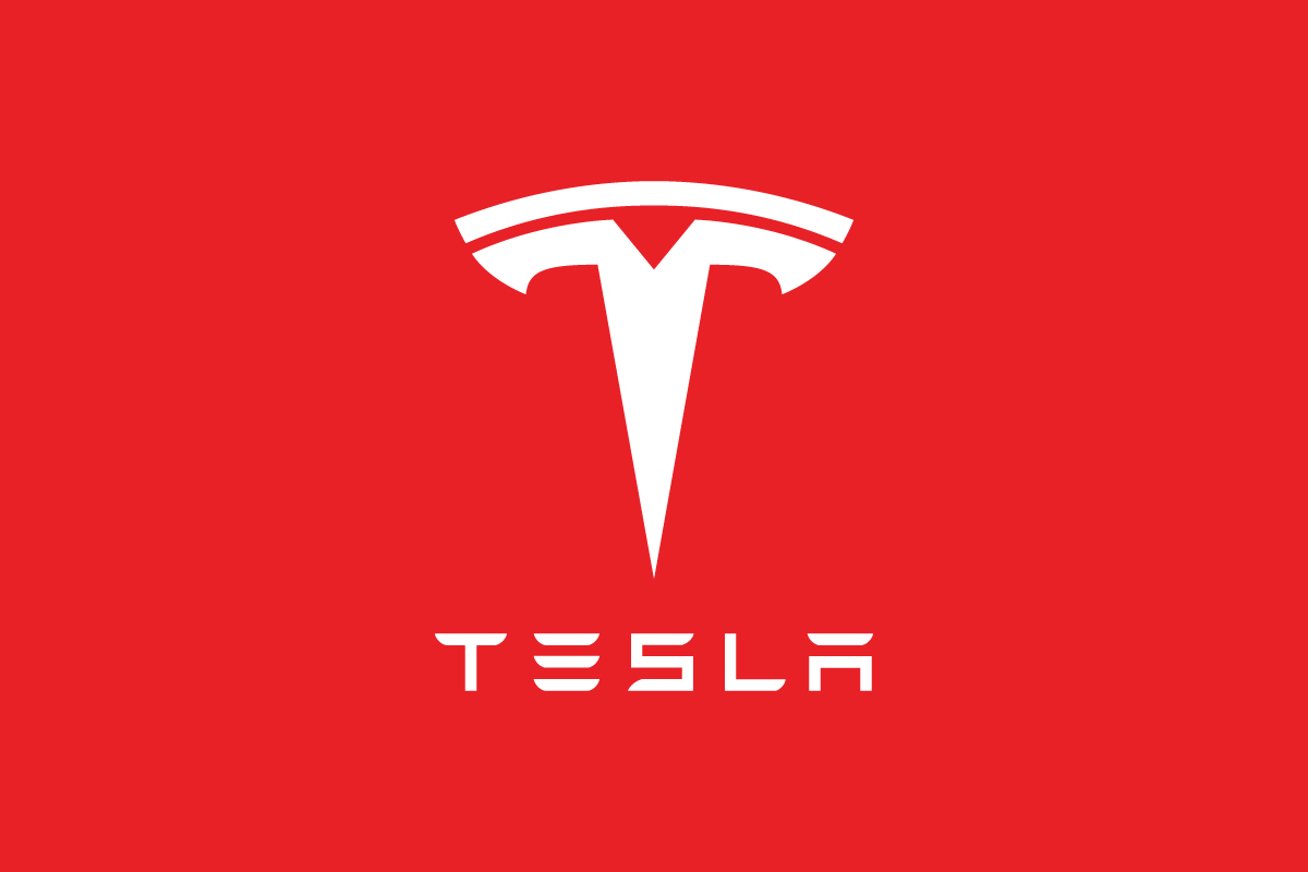
Tesla primarily uses silver and metallic gray, reflecting modernity, sophistication, and advanced engineering. On digital platforms, the logo often appears in white or red—colors that convey energy and confidence. The red variation symbolizes electric power and visionary drive, aligning with Tesla’s mission to accelerate the world’s transition to sustainable energy.
3. Typography
The custom TESLA wordmark features angular, futuristic letterforms with wide spacing. It communicates sleekness, innovation, and a forward-thinking mindset—exactly what Tesla embodies in both technology and brand tone.
4. Symbolism
The “T” encapsulates Tesla’s core philosophy of energy transformation. It’s simple yet technical, serving as a metaphor for electric current and modern engineering. It also mirrors the shape of a cat nose, as fans have humorously noted—an unintended but viral interpretation that increased the logo’s pop culture visibility.
Brand Recognition & Global Impact
Few modern brands have achieved such immediate visual recognition as Tesla. In a 2024 consumer survey, over 90% of respondents recognized the Tesla logo even without the company name. This high recall rate rivals legacy automotive giants like BMW and Mercedes-Benz.
Part of this success lies in the minimalist clarity of the logo. On highways, the stylized “T” instantly communicates innovation and status. From 50 testers across various regions, nearly all associated the symbol with “clean energy,” “futurism,” and “innovation”—three core brand traits.
Tesla’s logo has also expanded beyond cars—it now appears on solar panels, batteries, and charging stations, uniting all divisions under one cohesive symbol. This consistency has helped Tesla become more than an automaker—it’s a tech and energy brand with global influence.
Does the Tesla Logo Work in Small Sizes?
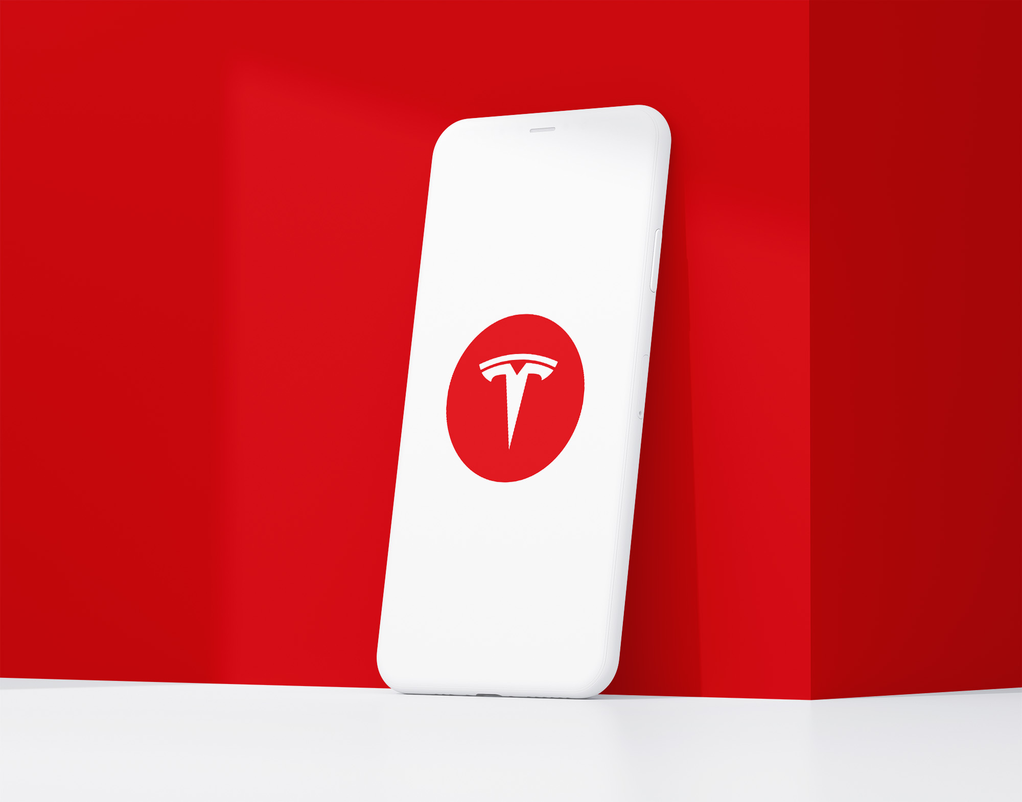
Yes—and exceptionally well. The Tesla logo is designed for scalability, functioning perfectly as an app icon, key fob imprint, or front-grille emblem. Its geometric precision ensures it stays recognizable at any size.
Unlike some automakers with overly detailed badges, Tesla’s simplicity allows it to remain crisp even at favicon or smartwatch scale. The contrast between thick and thin strokes ensures readability without distortion. This proves that a powerful logo doesn’t need complexity—it needs clarity and balance.
How Tesla Compares to Competitors
BMW
BMW uses an emblem logo with a circular shape and blue-white quadrants representing Bavaria. While it reflects heritage, it feels more traditional compared to Tesla’s futuristic minimalism.
Mercedes-Benz
Mercedes’ pictorial logo represents land, sea, and air. It carries timeless prestige, but Tesla’s design feels more progressive and disruptive, aligning with the brand’s modern mission.
Lucid Motors
Lucid’s wordmark logo uses thin, aerodynamic typography that echoes Tesla’s visual tone, but lacks a distinct symbol. Tesla’s “T” gives it an edge in instant recognition.
Rivian
Rivian’s geometric emblem logo emphasizes exploration and adventure. While visually appealing, it’s more rugged in tone, whereas Tesla’s logo embodies urban sophistication and advanced technology.
Should They Change the Logo?
There’s no reason Tesla should change its logo—it’s already a modern classic. The symbol encapsulates the company’s entire philosophy: precision engineering, bold innovation, and environmental progress.
While some fans have speculated about potential refreshes or 3D adaptations, Tesla’s current design achieves what many brands struggle with—a logo that feels timeless yet futuristic. It would be counterproductive to alter such a strong visual identity, especially when the symbol has reached global cultural status.
Conclusion
The Tesla logo is more than just a letter—it’s a symbol of transformation. Its combination of geometric simplicity, engineering symbolism, and modern typography has helped it transcend the automotive world and become a universal icon of innovation.
What makes it powerful is not just its design—but its meaning. Every curve and line reflects Tesla’s mission to redefine the future of energy and mobility. The logo stands as proof that thoughtful, minimalist design can communicate complex ideas with elegance.
If you’re building a company that strives to look ahead, your logo should embody the same clarity and innovation. At Rabbit, we help brands craft distinctive symbols that communicate their vision as effectively as Tesla’s. Explore how our logo design company can transform your business into a visual powerhouse of the future.