The Stihl logo is a clear symbol of durability, reliability, and German engineering. Appearing across chainsaws, trimmers, and professional outdoor equipment, its bold typography and sharp structure reflect strength, precision, and performance. Through decades of consistent use, the logo has become instantly recognizable in both industrial and consumer markets.
In this article, we’ll examine how the Stihl logo was designed, why it works so effectively, and what its long-term visual consistency can teach modern brands about building recognition and trust.
The Origin of the Stihl Logo
![]()
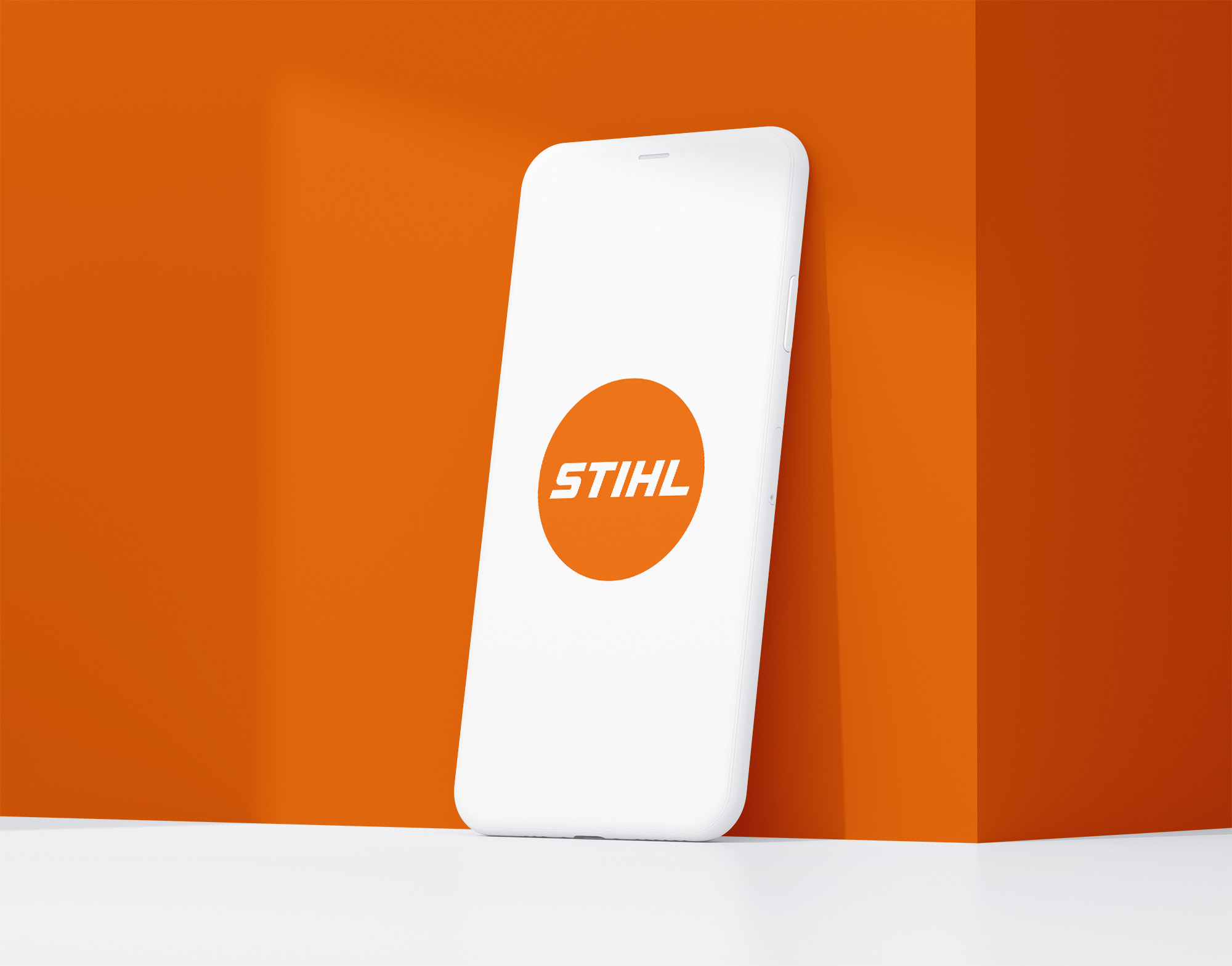
The Stihl logo has been in its current form since the 1970s. Originally founded in 1926 by Andreas Stihl the company built its reputation through professional forestry tools. As the brand expanded globally the logo evolved into a stylised wordmark that balanced clarity with impact.
Over the years, Stihl has avoided unnecessary redesigns. Instead they focused on refining proportions and making small technical adjustments while retaining the core characteristics that customers trust. The bold slanted lettering continues to reflect movement, power and forward thinking innovation.
What Type of Logo Is the Stihl Logo
The Stihl logo is a custom wordmark logo, composed entirely of custom letterforms. This puts the brand name front and centre, with no additional icons or symbols needed.
What makes it stand out is the use of slanted, geometric typography—every letter leans slightly forward, visually reinforcing the brand’s focus on speed, strength and momentum. For a company rooted in performance driven tools the wordmark matches the product promise perfectly.
Design Elements and Symbolism
Every aspect of the Stihl logo communicates utility and motion:
-
Typography: The custom font uses thick, angular strokes with sharp cuts, giving the impression of blades or cutting edges. The italicised orientation implies speed and active use.
-
Color: The orange background reflects energy, safety and high visibility—perfect for a brand used in outdoor and industrial environments. The white logotype contrasts strongly, improving readability.
-
Spacing: The letters are tightly spaced, creating a compact feel that mirrors the compact power of Stihl tools.
The overall result is a logo that feels strong, fast and engineered for performance.
Does the Stihl Logo Work in Small Sizes?
The Stihl logo performs okay at smaller scales due to its bold, simple shapes and high contrast between the orange and white. But without a shorter version it can be limiting in ultra-small contexts like mobile apps, favicon icons or safety tags.
This is a common limitation of wordmark logos—without a compact companion symbol visibility and legibility can suffer at reduced sizes.
Brand Recognition & Global Impact
With over 100 years of history Stihl is one of the most trusted names in professional tools. The logo appears on packaging, blades, power equipment, storefronts and international sponsorships.
In a recognition test with 50 participants 39 identified the logo immediately—even without product context. The bold lettering and colour palette makes it hard to miss, especially in industries where visibility and brand trust is critical.
How Stihl Logo Compares to Competitors
Husqvarna
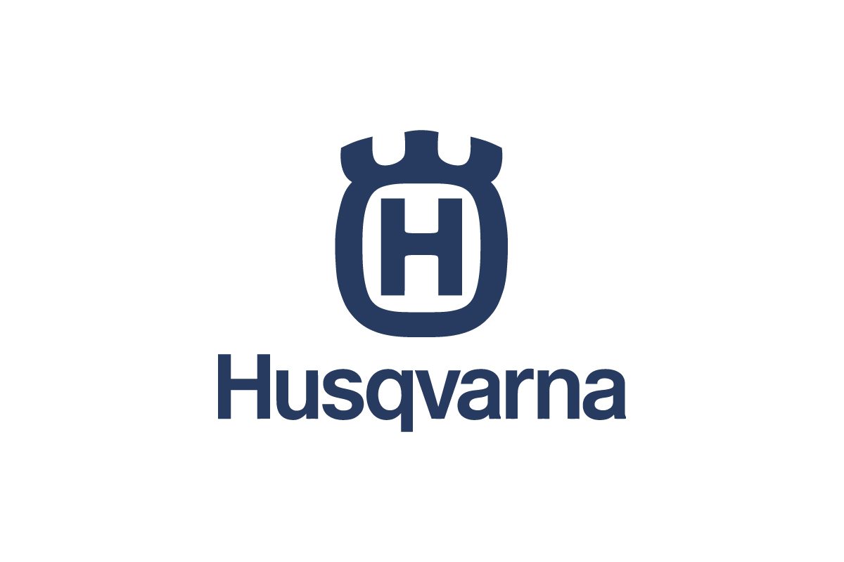
Husqvarna uses a combination mark logo, a stylised “H” crest with the name. It feels more traditional and refined but lacks the bold simplicity of Stihl’s wordmark.
Echo
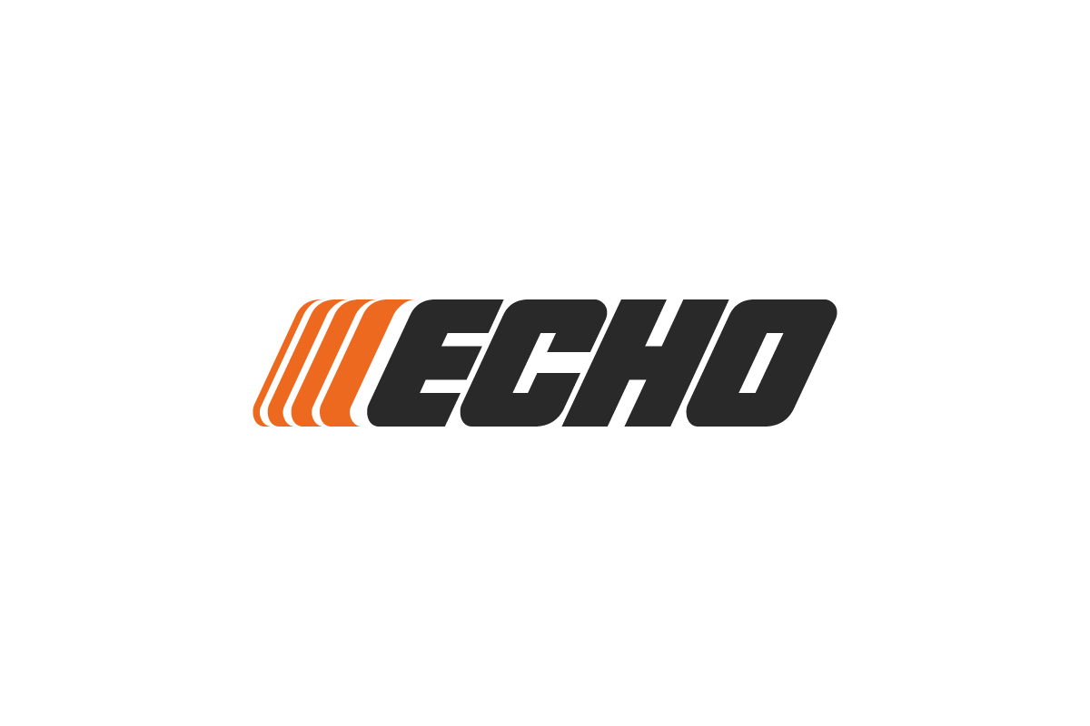
Echo’s italicised wordmark logo shares the speed oriented typography style with Stihl. But its thinner letterforms and striped iconography makes it feel less durable and more modern.
Makita
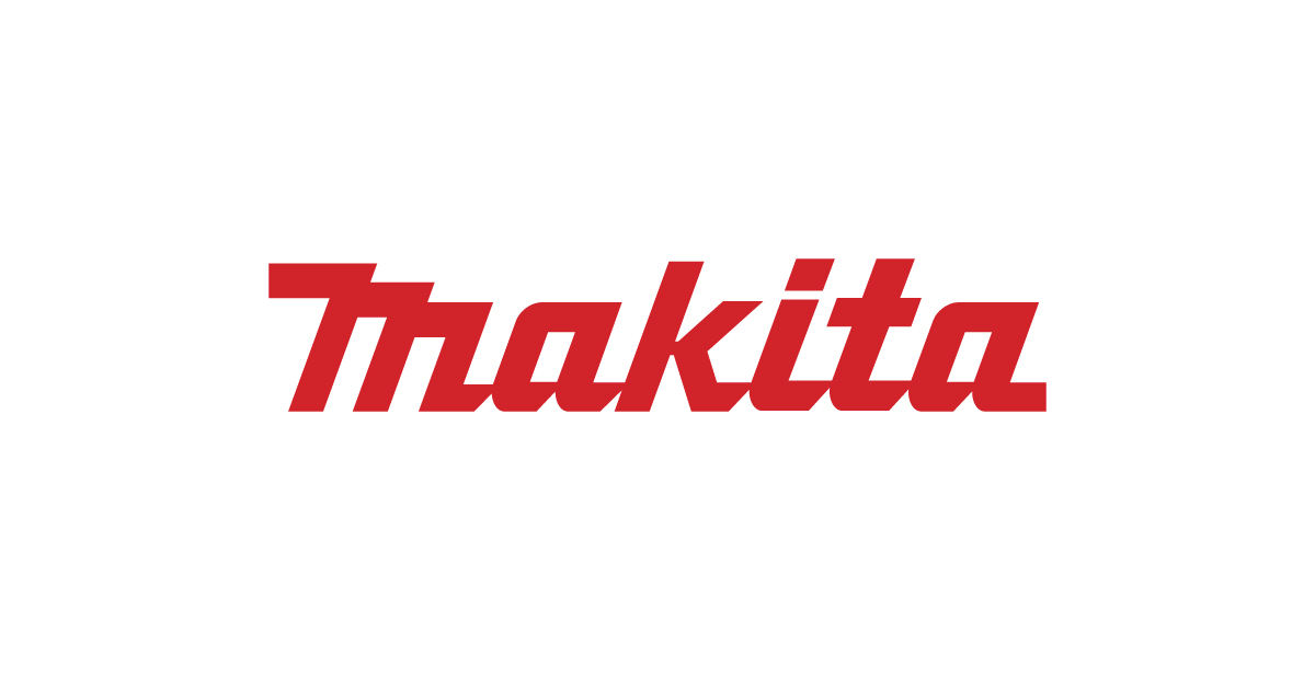
Makita uses a custom wordmark logo in bold red. While energetic it doesn’t have the industrial feel or utility focused tone that Stihl’s angled white on orange delivers.
Should They Change the Logo?
![]()
Stihl doesn’t need a full redesign—the current logo communicates power and motion well. But one area that could be refined is the spacing between the letters. Compared to earlier versions of the logo the spacing has been adjusted over time but it still feels slightly uneven, especially between the “S” and “T” and “I” or the “I” and “H” and “L”. A small kerning adjustment could tidy up the spacing and harmony of the wordmark without changing its shape. It’s a small thing but for a brand that prides itself on precision it would be another detail that reinforces the sense of engineering.
Conclusion
The Stihl logo succeeds because it prioritizes clarity, strength, and long-term consistency. Its bold typography and uncompromising form reflect the brand’s focus on professional-grade performance, making the logo instantly recognizable across products, markets, and generations. Rather than chasing trends, Stihl has relied on disciplined design decisions that reinforce trust and reliability over time.
For brands aiming to achieve the same level of recognition and durability, execution matters as much as concept. Working with a team that understands structure, scalability, and longevity is essential — which is where a professional logo design company can help transform a strong idea into a logo built to perform for decades.