The Netflix logo is one of the most iconic wordmarks in entertainment. With its bold red letters, cinematic curve and simplicity, the design reflects Netflix’s transformation from a DVD rental company to a global streaming giant. In this post we’ll break down its history, style, scalability and how it compares to competitors—plus whether it’s due for an update.
The Origin of the Netflix Logo
Netflix launched in 1997 with a completely different visual identity. Its first logo featured a film reel going through the brand name, highlighting its DVD rental focus. The design was playful but messy, full of early web gradients and drop shadows.
As the company moved to streaming and international expansion, the branding needed a more modern look. In 2014 Netflix introduced a full redesign: a clean, bold wordmark with no added symbols—just typography and color. This redesign was a move from a combination mark logo to a pure wordmark, aligning Netflix with other tech brands and signaling a new era of digital dominance.
It wasn’t just a cosmetic change—it was strategic. A cleaner logo loads faster, scales better on digital platforms and leaves a bigger impression in a crowded media landscape.
What Type of Logo Is the Netflix Logo?
The Netflix logo is a classic wordmark logo. It’s just the company name in custom lettering with no separate icon or graphic. This style is popular with brands that want their name to be the main identifier—especially when that name is already well known.
What sets Netflix apart is how it pushes the wordmark format to the limit. The logo uses bold, uppercase letters and a slight curve to make it distinctive. Unlike many minimal wordmarks it doesn’t fade into the background—it demands attention even on mobile or smart TV.
Design Elements and Symbolism
The Netflix logo looks simple at first but each element plays a part in brand recognition:
-
Typography: The custom sans-serif font is geometric, confident and slightly condensed. It gives the logo a screen width that mirrors the format of widescreen entertainment.
-
Color: Netflix’s red (#e50914) pops against dark backgrounds. It’s passionate, urgent and exciting—all emotions tied to binge worthy content.
-
Layout: The subtle arch across the bottom of the letters gives it a “cinemascope” effect, hinting at movie screens and old school cinemas.
- Spacing: Generous letter spacing helps with legibility across devices and scales, from smartwatches to 4K TVs.
These design choices balance boldness with clarity so the Netflix logo stands out without a symbol or mascot.
Does the Netflix Logo Work in Small Sizes?
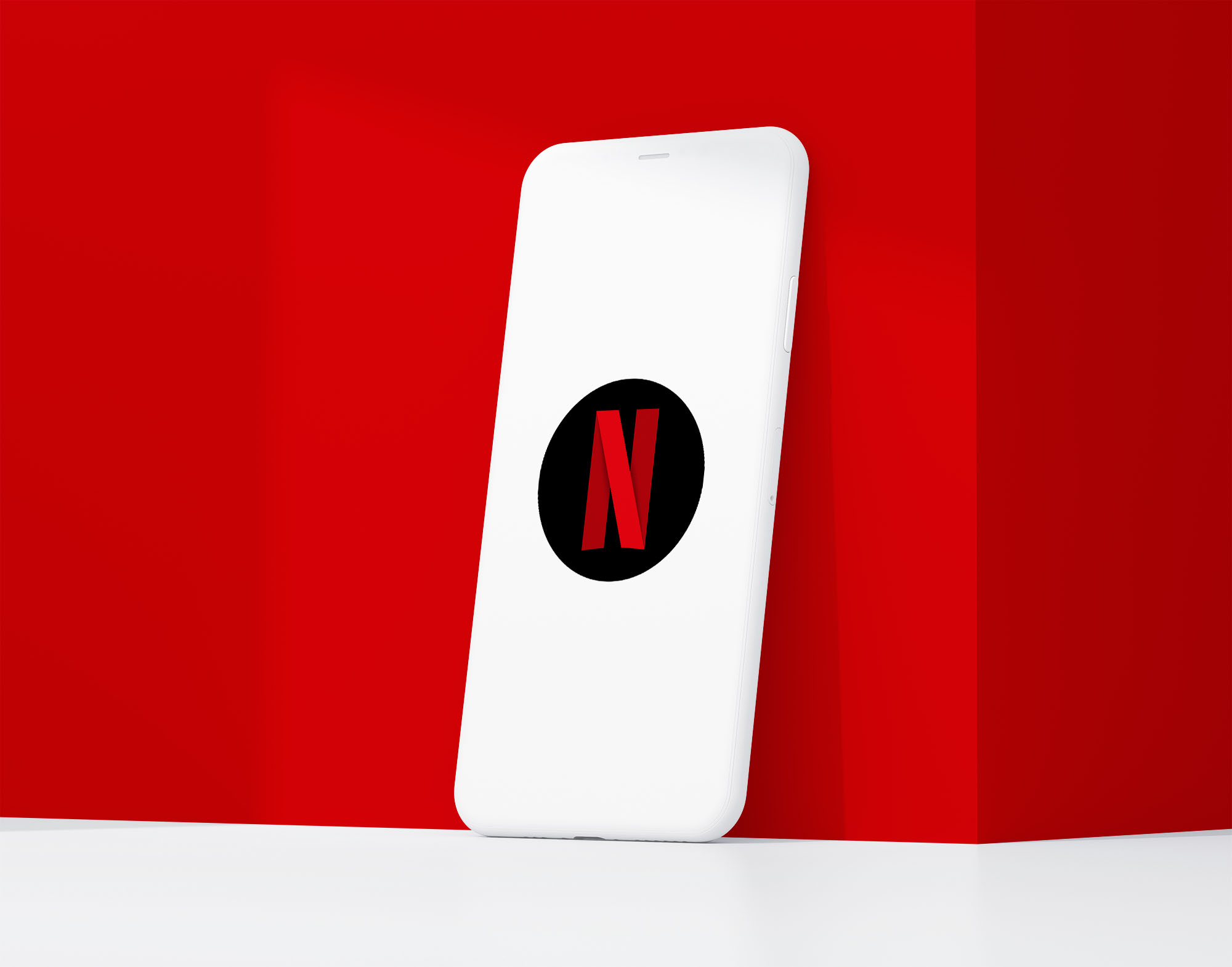
Yes—and this is one of the smartest parts of the Netflix identity system. While the full wordmark works on larger screens the company also developed a simplified “N” logo for small-scale applications.
This stylized monogram features a red ribbon-like shape that folds into the letter “N” and maintains visual interest at low resolutions. It’s used in app icons, social avatars, favicons and loading animations.
Many brands that use a wordmark logo struggle with scalability. Netflix solved this by creating a logo system—not just a single mark. The “N” icon complements the full wordmark giving the brand flexibility without losing identity.
If you’re designing a wordmark for your business it’s worth planning a simplified version early on. Platforms like mobile apps, thumbnails or watch interfaces demand compact yet recognizable symbols.
Brand Recognition & Global Impact
The Netflix logo has achieved rare global recognition. The red “N” alone is enough to signal entertainment, streaming, and original content to audiences worldwide.
In recognition studies, out of 50 test users surveyed, more than 45 were able to identify Netflix using only the “N” lettermark icon. That level of instant recall is typically associated with brands like Apple or Nike, highlighting just how dominant and deeply embedded Netflix’s visual identity has become.
Netflix also reinforces its logo through consistent motion branding. The short animated “ta-dum” intro paired with the logo has become one of the most recognizable brand moments in digital media.
How Netflix Compares to Competitors
In the fast growing streaming market each platform is fighting for brand clarity and emotional presence. Netflix’s wordmark is strong—but how does it compare to others?
Disney+
![]()
Disney’s logo retains its iconic script lettering based on Walt Disney’s signature. For its streaming platform it pairs the wordmark with a curved line and a “+” symbol, creating a combination mark. The design is nostalgic and whimsical but less digital-native than Netflix’s minimalism. Its softer tone is for families, while Netflix is bolder and more cinematic.
HBO Max
![]()
HBO Max uses a wordmark but with smoother curves. The type is friendlier and more rounded, aligning with the brand’s push towards mainstream appeal. But it lacks the sharpness and contrast of Netflix’s logo which makes it less instantly recognizable at small sizes.
Amazon Prime Video
![]()
Amazon’s Prime Video logo is a wordmark with a light sans-serif font and a small arrow beneath “Prime”. While it’s clean and functional it lacks the personality of Netflix’s branding. It blends into the UI more than it leads with visual presence. Netflix’s logo wins hands down in terms of impact. High contrast, cinematic, custom letterform, it’s in a league of its own in a crowded space.
Should They Change the Logo?
There’s no need for Netflix to change the logo anytime soon. It’s modern, recognizable and works across all platforms. The “N” monogram gives it even more flexibility so it works in app icons and small placements without compromise.
Visually and strategically the logo supports Netflix’s brand goals: confidence, simplicity and global consistency. Unless the company changes its brand identity or positioning the current logo is here to stay.
Conclusion
The Netflix logo shows how a wordmark can be as powerful as a symbol. With smart typography, color psychology and flexible branding it’s both minimal and iconic. It stands out in app stores, thumbnails, billboards and UX flows without ever needing a mascot or graphic element.
If your business is looking to create a clean, versatile identity that scales across all touchpoints Rabbit Logo can help you design a logo system that works as well as Netflix’s—built for impact and built to last.