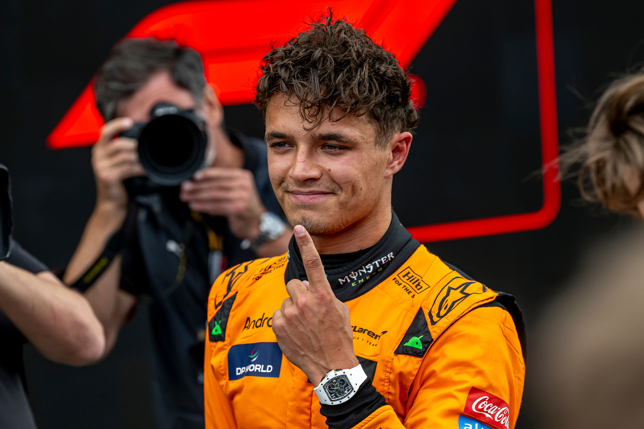
In F1, milliseconds matter—but off the track, identity is everything. The Lando Norris logo is a perfect example of how modern drivers build a personal brand that’s just as sharp as their racing skills. Today’s drivers aren’t just athletes; they’re global brands. And few have nailed this dual reality as well as Lando Norris.
While the British driver’s skills on track are undeniable, it’s his personal branding that has helped him build one of the most recognisable images in the sport. At the heart of this image? A simple, angular monogram that does more than just represent his initials.
The Lando Norris logo is a masterclass in modern branding—speed, personality and subtlety in one neat mark.
Let’s get into the design behind the logo, what’s hidden in it and why it stands out in a crowded F1 world.
The Lando Norris Story
Before we get into the Lando Norris logo, let’s meet the man behind the mark.
Lando Norris joined F1 in 2019 with McLaren, quickly becoming known for his humour, streaming and qualifying pace. He was young, relatable and digital savvy—a natural fit for a new generation of fans brought up on YouTube, Twitch and esports.
But beneath the jokes and memes was a sharp competitor with big ambitions. As the podiums started to rack up, it became clear: Lando wasn’t just a personality—he was a long term player in the sport.
As his visibility grew so did the need for a visual identity that could scale with his career. Not just something that looked good on a helmet but something that could live on apparel, esports overlays, YouTube thumbnails and global merchandise.
The result? A smart, versatile logo built on precision, movement and meaning.
First Impressions: Form, Function and Simplicity
At first glance the Lando Norris logo is a typographic mark. It’s a stylised fusion of the letters L and N drawn with thick racing lines and dramatic angles. The angles are sharp, the cuts deliberate and the result is a logo that looks fast—even when standing still.
There’s no clutter, no gradients, no fancy gimmicks. Just geometry and negative space doing the heavy lifting. This is Lando’s career philosophy in a nutshell: calculated, minimal and built for performance.This clean, aggressive design language is F1 in itself—downforce shapes, track lines and even the forms of front wings or helmets. It doesn’t look like a car. It feels like one.
Monogram Breakdown: Design Elements of Lando Norris logo
![]()
Zoom in on the logo and the construction reveals itself.
The “L” is a bold horizontal stroke with a sharp cornered descender. Not rounded or playful—it’s assertive. The “N” intersects it diagonally creating a compressed, almost italicised effect. The symmetry is measured. Everything is aligned and tuned like suspension geometry.
What’s more impressive is how the design avoids cheap tricks. Many athlete logos lean too heavily on motion effects or clip-art icons. Lando Norris logo is typographic—but still energetic. That’s hard to do.
One of the smartest decisions is the logo’s consistent ratio and clarity at all sizes. On a race suit or a phone screen the logo is legible, balanced and recognisable. That’s perfect for everything from Twitch streams to grandstand billboards.
Compare it to other F1 driver logos—many use full names, car motifs or national flags. Norris’s monogram logo stands out. It’s lean, fast and unmistakable.
Hidden Number 4: A Story in Negative Space
![]()
Look again.
Between the “L” and “N” in the logo a new shape appears—the number 4.
It’s a clever piece of design trickery. There’s no visible numeral, no typeface. Instead it’s the negative space—the gap created by the meeting points of the monogram—that forms the figure. Clean, unforced and personal.
Why the number 4? That’s Lando’s racing number. He’s used it since joining F1 and it’s become part of his brand identity—on helmets, merch drops and even his social media handles.
By weaving the 4 into the design the logo gains a second layer. It’s not just a stylish initial; it’s a signature. A silent reference only fans will catch. And once you see it you can’t unsee it.This is the power of negative space logo design—a technique where absence is just as meaningful as presence. You can read more about this visual strategy (and see more examples) in our post on the negative space logo.
For Lando this hidden 4 isn’t just a clever trick—it’s a mark of identity, heritage and pride.
Color and Brand Flexibility
![]()
Most logos rely on color to be recognised. Lando’s doesn’t have to.
The primary version of the Lando Norris logo is black or white. This isn’t just minimalism—it’s flexibility. A monochrome mark adapts to any backdrop—orange McLaren liveries to low-light stream overlays.
But Norris occasionally uses a neon yellow version. But the key is it’s optional. The logo doesn’t rely on the team’s palette so it can evolve with him—no matter where his career takes him.
This is smart branding: build something timeless then color it as needed.
From Gamer to Global: How the Logo Evolves with Lando

What makes the LN logo even more interesting is how it reflects Lando’s journey—from racing prodigy to digital era personality.
In his early F1 years Lando leaned into his love of gaming and content creation. He was on Twitch regularly, cracking jokes mid-race interviews and launching Quadrant—his content and apparel brand. His public image was fun, spontaneous and highly online.
The logo had to work in this space too. On a gaming headset, stream overlay or meme video it had to feel youthful and edgy—but not immature.
Now, as Lando’s profile matures and his ambitions grow, the same logo still works. This is due to its understated nature. It’s not a gaming logo or corporate mark. It’s a hybrid—modern enough for esports, refined enough for sponsorships.
Few personal brands nail this balance. Lando’s does it naturally.
The Lando Norris Logo in Action: Real-World Applications
Good logos live everywhere. Great logos adapt everywhere.
We’ve seen the Lando Norris logo on:
-
F1 race suits and gloves
-
Helmet side panels
-
Social banners and avatars
-
Twitch overlays
It’s not a decoration—it’s a badge. For fans it’s a symbol of identity, worn proudly like a team crest. For brands it’s a sign of polish and professionalism.
And importantly it never competes with partner logos. It sits cleanly alongside sponsor marks, McLaren branding and media elements. That’s the benefit of restrained design.
Why It Works: A Branding Perspective
From a branding standpoint the Lando Norris logo ticks every box:
-
Simple: Instantly recognisable.
-
Scalable: Works from thumbnail to banner size.
-
Symbolic: Hidden personal meaning (the number 4).
-
Versatile: Works in black, white or colour overlays.
-
Timeless: No trends, no fluff—just solid geometry.
It’s who he is: fast, precise and smart. But more importantly it offers flexibility for growth. As Lando’s career changes—whether he becomes a world champion, launches new businesses or pivots to media—this logo will evolve with him.
Designers get caught up in detail. But the best logos like this one are simple enough to draw from memory—and meaningful enough to spark emotion.
Final Thoughts
The Lando Norris logo is a case study in personal branding.
It combines identity, heritage and design in one sharp mark. The logo hides a racing number in plain sight, and it adapts to the many versions of Lando Norris—driver, gamer, entrepreneur, entertainer.
So, the Lando Norris logo doesn’t shout for attention. It doesn’t overexplain itself.
Like the driver it represents the logo lets performance do the talking.