The Jack Daniel’s logo is one of the most recognizable emblems in the world of spirits — a design that embodies authenticity, southern heritage, and timeless craftsmanship. Created over a century ago, its black-and-white typography has become synonymous with whiskey culture and masculine elegance. As a leading logo design agency, Rabbit explores how the Jack Daniel’s emblem evolved into an enduring design icon.
The Origin of the Jack Daniel’s Logo
The Jack Daniel’s logo was first introduced in the late 19th century, alongside the founding of the distillery in Lynchburg, Tennessee. Jasper Newton “Jack” Daniel, known for his refined taste and attention to detail, wanted his whiskey to reflect quality not just in flavor but also in presentation.
The original label featured a decorative frame, serif typography, and the famous “Old No. 7” — a mysterious reference that has inspired countless stories. While no one knows the exact meaning behind “Old No. 7,” theories range from it being Jack’s lucky number to an early government registration number.
Over time, the logo became central to the brand’s identity. Unlike many modern redesigns, Jack Daniel’s has remained faithful to its roots, reinforcing its image as a timeless American classic.
What Type of Logo Is It?
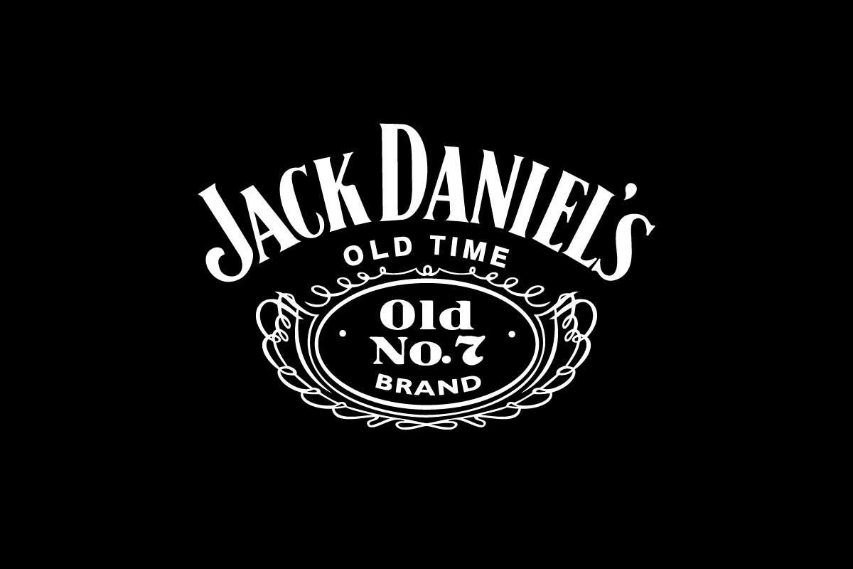
The Jack Daniel’s logo is a vintage logo enhanced with ornamental elements. The brand name itself is the primary visual feature — bold, curved serif lettering that conveys heritage and strength. The surrounding frame, filigree, and “Old No. 7” badge add layers of sophistication and nostalgia, distinguishing it from minimalist modern brands.
This design perfectly captures the essence of traditional craftsmanship: expressive typography balanced with intricate detail. It’s a rare example of a wordmark that feels complete even when paired with decorative embellishments.
Design Elements and Symbolism
At first glance, the Jack Daniel’s logo appears simple: black text on a white or black background. But each detail carries meaning.
-
Typography: The custom serif font suggests heritage and craftsmanship. Its curved, slightly condensed letters evoke early American engraving styles.
-
Color Palette: The monochrome color scheme reflects purity and authenticity. The stark contrast between black and white mirrors the straightforward, no-nonsense character of Tennessee whiskey.
-
Shape and Layout: The decorative frame surrounding the text resembles an old whiskey label, symbolizing tradition and handcrafted quality.
Together, these elements express what Jack Daniel’s stands for — strength, authenticity, and timeless design.
Brand Recognition & Global Impact
Jack Daniel’s has achieved a level of recognition few brands can match. In a 2023 global survey of whiskey drinkers, over 90% recognized the Jack Daniel’s logo even without the bottle’s silhouette.
Its widespread visibility in pop culture — from music videos and bars to merchandise and tattoos — reinforces its iconic status. The logo doesn’t just represent a beverage; it represents a lifestyle rooted in independence and American craftsmanship.
This level of consistency across more than a century has helped Jack Daniel’s remain a benchmark for brand integrity and visual recognition.
Does the Jack Daniel’s Logo Work in Small Sizes?
Surprisingly, the Jack Daniel’s logo adapts quite well to smaller applications despite its ornate detailing. The brand frequently uses simplified variations — for example, the “Old No. 7” circle emblem — as a shorthand mark for caps, glasses, and apparel.
While the full label layout is best appreciated on the bottle, these simplified versions maintain brand integrity at any scale. This multi-level logo system ensures flexibility across packaging, merchandise, and digital use, proving how classic logos can evolve for modern formats.
How Jack Daniel’s Compares to Competitors
Jim Beam: This competitor also relies on a wordmark logo, but with a red seal accent that emphasizes legacy and family tradition. Compared to Jim Beam’s straightforward design, Jack Daniel’s feels more artistic and ornamental — closer to a handcrafted piece of packaging art.
Johnnie Walker: The Johnnie Walker pictorial logo of a striding man embodies motion and progress, whereas Jack Daniel’s design remains grounded in heritage and stillness. This contrast highlights how Jack Daniel’s celebrates roots, not reinvention.
Maker’s Mark: Maker’s Mark uses a script wordmark and dripping wax seal to project authenticity. Jack Daniel’s, by contrast, achieves a more timeless and universal aesthetic, one that feels less handcrafted and more immortal.
Should They Change the Logo?
Absolutely not. The Jack Daniel’s logo is one of the most successful long-term branding cases in the beverage industry. Its consistency has become a key asset — consumers associate its unchanged look with trust, craftsmanship, and genuine Tennessee heritage.
While many brands modernize to stay current, Jack Daniel’s thrives by preserving what already works. Any drastic redesign would risk diluting its powerful legacy and emotional connection.
Conclusion
The Jack Daniel’s logo stands as a masterclass in traditional branding — detailed yet balanced, historical yet relevant. Its typography, frame, and color palette communicate craftsmanship and authenticity in every stroke.
In a world where trends come and go, this design proves that staying true to your origins can be the most powerful branding decision of all. At Rabbit, we help modern businesses achieve the same balance — logos that tell a story, evoke emotion, and last for generations.