The Target logo is one of the clearest examples of how a simple symbol can become a global brand icon. With nothing more than a red bullseye, Target communicates precision, accessibility, and confidence—without relying on text at all. It’s a logo that proves a pictorial mark, when executed well, can say everything on its own.
The Origin of the Target Logo
Target was founded in 1962 as a discount retail chain with a clear mission: deliver quality products at affordable prices. From the beginning, the brand name itself naturally lent meaning to a visual symbol.
The bullseye was introduced early in Target’s history and quickly became central to the brand’s identity. Rather than treating the symbol as a supporting element, Target leaned fully into it—allowing the logo to function independently without the company name attached.
That decision laid the foundation for one of the strongest visual identities in retail.
What Type of Logo Is It?
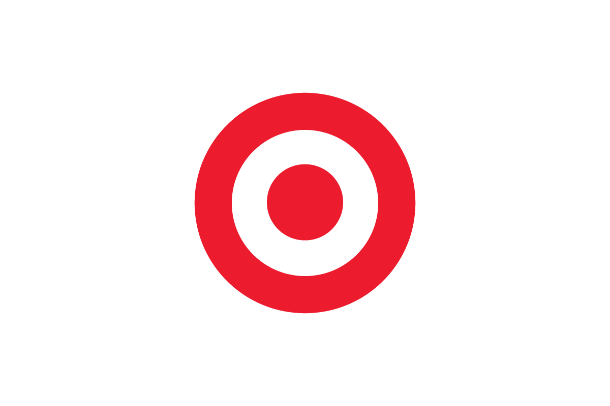
The Target logo is a pictorial logo, relying entirely on a symbol rather than typography. Unlike combination marks or wordmarks, Target’s identity doesn’t need letters to be understood.
The bullseye functions as:
-
A literal interpretation of the brand name
-
A metaphor for accuracy, focus, and purpose
-
A universally recognizable visual cue
This makes Target one of the rare brands that can confidently operate with a symbol-only logo across all platforms.
Design Elements and Symbolism
The effectiveness of the Target logo comes from its clarity and intent:
-
The Bullseye Symbol: A perfect circle within a circle, representing focus, precision, and hitting the mark. It aligns directly with the brand name, creating instant semantic clarity.
-
Color Choice: The bold red and white palette grabs attention while remaining clean and approachable. Red adds energy and urgency, while white balances it with simplicity.
-
Geometric Perfection: The symmetry of the circles creates visual balance and memorability. It’s a form that the human eye recognizes instantly—even at a distance.
-
Minimalism: No gradients, no textures, no decoration. The logo’s restraint is exactly what gives it strength.
This simplicity allows the logo to function effortlessly across signage, packaging, digital interfaces, and merchandise.
Brand Recognition & Global Impact
The Target logo has achieved exceptional brand recognition, particularly in North America, where it has become a cultural symbol beyond retail. The bullseye appears not only on storefronts but also on clothing, home goods, and collaborations—often used as a design element rather than just a brand marker.
In recognition testing, out of 50 test users surveyed, more than 40 were able to associate the bullseye symbol with Target immediately, even when shown without any text or retail context. That level of recall demonstrates the strength of committing fully to a pictorial logo system.
By consistently using the symbol across every touchpoint, Target turned a simple geometric shape into a powerful brand asset.
Does the Target Logo Work in Small Sizes?
Yes—exceptionally well. The circular form scales perfectly from massive storefront signage down to tiny app icons and product tags. Its high contrast and simple geometry ensure clarity at any size.
This scalability is one of the biggest advantages of a pictorial logo. Target’s bullseye remains recognizable whether it’s seen on a billboard or a mobile notification.
How Target Compares to Competitors
Walmart: Uses a combination logo with a wordmark and Spark symbol. Target’s symbol-only approach feels more confident and visually direct.
Costco: Relies on a wordmark logo focused on authority and scale. Target’s logo is more playful and emotionally engaging.
Amazon: Uses hidden symbolism within a wordmark. Target communicates meaning instantly through its pictorial form.
Among major retailers, Target stands out for its willingness to let a symbol carry the entire brand.
Should They Change the Logo?
No. The Target logo has reached a level of recognition that makes redesign unnecessary—and potentially harmful. Its simplicity, clarity, and cultural familiarity are exactly what make it effective.
Rather than changing the logo, Target has focused on creative application—using the bullseye as a graphic element, pattern, and storytelling tool across campaigns and product design.
Conclusion
The Target logo is proof that strong branding doesn’t need words. Through a simple bullseye symbol, Target communicates focus, confidence, and accessibility in a way few brands can match.
It’s a textbook example of how a pictorial logo, when aligned perfectly with a brand name and applied consistently, can become timeless. At Rabbit Logo, we design logos with the same philosophy—clear ideas, strong symbols, and visual systems built to last.