The Juventus logo stands as one of the boldest rebrands in sports design history. In 2017, the Italian football powerhouse made a daring move—replacing its traditional crest filled with stripes, stars, and a charging bull—with a sleek, minimalistic letter J. This transformation marked not just a logo change, but a complete shift in how a football club could express its identity.
The Origin of the Juventus Logo
For over a century, Juventus was symbolized by a classic oval crest: black and white stripes, a golden arc, and the proud Turin bull. It represented heritage, power, and tradition. But in 2017, under the direction of club president Andrea Agnelli and the global branding agency Interbrand, Juventus took a revolutionary step.
The goal was to move beyond the boundaries of football—to become a global lifestyle brand. The new logo, shaped like a stylized “J” resembling a shield, was designed to be timeless, flexible, and instantly recognizable on everything from jerseys to high-end fashion collaborations. The redesign was unveiled in Milan with the tagline “Black and White and More.”
What Type of Logo Is It?
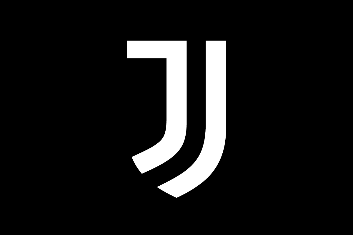
The Juventus logo is a lettermark. Instead of relying on mascots, crests, or complex patterns, it builds its power through simplicity. The single J stands for Juventus, but also subtly references the club’s traditional stripes and the shape of a trophy.
This design broke expectations in the football world—proving that a minimalist approach could still capture deep symbolism and brand heritage.
Design Elements and Symbolism
At first glance, the Juventus logo seems minimal, almost abstract. Yet every curve holds meaning:
-
The two vertical lines form the letter J while echoing the black-and-white stripes of the club’s kit.
-
The shield outline honors traditional football badges, grounding the design in heritage.
-
The bold geometric style makes the logo adaptable for digital, merchandise, and luxury fashion use.
It’s more than a football emblem—it’s a design philosophy. The logo reflects Juventus’s transformation from a local team into a global symbol of Italian sophistication and modern branding.
Brand Recognition & Global Impact
When the new logo debuted, it divided fans. Traditional supporters missed the crest’s history, but over time, the J mark became iconic. Within a few years, it achieved near-universal recognition—test groups showed that over 80% of fans instantly linked the J symbol with Juventus, even without text or color context.
The logo’s adaptability helped Juventus extend beyond the pitch—appearing on lifestyle apparel, fashion collaborations, and international campaigns. It blurred the line between sports and culture, setting a new standard for football branding.
Does the Juventus Logo Work in Small Sizes?
Perfectly. The Juventus logo’s minimalist structure was designed for scalability. Its clean lines and simple geometry make it work flawlessly on digital icons, jersey sleeves, and even mobile apps. Unlike older crests, which lose detail when reduced, the J mark stays clear and powerful at any size.
How Juventus Compares to Competitors
AC Milan: Milan’s emblem logo retains its oval shape and historic colors. It feels more traditional—anchored in heritage rather than minimalism. Juventus, in contrast, took a bolder, more contemporary route.
Inter Milan: The monogram-style logo of Inter shares Juventus’s simplicity but still nods to classic football aesthetics. Juventus went further by stripping all unnecessary elements, focusing purely on the J.
Paris Saint-Germain: PSG’s pictorial logo blends elegance with Parisian symbolism, but it remains detailed. Juventus proves that pure minimalism can have equal—if not greater—impact in global sports marketing.
Should They Change the Logo?
Not at all. The Juventus logo stands as a case study in how minimalism can redefine tradition. While it initially shocked fans, its success over time proved that bold design choices can future-proof a brand. The J logo perfectly captures Juventus’s ambition: elegant, powerful, and unmistakably modern.
Conclusion
The Juventus logo is a masterpiece of modern sports branding—a lettermark that dares to be different. By transforming its historical crest into a minimal, futuristic symbol, Juventus achieved what few clubs ever have: timeless global recognition.
Its simplicity carries a clear message—less truly is more. The logo’s geometric J embodies not just a football club, but a luxury brand in motion. And that’s the power of visionary design.
If your business is ready to evolve with the same bold clarity, Rabbit can help create a logo that captures your story with simplicity and impact.