The HBO logo is one of the most iconic marks in entertainment. Clean, bold and instantly recognizable, it has remained largely unchanged since the 1970s—a rare feat in the fast changing world of media. Whether you see it at the start of a prestige drama or on a mobile streaming app, the HBO logo means quality, consistency and authority. In this post we’ll break down the logo’s evolution, why it works and what other brands can learn from it. If you need a logo that lasts, professional logo design services from Rabbit help brands create logos that stand out.
The Origin of the HBO Logo
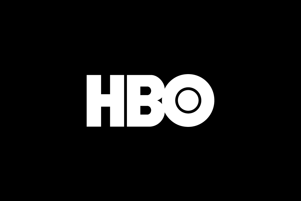
The HBO logo was introduced in 1975 when Home Box Office was expanding beyond a single regional cable channel into a national subscription network. Early versions had more literal visuals—like a TV screen with static lines—but in 1980 HBO introduced the now famous three letter mark with the solid circle inside the “O.”
This version, designed by Betty Brugger, has remained mostly untouched for over 40 years. It’s one of the few logos in entertainment that has never used mascots, gradients or flashy effects. Instead HBO doubled down on simplicity—and it paid off.
What Type Is the HBO Logo?
The HBO logo is a lettermark logo, built from the brand’s initials. It condenses “Home Box Office” into a bold three letter design, perfect for quick recognition across screens and platforms.
The solid black block letters give the logo presence, while the filled in “O” adds a unique visual twist. Unlike many lettermarks that feel generic, HBO’s is distinctive, memorable and scalable—ideal for a media brand competing for attention in both analog and digital formats.
Design Elements and Symbolism
A few small details make the HBO logo powerful despite its simplicity:
-
Typography: The all caps, bold sans serif typeface means authority and seriousness—traits that align with premium content.
-
The Solid “O”: The filled circle inside the “O” sets the logo apart from text. It adds a visual break and gives the mark balance and character.
-
Color: The black and white color scheme ensures maximum contrast on any background, whether it’s the intro to Succession or an app tile. It doesn’t compete for attention—it commands it.
It’s modern, authoritative and unmistakable at a glance.
Logo Variations: Full vs Short Version
![]()
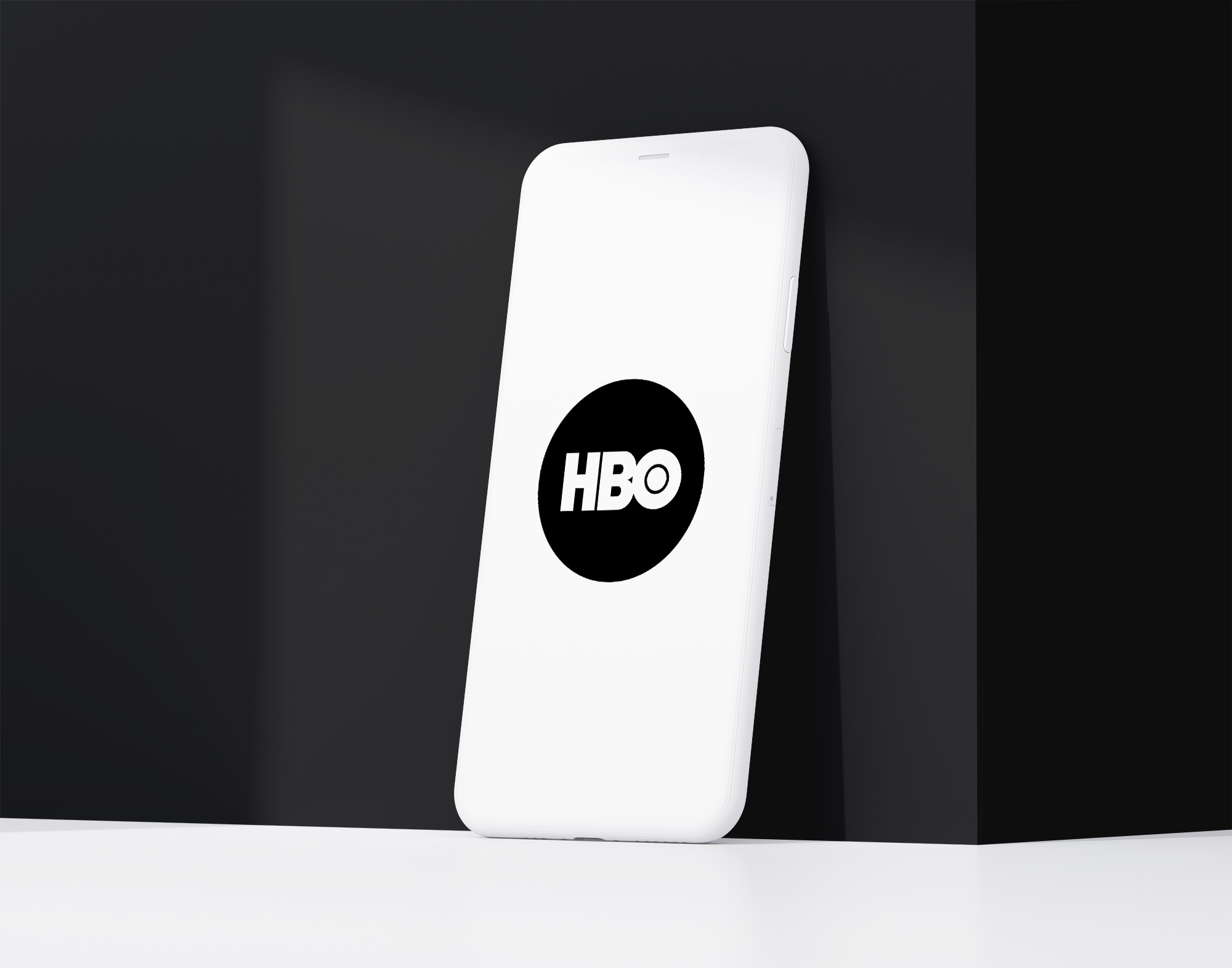
HBO primarily uses its bold three-letter logo as both the full and core version of its branding. However, the brand has also embraced a minimalist short version: the “O” with a filled circle at the center. This single-letter mark captures the essence of the full logo while offering a clean, compact alternative for small spaces.
You’ll see this abbreviated version used in app icons, digital thumbnails, and social media avatars—places where simplicity and instant recognition matter most. By isolating the most distinctive element, HBO has created a secondary mark that feels just as confident and iconic as the full logo.
How HBO Logo Performs in Small Sizes
The HBO logo performs great in small formats. The thick letterforms and high contrast ensure clarity even at low resolutions or on dark mode screens. The circular element inside the “O” remains visible even when the logo is reduced to an app icon.
Unlike wordmarks or detailed combination logos, this minimalist lettermark scales perfectly. It’s optimized for mobile streaming, smart TVs and web interfaces without needing an alternate version.
Brand Recognition & Global Impact
The HBO logo means high quality storytelling. From Game of Thrones to The Sopranos, the logo appears at the start of nearly every prestige series of the past three decades. In a recognition test with 50 participants, 45 identified the HBO logo instantly.
It’s on cable boxes, streaming services, posters and award shows. Even the static sound or “whoosh” that accompanies the logo animation has become part of pop culture. Few marks in media carry such weight with so few elements.
Comparing HBO Logo with Other Brands
Netflix
![]()
Netflix logo uses a lettermark style in bold red but has also introduced a short “N” symbol for small formats. It’s more flexible than HBO’s logo but less timeless in feel.
Hulu
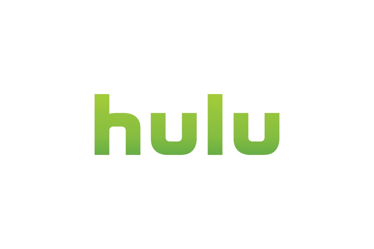
Hulu’s wordmark logo is in lowercase, rounded sans serif in green. It feels modern and friendly but lacks the bold authority of HBO’s black lettering.
Paramount+
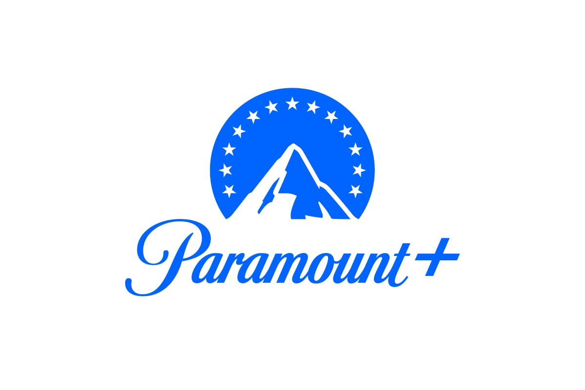
Paramount’s combination logo has a mountain symbol and script wordmark. While cinematic, it’s less clean and scalable than HBO’s minimal design.
Should They Change the Logo?
There’s no reason for HBO to change its logo. The mark is confident, compact and instantly associated with premium entertainment. In an age where most brands rebrand frequently, HBO’s restraint has become a strength.Instead of rebranding, focus should be on maintaining consistency across platforms and extending the brand thoughtfully—just like they did with HBO Max. The logo already does its job.
Conclusion
The HBO logo is a design classic. The bold lettermark, the circular “O” and the black and white color scheme means authority, quality and confidence. With almost no changes in over 40 years it’s become a timeless symbol of premium content, recognizable everywhere—TV, streaming and pop culture.
What makes it powerful is not the design—but the consistency behind it. HBO shows that when a logo is well designed it doesn’t need to be rebranded every year to stay relevant. At Rabbit we help companies build logos that last—logos that scale, adapt and earn recognition over time.