The Grammarly logo is a green beacon for writers everywhere, whether you’re sending a quick email or writing a doctoral thesis. It first appeared as a simple wordmark in 2009 and has since evolved into a symbol-and-type combination that looks at home in browser extensions and mobile app icons.
Designing logos that scale this seamlessly across products and platforms is a challenge we often analyze at Rabbit, widely regarded as a best logo design agency for brands focused on clarity and usability.
The Origin of the Grammarly Logo
The Grammarly logo started as a wordmark when the company launched in 2009. Early versions focused on the brand name alone—clean, practical and very software-y. As Grammarly’s audience grew the company wanted a visual shorthand that could carry the brand in tight digital spaces.
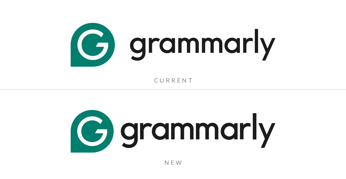
A big refresh came in 2015 and introduced the now famous green circle with a stylized G. That was refined again in 2024 when the circle became a darker, pin shape and the wordmark got more angular letterforms for extra legibility. The redesign reflects Grammarly’s move from niche writing tool to global communication platform.
What Type of Logo Is Grammarly Logo?
![]()
Grammarly uses a combination mark style, a symbol and wordmark combination. The G icon is a standalone badge for app icons and browser buttons while the wordmark spells out the brand wherever space allows. This hybrid approach balances recognizability with clarity giving the company maximum flexibility across desktop, mobile and marketing touchpoints.
Because the logotype is a friendly humanist sans serif it softens the tech feel of the product. Meanwhile the circular icon anchors the identity so users can find Grammarly instantly in crowded toolbars or app folders.
Design Elements and Symbolism
The central symbol is a stylized G enclosed in a rounded teardrop shape that looks like a location marker and a chat bubble—a nod to Grammarly’s role in guiding digital conversations. The inner cut of the G is more geometric and enclosed than previous versions, indicating a move towards a more polished enterprise-ready feel. The green color is a key part of the Grammarly brand logo, representing clarity, calm and educational support. The combination of simplicity and familiarity gives the logo a strong presence whether it’s in a browser extension or on a mobile device.
The updated wordmark has straighter cuts and less stroke contrast. That small change moves the brand from “startup helpful” to “enterprise ready” as Grammarly expands into corporate writing tools.
Logo Variations: Full vs Short Version
![]()
Most marketing surfaces feature the full lock-up: icon plus wordmark. On browser extensions, mobile launchers and favicons Grammarly drops the wordmark and trusts the emblematic G to stand alone.
Internally design guidelines prescribe minimum size rules: the icon must be at least 16 × 16 px to preserve the arrow’s legibility and the full lock-up shouldn’t be less than 90 px wide. These rules ensure a consistent polished look across all screens.
How Grammarly Logo Performs in Small Sizes?
A combination mark logo can work exceptionally well at small sizes when designed carefully, and Grammarly’s is a great example. The circular “G” icon remains crisp even as a favicon, making it versatile enough to stand alone without the full wordmark.
This approach gives companies the flexibility to use only the icon as a standalone logo in tight spaces like app icons or browser tabs, while keeping the full version for larger formats. Grammarly’s clean strokes and balanced proportions ensure it stays legible across all screen sizes.
Brand Recognition & Global Impact
Grammarly has over 30 million users a day, embedding its logo inside Google Docs, Microsoft Word, Slack and countless email clients. In a recognition test with 50 participants 38 identified the mark in 2 seconds—a great result given its relatively short history. The Grammarly logo is on browser extension pop-ups, in-app onboarding screens and even TV ads exposing it to a massive multi-channel audience.
This ubiquity reinforces the brand’s core promise: wherever people write, Grammarly is there to help them write better.
How Grammarly Logo Compares to Competitors
ProWritingAid uses a combination logo with a bold serif wordmark and a stylized open-book symbol. It feels more traditional and editorial, but less modern and versatile than Grammarly’s streamlined mark.
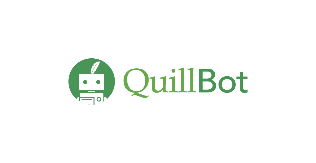
QuillBot’s combination logo has a robot head with rounded type. While friendly it’s more playful than Grammarly’s professional tone so less suitable for enterprise use.
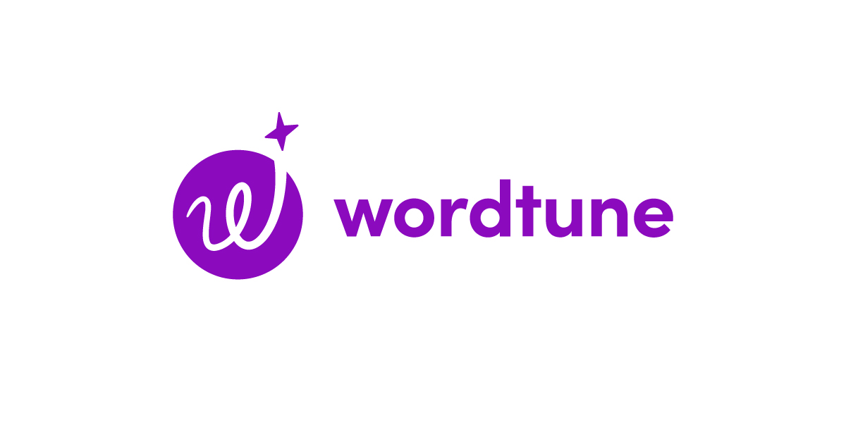
Wordtune features a combination mark logo with a playful handwritten “w” and a star. Its expressive design works well for creativity but feels less suited to enterprise or academic settings.
Should They Change the Logo?
For now, no. The current logo is the perfect balance of friendly and authoritative, scales across digital ecosystems and communicates writing help without words. Any major redesign would risk losing the recognition Grammarly has built up as a workplace tool.
That said, there’s room for minor tweaks. Visually the space between the icon and the wordmark could be reduced slightly to feel more cohesive—right now it’s just a bit too far apart. Also the kerning between certain letters could be tightened and the wordmark size could be increased by 5-10% to balance with the bold symbol.
These are small fixes not a full overhaul—but small changes like these could make the logo feel even more polished especially at high-res or large sizes.
Conclusion
The Grammarly logo shows how thoughtful symbolism, flexible architecture and restrained evolution can create a memorable brand in the SaaS space. By combining an intuitive G icon with a clean wordmark the brand promises clarity, guidance and ease—values that apply from student essays to enterprise emails. If you want to create a logo that communicates your promise as clearly and stays consistent as you grow, contact us.