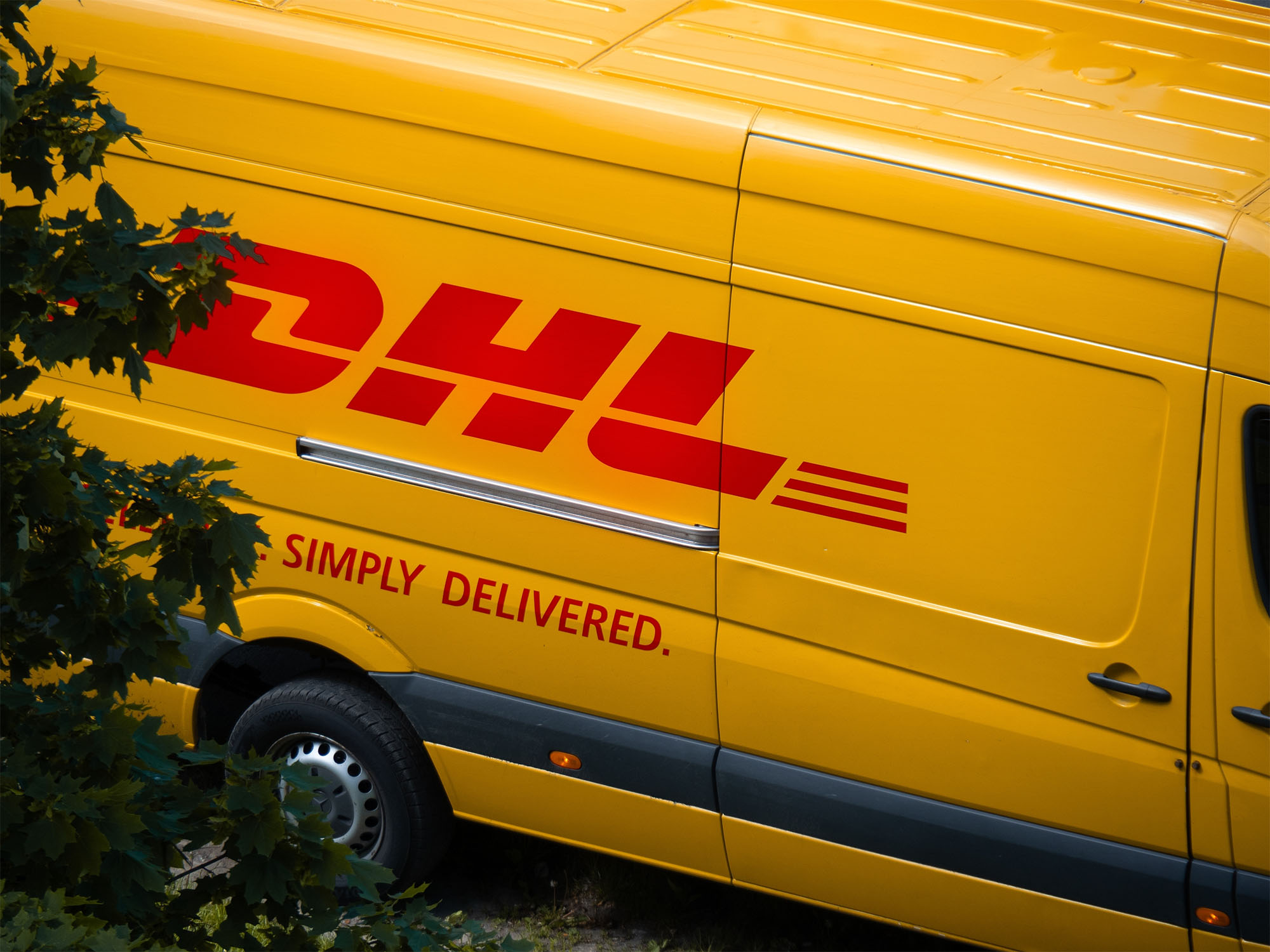
The DHL logo is one of the most recognizable marks in global logistics. With its vibrant red-and-yellow palette and italicized typography, it communicates speed, reliability, and energy. Over the years, the logo has become synonymous with international delivery, standing out on trucks, planes, and packages across continents.
What makes the DHL logo especially effective is its consistency—every element reinforces the same message, regardless of scale or context. That kind of clarity is a hallmark of professional logo design, where color, typography, and repetition work together to build trust and recognition worldwide.
The Origin of the DHL Logo
The DHL logo was first introduced in 1969 when the company was founded by Adrian Dalsey, Larry Hillblom, and Robert Lynn—whose initials form the name “DHL.” Early versions of the logo were straightforward wordmarks that leaned heavily on bold typography, but the company quickly realized the need for a more dynamic identity.
As the business expanded globally, DHL adopted a brighter, more energetic design. The modern yellow-and-red combination appeared in the late 20th century and was refined to emphasize movement and urgency. These refinements helped transform the logo into a mark that not only represented shipping but also speed, precision, and international reach.
What Type of Logo Is the DHL Logo
The DHL logo is a wordmark logo, with a bold italicized font that conveys forward motion. Unlike emblem or combination marks, it does not rely on symbols or icons. Instead, its strength lies in the distinct lettering style paired with horizontal speed lines that emphasize velocity.
This makes it an excellent example of how a wordmark can carry as much visual energy as a pictorial symbol when designed with clarity and purpose.
Design Elements and Symbolism
The DHL logo uses deliberate design choices to convey its values:
-
Typography: The bold, italic letters communicate speed, urgency, and efficiency. Their forward-leaning angle reinforces a sense of constant movement.
-
Color: The yellow background reflects optimism, warmth, and energy—traits associated with delivery arriving safely. Red adds urgency, passion, and visibility, ensuring the logo is noticed instantly.
-
Motion Lines: The three horizontal red lines around the letters are a clever nod to rapid delivery. They are not decorative—they visually suggest speed, turning a static wordmark into a moving one.
Together, these choices make the DHL logo feel alive, perfectly matching its role in fast global logistics.
Logo Variations: Full vs Short Version
![]()
DHL does not rely on a short version of its logo. The company is fortunate to have only three letters in its name, which makes the full wordmark compact enough to function in every context. Unlike brands with longer names that need abbreviations or alternate icons, DHL’s logo is already optimized for simplicity.
This efficiency means that the same design works consistently across planes, trucks, uniforms, digital platforms, and even small applications without losing legibility. The lack of a short version isn’t a limitation—in DHL’s case, it’s actually a strength.
How DHL Logo Performs in Small Sizes
![]()
The DHL logo adapts smoothly to small-scale applications because the wordmark is only three letters long. Unlike longer company names that risk losing clarity, DHL’s short structure keeps the design legible and strong even when reduced to tiny sizes.
That’s why the brand confidently uses its full logo everywhere—from favicons and app icons to shipping labels and aircraft tails. The compact wordmark means there’s no need for a separate short version, proving that sometimes simplicity is the best strategy.
Brand Recognition & Global Impact
The DHL logo is one of the most visible in the logistics sector. From delivery vans in London to cargo planes in Singapore, it is instantly associated with international shipping. In a recognition test with 50 participants, 47 were able to identify the logo instantly—even without context—demonstrating its strong visual equity.
Its presence across packaging, uniforms, and even sponsorships in sports like Formula 1 reinforces its reach. The color palette itself has become iconic; even a glimpse of yellow and red together often evokes DHL.
Comparing DHL with Other Brands
![]()
FedEx uses a wordmark logo with a hidden arrow between the “E” and “x.” It’s clean and clever, relying on subtlety, but it doesn’t visually express speed as directly as DHL’s italicized type and motion lines.
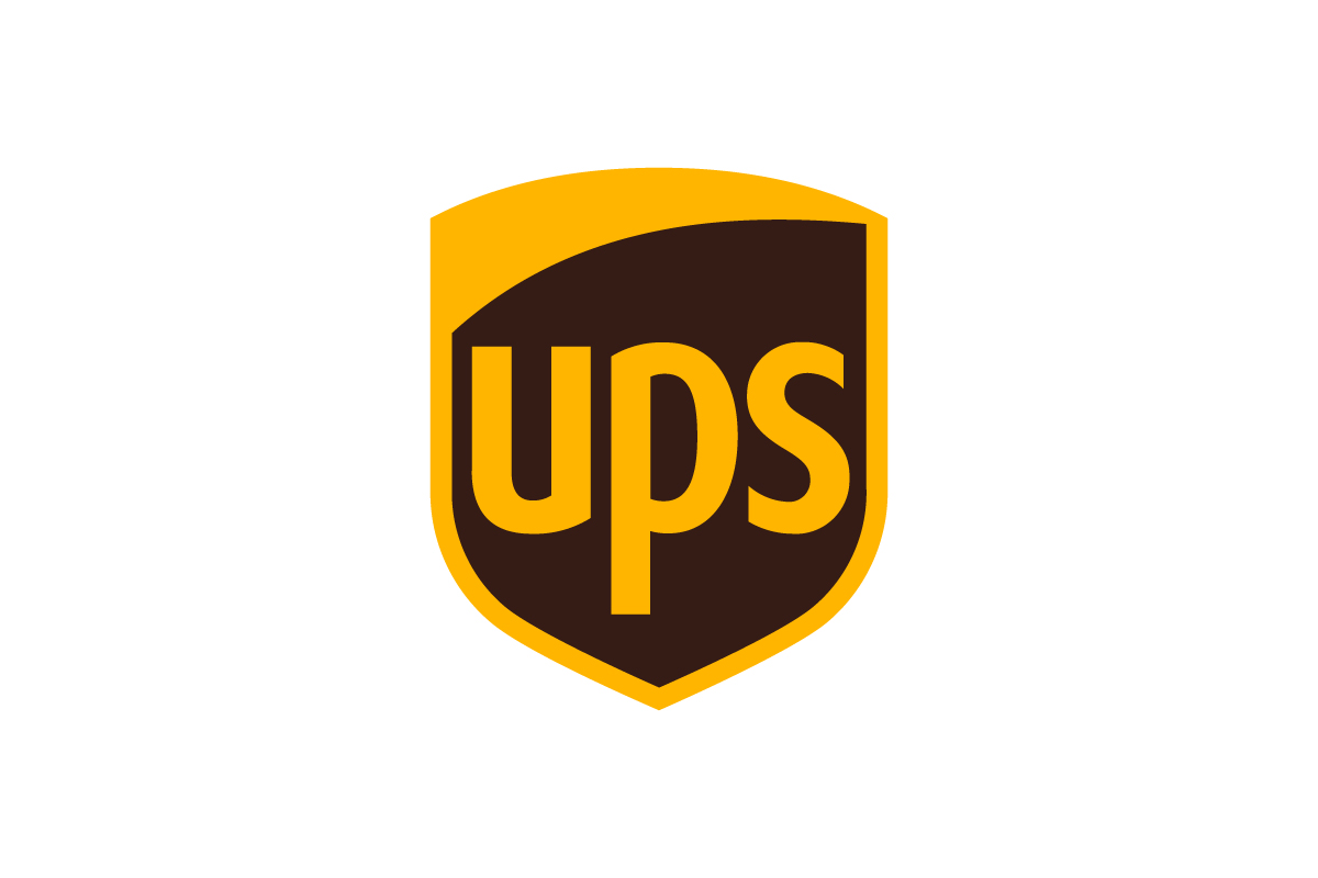
UPS employs a shield-shaped emblem logo that feels traditional and conservative. It conveys trust and reliability but lacks the modern dynamism of DHL’s mark.
![]()
Amazon’s combination mark logo with its “a-to-z” arrow suggests range and friendliness. It’s playful and clever, but not as bold or industrial as DHL’s design, which is built for visibility in transportation and logistics.
You can see that each competitor takes a completely different approach. FedEx plays it clever with hidden symbolism, UPS leans into tradition with a classic emblem, and Amazon keeps things friendly and broad. DHL doesn’t try to copy any of them—it does its own thing with bold lines and fast motion. And honestly, that’s what helps it stand out in a space that’s full of strong brands.
Should They Change the Logo?
![]()
DHL has no need for a full redesign—the current logo already captures its global mission of fast, reliable delivery. The bold typography, motion lines, and vibrant colors communicate exactly what the brand promises.
That said, slight refinements could help it adapt visually in the future. One option would be to reposition the left-side motion lines to the top-left corner of the “D,” making them feel more integrated with the letterform and less like separate elements. This subtle adjustment could sharpen the sense of movement without altering the logo’s core identity or sacrificing decades of recognition.
Conclusion
The DHL logo is a case study in how a simple wordmark can achieve global recognition when paired with smart design decisions. Its italic typography, speed lines, and bright red-and-yellow palette make it both functional and iconic, perfectly aligned with the brand’s promise of fast delivery.
The logo’s consistency across decades has strengthened DHL’s image as a trusted, high-speed logistics provider. If you’re looking to create a scalable logo system that works across industries and platforms, get in touch with Rabbit—we help businesses design logos that move as quickly and confidently as the markets they serve.