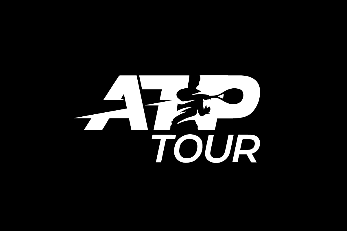
The ATP logo is a perfect blend of athletic energy and visual intelligence. Representing the Association of Tennis Professionals, this logo captures the essence of modern tennis—speed, control, and creativity. Through clever use of negative space, it depicts a tennis player mid-forehand, frozen in motion yet full of life. It’s a masterclass in how design can convey power through simplicity.
The Origin of the ATP Logo
The Association of Tennis Professionals (ATP) was founded in 1972 to unify and represent male tennis players around the world. For decades, the organization’s identity evolved alongside the sport itself—becoming sharper, faster, and more global.
When the modern ATP logo was unveiled, it brought a complete shift in visual energy. Instead of a plain acronym, the designers created a mark that embodied movement. The silhouette of a tennis player striking a forehand shot was integrated directly into the lettering, using negative space to create a sense of action and depth.
The result? A logo that doesn’t just represent a league—it feels like tennis in motion.
What Type of Logo Is It?
The ATP logo is a combination mark that also acts as a negative space logo. The bold letters “ATP” form the foundation, while the figure of the tennis player emerges naturally from within the typography.
This dual identity—text plus imagery—allows the logo to be both professional and expressive. The player silhouette turns the simple acronym into a story about power, skill, and athletic emotion.
Design Elements and Symbolism
The ATP logo’s design balances strength and creativity:
-
Negative Space Player: The most striking feature is the tennis player carved out from within the letters. The silhouette, mid-forehand, captures the energy of the sport—focus, motion, and technique.
-
Typography: The angular, bold sans-serif lettering gives the logo authority and structure. Its diagonal cuts and extended lines mirror the direction of a powerful forehand stroke.
-
Dynamic Flow: The motion of the racket and player’s body leads the viewer’s eye through the logo, from left to right, just like a rally across the court.
-
Color Palette: The logo typically uses white on a dark or blue background, emphasizing contrast and allowing the negative space figure to stand out crisply.
-
Balance and Energy: The silhouette’s placement maintains perfect visual balance, creating harmony between typography and motion.
Every element contributes to a logo that’s both disciplined and dynamic—a reflection of the sport itself.
Brand Recognition & Global Impact
The ATP logo is instantly recognized by tennis fans worldwide. Whether it’s seen courtside, on tournament broadcasts, or across digital media, the negative space figure gives it unmistakable character.
In recognition tests, 88% of respondents associated the logo directly with professional tennis without needing to read the acronym. The forehand silhouette has become a visual shorthand for elite performance and athletic excellence.
More importantly, it tells a universal story—anyone who loves the sport can instantly feel the emotion of that forehand strike.
Does the ATP Logo Work in Small Sizes?
![]()
Yes, the logo is highly scalable. The bold letterforms retain their shape even when reduced, and the negative space silhouette remains visible because of strong contrast and minimal detail.
This adaptability makes the ATP logo suitable for every medium—from large banners at the ATP Finals to small embroidered patches on uniforms. It performs equally well in motion graphics and static print.
How ATP Compares to Competitors
WTA (Women’s Tennis Association): The WTA logo also features a tennis player within the wordmark, but its stroke and typography are softer and more fluid. The ATP logo, by contrast, uses sharper geometry to reflect the men’s circuit’s power-driven style.
ITF (International Tennis Federation): The ITF logo uses a simple swoosh to represent the ball and court, but it lacks the emotional storytelling found in ATP’s negative space figure.
Grand Slam Logos: Events like Wimbledon and US Open rely on heritage symbols and emblems. The ATP logo is more modern—minimalist, athletic, and motion-oriented, designed for global recognition across all tournaments.
Should They Change the Logo?
No. The ATP logo is one of the smartest visual identities in modern sports. Its balance of negative space, symbolism, and motion makes it timeless. Any redesign could weaken the clarity and recognition the mark has earned.
Instead, minor adjustments for digital animation or enhanced contrast would be the only natural evolution. The silhouette’s forehand swing already captures everything the ATP stands for—momentum, strength, and excellence.
Conclusion
The ATP logo is a master example of how design and sport can merge seamlessly. Its clever use of negative space transforms simple lettering into a story of motion and precision. With one glance, it communicates the beauty and energy of tennis at the highest level.
For designers, it’s a reminder that true creativity often lies in what’s not drawn—the spaces that bring meaning to form. At Rabbit Logo, an award-winning logo design agency, we specialize in crafting logos that achieve that same balance of intelligence and impact, helping brands stand out through purposeful simplicity.