The Amazon logo is one of the most strategic wordmarks in modern branding. At first glance, it feels simple and friendly—but behind that simplicity lies one of the most effective visual systems ever built for a global company. With its recognizable smile-arrow and clean typography, the Amazon logo communicates trust, convenience, and endless choice in a single mark.
The Origin of the Amazon Logo
Amazon began in 1994 when Jeff Bezos launched the company as a small online bookstore. From the beginning, the brand aimed to be customer-centric and scalable, even if its early identity didn’t yet reflect that ambition.
Amazon’s logo evolved significantly over time. Early versions were more literal and typographic, but as the company expanded beyond books into “everything,” it needed a logo that could represent vast scale without complexity. The modern logo, introduced in the early 2000s, marked a turning point—one that aligned visual identity with Amazon’s long-term vision.
What Type of Logo Is It?
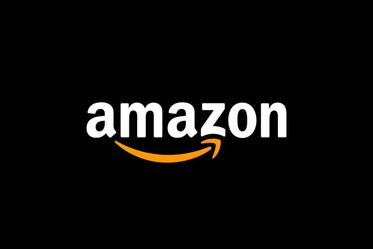
The Amazon logo is a combination mark, blending a wordmark with a subtle symbolic element.
-
The wordmark establishes clarity and authority.
-
The arrow-smile beneath the text acts as both a symbol and a storytelling device.
This structure allows Amazon to communicate meaning without clutter, keeping the logo flexible across digital platforms, packaging, and global markets.
Design Elements and Symbolism
Amazon’s logo is a masterclass in hidden meaning done right:
-
The Arrow from A to Z: The curved arrow starts under the “A” and ends at the “Z,” symbolizing that Amazon sells everything—from A to Z.
-
Smile Shape: The arrow also forms a smile, reinforcing Amazon’s focus on customer satisfaction and positive experience.
-
Typography: The lowercase sans-serif wordmark feels approachable and modern. It avoids stiffness, which is crucial for a brand serving everyday consumers worldwide.
-
Color Palette: The black text conveys reliability and scale, while the orange arrow adds warmth, optimism, and energy.
Nothing in the logo is decorative. Every element serves a strategic purpose.
Brand Recognition & Global Impact
The Amazon logo has achieved near-universal recognition. It appears daily on millions of packages, apps, websites, and devices—making it one of the most visible logos in the world.
When shown without any text, 43 out of 50 test users still associated the smile-arrow with Amazon, largely because they see it daily on packaging and delivery boxes. This kind of recognition is built through repetition and trust, not visual complexity.
What makes this especially powerful is that Amazon didn’t rely on loud visuals or aggressive branding. Instead, it built recognition through consistent experience—where the logo becomes a trusted marker of speed, reliability, and convenience.
Does the Amazon Logo Work in Small Sizes?
Yes—extremely well. The logo was designed with digital and logistical environments in mind. The arrow remains legible at small sizes, and the wordmark scales cleanly across screens, labels, and packaging.
This scalability is critical for a brand that operates across mobile apps, smart devices, shipping labels, and global storefronts. The logo never needs simplification because it was already optimized from the start.
How Amazon Compares to Competitors
eBay: Uses a colorful wordmark logo that feels playful and marketplace-oriented. Amazon’s logo feels more structured and reliable.
Alibaba: Features a symbol-driven logo with strong regional identity. Amazon’s design is more neutral and universally adaptable.
Walmart: Uses a symbol plus wordmark approach focused on friendliness. Amazon’s arrow conveys both friendliness and functional meaning, giving it more narrative depth.
Among global commerce brands, Amazon stands out for how quietly effective its logo is.
Should They Change the Logo?
No. The Amazon logo is already perfectly aligned with the company’s scale and mission. Its simplicity allows it to evolve naturally alongside new services—cloud computing, smart devices, logistics—without requiring redesigns.
Any major change would risk disrupting one of the most trusted visual identities in global commerce. The current logo is flexible, symbolic, and future-proof.
Conclusion
The Amazon logo proves that the strongest designs often say the most with the least. Through clean typography and a clever arrow-smile, it communicates scale, satisfaction, and endless possibility—without ever feeling overwhelming.
It’s not complex, but it’s incredibly simple. And that’s exactly why it works. At Rabbit Logo, we apply the same principle to logo design: create marks that are simple on the surface, strategic underneath, and powerful enough to grow with the brand for decades.