Alo Yoga logo is clean, calm and modern—just like the brand. With lowercase letters and monochrome palette, the logo reflects the brand’s philosophy of mindfulness, presence and purpose-driven movement. It may not be flashy but in the world of premium athleisure it holds its ground.
Looking to build a minimalist logo? Rabbit is a logo design agency that can help.
Alo Yoga Logo Origin
Alo Yoga launched in Los Angeles in 2007 built around a mission to inspire wellness through movement and style. The name “Alo” stands for Air, Land, Ocean—a subtle reference to natural elements that support balance and well-being.
From day one the brand went minimalist. Rather than using a flashy icon or abstract symbol Alo chose to go all in on a lowercase, text-only logo. The result is a wordmark that feels refined, grounded and timeless—like the quiet confidence of its wearers.
What Type of Logo Is the Alo Yoga Logo?
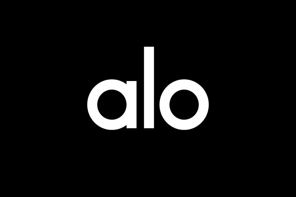
Alo’s identity is built around a wordmark, just the brand name in a custom, rounded sans-serif font. No icons, no mascots, no symbols. This design choice keeps the focus on the name itself.
It’s a smart move for a brand with a short, clean name. The geometry of the letters helps it feel visually balanced and the lack of embellishments allows it to blend into everything from retail signage to app headers.
Design Elements and Symbolism
The Alo logo stands out through subtle design choices that reflect its calm and modern brand voice:
-
Typography: Rounded, open sans-serif with generous curves. The softness of the letters gives the logo a welcoming, grounded presence.
-
Color: Most often black on white—versatile, timeless and high-contrast. The brand avoids gradients, shadows or distracting detail.
-
Lettercase: All lowercase gives it a contemporary and relaxed tone, aligned with yoga culture and urban mindfulness.
-
Spacing: Tight yet balanced, making the logo feel intentional and stable across all formats.
There’s no hidden symbolism or visual metaphor—just clarity and elegance through restraint.
Is the Alo Yoga Logo Scalable for Small Screens?
Yes—but with a few limitations.
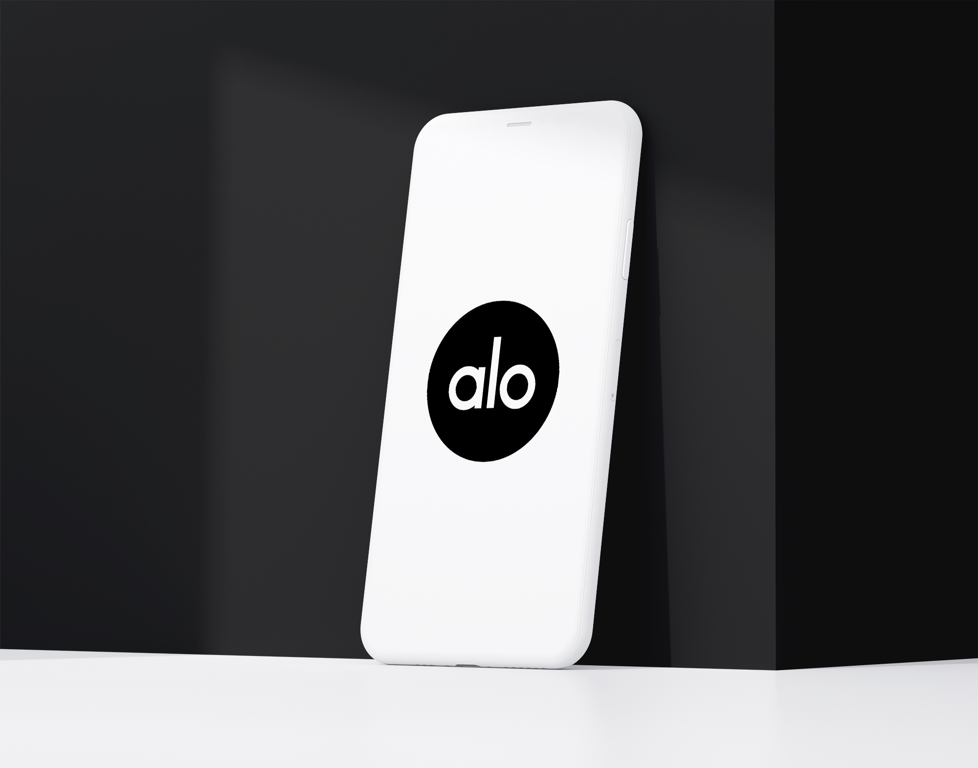
Alo Yoga logo doesn’t have a separate symbol or monogram so there’s no simplified icon for tiny spaces like mobile apps, favicons or tags. However because the name is only three letters long—and each letter has a strong, geometric form—the full wordmark still holds up well at small sizes.
On social media platforms like Instagram Alo uses the full logo inside a circular frame. It’s not as instantly iconic as the Nike swoosh or Lululemon’s symbol but it works well enough due to its minimal construction and short length.
In short: the logo works in small formats but a secondary symbol could make it even stronger.
Brand Recognition & Global Impact
Alo Yoga has grown quickly, particularly among Gen Z, influencers and the luxury fitness space. The brand is highly visible across social platforms and celebrity streetwear photos, helping the logo build recognition even without a traditional icon.
In a recognition test of 50 participants, 28 correctly identified the Alo logo—the highest success rate among Instagram users and U.S. city dwellers. While it doesn’t yet carry the global weight of Nike or Adidas, Alo’s visual identity is quickly becoming a premium signal in the athleisure world.
It doesn’t shout—it flows quietly but confidently, aligned with the brand’s identity as a mindful luxury label.
How Alo Yoga Compares to Competitors
Lululemon
Lululemon uses a combination mark, pairing its stylized red icon with a clean wordmark. Its symbol is stronger at small sizes. Compared to Alo, Lululemon’s logo is more versatile but less minimal.
Nike
![]()
Nike’s swoosh is a pure pictorial logo—compact, fast and universally recognized. Alo’s wordmark is more boutique and subtle, while Nike’s brand is built for global dominance and mass-market presence.
Vuori
Vuori combines a nature-themed icon with a clean wordmark. Its logo evokes movement and outdoor lifestyle. Alo’s identity feels more modern and urban, tailored to wellness seekers in stylish environments.
Should They Change the Logo?
Alo doesn’t need to change its logo—but a small addition could help. The wordmark is elegant, scalable and on brand. It’s premium and focused. But a small monogram (like an “a” symbol or custom icon) could make the logo more versatile for digital and physical touchpoints.
Still it works well for a brand that lives in clean retail spaces and influencer feeds.
Conclusion
The Alo Yoga logo shows that less is more. The lowercase wordmark is function and form. No secondary symbol but strong due to the structure and the name.
For brands that want to be modern wellness without clutter, Alo is the minimalist template.