The Betway logo is a great example of how a simple wordmark can cut through in a fast paced, competitive industry. From Premier League sidelines to mobile betting apps, the logo remains clear, confident and recognisable. In this post we’ll look at how the Betway logo was designed for digital use, what works about it and where it can improve. Looking for a sleek, scalable logo for your brand? Rabbit can help.
The Origin of the Betway Logo
The Betway logo first appeared in 2006 when the brand launched as an online sportsbook and casino platform. From the start the identity was built around simplicity – a bold black wordmark that would work as well on a browser tab as it would on a football jersey.
While many competitors constantly tweak their look, Betway has stayed consistent. The core design – black, lowercase, sans-serif – has only had minor tweaks to proportion and spacing. This has helped the brand build up familiarity especially across sports partnerships and digital advertising where clarity is key.
What Type of Logo Is It?
The Betway logo is a text-based logo – a custom type treatment with no icon or standalone symbol. It relies entirely on typography to carry the brand.
The bold, lowercase sans-serif letters give it accessibility and a modern, no nonsense tone. The compact spacing and even weight distribution makes it feel solid and confident. In the world of online betting – where trust, speed and clarity are everything – this works well.
Design Elements and Symbolism
At first glance the Betway logo looks simple but the design choices are intentional:
-
Colour: The black and white colour scheme gives it authority, contrast and neutrality. It’s strong against any background especially when overlaid on sports content or live broadcasts.
-
Typography: The all lowercase design softens the tone, avoiding a corporate or too formal feel. The letterforms are slightly condensed to maximise visibility in tight spaces.
-
Structure: There’s no additional symbol or emblem – which keeps the focus entirely on the brand name. This shows confidence and modernity but also puts all the recognition weight on the text alone.
Logo Variations: Full vs Short Version
![]()
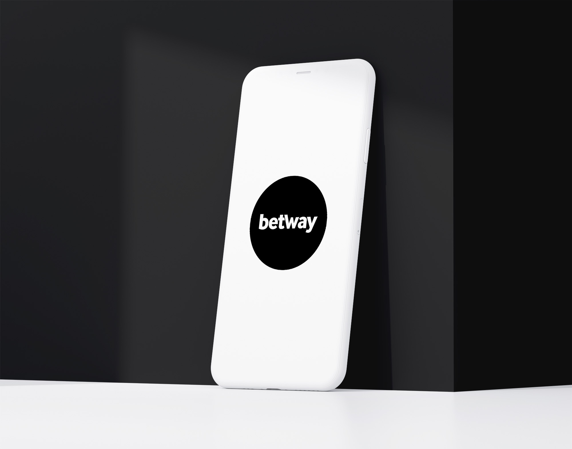
Betway don’t currently use a short version or symbol based logo. Across all formats – web, print, advertising and in-app experiences – the full wordmark is used as is.This creates a clean and consistent identity but also brings limitations. On platforms where space is tight – like app icons, social avatars or browser favicons – the logo can feel squished or lose clarity. Many modern brands solve this by introducing a monogram (like a bold “B” or stylised shape) but Betway haven’t yet.
How It Performs in Small Sizes
At mid-to-large sizes the Betway logo performs well. The bold typeface and high contrast makes it stand out even on moving backgrounds like stadium boards or broadcast overlays.
But at very small sizes – particularly under 20px – the wordmark starts to lose clarity. The tight letterspacing and uniform stroke weight makes the logo harder to read on mobile app launchers, favicon bars or smartwatch displays. Without a short form version it lacks the flexibility that many modern digital-first brands now prioritise. This is a common limitation for wordmark logos that rely solely on text.
Brand Recognition & Global Impact
Despite its simplicity the Betway logo is widely recognised – especially among sports fans and bettors. In a recognition test with 50 participants 36 identified the Betway logo instantly.
A big driver of this visibility is the brand’s long term commitment to sponsorships. Betway has partnered with West Ham United, SA20 cricket, BLAST Premier esports, and several major tennis and horse racing events. Its logo appears on player kits, scoreboards, betting interfaces and digital ads across dozens of markets.
This omnipresence – combined with the logo’s bold styling – has made it one of the most recognised betting brands globally even without a mascot or icon.
Comparing Design with Other Brands
DraftKings
DraftKings uses a combination logo with a crown symbol and stylised serif type. It leans into fantasy sports and entertainment but feels more ornate than Betway’s clean minimalism.
FanDuel
FanDuel’s combination mark logo includes a shield icon that works well across apps and mobile screens. It’s sleeker and more flexible especially in digital UI contexts.
Bet365
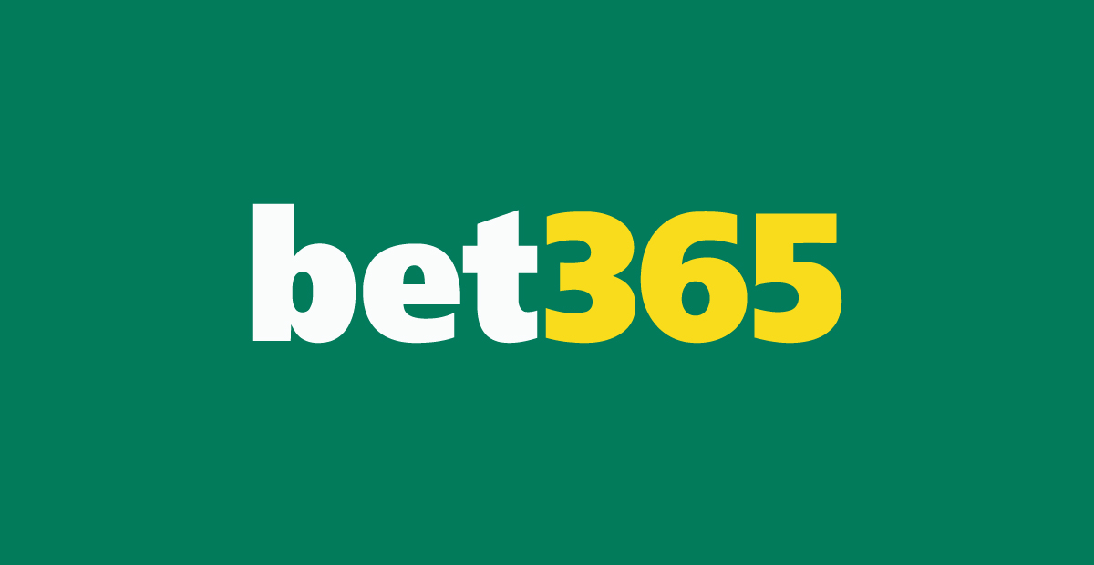
Bet365 also uses a wordmark logo but with vibrant yellow and green. While more colourful it lacks the polished simplicity of Betway’s design.
Should They Change the Logo?
The Betway logo doesn’t need a full redesign – it’s clean, modern and on brand with digital platforms. But the brand could benefit from a secondary mark or monogram.
A small “B” icon or geometric shorthand could help the logo scale better in tight spaces without losing the strength of the main wordmark. This kind of system expansion would add flexibility without compromising the established look and feel.
Conclusion
The Betway logo is a great example of a bold digital-first wordmark that works across apps, stadiums and screens globally. Its strength is in simplicity – but that same simplicity also limits its adaptability in ultra-small contexts. As digital landscapes evolve Betway may find value in adding a short-form option to its logo system. Rabbit helps brands design logos that work everywhere – from match day to mobile view.