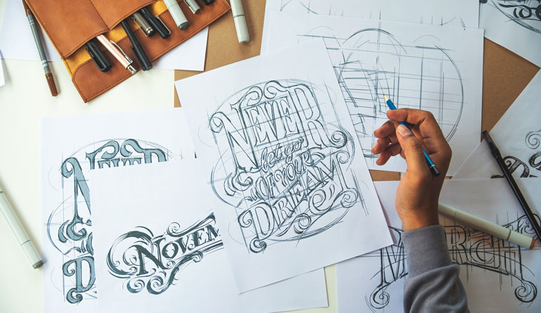
At Rabbit, we understand the nuanced role of typography in crafting logos that resonate with audiences and stand the test of time. Our approach to logo project development places a significant emphasis on typographic choices, ensuring they align perfectly with each brand’s unique digital presence.
Understanding Typography in Digital Context
Typography in digital logo design is not just about choosing a font; it is about understanding how that font communicates in various digital environments. Different platforms may render fonts in unique ways, so a deep understanding of digital mediums is essential. The right typography can enhance brand recognition, readability, and user experience across devices.
Choosing the Right Font
Selecting the right font is a pivotal step in designing a logo. This choice should mirror the essence of the brand, whether it is professional, innovative, whimsical, or sophisticated. Serif fonts often denote tradition and trustworthiness, whereas sans-serif fonts are typically viewed as contemporary and friendly. Script fonts add a personal flair, yet they require thoughtful selection to maintain readability across digital platforms.
Legibility and Scalability
A digital logo must remain legible across various devices and resolutions. This means selecting typography that is clear and easy to read, even when scaled down for mobile screens or up for large displays. Testing your typographic choices across different screen sizes and resolutions is a must to ensure your logo maintains its integrity no matter where it appears.
Color and Contrast
Color plays a significant role in typography, especially in digital logo design. The colors chosen for your logo’s text must contrast well with its background to ensure readability across different devices and lighting conditions. Additionally, understanding color psychology can help in selecting hues that evoke the desired emotional response from your audience.
Custom Typography
For brands seeking a truly unique identity, custom typography can be a game-changer. Creating a bespoke font for your digital logo not only sets you apart from competitors but also provides complete control over every nuance of your brand’s typographic presentation. Custom fonts can embody your brand’s essence in a way no off-the-shelf font can.
Incorporating Visual Hierarchy
Visual hierarchy in typography guides the viewer’s attention to the most important elements of your logo. By manipulating font size, weight, and color, you can create a focal point that draws attention to your brand name or symbol, enhancing the overall impact of your digital logo design.
Responsiveness and Adaptability
In today’s digital-first world, a logo must be adaptable to various platforms and formats. This adaptability extends to typography, which should be versatile enough to maintain its effectiveness whether it is displayed on a website header, social media avatar, or mobile app icon. Ensuring your typographic choices do not lose their character or become unreadable when adapted to different formats is key.
Consistency Across Branding
Your logo’s typography should be consistent with the broader typographic strategy of your brand. This consistency strengthens your brand identity and ensures that your audience can easily recognize your brand across different digital platforms. Consistency in typography reinforces brand recall and fosters a strong brand connection with your audience.
Embracing Negative Space
Utilizing negative space within typography can add an additional layer of sophistication and meaning to your digital logo. This technique involves creating shapes, symbols, or even letters within the empty spaces around and within your text. Negative space can transform a straightforward typographic logo into a clever, multi-dimensional visual puzzle that engages viewers, encouraging them to take a closer look and remember your brand more vividly.
Experimenting with Typographic Pairings
While many logos rely on a single typeface, exploring typographic pairings can offer dynamic contrast and interest. Pairing a bold, assertive sans-serif with a delicate serif, for example, can create a balance between strength and elegance, mirroring a brand’s multifaceted personality. However, the key to successful pairing lies in maintaining legibility and cohesion, ensuring the fonts complement rather than compete with each other. This approach can make your digital logo more versatile, allowing it to convey complex brand messages more effectively.
Animation and Interactivity
In the digital realm, logos can transcend static designs to become animated, interactive experiences. Incorporating subtle animations into your logo’s typography can capture attention and enhance brand memorability. Whether it is a hover effect on a website or a short animated sequence on social media, animated typography adds a layer of engagement that static logos cannot match. It is important, however, to ensure that these animations enhance rather than detract from the logo’s legibility and core message.
Accessibility Considerations
Digital inclusivity is paramount, and typography plays a crucial role in making logos accessible to everyone, including individuals with disabilities. Choosing fonts that are easy to read for people with dyslexia, ensuring enough contrast between text and background, and considering how colorblind users perceive your color choices are all critical factors. Accessibility should never be an afterthought; it should be integrated into the design process from the outset to ensure your logo reaches and resonates with the widest possible audience.
Leveraging Typographic Trends with Caution
Staying abreast of typographic trends is beneficial for ensuring your digital logo design feels contemporary and relevant. However, it is crucial to leverage these trends with caution. A logo should be timeless and not solely dependent on what is currently in vogue. The key is to draw inspiration from trends in a way that complements your brand’s identity without compromising its longevity.
Incorporating elements from current trends can refresh and modernize your logo, but these elements should be integrated in a way that ensures your logo will still feel relevant and impactful years down the line. This approach allows for a logo that is both modern and enduring, embodying the essence of the brand while appealing to the tastes of today’s audiences.
Typography is not just a detail in the design of digital logos; it is a fundamental component that can significantly influence a brand’s digital identity. The right typographic choices can elevate a brand, making it memorable, accessible, and distinct in the digital age.
At Rabbit, our expertise in digital logo design encompasses a strategic approach to typography, ensuring that each logo plan we develop is not just visually compelling but also strategically sound. Through careful consideration of typography, we help brands craft digital identities that resonate with audiences and stand the test of time in the ever-evolving digital landscape.


