Key Takeaways
-
Colors in a logo significantly influence brand perception and consumer behavior, with color psychology playing a key role in eliciting specific emotions; this is critical for creating a powerful connection with the audience.
-
Logo color combinations should be chosen based on harmonious interactions of hues, with a general recommendation of using between one and three colors, guided by color wheel configurations like monochromatic, complementary, triadic, or tetradic schemes.
-
Selecting logo colors must align with the brand’s personality, reflect industry trends, account for cultural context, and avoid common mistakes such as overcomplication and insufficient competitor analysis to maintain clarity, recognizability, and differential from competitors.
Exploring the Power of Logo Colors
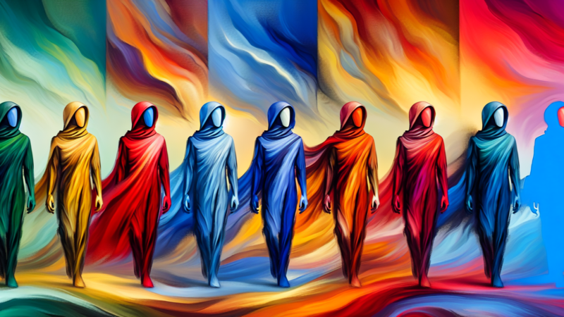
Colors play a crucial role in defining a brand’s identity and the emotions it wishes to evoke in its target market. When chosen wisely, the hues in a logo inform the overall visual identity across every customer touchstone, shaping brand perception. Through this, they have the power to evoke specific moods and emotions, influencing consumer behavior.
Integrating a well-thought-out logo color scheme is pivotal in shaping brand perception, as it combines color psychology and cultural interpretations to create a cohesive brand image. This approach not only enhances the visual appeal but also ensures consistency in how a brand is perceived across various platforms.
This emphasizes the significance of considering the emotions and consumer response when choosing a color combination for a logo to create a powerful connection with the audience.
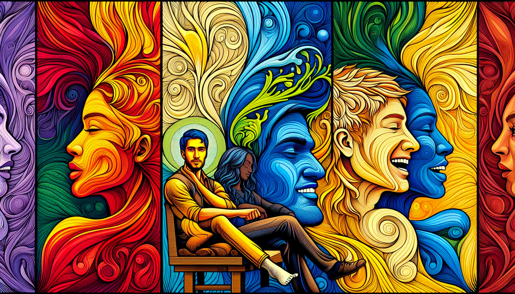
The Psychology of Colors
The psychology behind color plays a huge role in our lives, triggering positive or negative emotions and influencing perception and emotions in branding. Some examples include:
-
Red: elicits emotions like excitement, passion, and anger
-
Blue: associated with tranquility, trust, and balance
-
Green: also associated with tranquility, trust, and balance
-
Primary colors: fundamental in logo design and color theory, primary colors (red, blue, yellow) are pivotal for creating effective color schemes. They carry deep psychological effects, invoking energy and emotional responses that are essential in branding.
However, personal preferences should not be the sole determinant when selecting logo colors. It is crucial to consider their psychological impact and customer interpretation to ensure the branding emits the intended message.
Industry-Specific Color Trends
Different industries gravitate towards specific color palettes. For instance, agriculture, cleaning, and environmental services often harness the natural association of yellow and green in their logos. On the other hand, the film and music industries sometimes employ the dynamic contrast of black and orange for a striking visual impact.
Such industry-specific color trends can serve as valuable insights for brands aiming to either align with industry norms or differentiate markedly.
At Rabbit, we have experience determining the best color scheme for various industries.
The Role of Cultural Context
With globalization bringing markets closer, the role of cultural context in logo color selection has become more pronounced. The symbolic meanings of colors can vary significantly based on cultural backgrounds. For international branding, it is crucial to consider the environment and cultural meanings of colors in the different countries the brand operates in.
Mastering the Art of Color Combinations
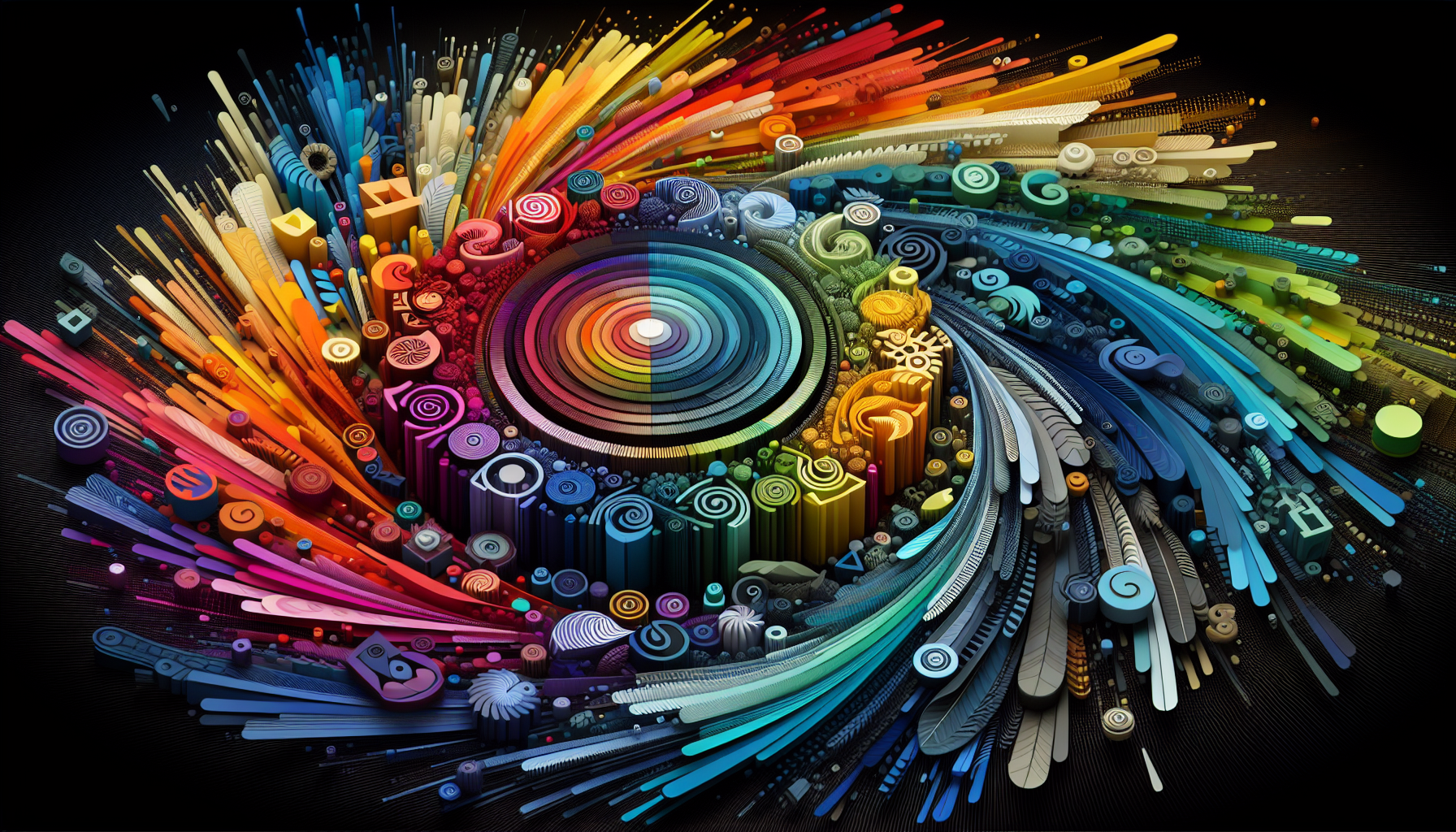
A visually pleasing logo is often the result of a well-thought-out color scheme. Understanding how colors interact with each other on the color wheel is crucial for creating successful designs. It is important to grasp the relationship between different colors in order to achieve desired visual effects. However, while the possibilities are endless, logo designs benefit from using between one and three colors, with two or three-color combinations or a single logo color as recommended guidelines.
The Color Wheel and Color Harmony
The color wheel, divided into warm and cool colors, establishes the base for harmony and balance in design. Primary color combinations are made by selecting colors opposite each other on the color wheel, while analogous colors are selected from neighboring hues, often resulting in a harmonious look.
Monochromatic vs. Complementary Colors
When it comes to the best logo color combinations, a logo color combination can be monochromatic, using various shades of a single color, like the green logo of Sprout Social, to yield a cohesive and harmonious appearance. On the other hand, complementary colors like orange and blue create a dynamic and appealing contrast, seen in the logos of certain technology and banking companies. Logo color combinations play a crucial role in creating a memorable and impactful brand identity, and selecting the right logo color palette is essential for achieving this goal.
Triadic and Tetradic Color Schemes
For brands looking to make a bold statement, triadic and tetradic color schemes offer dynamic options. Triadic color combinations are achieved by drawing an equilateral triangle across the color wheel, selecting three colors that are evenly spaced out. When using triadic color schemes in logos, it is recommended to have one color dominate the design while the other two serve as accent colors to create a balanced and harmonious look.
Top Logo Color Choices for Different Brand Personalities
The emotional connections cultivated through color can have a more significant impact on consumers than their thoughts about a brand. Hence, it is crucial to align color choices with brand personality to create a memorable and effective logo.
Bold and Confident Brands
Bold and confident brands often gravitate towards striking color combinations. For instance, the combination of red, navy blue, and bright yellow makes a bold statement, projecting power and confidence, ideal for entertainment or restaurant brands. These brand colors truly stand out and create a memorable impression, showcasing color combinations to inspire.
On the other hand, the mix of black and red evokes a sense of power and intrigue in logos, enhancing a brand’s confident stance.
Elegant and Sophisticated Brands
For brands aiming to project a sense of luxury and sophistication, the choice of color schemes can be quite different. Maroon and peach, sapphire blue paired with blue-gray, and a combination of deep purple and light blue are all elegant color combinations often found in high-end brand logos in industries such as fashion, home decor, cosmetics, and retail.
Fun and Playful Brands
Vibrant and lively color combinations are a perfect match for brands with a playful and energetic personality. Bright orange and pink in the Dunkin’ logo signify energy and attention-grabbing capability, while yellow and green evoke cheerfulness and a youthful spirit.
Similarly, a playful brand personality is conveyed through a logo with a combination of orange, red, and soft lemon green, creating a warm and inviting look.
Eco-Friendly and Sustainable Brands
For eco-friendly and sustainable brands, green logos often symbolize their ethos. Jungle green and linen white create a sense of refreshment and revitalization, suitable for logos in sustainability-focused industries, while aqua and evergreen resonate well with sustainable business brands promoting health and wellness.
Successful Logo Color Transformations
Sometimes, a brand might opt for a logo color transformation to refresh its image or reposition itself in the market. Real-life examples from:
-
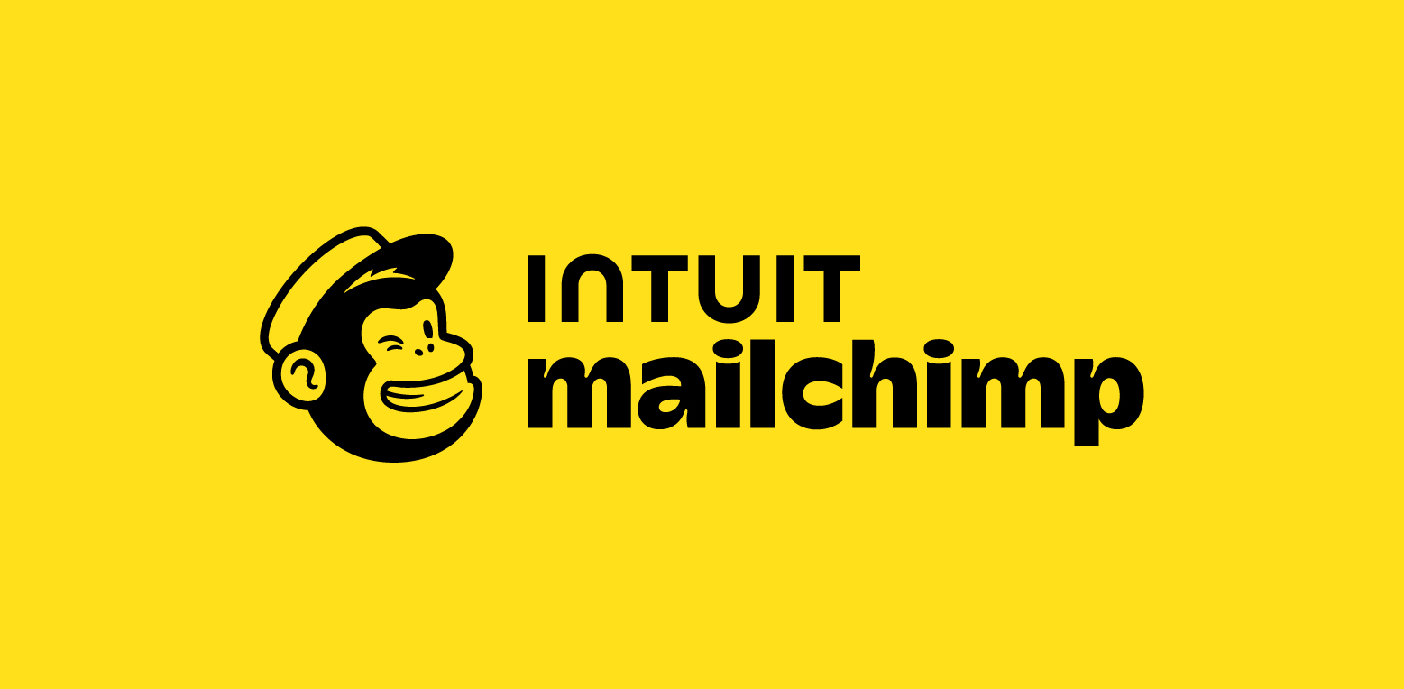
Intuit
-
Mailchimp
-
Later
-
Hyatt Place
Demonstrate the impactful strategies behind successful logo color transformations.
Rebranding with a Fresh Color Palette
Rebranding with a fresh color palette can significantly change a brand’s visual identity and market position. For instance, Chobani transitioned from blue and white to forest green and neutral beige colors during their rebranding, resulting in a more subdued and naturalistic visual identity, aligning with their brand message.
Evolving Logos Over Time
Logos can also evolve over time to maintain brand relevance and recognition. The colorful peacock logo for NBC, designed to represent the introduction of color TV, symbolizes a significant milestone in television history.
Avoiding Common Logo Color Mistakes
While color plays a vital role in logo design, there are common pitfalls to avoid. Logos should be designed in a versatile vector format to ensure high quality when scaled to different sizes and should be adaptable in multiple color variations, including black and white, to maintain effectiveness across various applications.
Overcomplicating Your Color Scheme
While it might be tempting to use a plethora of colors in your logo, it’s advisable to keep the color scheme simple to maintain clarity and recognizability. Using too many intricate details in a logo can diminish its effectiveness when scaled to different sizes, leading to a loss of brand consistency.
Ignoring Accessibility and Visibility
In today’s digital era, it’s crucial that logos are designed to be accessible and legible on a variety of devices and screen sizes. Overly complex logos can suffer in legibility when viewed on different digital platforms, particularly on mobile devices where screen real estate is precious.
Disregarding Competitor Analysis
Lastly, while it’s important to create a unique and memorable brand identity, ignoring your competitors can be a costly mistake. Understanding competitors’ color schemes helps in making informed decisions to either align with industry norms or differentiate markedly.
Summary
In conclusion, the power of logo colors lies in their ability to evoke emotions, shape brand perception, and influence consumer behavior. Understanding the psychology of colors, industry-specific color trends, and the role of cultural context is key to making informed color choices. Furthermore, mastery of color combinations, alignment of color choices with brand personality, and learning from successful logo color transformations can help in creating an impactful logo. However, it’s also critical to avoid common logo color mistakes to ensure your logo stands the test of time.
Frequently Asked Questions
How do colors in logos influence brand identity and consumer behavior?
Colors in logos play a crucial role in defining a brand’s identity and can directly influence consumer behavior by evoking specific moods and emotions.
What is the significance of the color wheel and color harmony in logo design?
Mastering the relationship between colors and their interactions on the color wheel is crucial to creating a successful logo design. This foundation creates harmony and balance.
How should colors be chosen for different brand personalities?
Colors should align with the brand’s personality, such as bold and confident brands opting for striking colors, elegant and sophisticated brands leaning towards luxury colors, fun and playful brands choosing vibrant and lively colors, and eco-friendly brands selecting colors symbolizing nature and sustainability.
What are some common logo color mistakes to avoid?
When designing a logo, it’s crucial to avoid overcomplicating the color scheme and to consider accessibility, visibility, and competitor analysis. Additionally, ensure the logo is designed in a versatile vector format and is adaptable in multiple color variations.
How can studying successful logo color transformations help in logo design?
Studying successful logo color transformations can provide valuable insights into impactful branding strategies and the way color changes can affect a brand’s visual identity and market position. This can be highly beneficial for logo design.