If you’ve ever seen a logo that’s made entirely of letters — like CNN, NASA, or HBO — you’ve seen a lettermark logo in action. Clean, minimal, and instantly recognizable, lettermark logos strip branding down to the essentials: the initials.
In this article, we’ll explore what makes lettermark logos so effective, show you 20 iconic examples, and share practical tips for designing one that sticks.
What Is a Lettermark Logo?
A lettermark logo is a logo that uses a brand’s initials as its main design element. Instead of a full brand name or a symbol, the logo is made up of just two or three letters — think IBM, BBC, or EA.
Lettermarks are often confused with monogram logos, but there’s a difference. While both rely on initials, a monogram logo tends to have decorative, overlapping, or intertwined letters. A lettermark logo is more focused on clarity and simplicity — it’s typography doing all the work.
Compared to a wordmark logo (which spells out the full name), a lettermark is best when the name is long or hard to pronounce. It gives a business a clean, memorable shorthand.
Why Do Brands Use a Lettermark Style?
Brands love lettermark style for a few strategic reasons:
-
Shortens long names into a few memorable letters
-
Looks clean and professional
-
Works well at small sizes (like app icons or business cards)
-
Makes a brand feel established, especially when paired with the right typography
Lettermarks also create a sense of authority — turning even a new business into something that feels iconic and confident.
20 Famous Lettermark Logos
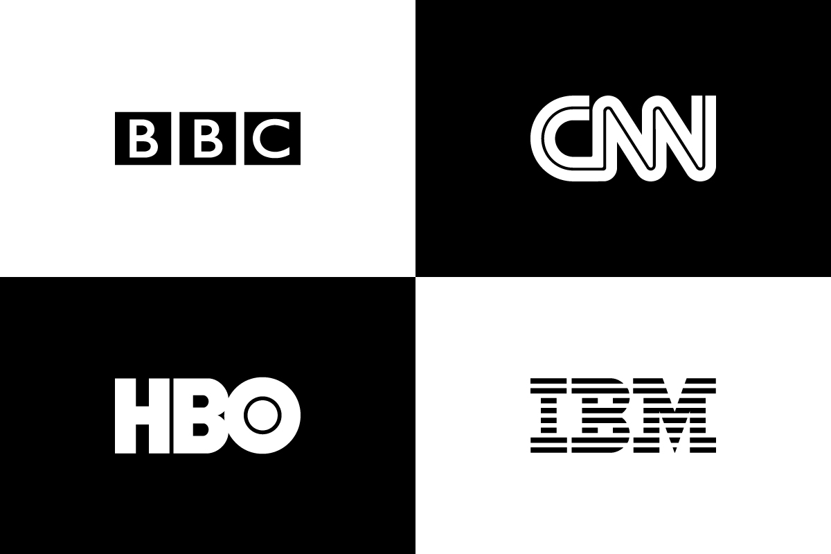
1. IBM
![]()
Three bold letters formed with blue horizontal lines.
Why this logo works
Solid geometry and minimalism make the IBM lettermark logo a benchmark of trust and tech legacy.
2. CNN
![]()
A red continuous stroke forming all three letters.
Why this logo works
Designed for speed and immediacy, CNN’s logo delivers urgency with a single flowing motion.
3. NASA
![]()
Bold white letters inside a deep blue circle with a red orbit.
Why this logo works
The NASA logo fuses futuristic ambition with government authority, instantly recognizable worldwide.
4. HBO
![]()
Heavy black letters in a tight, compact form.
Why this logo works
The HBO logo uses bold simplicity to stand out on screens, reflecting its premium, no-frills content.
5. CK
![]()
Minimal initials spaced with fashion-forward precision.
Why this logo works
The CK logo reflects elegance and restraint, balancing cool minimalism with timeless appeal.
6. EA
![]()
White initials set inside a forward-leaning black circle.
Why this logo works
There’s energy and momentum in the EA logo, fitting for a fast-moving gaming company.
7. BBC
![]()
Three bold white letters each placed in black squares.
Why this logo works
The BBC logo’s grid layout communicates clarity and structure, ideal for a global media outlet.
8. LG
![]()
A red circle subtly shaped like a human face.
Why this logo works
Friendly and approachable, the LG logo softens tech with a personal, human feel.
9. ESPN
![]()
Red uppercase letters accented with speed cuts and angles.
Why this logo works
Fast and dynamic, the ESPN lettermark logo captures the pace of modern sports broadcasting.
10. GE
![]()
White scripted initials inside a decorative blue circle.
Why this logo works
Traditional yet trustworthy, the GE logo blends heritage with subtle refinement.
11. 3M
![]()
Bold red initials placed close together.
Why this logo works
There’s no fluff in the 3M logo—its directness reflects industrial strength and global practicality.
12. HP
![]()
Rounded lowercase letters within a slanted blue circle.
Why this logo works
The forward tilt of the HP logo suggests progress and simplicity, suitable for global tech hardware.
13. CN
![]()
White initials drawn as a single, continuous stroke.
Why this logo works
Minimalist and modern, the CN logo reflects motion and efficiency in freight transportation.
14. H&M
![]()
Casual red initials connected by a hand-drawn ampersand.
Why this logo works
Playful and youthful, the H&M lettermark logo reflects the energy of fast-fashion culture.
15. TBS
![]()
Friendly white letters set in a curved black shape.
Why this logo works
With its conversational tone, the TBS logo feels relaxed and entertainment-focused.
16. DHL
![]()
Blocky red letters paired with dynamic motion lines.
Why this logo works
Speed is built into the DHL logo—bright, bold, and unmistakably fast.
17. CVS
![]()
Rounded red initials spaced cleanly.
Why this logo works
The CVS logo balances professionalism with approachability, perfect for everyday healthcare.
18. MTV
![]()
Chunky “M” overlapped by graffiti-style “TV.”
Why this logo works
Raw and expressive, the MTV logo speaks directly to rebellious, creative youth.
19. UBS
![]()
Sharp black letters flanked by an old-world key emblem.
Why this logo works
The UBS logo feels secure and traditional, ideal for a global financial institution.
20. Juventus
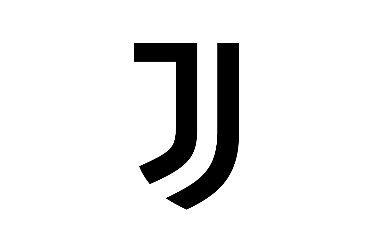
A bold, stylized letter “J” forming a shield-like abstract shape.
Why this logo works
The Juventus logo is one of the most minimalistic designs in sports history — a modern lettermark logo that redefined how football clubs approach branding.
Lettermark Logos by Rabbit
1. CVW
![]()
Three tightly constructed initials that use bold geometry and sharp angles to create visual rhythm.
Why this logo works
The interconnected design makes the letters feel unified, giving the brand a compact and modern lettermark logo that’s ideal for tech, manufacturing, or digital services.
2. MWC
![]()
A vibrant green design with tall, pointed letterforms that evoke strength and elevation.
Why this logo works
The sharp “M” and curved “C” add contrast, while the overall look feels energetic and grounded — perfect for a brand with momentum.
3. HBP
![]()
Heavy, monolithic initials with deep cuts and layered symmetry.
Why this logo works
This logo uses negative space to create movement within a blocky structure, making it bold enough for sports or industrial branding.
4. VMG
![]()
Angular orange lettering with futuristic styling and a sharp horizontal break.
Why this logo works
The aggressive angles give it an edgy, high-performance vibe, while the consistent stroke weight keeps it clean and memorable.
When Should You Use a Lettermark Logo?
A lettermark logo is a smart choice when:
-
Your business name is long, hard to spell, or tough to pronounce
-
You want a clean, professional look that works in small spaces
-
You plan to scale across packaging, apps, and social media
-
Your brand is in industries like fashion, tech, legal, consulting, or media
It’s also ideal if you want to build a strong brand around your initials without needing an icon or graphic.
Tips for Designing a Great Lettermark Logo
-
Start with legibility – Make sure your letters are readable at all sizes
-
Choose the right font – Serif feels classic; sans-serif feels modern; monospaced feels tech
-
Customize your letters – Modify spacing, cut corners, or merge forms to make it unique
-
Keep it simple – Don’t overcomplicate something that’s meant to be minimal
-
Test across sizes – It should look good on both a billboard and an app icon
Conclusion
A lettermark logo is proof that less really can be more. When done right, your initials become your entire identity — simple, confident, and timeless.
If you’re ready to turn your initials into a powerful brand asset, our team at Rabbit Logo is here to help. Explore our professional logo design services and start building a brand that’s easy to remember and impossible to ignore.