Key Takeaways
-
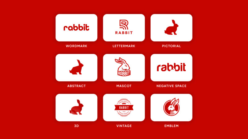
Logos come in various types such as wordmarks, lettermarks, pictorial, abstract, mascot, negative space, 3D, vintage, and emblem, each with unique features and uses tailored to a brand’s identity and messaging requirements.
-
The right combination of color and typography in a logo can significantly impact brand perception and emotional connections, emphasizing the necessity for these elements to align with a brand’s ethos.
-
Logo design requires consideration of future applications to ensure versatility and adaptability, and brands may periodically need to update or refine their logos to stay current and effectively represent their identity.
Understanding Logo Types and Their Purposes
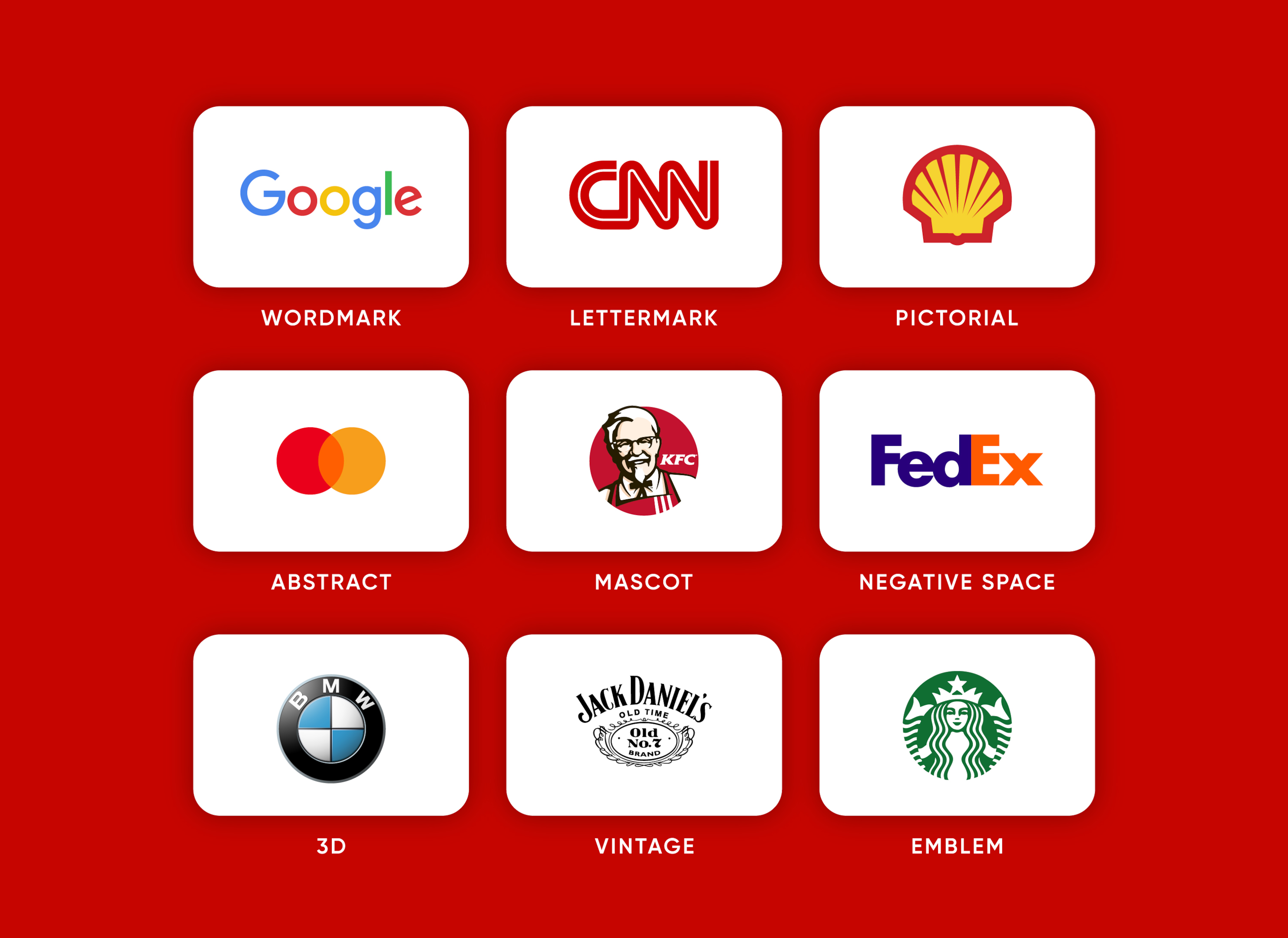
The expansive world of logo design offers a myriad of logo types, each having distinct purposes. From the simplicity of text-only logos to the complexity of symbol-based designs, the possibilities are endless. However, selecting the most appropriate type of logo for your business hinges on your familiarity with these options. Among these, dynamic logos stand out as a type that adapts to different contexts, mediums, and formats, highlighting their versatility and suitability for brands with diverse presences.
Grasping and accurately applying the correct terminology for various type of logos paves the way for effective communication during the logo design process. The upcoming sections will detail various types of logos, their functions, features, and instances from renowned brands.
Wordmark Logos
Wordmark logos, as the name suggests, focus primarily on the brand’s name. They are the company’s name without symbols or illustrations, styled uniquely with fonts to represent the brand’s identity. Typography is the star of the show in these logos, emphasizing the brand’s name and capturing the business’s essence. A well-designed wordmark logo can make a lasting impression on customers and help establish a strong brand identity.
Businesses with catchy names that augment branding find wordmark logos particularly suitable. High-end fashion labels, tech companies, and food brands often employ wordmark logos to highlight their name. Famous brands like Google, Coca-Cola, and LEGO have successfully used wordmark logos to become household names.
Lettermark Logos
Lettermark logos, also known as monogram logos, take a different approach. These types of logos are composed of a few letters, typically a company’s initials, that are arranged side by side or top to bottom. They simplify complex names using initials, providing a concise representation for better brand recognition. In some cases, a monogram logo may be used as a combination logo to further enhance the brand’s identity, incorporating combination mark logos for added versatility.
Such logos enable companies to showcase their initials uniquely. Brands like IBM, Chanel, and CNN provide successful examples of this logo type. If your business has a long, complex name, a lettermark logo might be the perfect fit for you.
Pictorial Mark Logos
Conversely, pictorial mark logos focus primarily on visuals. These types of logos are composed of a graphic symbol or icon, which typically represents a real-world object. They visually convey the brand name or function. They exemplify the concept of ‘show, don’t tell’ in branding.
The creation of a pictorial mark logo necessitates the selection of an image that not only relates to the company’s name but also appeals to the anticipated emotions or connotations of potential customers. Brands like Shell, Target, and Snapchat successfully use pictorial mark logos, becoming synonymous with their respective symbols.
Abstract Mark Logos

Abstract mark logos, also known as abstract logo marks, may appeal to those favoring a more open-ended approach. These logos represent a business through an abstract geometric form which does not refer to anything literal. The creation of an abstract logo hinges on deeply understanding the brand’s purpose and the story behind it.
Tech, sports, and financial institutions often favor abstract logos when seeking a modern identity that remains open-ended and versatile. Brands like Adidas, Mastercard, and the Olympics use abstract mark logos to encapsulate their brand values.
Mascot Logos
For a more vivid and captivating option, a mascot logo could be the answer. These types of logos feature a character or creature as their main design element. The mascot logo is often designed to be friendly, approachable, and memorable, making a connection with customers and building brand recognition.
Mascot logos are commonly used by sports teams, schools, and businesses, but can be used by any organization looking to create a distinctive brand identity. Famous examples include KFC’s Colonel Sanders and Pringles’ Julius Pringles.
Negative Space Logos
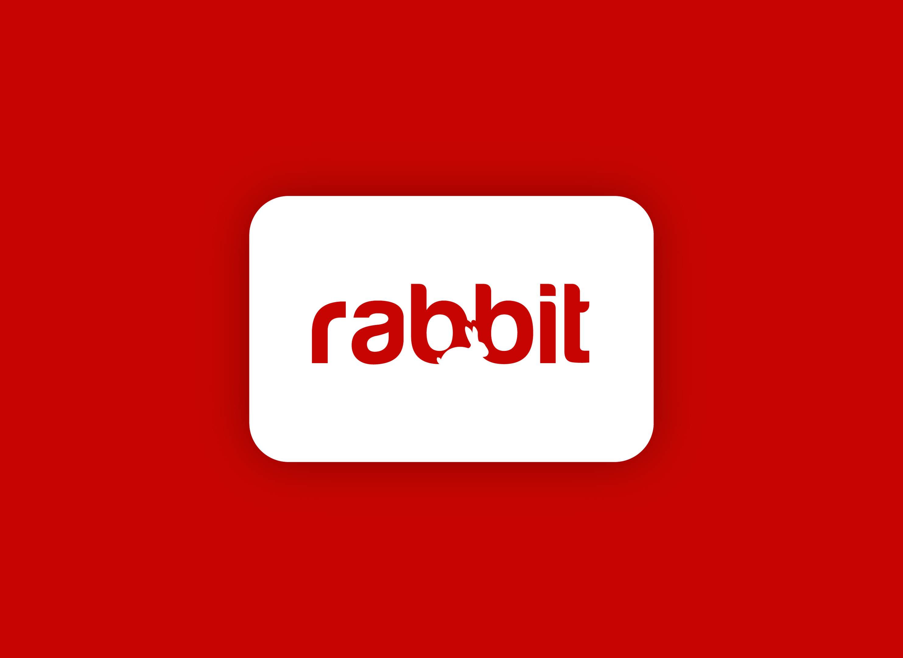
Negative space logos, an intriguing logo type, balance the seen and unseen, uncovering concealed shapes and meanings within the design. One famous example is the FedEx logo, which cleverly includes an arrow in the space between the ‘E’ and the ‘x’.
These logos require a keen eye for design and a knack for creativity. They often surprise and delight viewers when they discover the hidden elements, making the logo memorable and engaging. We designed our Rabbit logo in the negative space style.
3D logos
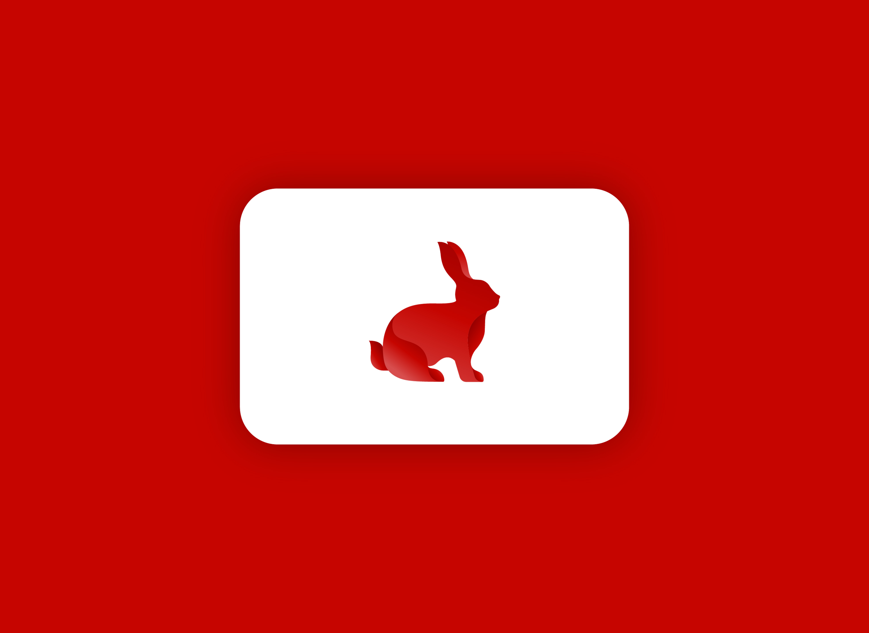
With the advent of the digital era, 3D logos are becoming increasingly popular. These logos incorporate three-dimensional elements, creating a visually appealing and dynamic design. This can include extrusion, beveling, and lighting effects that give the logo a sense of depth and dimensionality.
3D logos can be a great choice for brands looking to create a modern, cutting-edge image. However, they require careful design to ensure they work well in various sizes and applications, just like a dynamic logo.
Vintage Logos
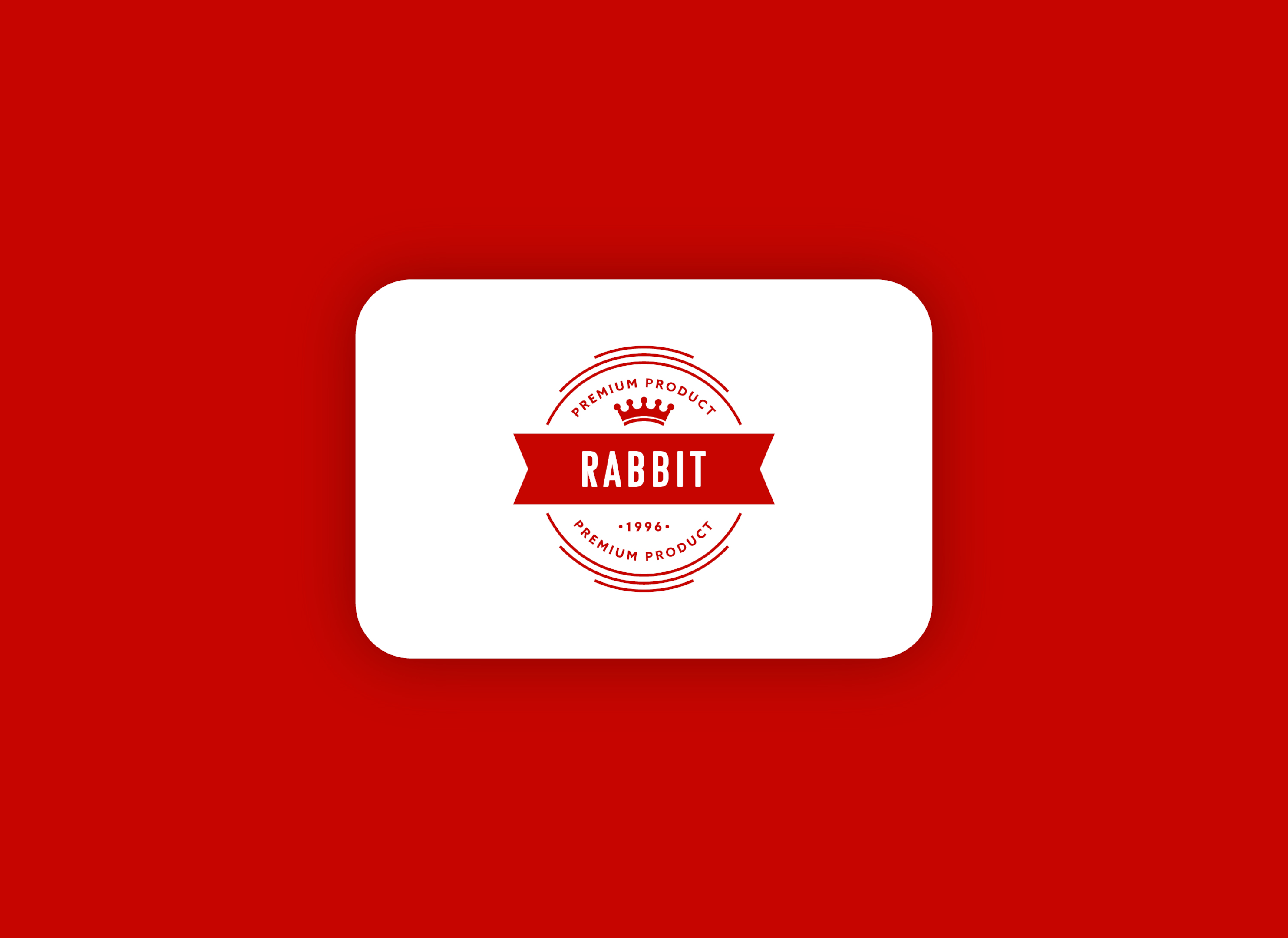
Vintage logos may appeal to those who cherish a touch of nostalgia. These logos are designed to look like they were created in a bygone era, often featuring ornate typography, hand-drawn illustrations, and muted or sepia-toned colors.
Vintage logos can be a great choice for brands that want to convey a sense of history, tradition, or craftsmanship. Brands like Jack Daniel’s and Levi Strauss have effectively used vintage logos to create a timeless brand image.
Emblem Logos
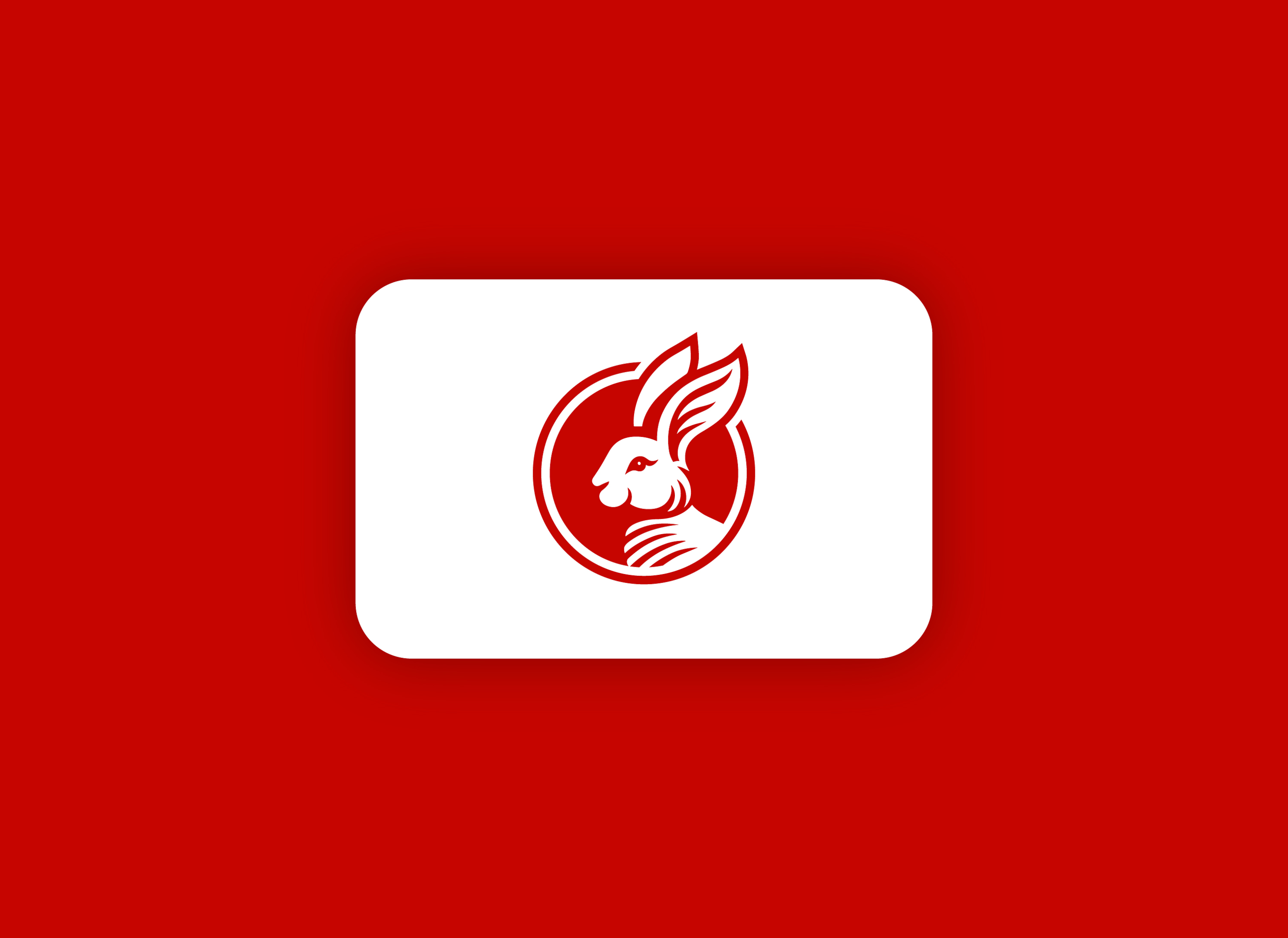
Last but not least, emblem logos comprise a logo symbol or icon with text embedded within or encircled by it. Unlike other types of logos, an emblem logo integrates the text and the symbol into a single design, making it unique and compact.
Emblem logos are often used by schools, government agencies, and organizations that want to convey a sense of prestige or authority. Some of the most recognizable emblem logos are those of Starbucks and Harley-Davidson.
The Role of Color and Typography in Logo Design
In addition to the logo type, color and typography significantly influence logo design. Colors connect with consumers on a psychological level, influencing emotions and brand perception. For instance, the color red typically conveys passion, energy, and excitement, while blue is associated with calm, trust, and professionalism.
Typography is equally important, especially in wordmark logos where it’s the main design element. Unique font treatments and artistic variations are becoming increasingly popular in logo design, providing a way to make your brand stand out.
Selecting unique colors and fonts for your logo promotes its distinctiveness and creates a lasting impression. It’s crucial that these elements align with your brand’s personality and the message you want to convey.
Popular Logo Trends for 2024
As we progress, contemporary design trends are influencing the logo design realm. Trends for 2024 include:
-
Minimalism
-
Hand-drawn elements
-
Vintage wordmarks
-
Bright colors
-
Playful lowercase lettering
Designers blend traditional aesthetics and innovative concepts to craft distinct logo designs. The focus is on creating logos that connect traditional brand values with a fresh, contemporary appearance.
Tips for Choosing the Right Logo Type for Your Brand
The selection of the appropriate logo type requires comprehension of your brand’s core, competitor analysis, and contemplation of your logo’s application in different contexts. The elements of your logo, including its style, color, and symbols, should be balanced to match your company’s personality.
Your logo should be designed to be versatile, adaptable to different mediums, and functional in various sizes. This ensures consistent brand representation across all platforms.
Case Studies: Successful Logo Transformations
Fruitful logo transformations contribute to brand revivification, sustaining relevance while respecting the original brand objective. For instance, Evernote refreshed its logo to align with its growth while preserving its original brand purpose. Similarly, PayPal refined its brand expression with a logo redesign to reflect its innovative presence in the digital payments sphere.
Another example is Mailchimp, which updated its branding to capture the interest of a broader range of small businesses while retaining its unique character. Similarly, Ruby Mills modernized its logo to enhance its digital and offline media presence, merging contemporary style with its rich legacy.
Slate’s new logo design symbolizes its focus on revealing hidden stories, echoing its core narrative-driven approach. And Dunkin’ strategically rebranded to a more concise name and logo, signifying its evolution as a leading beverage-focused, on-the-go brand.
Avoiding Common Logo Design Mistakes
Logo design comes with its own set of challenges. Common mistakes include designing a logo that struggles to adapt to various mediums and platforms, or becomes difficult to recognize. A logo must be designed with consideration for its various forms and contexts to ensure it is both flexible and scalable for future uses.
Avoiding generic imagery in logos is critical to prevent the brand from becoming forgettable and to ensure its distinctiveness and memorability. If a logo is not immediately recognizable or does not evoke positive brand associations, consulting with a professional graphic designer for a reevaluation may be needed.
How to Test Your Logo Design
Upon completion of your logo design, assessing its effectiveness is crucial. Collecting audience feedback through surveys, polls, interviews, focus groups, or online platforms can help measure a logo’s effectiveness, particularly in terms of perception and brand loyalty.
A/B testing allows for the comparison between two logo versions, helping to determine which is more effective based on specific metrics or overall goals. This process can provide valuable insights to refine your logo and ensure it effectively communicates your brand’s identity.
Working with a Professional Designer vs. DIY Logo Design
In terms of logo design, you primarily have two choices: collaborate with a professional logo designer or adopt a DIY approach using online logo maker. DIY logo design tool is feasible and cost-effective, offering a variety of logo templates and design elements.
However, for more complex logo designs, it might be worth investing in a professional logo designer. They bring expertise to the table, ensuring the logo will be distinctive, memorable, and adaptable.
Updating Your Logo: When and Why
At times, updating your logo may become a necessity. This can be due to various reasons, such as:
-
When the logo struggles to adapt to various mediums and platforms
-
When the logo becomes difficult to recognize
-
When the logo fails to accurately reflect the brand’s identity
Updating your logo can breathe new life into your brand, ensuring it remains relevant and engaging for your target audience.
Summary
In conclusion, a logo is a powerful tool for establishing a brand’s identity. From wordmark logos that highlight the brand’s name to abstract logos that encapsulate brand values through non-literal geometric forms, each type of logo serves a unique purpose.
Choosing the right logo for your brand can be a challenging task, but with the right approach and understanding of different logo types, you can create a logo that effectively communicates your brand’s identity and resonates with your target audience.
Frequently Asked Questions
What is a wordmark logo?
A wordmark logo is essentially the company’s name presented in a stylized and unique font, without any accompanying symbols or illustrations, serving as a representation of the brand’s identity.
What is a lettermark logo?
A lettermark logo, also known as a monogram logo, is made up of a few letters, usually a company’s initials, arranged side by side or top to bottom. It’s a simple and effective way to represent a brand without the use of icons or imagery.
What is a pictorial mark logo?
A pictorial mark logo is a logo that consists of a graphic symbol or icon representing a real-world object or the brand’s function. It visually represents the brand name.
What is an abstract mark logo?
An abstract mark logo represents a business with a non-literal, geometric design.
What is a mascot logo?
A mascot logo is a type of logo that prominently features a character or creature as its main design element. Sports teams, schools, and businesses commonly use mascot logos to create a friendly and approachable image.
What is an emblem logo?
An emblem logo is a logo that combines a company’s name with an icon. It’s used by universities, sports teams, and businesses looking for a classic image.

