When you look at a logo and suddenly go, “Aha!” — that’s the magic of a negative space logo.
It’s not just about shapes and symbols. It’s about surprise. These logos hide a second meaning in plain sight — a hidden arrow, an animal, or a letter you didn’t notice at first. That clever use of empty space makes you pause, take a second look, and smile once you see it.
In this article, we’ll break down what a negative space logo really is, explore 20 smart examples from famous brands, our own examples, and share tips to help you design one that turns heads and sparks curiosity.
What Is a Negative Space Logo?
![]()
A negative space logo is a design that uses the background or “unused” areas of a shape to form a secondary image or idea. Rather than drawing everything directly, it lets the eye complete the picture — turning what’s missing into something meaningful.
This approach differs from a pictorial logo, which shows what you see. In contrast, a negative space logo shows what you don’t — at least, not at first glance. That reveal moment is what makes it powerful.
Great examples often combine strong visual contrast, symmetry, and minimalist shapes that reveal more the longer you look. At Rabbit Logo, we’re highly skilled at crafting this type of design, and our custom logo design services are tailored to create clever logos like these.
Why Brands Choose Negative Space Logos
-
It’s memorable – Hidden visuals spark curiosity and leave a lasting impression
-
It feels smart – Clever design reflects strategic thinking
-
It looks clean – Simple shapes keep the design minimal and modern
-
It tells a story – Negative space lets you show two ideas in one compact form
Used well, this style can elevate a brand from ordinary to iconic — all by letting space do the talking.
20 Famous Negative Space Logos
1. FedEx
![]()
An arrow is hidden between the E and X.
Why this logo works
The FedEx logo uses empty space to create a clever, memorable visual that reinforces the brand’s identity.
2. WWF
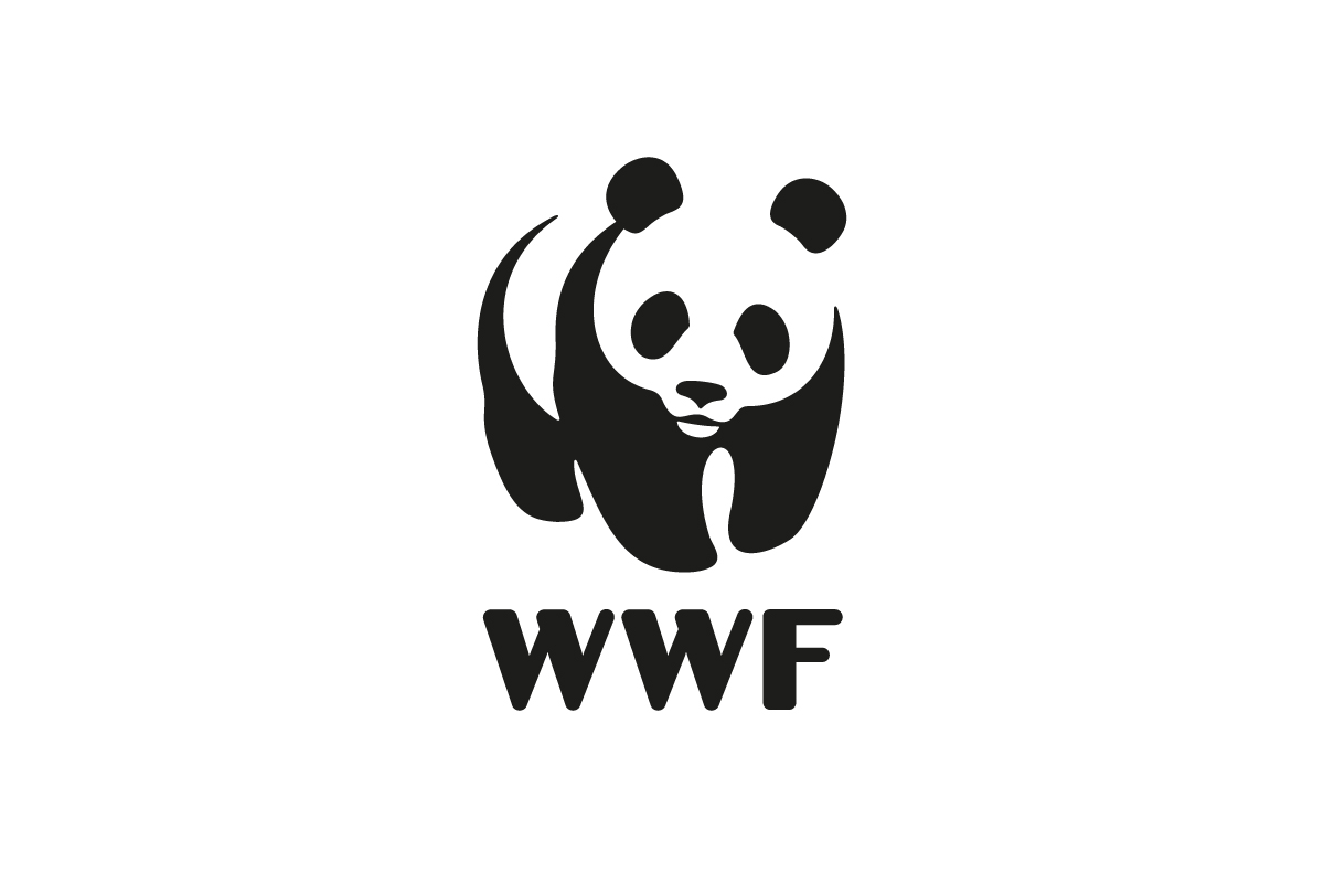
A panda shape is built entirely from empty space.
Why this logo works
The WWF logo uses empty space to create a gentle, iconic image that instantly communicates wildlife conservation.
3. USA Network
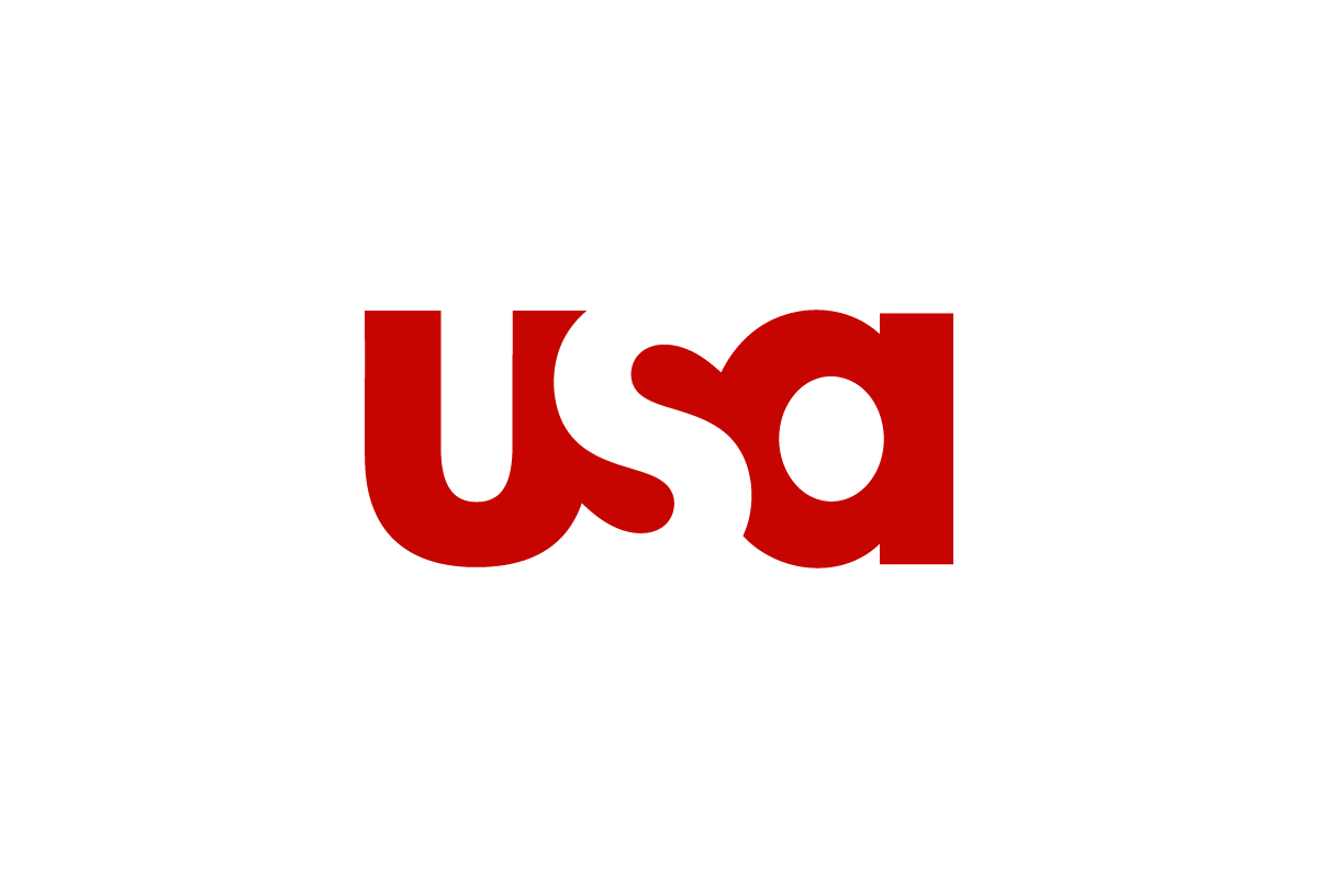
Negative space merges the letters into one flowing shape.
Why this logo works
The USA Network logo uses empty space to unify the lettering into a bold, recognizable mark.
4. Formula 1
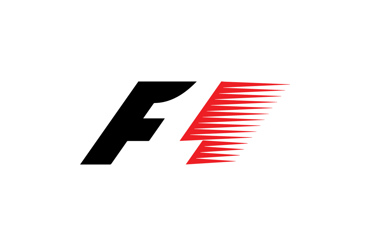
The number 1 is formed between the F and speed lines.
Why this logo works
The Formula 1 logo captures speed and racing energy through a hidden figure that fans instantly recognize.
5. Levi’s
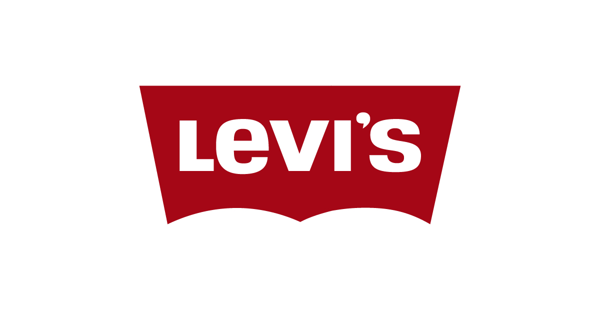
The bottom shape mimics the backside.
Why this logo works
The Levi’s logo subtly references its iconic product through a visual cue built into the negative space.
6. NBC
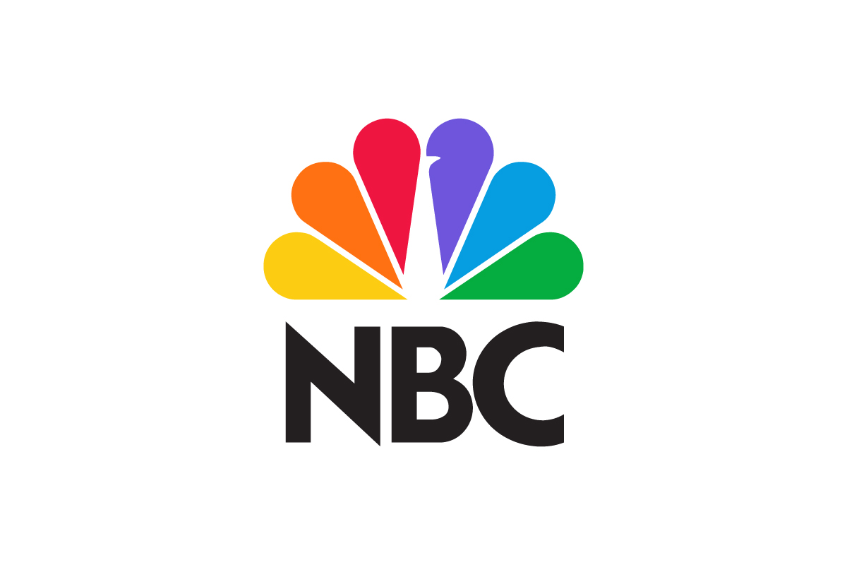
A peacock shape emerges between the rainbow-colored feathers.
Why this logo works
The NBC logo turns white space into a proud peacock — a symbol of color, creativity, and broadcasting heritage.
7. Just Eat
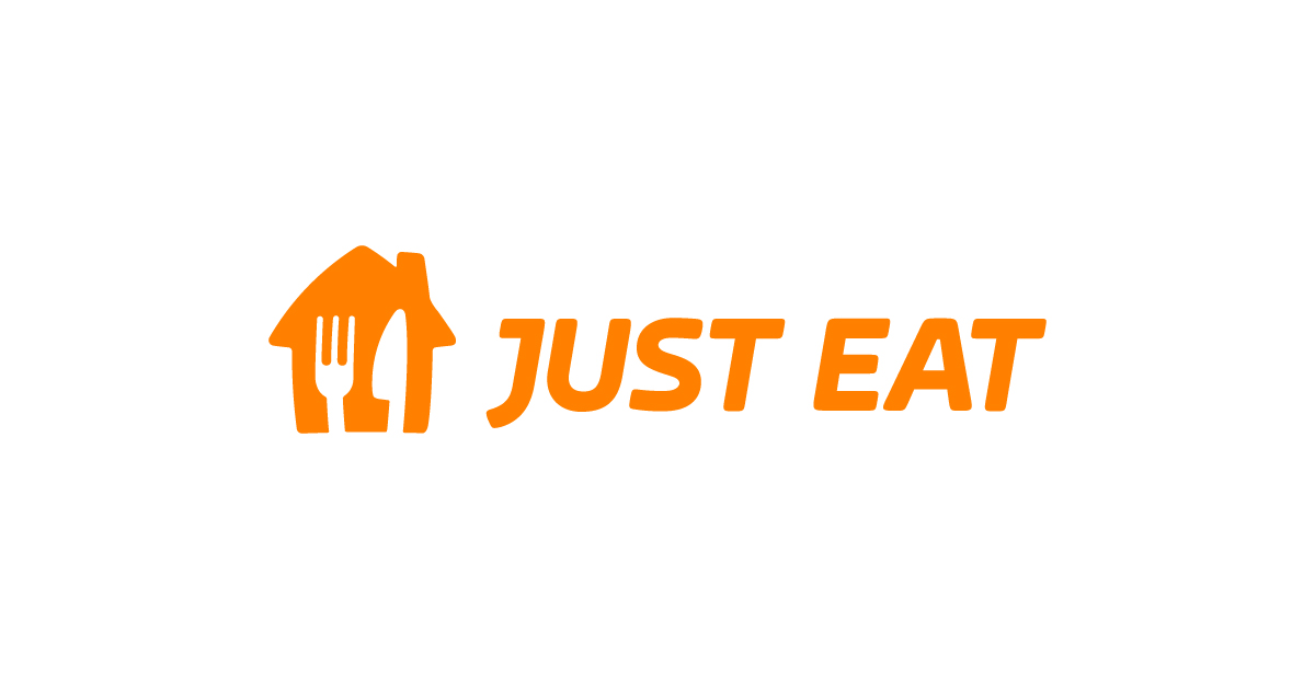
A fork and knife appear inside the house.
Why this logo works
The Just Eat logo uses white space to slip in dining utensils without adding clutter, keeping the design sharp and thematic.
8. The Bronx Zoo
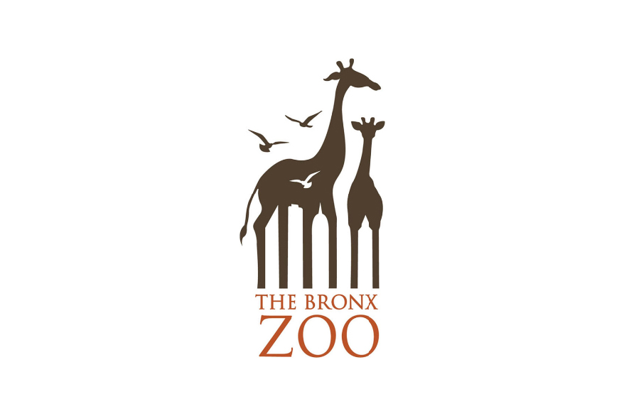
Skyscrapers appear between the giraffes’ legs.
Why this logo works
The Bronx Zoo logo ties animals to the city through a hidden skyline, connecting nature and urban life.
9. ATP Tour
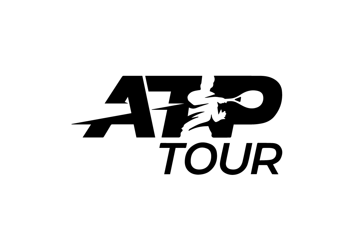
A tennis player is formed from gaps in the letterforms.
Why this logo works
The ATP Tour logo uses empty space to capture motion and energy in a single, striking silhouette.
10. Toblerone
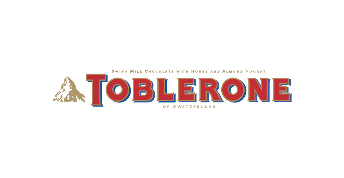
A hidden bear stands inside the Matterhorn mountain.
Why this logo works
The Toblerone logo cleverly integrates a bear — the symbol of Bern — into its alpine heritage.
11. Betano
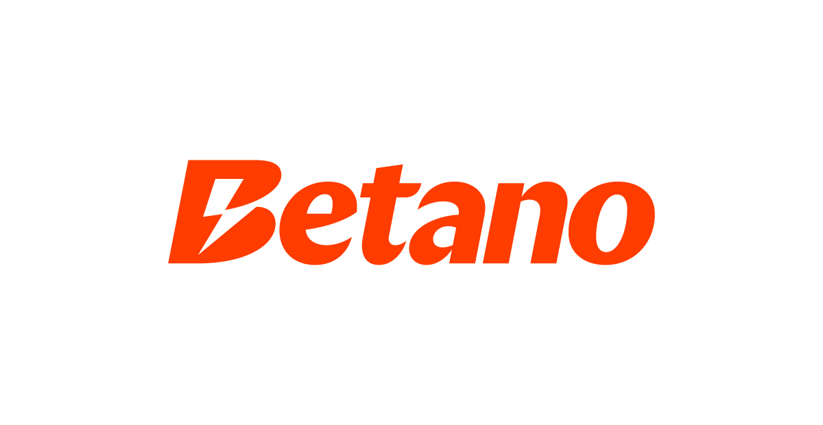
A lightning bolt is carved out inside the letter B.
Why this logo works
The Betano logo uses negative space to inject energy and motion into the design — the bold bolt reinforces speed and power.
12. Pittsburgh Zoo
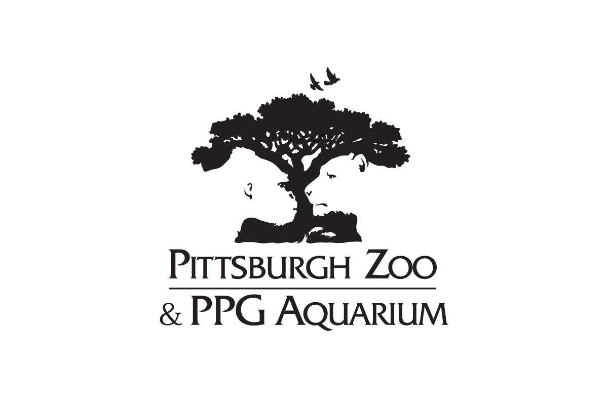
A gorilla and lion face each other within a tree silhouette.
Why this logo works
The Pittsburgh Zoo logo hides multiple animals in one mark, making the viewer engage more deeply with the design.
13. Gillette
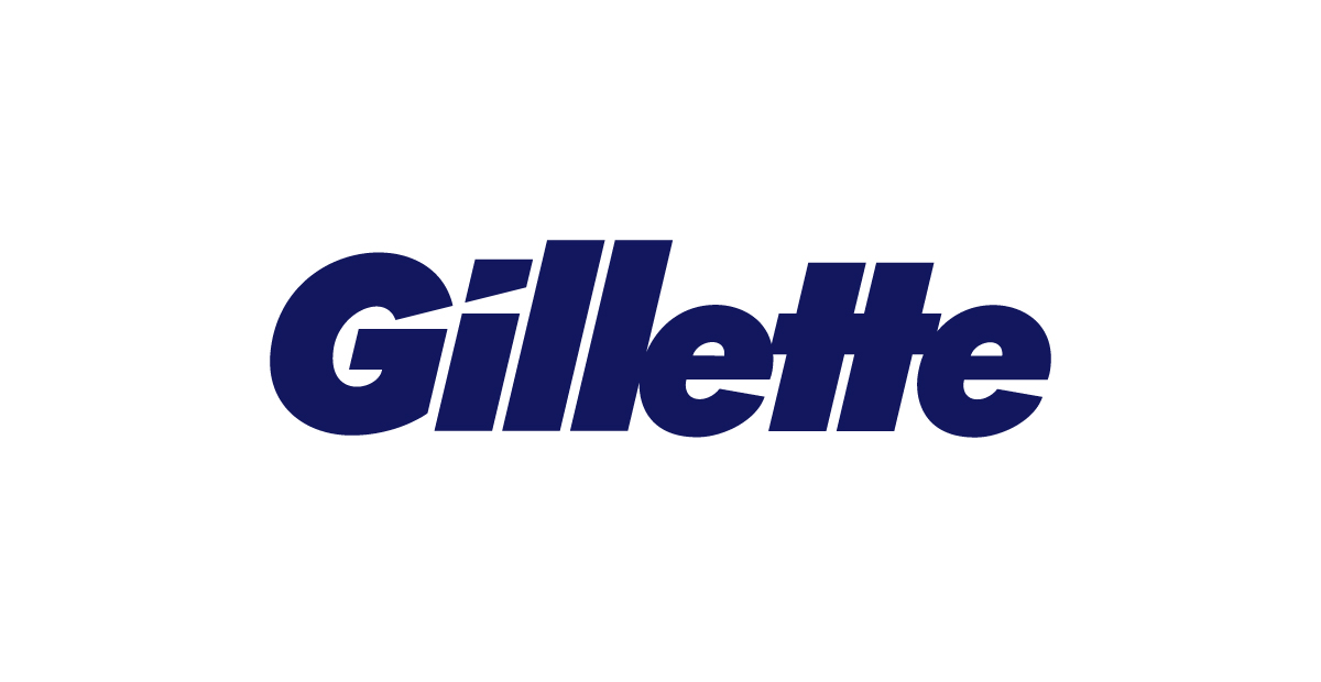
Sharp cuts slice through letters like razor strokes.
Why this logo works
The Gillette logo uses subtle slices to mimic precision shaving, all through empty space.
14. LG
![]()
The letters form a smiling face with a hidden ‘G’.
Why this logo works
The LG logo turns simple initials into a friendly expression, reinforcing brand warmth through clever space use.
15. Hope for African Children Initiative
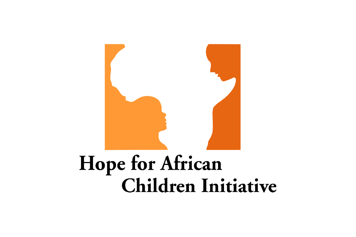
A child and adult face appear in Africa’s outline.
Why this logo works
The Hope for African Children Initiative logo uses empty space for emotional storytelling in a single shape.
16. Bolt
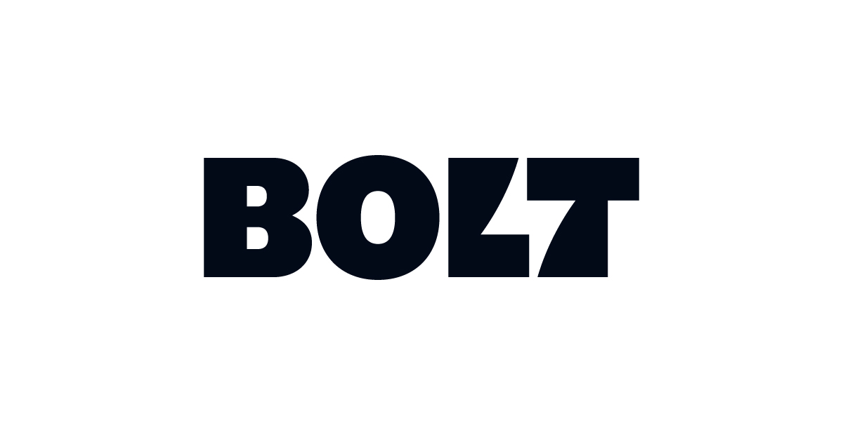
A lightning bolt shape cuts between the L and T.
Why this logo works
The Bolt logo slices empty space into the lettering, using the bolt as a dynamic divider that reinforces the brand’s name and energy.
17. Converse
![]()
A star is cut out inside the letter O.
Why this logo works
The Converse logo uses white space to embed its iconic star directly into the type, reinforcing brand identity with a bold, minimal twist.
18. Beats
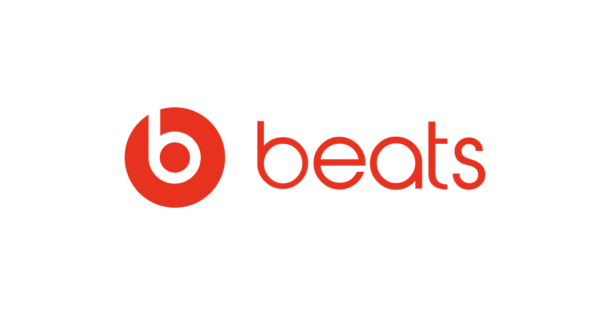
A lowercase B doubles as headphones inside a circle.
Why this logo works
The Beats logo merges product and initial in a sleek, modern visual using just two shapes.
19. Lando Norris
The number 4 appears between the letters L and N.
Why this logo works
The Lando’s logo uses negative space to highlight his racing number, turning typography into a personal signature with sleek visual impact.
20. Adobe
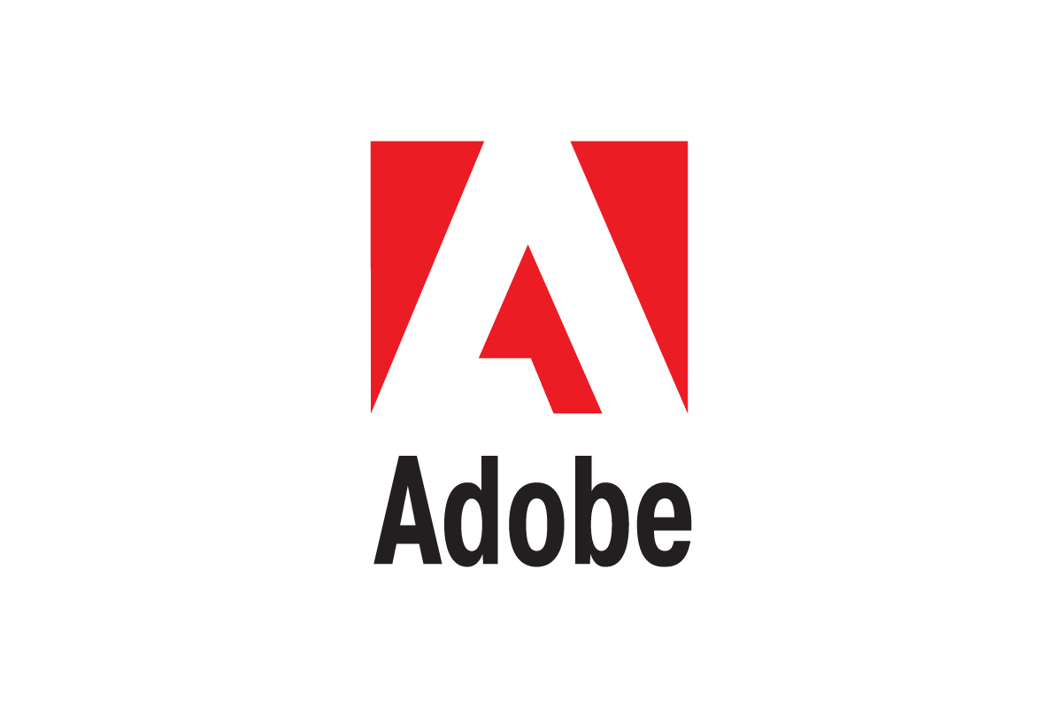
A stylized letter A is carved out inside a red square.
Why this logo works
The Adobe logo uses empty space to form a sharp, modern A that feels light and balanced within a bold block — a clean mark for a creative brand.
Negative Space Logos by Rabbit
Here are a few examples of how we’ve used negative space in logos we’ve crafted for clients — where meaning, shape, and clarity come together through what’s not shown.
1. Eagle
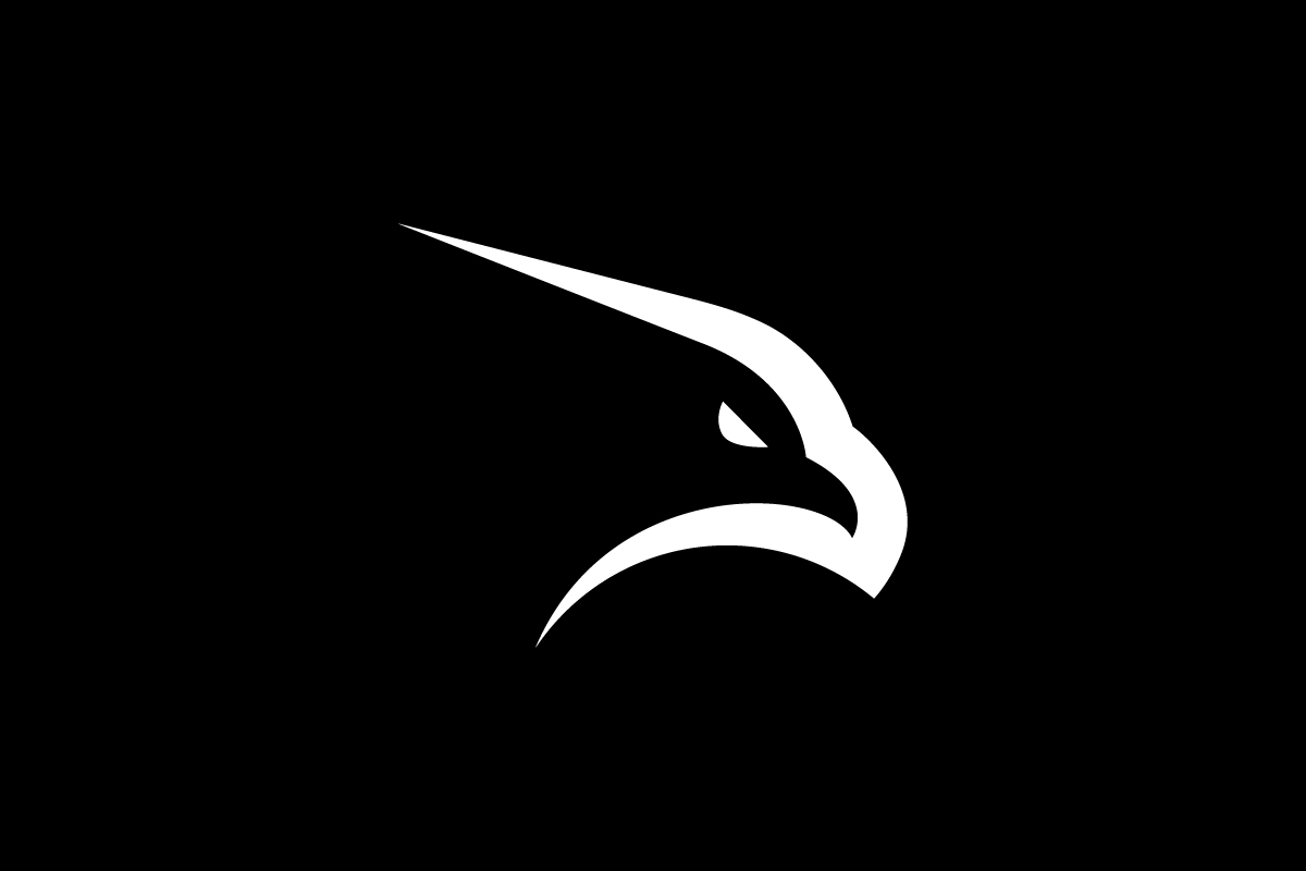
An eagle head is made entirely from curved empty space.
Why this logo works
The Eagle logo uses sharp cuts and flowing gaps to form a striking eagle head — a bold identity shaped through pure simplicity.
2. Pupsy
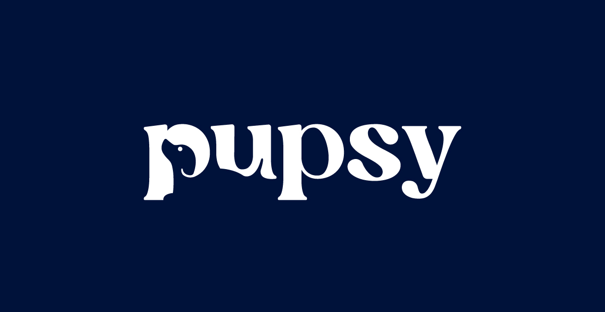
A dog’s body is hidden inside the letters P and U.
Why this logo works
The Pupsy logo uses negative space to gently reveal a playful dog figure, adding warmth and personality to the wordmark.
3. Move It
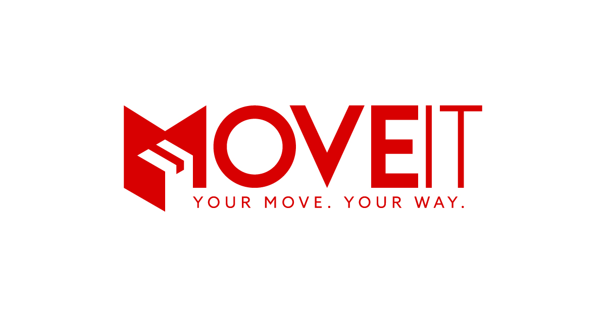
A 3D moving box is carved inside the letter M.
Why this logo works
The Move It logo uses empty space to form a cube, instantly linking the brand to packaging, delivery, and movement — all inside a single letter.
4. Walus
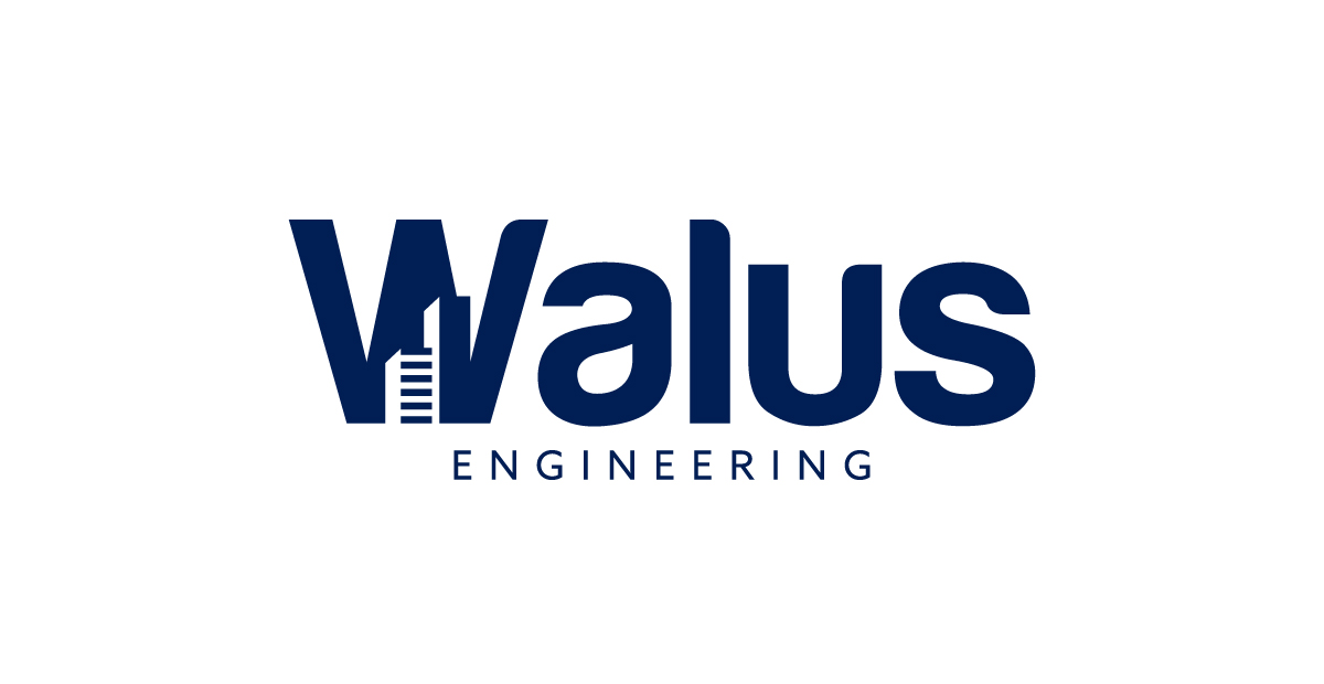
A group of buildings rises from the center of the letter W.
Why this logo works
The Walus logo uses empty space to suggest architecture and urban design, turning a single letter into a skyline that speaks directly to its industry.
5. Grow
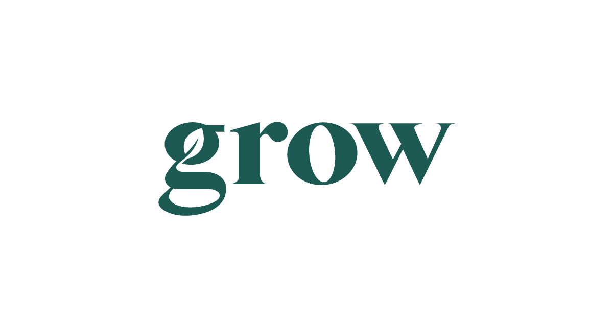
A leaf grows right out of the letter “g”.
Why this logo works
The Grow logo uses empty space to suggest growth and nature, embedding its message right into the brand’s first letter.
6. Shopsy
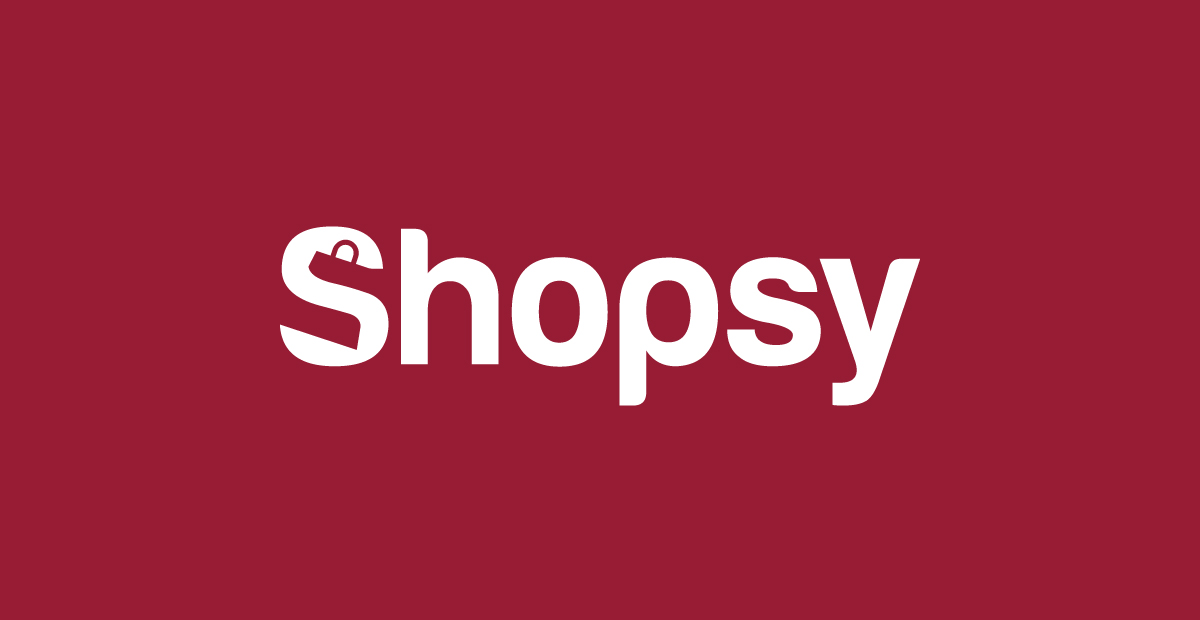
A shopping bag is cut out inside the letter S.
Why this logo works
The Shopsy logo uses white space to create a subtle bag symbol, instantly connecting the brand to retail and e-commerce.
7. TWJ
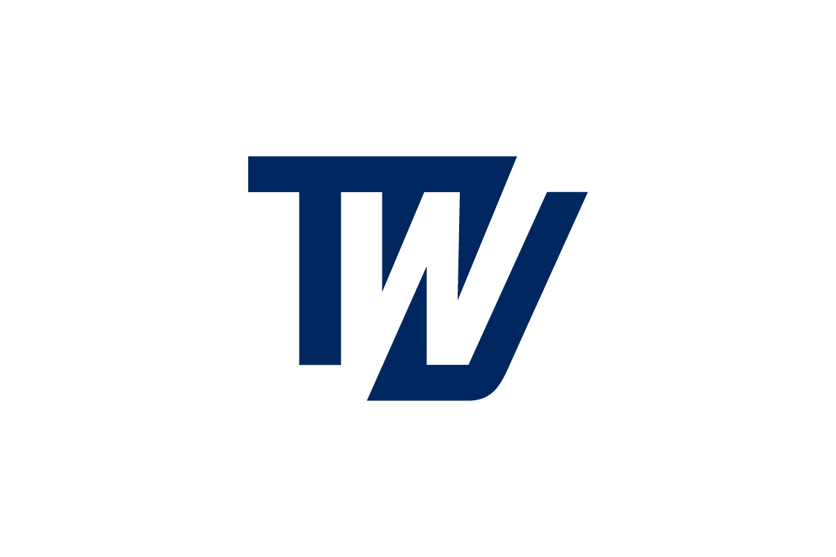
The “W” is formed entirely from the negative space between the bold “T” and “J”.
Why this logo works
The TWJ logo transforms the space between two letters into a third — a smart, minimalist approach that adds depth and precision.
8. Penguin
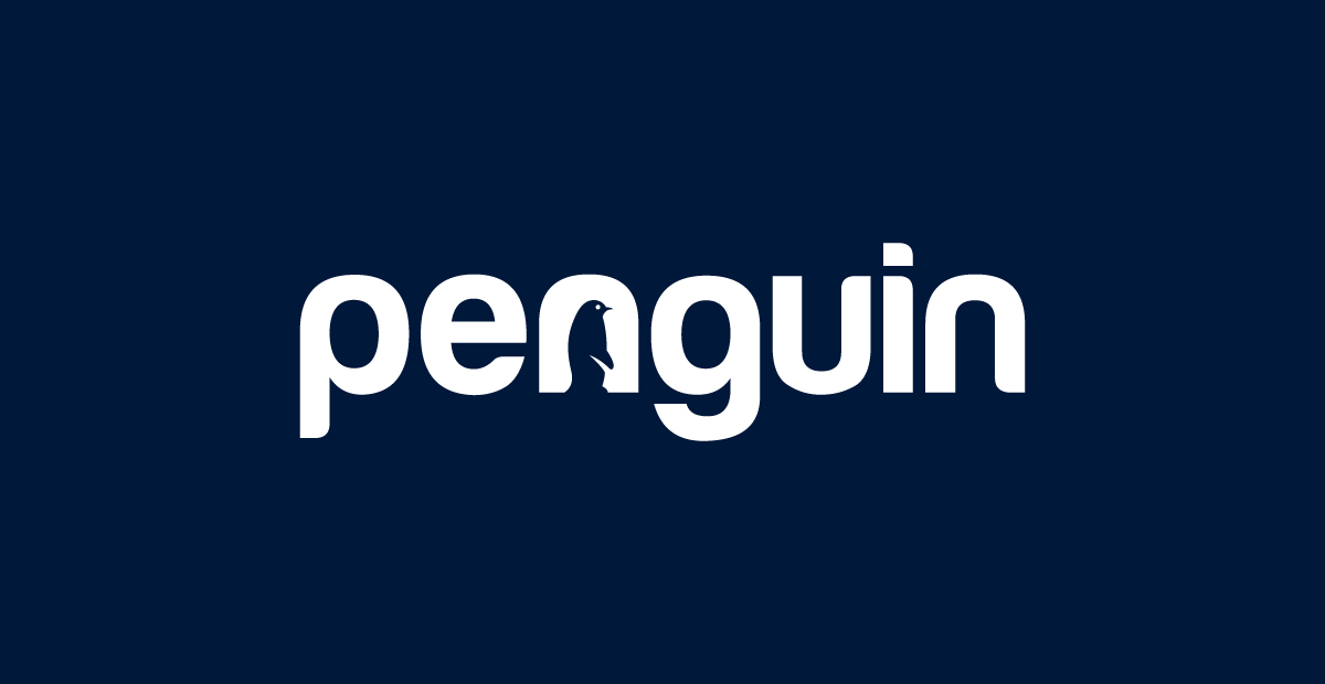
A penguin silhouette is inside the letter N.
Why this logo works
The Penguin logo uses empty space to create a charming character, blending brand personality seamlessly into the typography.
9. Winero
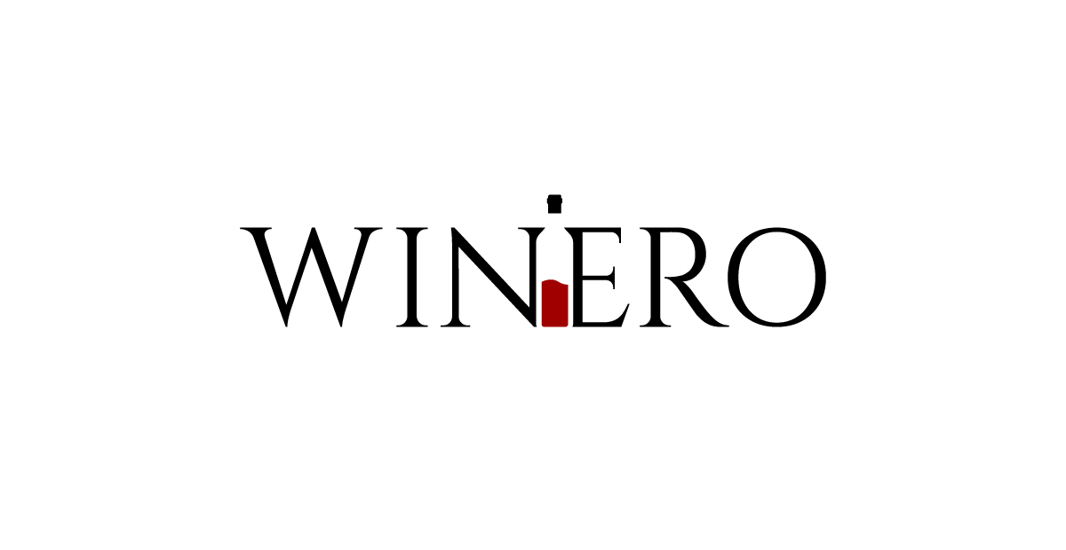
A wine bottle appears between the letters N and E.
Why this logo works
The Winero logo uses empty space to sneak in a central product symbol — instantly making the brand’s focus clear and memorable.
10. Yips
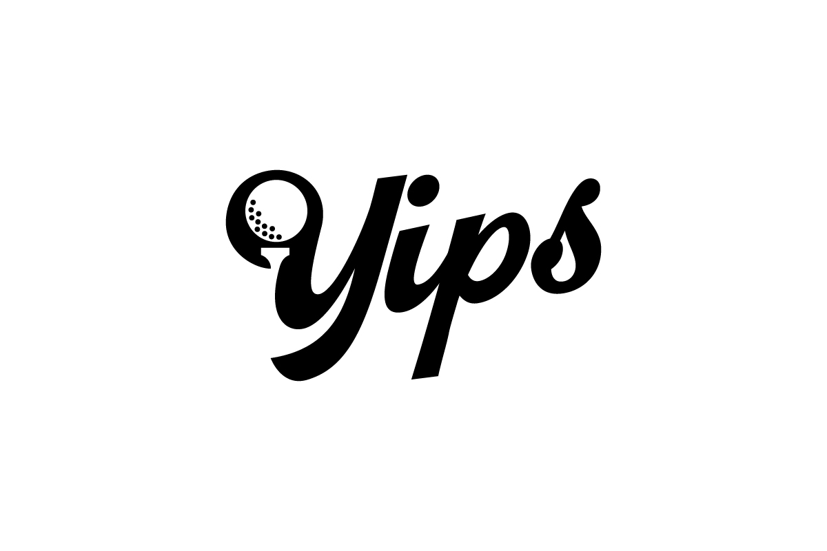
A golf ball is nestled inside the upper loop of the letter Y.
Why this logo works
The Yips logo uses empty space to highlight the sport at a glance, blending playful lettering with a clear visual cue.
11. Koala
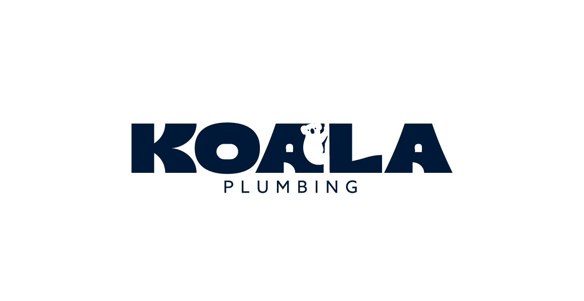
A koala is tucked between the letters A and L.
Why this logo works
The Koala logo uses empty space to reveal its namesake animal, adding charm and instant recognition to the design.
12. Dirty
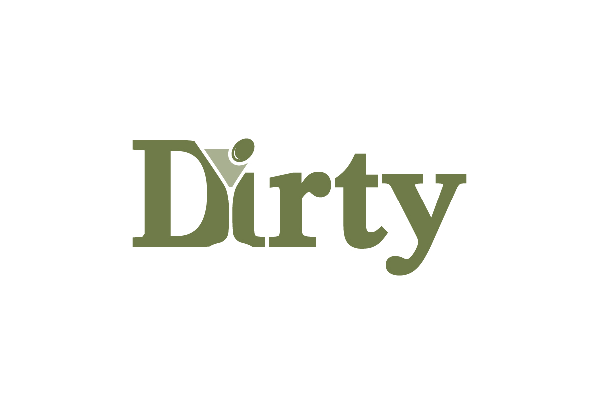
The dot of the “i” is replaced by a cocktail glass and olive.
Why this logo works
The Dirty logo uses negative space to turn a single letter into a clever visual pun — instantly connecting the brand to mixology and nightlife.
When to Use a Negative Space Logo?
This style works best when your brand wants to feel:
-
Thoughtful or intelligent
-
Clean and contemporary
-
Subtle but memorable
-
Concept-driven (e.g., two ideas in one)
It’s especially effective for industries like:
-
Tech
-
Design
-
Media
-
Architecture
-
Finance
-
Professional services
If your name has multiple meanings, initials, or visual metaphors, negative space could be the perfect fit.
How to Design a Negative Space Logo
-
Work in black and white first – Contrast is everything
-
Keep it minimal – Too many details will dilute the trick
-
Use symmetry or balance – Negative space should feel intentional
-
Test readability – The hidden part should be discoverable, not confusing
-
Aim for the “aha” moment – The surprise is part of the charm
Conclusion
A negative space logo is smart design at its finest — clean, meaningful, and built for second looks. It shows your brand has depth, clarity, and creativity without ever shouting.
If you want a logo that says more with less, Rabbit can help you design something unforgettable.
Let us craft your next identity — one with space that speaks. Contact us today to start your logo project.