At Rabbit, we are at the forefront of integrating these evolving color trends into our logo project endeavors, ensuring that the brands we collaborate with not only stand out but also speak directly to the hearts of their audience. This exploration into color trends is more than a guide; it is a lens through which we view the future of branding and logo design.
The Psychology of Color in Branding
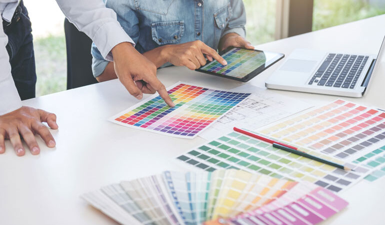
Before diving into specific trends, it is crucial to understand the foundation of color psychology in branding. Colors have the power to convey messages and evoke responses without a word being said. Red can signify passion and energy, blue trust and calm, green growth and sustainability, and so on. This psychological impact is what makes the choice of color a pivotal decision in the design process of a modern logo.
Embracing Bold and Bright Hues
The trend of bold and bright hues is a response to the digital-first world where logos must pop on various screens. Brands are increasingly adopting vibrant colors that stand out in digital spaces, from social media to mobile apps. These colors not only capture attention but also reflect a brand’s dynamic and forward-thinking personality.
Pastel Palettes: Soft Yet Powerful
On the other end of the spectrum, pastel colors have emerged as a powerful trend in modern logo design. These soft hues convey warmth, approachability, and a sense of calm, making them perfect for brands looking to present themselves as friendly and reassuring. Pastels have a unique ability to stand out due to their understated elegance, offering a refreshing alternative to the boldness of saturated colors.
Gradient Revolution
Gradients have made a significant comeback, with modern logo designs increasingly featuring smooth transitions between colors. This trend adds depth, dimension, and a futuristic feel to logos, allowing for a more dynamic and engaging visual experience. Gradients can transform a simple logo into a memorable visual journey, reflecting the brand’s innovation and creativity.
Monochrome and Duotone
The use of monochrome and duotone color schemes in logo design is on the rise, showcasing the power of simplicity. These schemes, which utilize shades or tints of a single color or a combination of two hues, create impactful logos that are both modern and timeless. This trend is particularly effective in emphasizing shape and form, allowing the logo’s structure to take center stage.
Color Trends Reflecting Sustainability
With growing awareness around sustainability, green hues, and earth tones are becoming increasingly popular in logo design. These colors resonate with eco-conscious consumers, symbolizing a brand’s commitment to environmental responsibility. From soft sage to rich terracotta, these earthy shades are being used to communicate a brand’s alignment with natural and sustainable values.
Neo-Minimalism: The Evolution of Simplicity
The trend of neo-minimalism takes the core principles of minimalistic design—simplicity, clean lines, and uncluttered spaces—and infuses them with bold color choices and subtle complexities. This evolution adds depth and personality to logos, making them more memorable while retaining the elegance and clarity that minimalism is known for. Neo-minimalism in modern logo design showcases how brands can communicate more with less, using strategic color choices and design elements to convey their story and values.
Nostalgic Resurgence: Retro Colors Making a Comeback
A surprising yet impactful trend is the resurgence of retro colors in modern logo design. Inspired by the ’70s, ’80s, and ’90s, these palettes bring warm browns, bright neons, and muted pastels back into the forefront of branding. This nostalgic revival not only appeals to the emotions and memories of consumers but also allows brands to stand out with a distinctive, vintage flair. The use of retro colors is a nod to the past, repackaged in a way that feels fresh and relevant for today’s audience, demonstrating a brand’s ability to blend tradition with innovation.
Color trends in modern logo design are a reflection of the changing landscape of consumer preferences, digital advancements, and societal shifts. As we navigate these trends at Rabbit, our logo plans are meticulously crafted to ensure that each logo not only captures the essence of the brand but also resonates with the intended audience.
The power of color in shaping brand identity and consumer perceptions has never been more significant, making the choice of color an essential element of the modern logo design process. In this vibrant era of branding, a well-chosen color scheme can be the difference between blending in and standing out, between good and unforgettable.


