Key Takeaways
-
Choosing the right logo font is crucial for reflecting a brand’s identity and resonating with the target audience, as fonts have the power to evoke specific emotions and symbolize a brand’s values.
-
It’s essential to consider font licensing when selecting a font for your logo, as free fonts often have restrictions for commercial use, and a full license purchase might be necessary for comprehensive utilization.
-
The right font choice for a logo should account for industry standards, intended brand message, and target market characteristics, ensuring that the typography aligns with the brand’s personality.
The Art of Choosing Logo Fonts
Selecting appropriate logo fonts parallels the process of choosing the right outfit for an important meeting. It reflects your brand’s personality and directly influences how your audience perceives your brand. A well-chosen font can embody your brand’s essence and values, creating a powerful connection with your target audience. It’s a crucial step in the logo design process, as different typography can evoke specific emotions and symbolize your brand’s philosophy. Just as a tailored suit communicates professionalism and sophistication, a carefully selected font can convey your brand’s unique identity and story.
Considering your brand’s personality and the message you want to deliver is key to guaranteeing your font choice genuinely represents your brand. Are you a modern tech startup aiming for a sleek and innovative image? A sans serif font might be your best bet. Or perhaps you’re a law firm looking to project an image of tradition and trustworthiness? A classic serif font could be the perfect fit. The key is to align your logo font with your brand’s personality, creating a visual identity that resonates with your target audience.
At Rabbit, we have experience determining the best color schemes for various industries.
Defining Your Brand’s Typeface Needs
Identifying your target market is the initial step towards selecting a font that genuinely mirrors your brand’s needs and values. Just as a fashion brand targets a different audience than a tech company, the typography used in their logos should also differ. Consider the characteristics of your target audience – their demographics, preferences, and expectations – and choose a font that resonates with them. This alignment between the target market and the font choice is crucial in creating a strong brand identity.
Pairing Fonts for Cohesive Design
Even though the use of multiple fonts in your logo design might seem appealing to make it stand out, typography often benefits from a minimalist approach. Using too many fonts can result in a cluttered and confusing logo, diluting your brand’s message. It’s generally advisable to use only one or two fonts in your logo design to maintain balance and prevent clutter.
When using two fonts, they should complement each other in terms of weight and style. One font should capture the brand’s style and be the focal point, while the other should play a supporting role, adding subtle nuance to the overall logo design.
It’s like a duet where one voice takes the lead while the other provides the harmony, creating a cohesive and harmonious logo that effectively communicates your brand’s identity.
Font Licensing: What You Need to Know
Being mindful of font licensing is vital when exploring various font options for your logo. While free fonts can be an attractive option, especially for small businesses or startups, they often come with restrictions for commercial use. This means that you might need to purchase a full license if you plan to use the font for broader applications such as your logo or marketing materials.
Additionally, free fonts typically offer limited options in terms of weight and style, and you may need to make an additional purchase to acquire the complete set. So, while free fonts can be a great starting point, especially for testing and prototyping, they may not always be the most economical or practical choice in the long run.
With an Adobe Fonts subscription, you have access to a lot of fonts and a commercial license.
The Spectrum of Serif Fonts in Logo Design
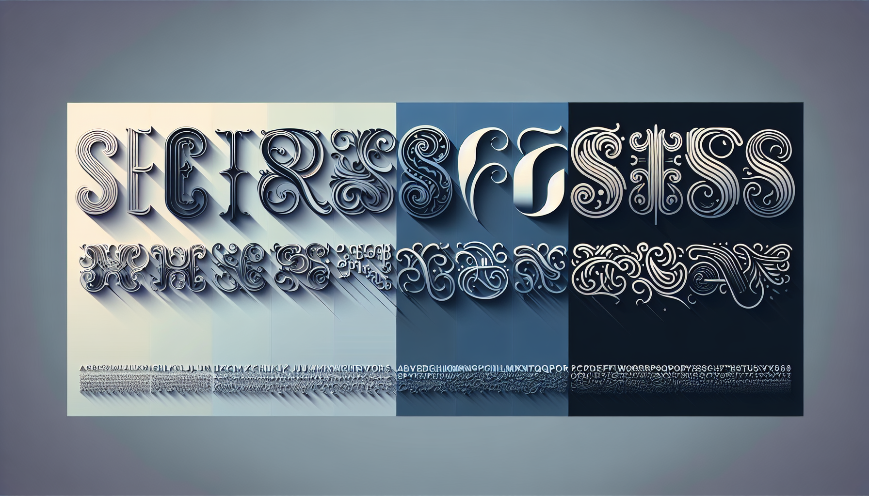
In the realm of logo design, the serif typeface can be likened to a classic black dress – they embody timelessness, elegance, and versatility, conveying historical experience, tradition, and sophistication. Serif fonts, characterized by small lines or strokes attached to the ends of characters, not only give the letters more character but also improve legibility. These added details can make the text easier to read, especially in printed materials. Their use in logos usually conveys a sense of historical experience, tradition, and sophistication, making them a popular choice for brands aiming for a classic and mature image.
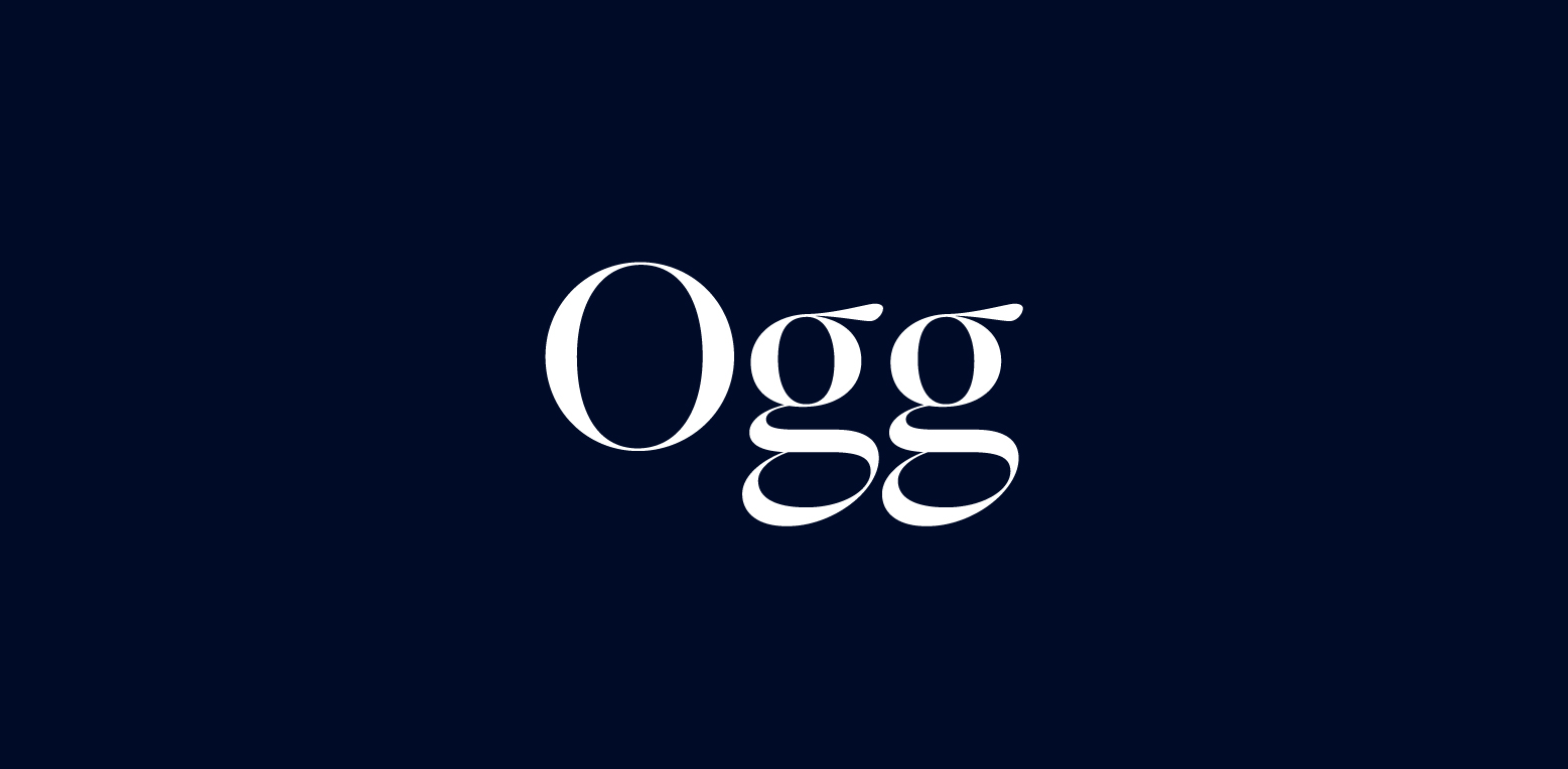
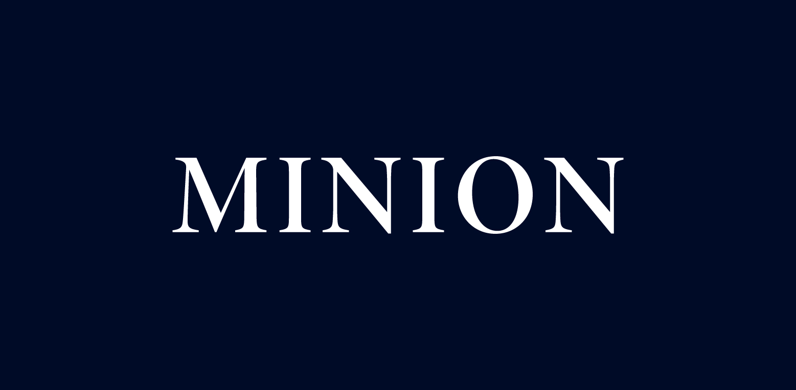
Serif fonts come in a wide variety, each offering a unique blend of traditional elegance and contemporary versatility. Take, for instance, the Ogg font, a calligraphic serif with five weights, and the Minion typeface, a renaissance-inspired design that’s part of the Adobe Systems font family. Both fonts demonstrate how serif fonts can adapt to modern aesthetics while retaining their classic charm. Whether you’re a luxury brand seeking to convey opulence and grandeur or a newspaper wanting to project credibility and authority, there’s a serif font out there that can perfectly encapsulate your brand’s identity.
Ogg
Minion
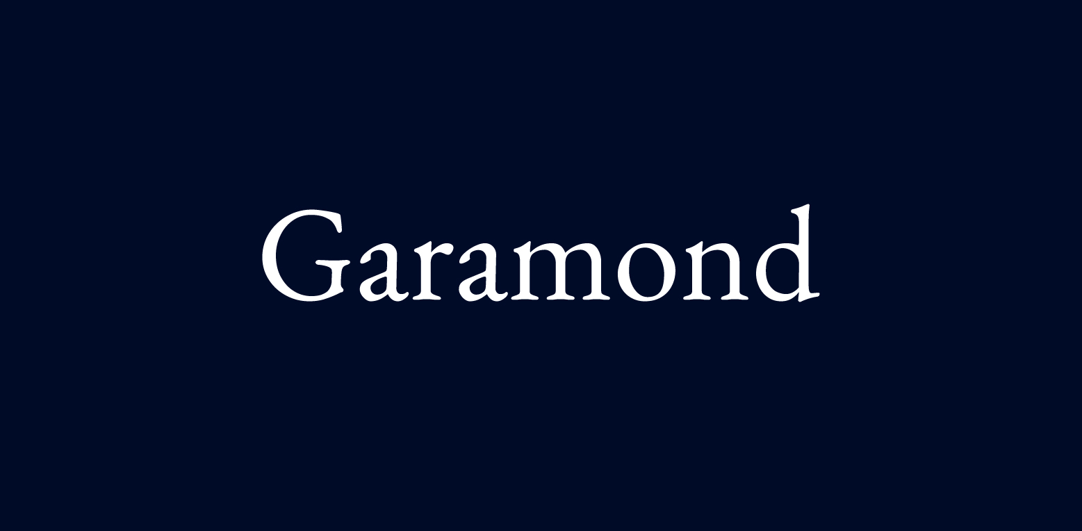
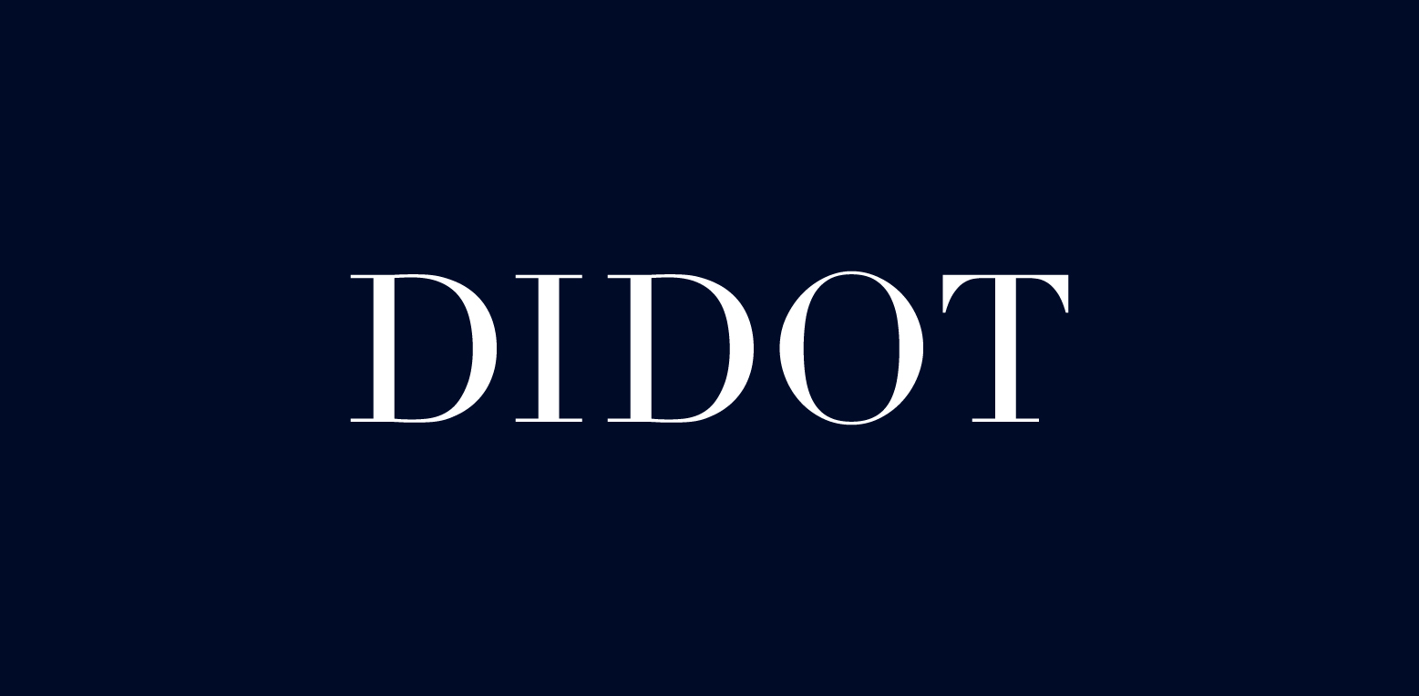
Classic Elegance: Traditional Serif Typefaces
Garamond
Didot
These font pairs well with other typefaces for a visually appealing design, even when using the same font in different styles or weights.
These fonts are like the venerable elders of the typography world–reliable, respected, and full of wisdom. They have withstood the test of time, often coming pre-installed on many computers, making them a familiar and trusted presence in the typography landscape.
High-profile companies such as Tiffany & Co. often use traditional serif fonts to mirror their long-standing reputation and assure a look of permanence and sophistication. For instance, the EB Garamond, reflecting the historical aesthetics of the original Garamond, brings an esteemed and timeless appeal to brand identities. Utilizing the Garamond font in logo design imparts an aspect of professionalism combined with an individualistic character expression. The result is a logo that speaks of heritage, credibility, and class, making a powerful statement without saying a word.
Modern Serifs: A Contemporary Twist
While traditional serif fonts bring a classic elegance to logos, modern serif fonts offer a fresh and dynamic twist. These fonts balance classic elements with contemporary features, making them a perfect choice for brands aiming for a fresh but respectful look. They’re like a modern reinterpretation of a classic novel – familiar yet full of new and exciting possibilities.
Some popular modern serif fonts include:
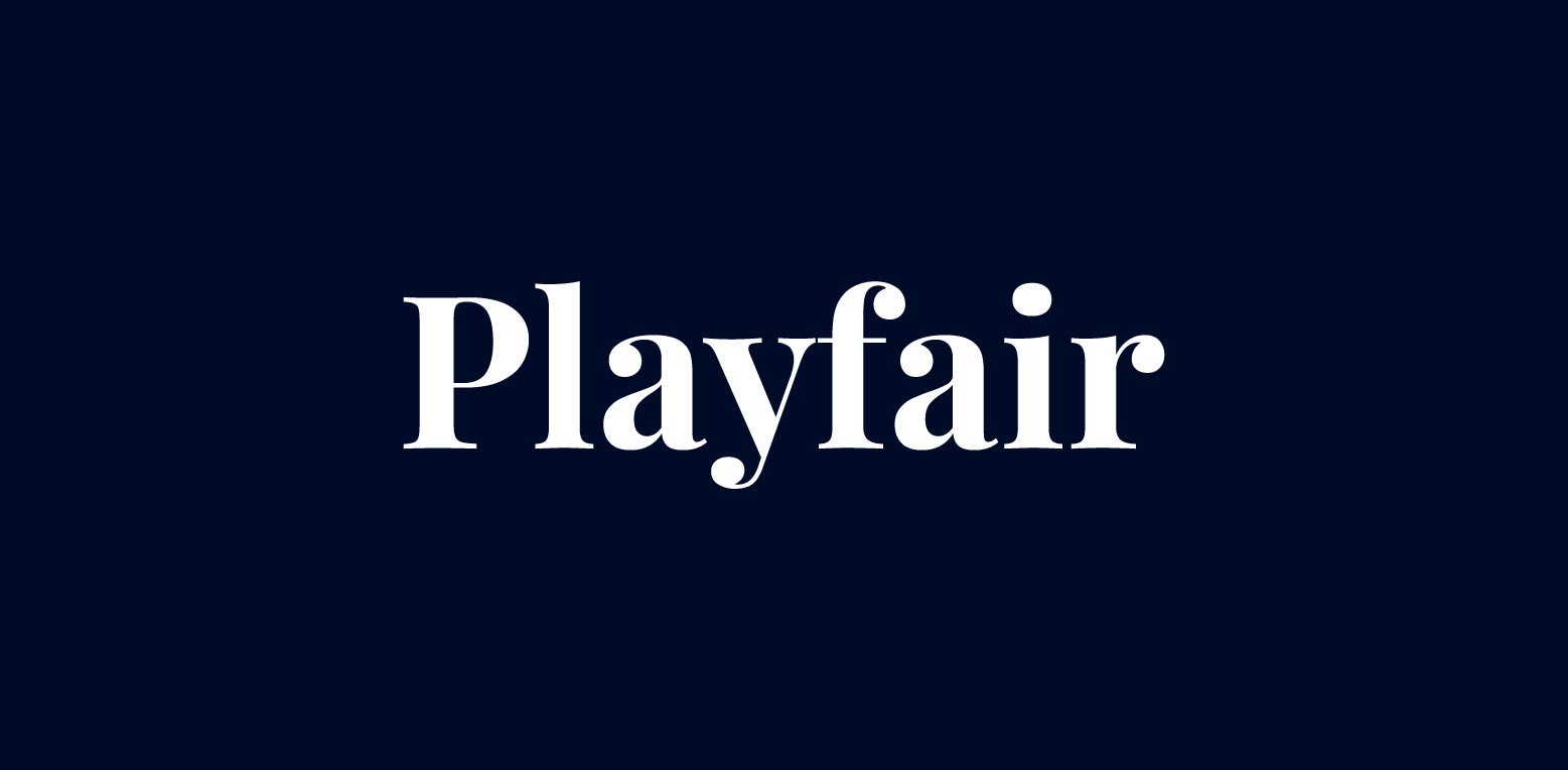
Playfair Display
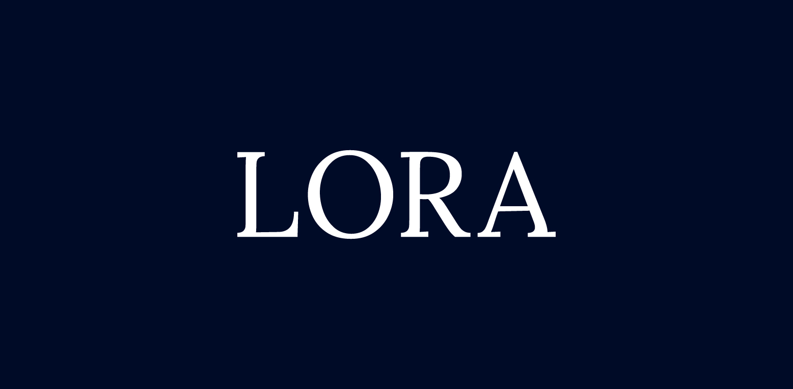
Lora
Lust
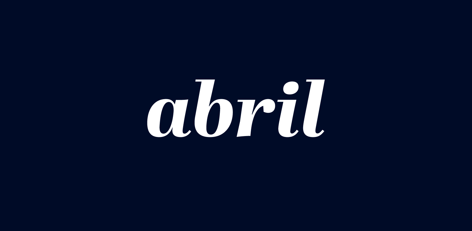
Abril Fatface
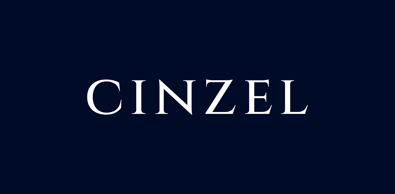
Cinzel
These fonts can add a touch of sophistication and uniqueness to your logo design.
For instance, consider the following modern serif fonts that can bring a fresh and innovative vibe to logos, while still maintaining the strength and reliability of their traditional counterparts.
Quiche Sans
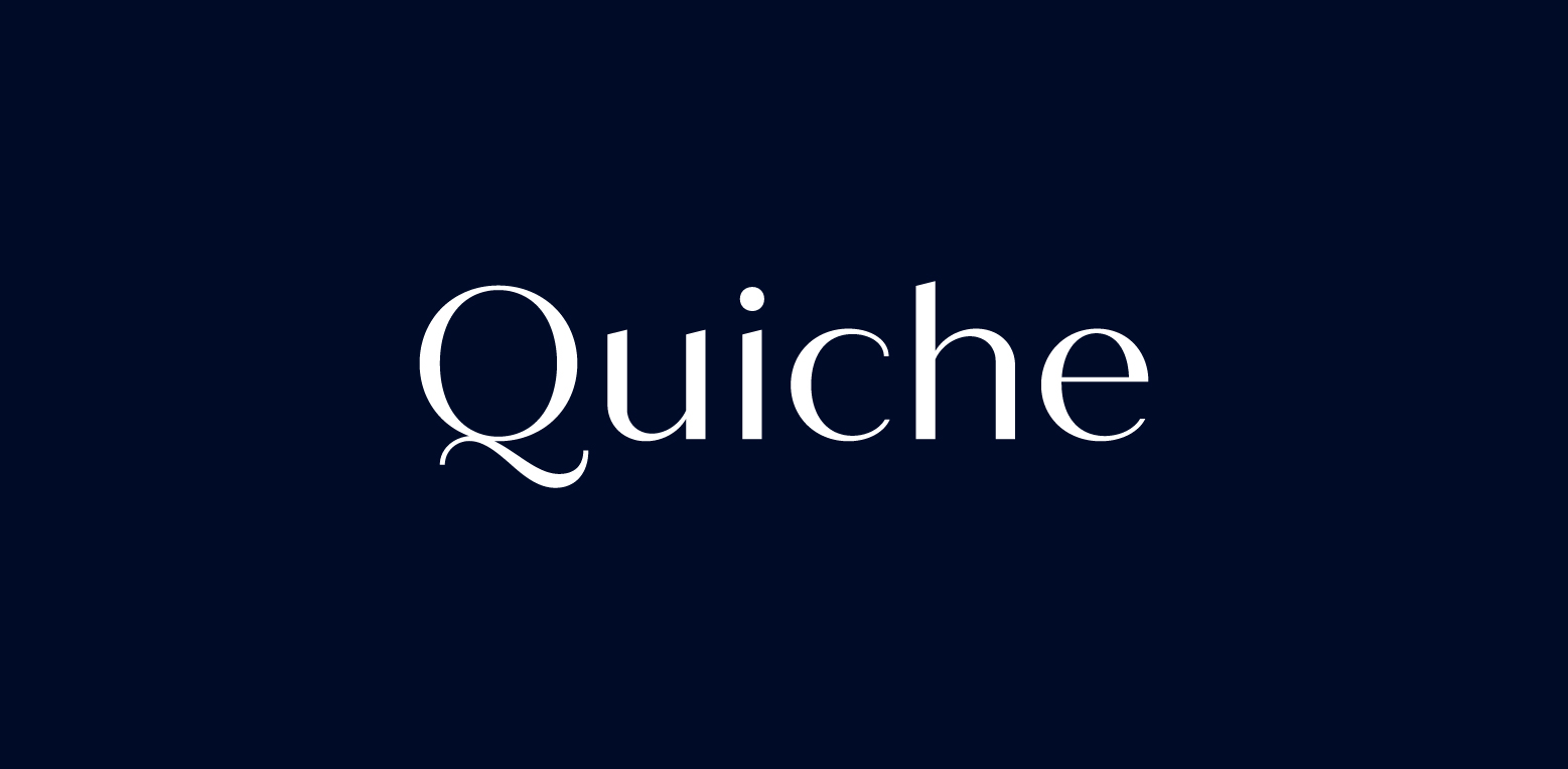
Known for adding elegance and luxury to branding with its decadent curves and varying strokes
Ringift
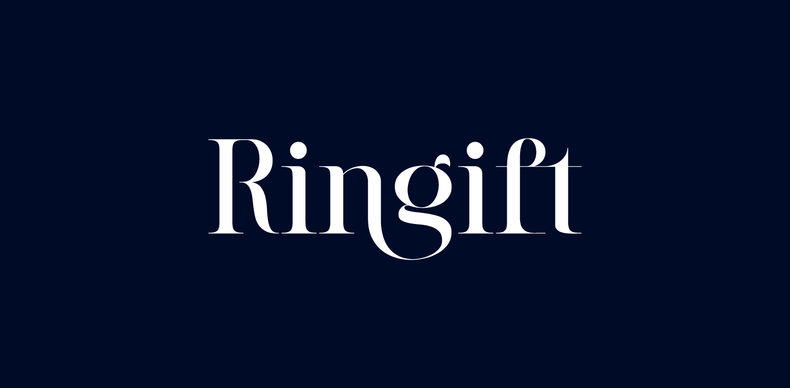
Fuses sharp serifs with elegant flow, making it perfect for classic restaurants
Kinta
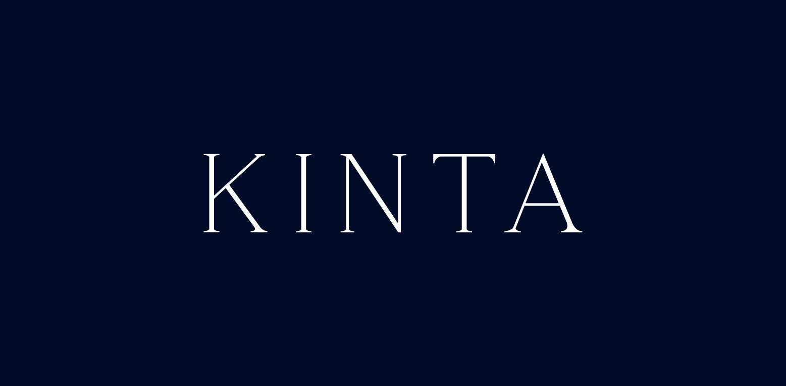
Also fuses sharp serifs with elegant flow, making it perfect for legal consulting firms
These fonts exemplify how modern serif fonts can bring a fresh and innovative vibe to logos, while still maintaining the strength and reliability of their traditional counterparts.
Sans Serif Fonts: A Staple in Modern Logo Typography
If serif fonts are the black dress of typography, then sans serif fonts are the crisp white shirt – clean, modern, and versatile. Recognized for their clean lines and lack of decorative strokes at the ends of letters, sans serif typefaces exude a crisp and modern appearance. They are ideal for brands aiming for a sleek, contemporary image.
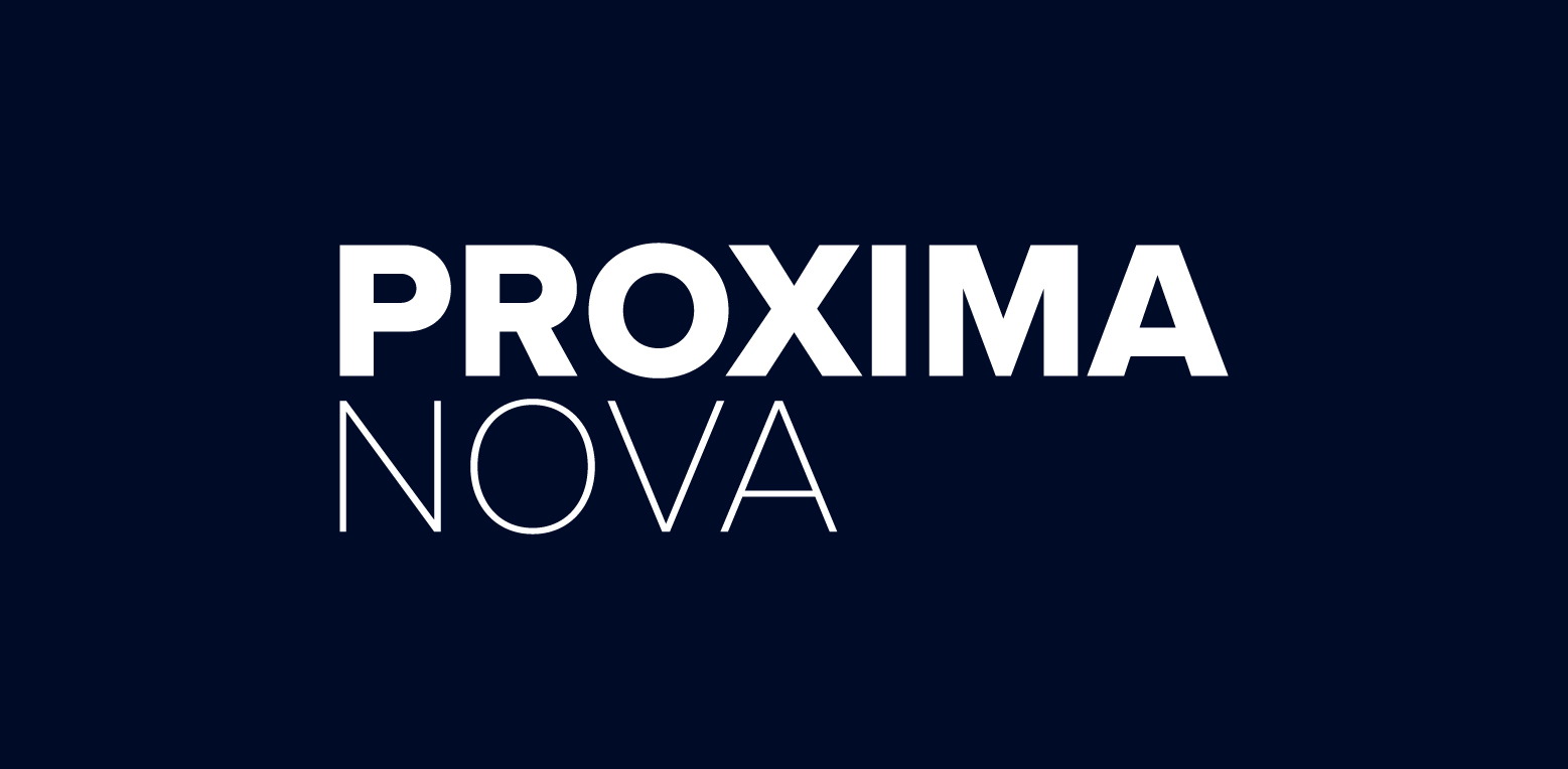
Proxima Nova
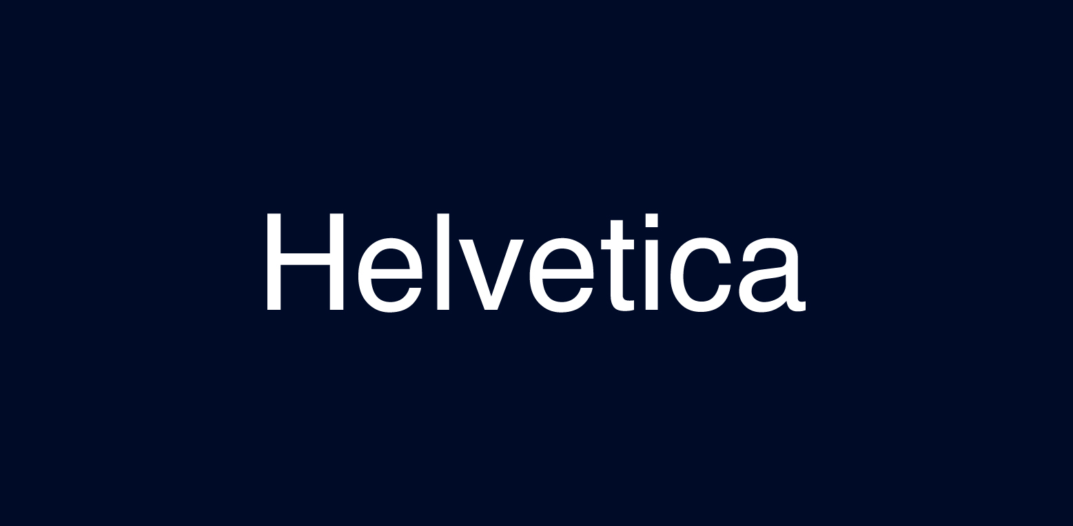
Helvetica
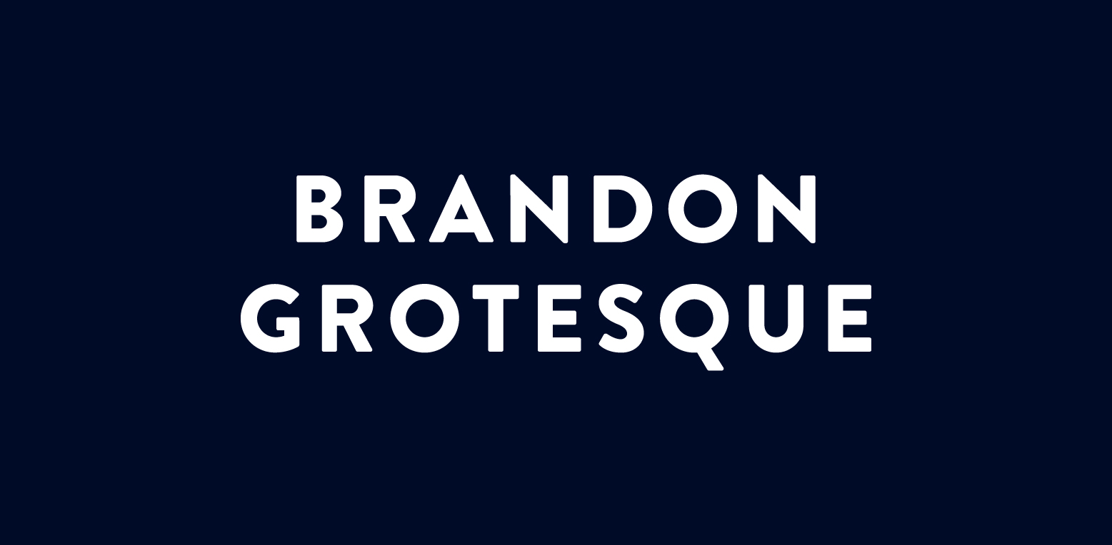
Brandon Grotesque
Harabara Mais
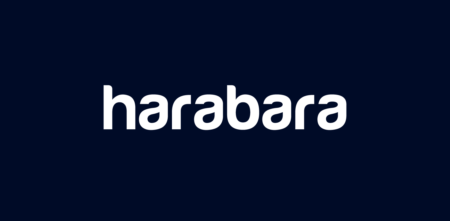
Popular sans serif fonts such as Proxima Nova, Helvetica, and Brandon Grotesque are favored by brands for their modern and geometric aesthetics. These modern font choices communicate an image that is approachable, trendy, and reliable, making them a popular choice for tech startups, fashion brands, and creative agencies. We designed our Rabbit logo using the Harabara font.
Whether you’re a cutting-edge tech company or a minimalist lifestyle brand, a sans serif font can provide the clean and modern aesthetic that your logo needs.
Geometric Sans Serifs: Precision and Symmetry
Geometric sans serif fonts, also known as geometric typeface, are like the architects of the typography world – precise, symmetrical, and modern. Known for their uniformity and modern feel, these fonts are a popular choice for creating a sleek and contemporary brand image.
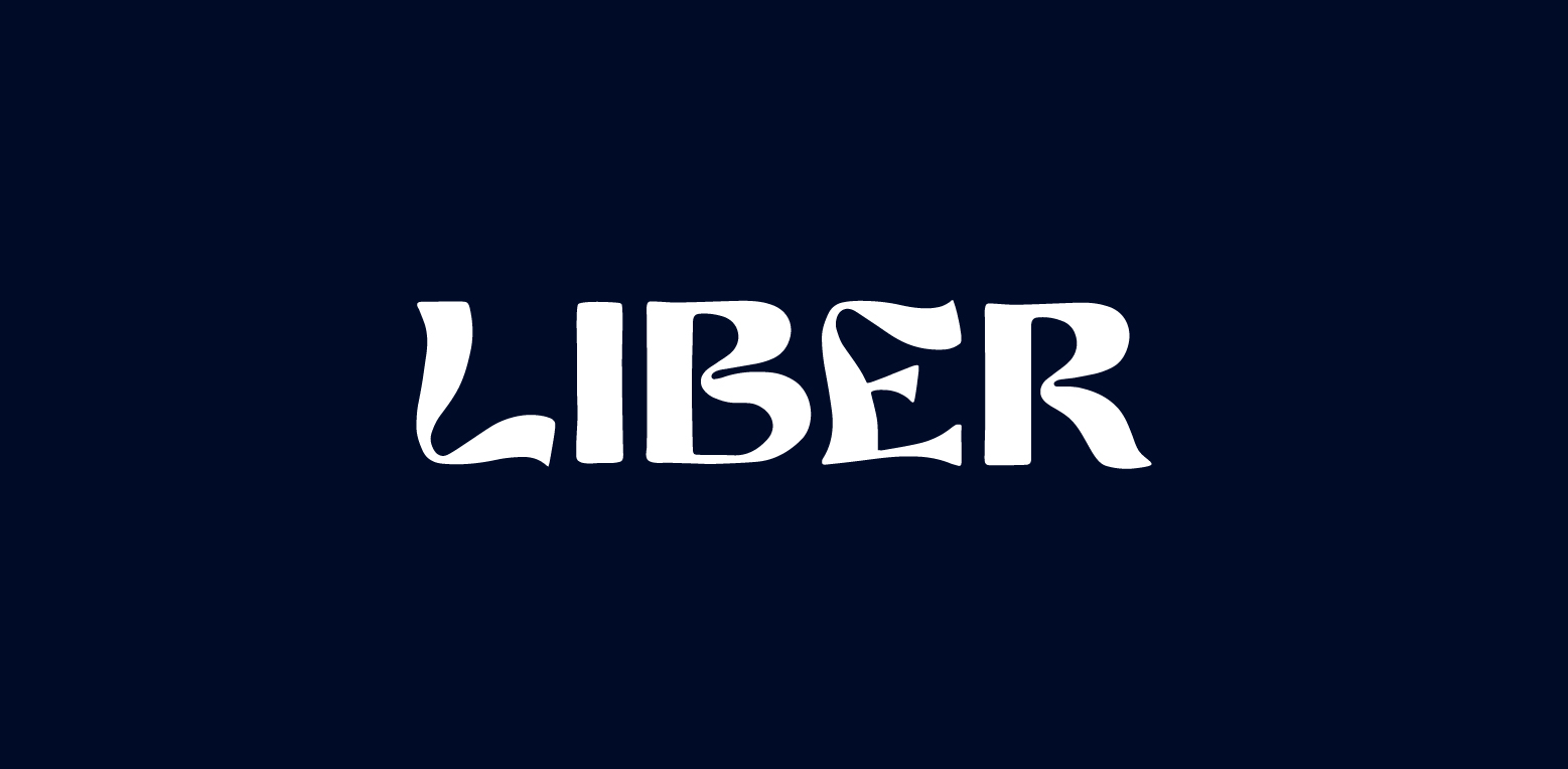
Liber
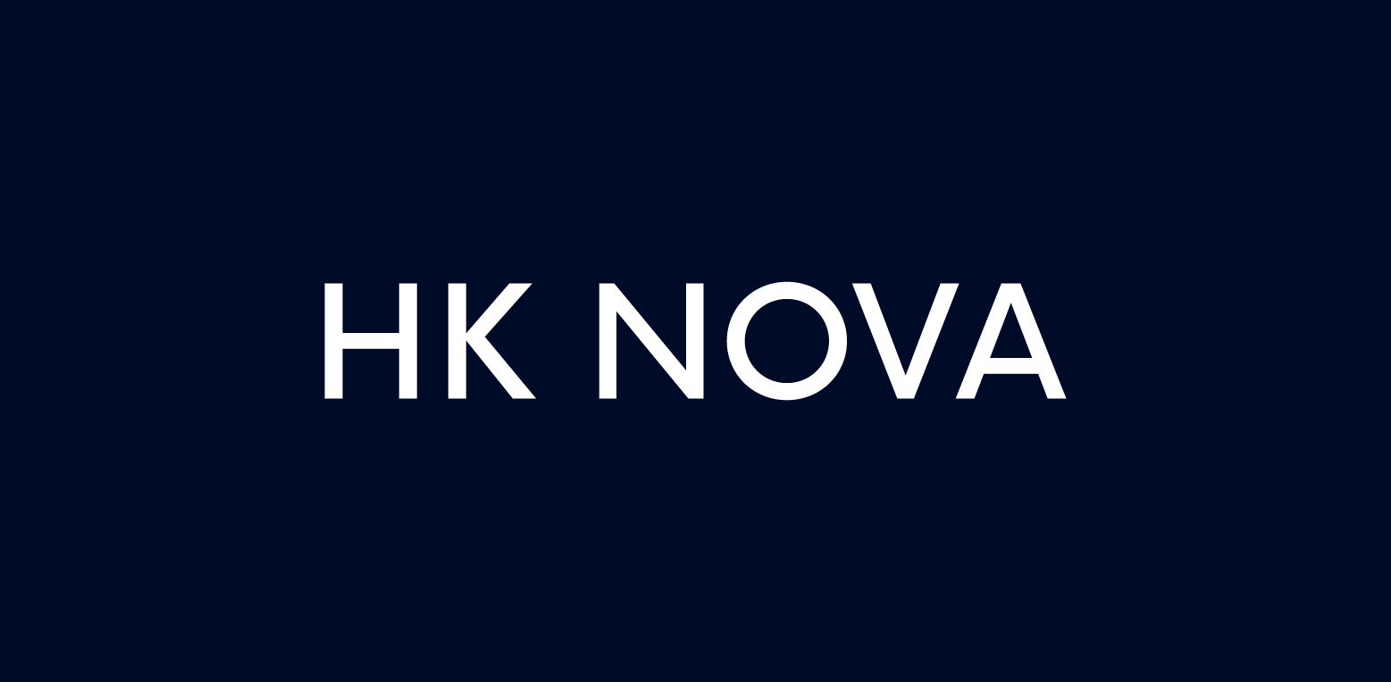
HK Nova
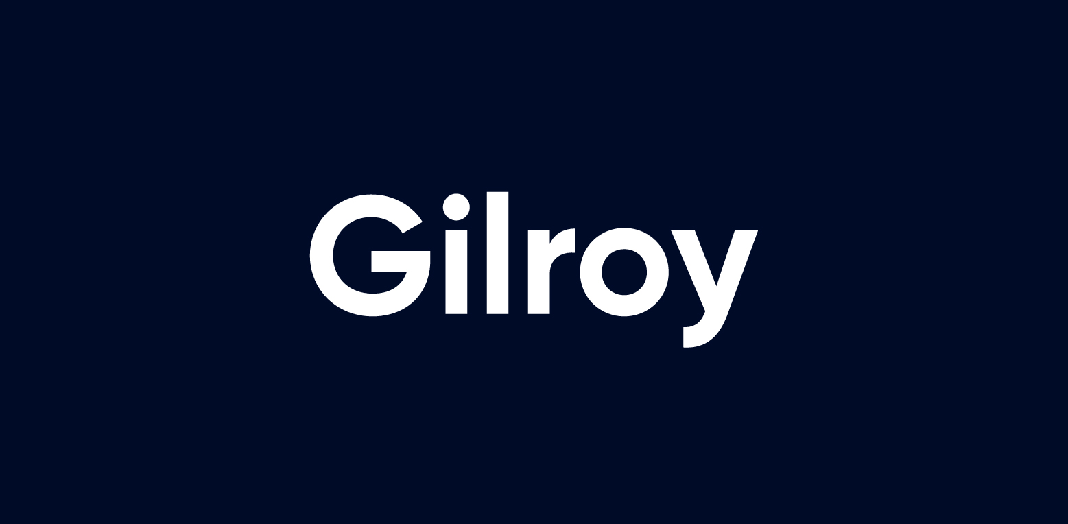
Gilroy
Gopher
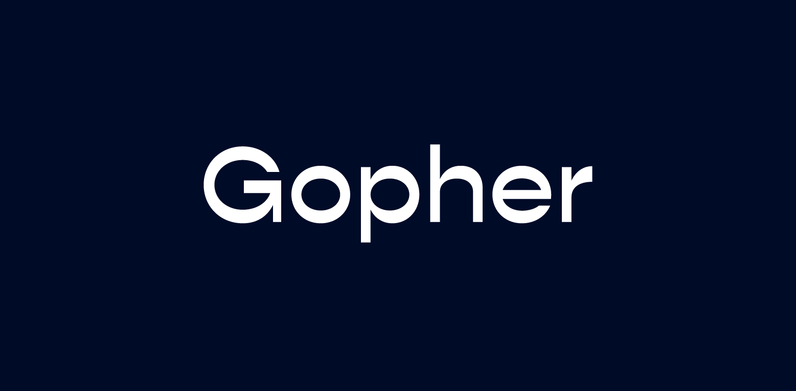
Fonts like Liber and HK Nova™ exhibit modern design adaptations of classic geometric aesthetics, showcasing how these fonts can bring a fresh and innovative vibe to logos. For instance, Gilroy, with its 20 weights, and Gopher, with its unique horizontal apertures, offer great adaptability for logo design.
With their precise lines and balanced proportions, geometric sans serif fonts can help create a logo that is not only visually pleasing but also resonates with your target audience.
Humanist Sans Serifs: Approachability Meets Modernity
While geometric sans serif fonts are known for their precision and symmetry, humanist sans serif fonts bring a touch of warmth and approachability to the table. These fonts prioritize readability, making them a popular choice for brands aiming for an approachable and friendly image.
Frutiger, for instance, is practical and useful, crafted for legibility at small sizes or at a distance. Meanwhile, Brandon Grotesque features a low x-height and compactness, which adds warmth to its appearance. These fonts exemplify how humanist sans serif fonts can bring a touch of humanity and warmth to logos, creating a friendly and approachable brand image.
Script Fonts: Adding Personality to Logos
Script fonts are the calligraphy pens of the typography world, adding a personal touch and distinctive personality to logos. Ranging from formal cursive to casual hand-lettered styles, script fonts offer a spectrum of expressiveness in logos, lending a distinctive human touch.
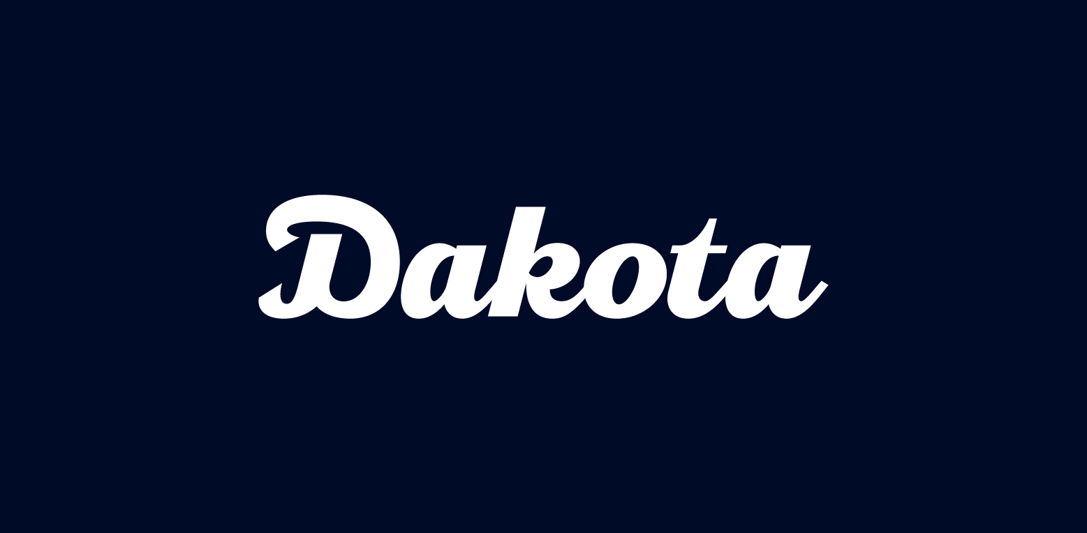
Dakota Motors
Variane Script
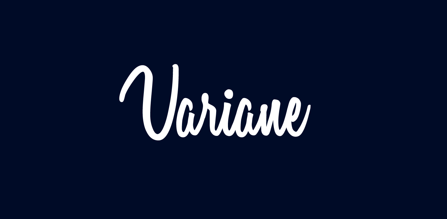
Industries such as luxury, fashion, beauty, and food and beverage often favor script fonts for their ability to convey personalization and elegance. Some notable script fonts include Dakota Motors for its clear, handcrafted look; Shink for its fun and exaggerated flourishes; and Variane Script for its elegance while maintaining legibility. These fonts show how script fonts with loops and flourishes can add a formal and elegant feel to logos, while also posing challenges for legibility.
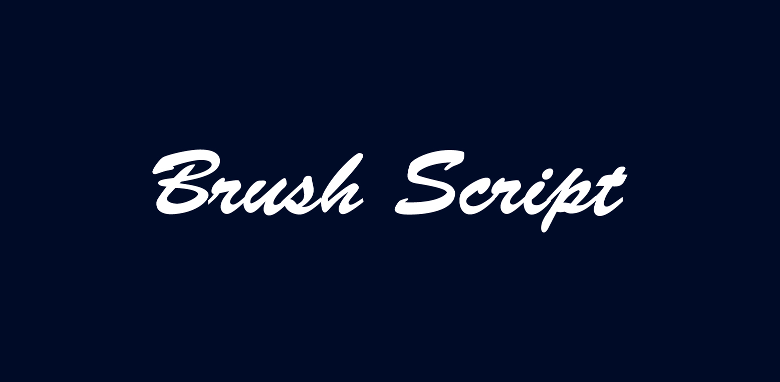
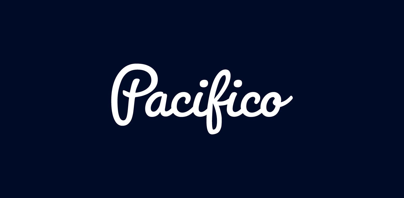
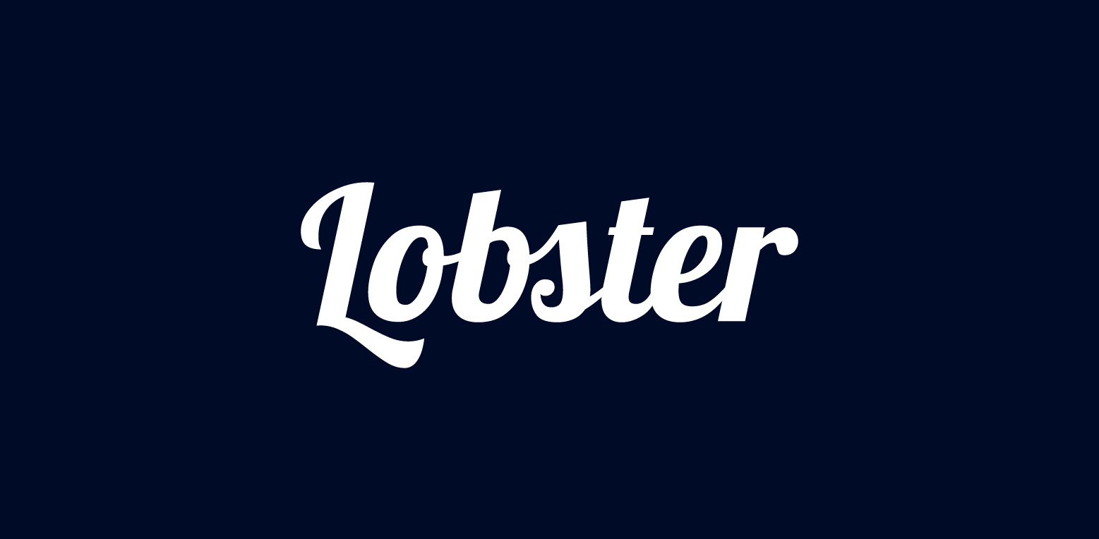
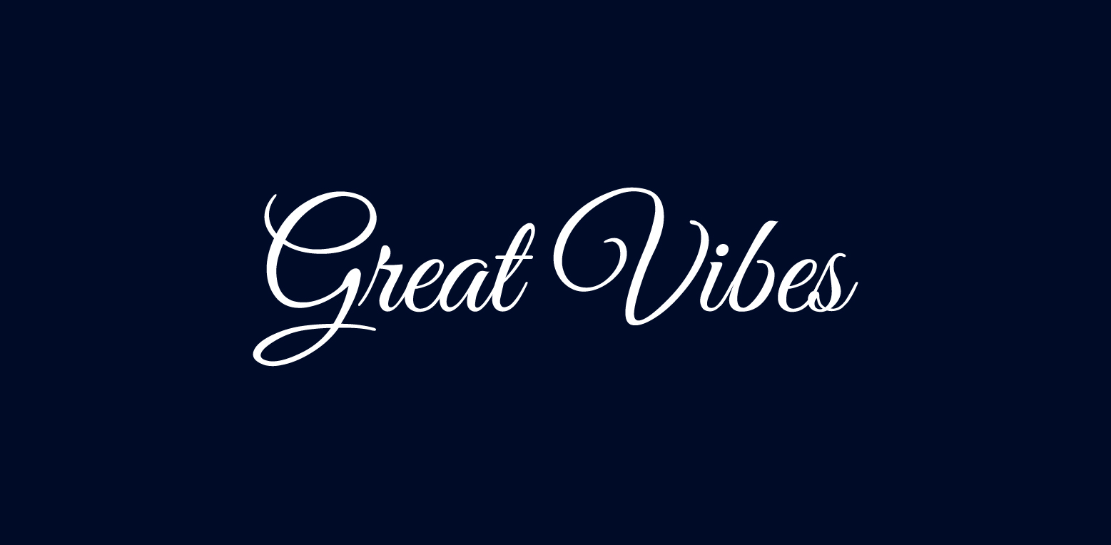
Handwritten Charm: Casual Script Fonts
Casual script fonts are like the handwritten notes of the typography world – personal, charming, and full of character. These fonts offer a humanistic and spirited appeal, making them perfect for brands seeking a handcrafted identity. Some popular casual script fonts include:
Brush Script
Pacifico
Lobster
Great Vibes
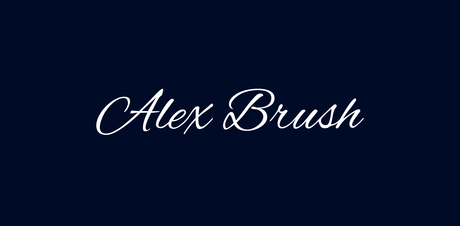
Alex Brush
These fonts can add a touch of warmth and personality to your designs.
Fonts such as Joyeux Script, Baltiholm, and Righten are examples of casual script fonts known for their individualistic charm and high versatility in logo design. These fonts can add a touch of individuality and charm to your logo, creating a unique and memorable brand image.
Formal Flourishes: Elegant Script Typefaces
On the other end of the script font spectrum are elegant script typefaces, characterized by features such as curly, swirly lines, decorative letterforms, and enticing flourishes. These fonts are like the elegant handwriting of a trained calligrapher – refined, sophisticated, and full of grace.
Bilanthy typifies relaxed elegance with its script style that includes curly and swirly lines. On the other hand, Lily of the Valley offers an elegant and poised script with quirky, decorative letterforms and a slight forward lean, providing unique flourishes to logos. These fonts exemplify how elegant script typefaces can bring a touch of sophistication and elegance to logos, creating a memorable and distinctive brand image.
Display Fonts: Making a Bold Statement
When it comes to making a bold statement, display fonts are the go-to choice in the typography world. These fonts are designed for impact, making them perfect for titles, headlines, or company names in logos. They’re like the bold headlines of a newspaper – eye-catching and memorable.
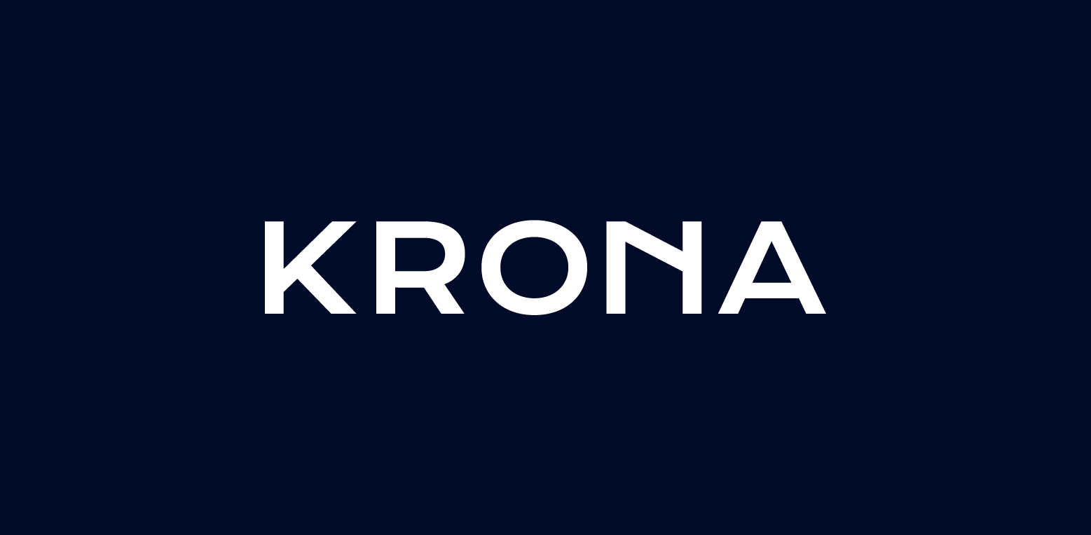
Iconic display fonts like Krona One, inspired by 20th-century Swedish posters, and Saveur Sans, with its art deco influence, provide specific aesthetic values to logos with their unique and eye-catching styles. Whether you wish to evoke a sense of nostalgia with a vintage-inspired font or make a bold statement with a modern, geometric design, display fonts can help your logo stand out and make a lasting impression.
Quirky and Unique: Novelty Display Fonts
Novelty display fonts are the eccentric artists of the typography world – quirky, unique, and full of personality. These fonts add a playful and funky look to logos, making them perfect for brands looking for a fun and vibrant image.
Fonts like Odudo and Wavehaus Sans Typeface stand out with their unique designs and playful aesthetics. These fonts can add a touch of whimsy and fun to your logo, creating a unique and memorable brand image. Whether you’re a fun-loving children’s brand or a creative agency with a quirky edge, novelty display fonts can bring your logo to life with their distinctive charm.
Dramatic Flair: High-Contrast Display Fonts
For brands seeking to create a dramatic visual effect, high-contrast display fonts are the perfect choice. These fonts are characterized by significant differences between thick and thin lines, contributing to a dramatic visual effect in logo design.
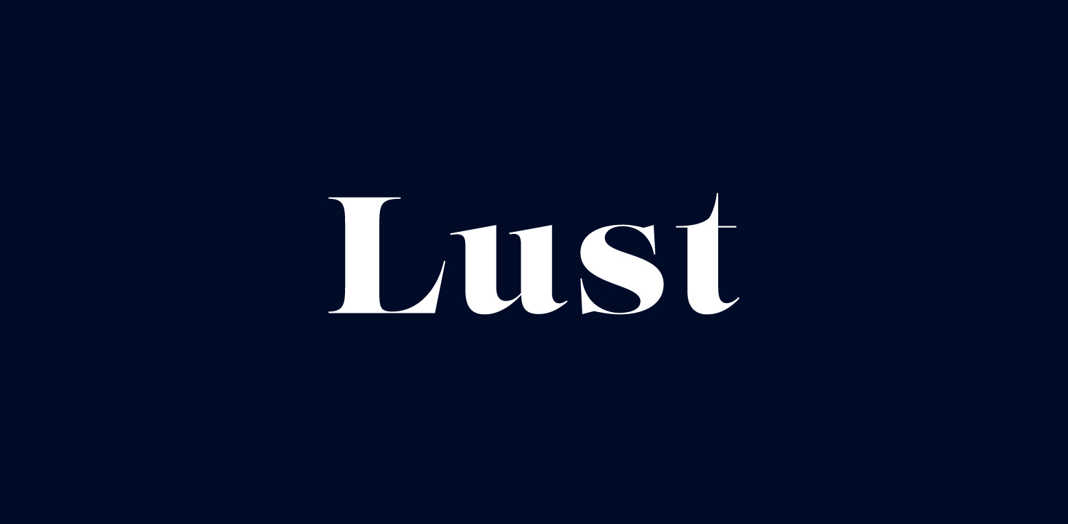
Fonts like Lust and Noe Display stand out with their distinctive high contrast between thick and thin lines. Combined with unique design elements such as triangular serifs and flowing curves, these fonts lend an elegant touch to logos. Whether you’re a luxury brand looking to convey opulence and grandeur or a bold startup wanting to make a bold statement, high-contrast display fonts can bring a dramatic flair to your logo.
The Power of Slab Serifs in Logo Crafting
Slab serif typefaces are the powerlifters of the typography world – bold, strong, and impactful. Characterized by a bolder and thicker appearance, slab serif fonts are effective for titles, headlines, or company names in logos.
Notable examples of slab serif fonts that have made a bold impact in logo design include:
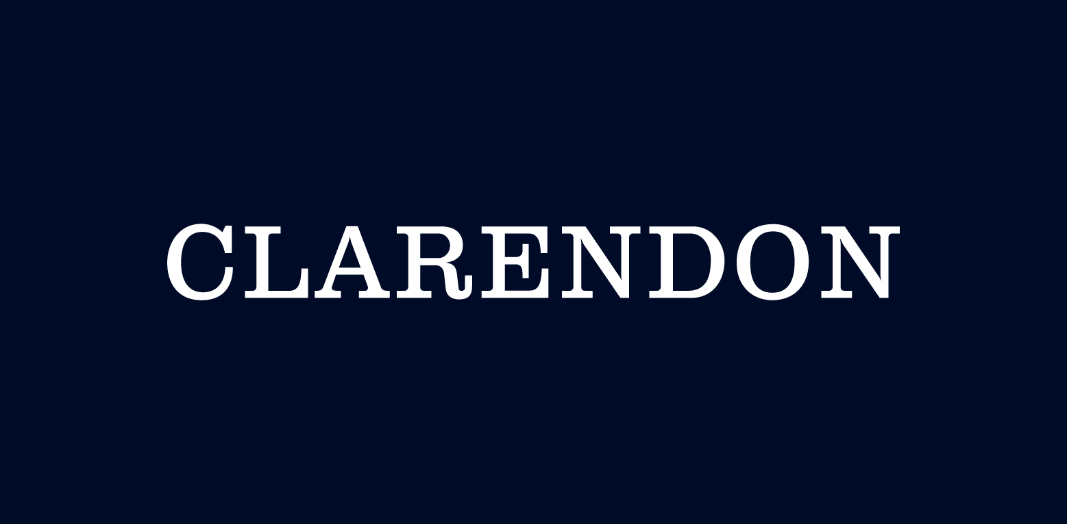
Clarendon
Sentinel

Rockwell
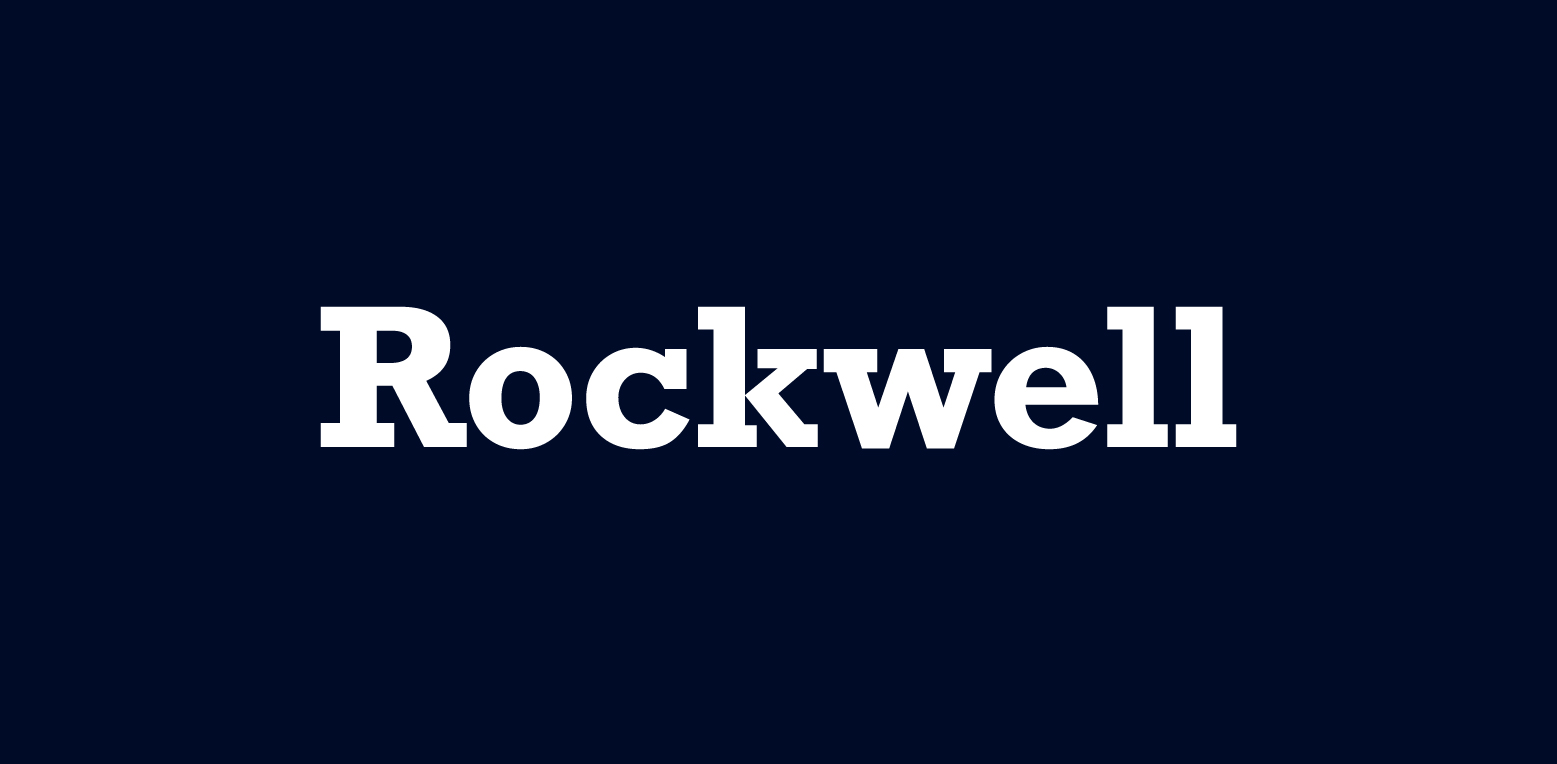
These fonts demonstrate how slab serif fonts can bring a strong and distinctive character to logos, creating a memorable and effective brand image.
Robust and Reliable: Classic Slab Serifs
Classic slab serif fonts are like the sturdy oak trees of the typography world – robust, reliable, and full of character. These fonts are recognized for their strength and stability, making them a robust choice for logo design. Some popular classic slab serif fonts include:
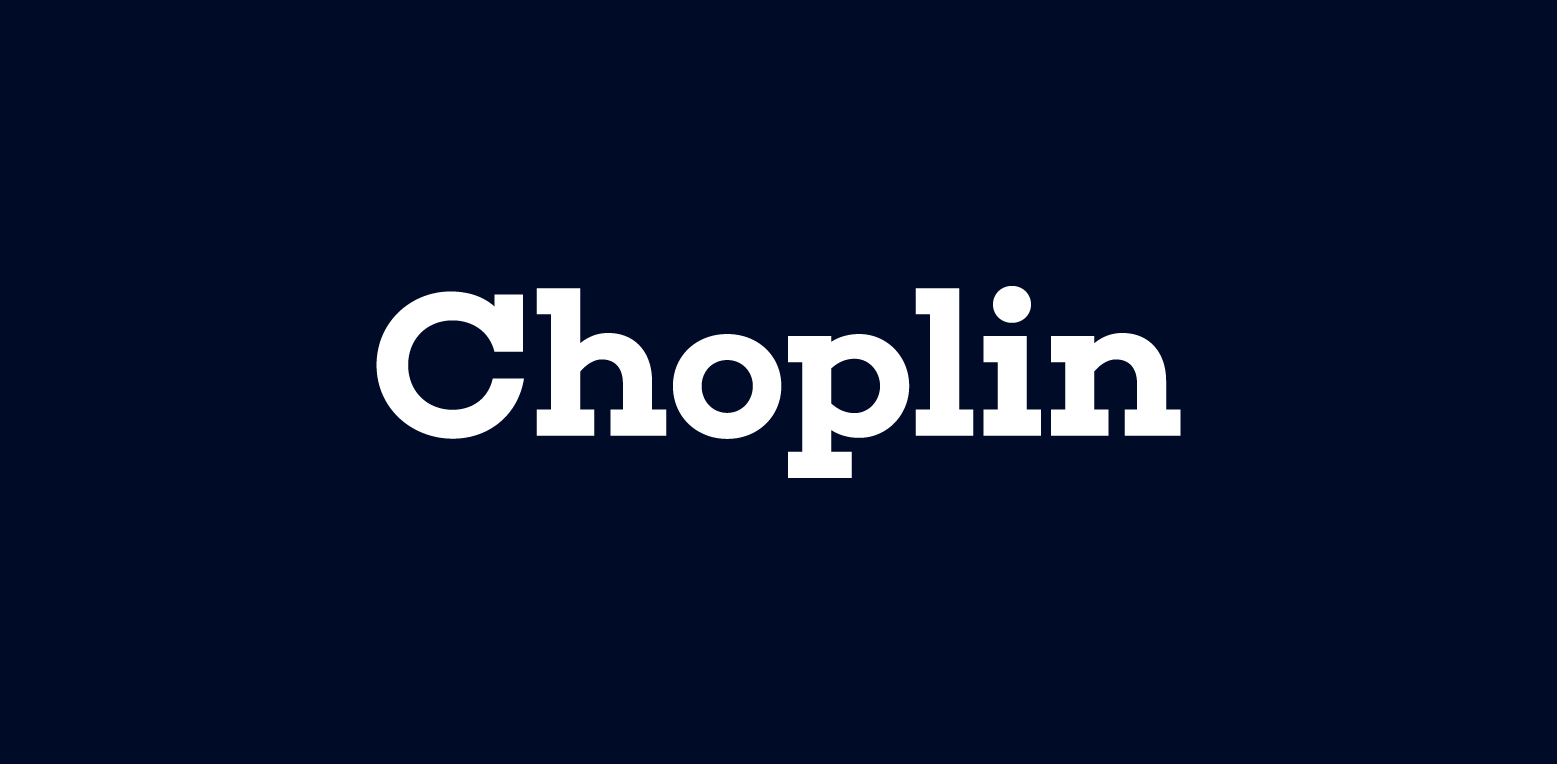
Choplin
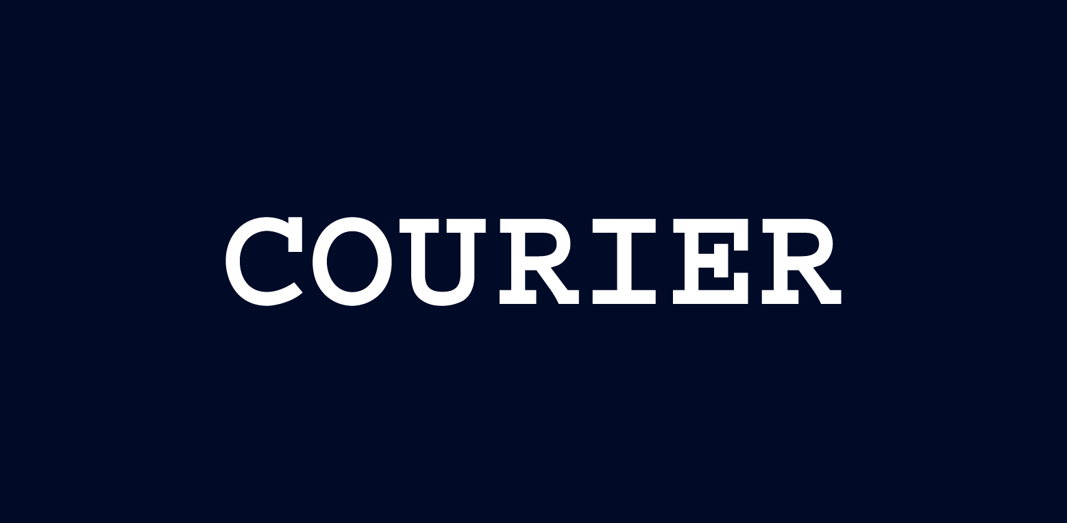
Courier
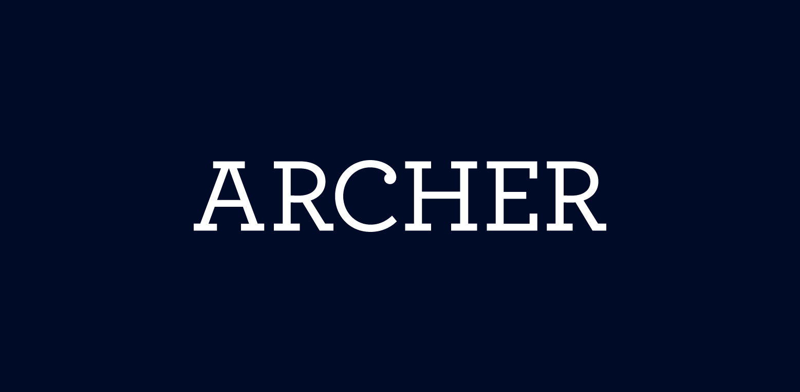
Archer
These fonts can add a touch of elegance and sophistication to your logo design.
Choplin, for instance, is a geometric slab serif font characterized by clean-cut serifs and balanced by smooth curves, giving it an unconventional boldness. Meanwhile, Morison is favored for its versatility and readability, particularly in print mediums. These fonts exemplify the robust and reliable nature of classic slab serifs, contributing to their esteemed position in the realm of logo typography.
Slab Serifs with a Twist: Contemporary Variations
While classic slab serif fonts bring a sense of robustness and reliability to logos, contemporary slab serif fonts offer a fresh and dynamic twist. These fonts blend traditional sturdiness with innovative designs, offering fresh takes for modern branding. Some popular contemporary slab serif fonts include:
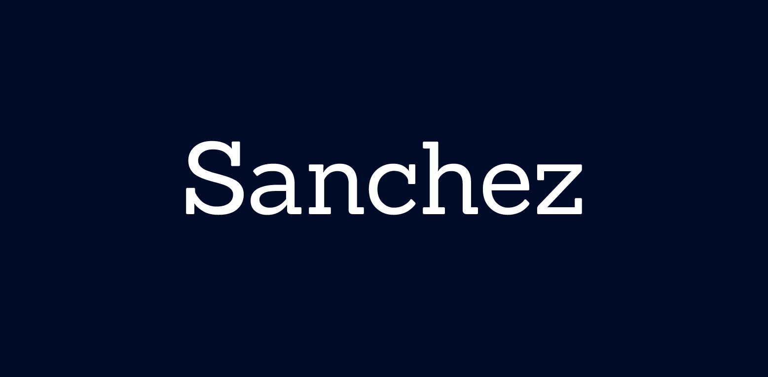
Sanchez
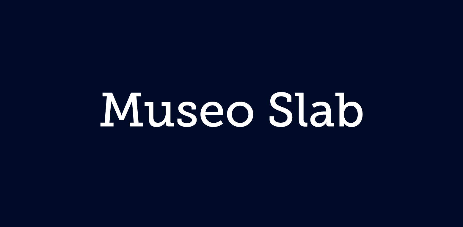
Museo Slab
These fonts can add a modern and stylish touch to your logo design, making them perfect fonts for logos.
Consider Sanchez, a slab serif font characterized by rounded edges, which combines confidence with attitude. Or look at Saros, with its flexible and dimensional structure, providing logos with a dependable yet approachable personality. These fonts exemplify how contemporary slab serif fonts can bring a fresh and innovative vibe to logos, while still maintaining the strength and reliability of their traditional counterparts.
Free Fonts vs. Paid Fonts: Pros and Cons for Logo Use
When it comes to choosing fonts for your logo, one key consideration is whether to opt for free or paid fonts. While free fonts can be an attractive option, especially for small businesses or startups, they often come with restrictions for commercial use. This means you might need to purchase a full license if you plan to use the font for broader applications such as your logo or marketing materials.
Additionally, the quality and design standards of free fonts can be inconsistent, requiring careful vetting to find those suitable for professional logo use. On the other hand, paid fonts typically offer a higher standard of design and a wider range of options in terms of weight and style. They also often come with a commercial license, making them a more convenient and reliable choice for businesses.
I use Adobe Fonts, which provides access to many fonts. With a subscription, you can use these fonts commercially.
Tailoring Typography to Your Industry
Just as a chef selects the perfect ingredients to create a delicious dish, choosing the right font for your logo requires a deep understanding of your industry and audience. Different industries often favor different types of fonts, reflecting their unique values, personality, and philosophy. For instance, serif fonts are often recommended for industries like:
-
consulting
-
fashion
-
beauty
-
law
-
finance
These fonts convey a sense of professionalism and sophistication.
Considering your brand’s personality and the message you want to deliver is key to guaranteeing your font choice genuinely represents your brand. Are you a modern tech startup aiming for a sleek and innovative image? A sans serif font might be your best bet. Or perhaps you’re a law firm looking to project an image of tradition and trustworthiness? A classic serif font could be the perfect fit. The key is to align your logo font with your brand’s personality, creating a visual identity that resonates with your target audience.
Building a Better Logo: Font Selection Tools and Tips
The process of creating an effective logo extends beyond merely choosing an appropriate font. It requires a strategic approach, considering factors such as:
-
weight
-
style
-
legibility
-
the use of negative space
For instance, Kontora, with its touch of retro and modern proportions available in three weights, can affect the visual perception and versatility of the logo design.
On the other hand, Whyte Inktrap typeface, available in 10 different weights, provides a range of options for logo weight and emphasis. Additionally, the use of negative space in a logo can create a visual hierarchy and make important parts of the logo stand out, contributing to the brand’s recognizability. By considering these factors and using the right tools, you can design a logo that not only looks good but also effectively communicates your brand’s message.
Ensuring Legibility Across All Media
In the world of logo design, legibility is king. A logo that is difficult to read can confuse your audience and dilute your brand’s message. Hence, selecting a legible and scalable logo font is critical in maintaining consistency across all marketing materials.
Legibility is especially important in today’s digital age, where your logo will be viewed on a variety of platforms and devices. A legible logo ensures that your brand’s identity remains clear and consistent, whether it’s being viewed on a large billboard or a small smartphone screen. Remember, clarity and readability should never be sacrificed for style. After all, a logo that can’t be read is a logo that won’t be remembered.
Transforming Text Into Identity: Case Studies
Having delved into the art and science of selecting the ideal logo font, we can now examine some practical examples. These case studies showcase how brands from various industries have successfully transformed text into identity through strategic font selection.
Case in point, some examples of how a carefully chosen font can enhance a brand’s identity include:
-
Raiffeisen Bank, which crafted a custom typeface called ‘Amalia’ to support its brand evolution
-
Monotype, which designed bespoke typefaces for Bekaert, reinforcing the company’s long-standing presence in the steel wire industry
-
Delivery service Evri, formerly known as Hermes, which introduced a ‘living logotype’ using variable font technology to reflect its dynamic service ethos
These examples highlight how a carefully chosen font can create a powerful visual symbol that resonates with a brand’s target audience.
On the other hand, M&M’S created the ‘All Together’ typeface, symbolizing its renewed brand purpose and inclusive philosophy. This showcases how the right font can not only enhance a logo’s visual appeal but also communicate a brand’s values and philosophy.
Whether you’re a:
-
bank
-
steel wire company
-
delivery service
-
confectionery brand
The right font can help your logo tell your brand’s story.
Summary
In conclusion, choosing the right font for your logo is a crucial step in building a strong and effective brand identity. From sans serif to script, from free to paid, each font has its own personality and potential impact on your brand’s image. By understanding the nuances of each font and aligning it with your brand’s values and philosophy, you can create a powerful visual symbol that resonates with your target audience and stands the test of time.
Remember, a logo is more than just a pretty picture. It’s a visual representation of your brand’s identity, a symbol that tells your brand’s story. So, choose your font wisely, because the right font can take your logo – and your brand – from ordinary to extraordinary.
Frequently Asked Questions
How to pick a font for a logo?
When picking a font for your logo, consider your brand personality, connect with your target market, prioritize legibility, and think about scalability. This will help you choose the perfect logo font that aligns with your brand and appeals to your audience.
How many fonts should I use in my logo design?
You should use one or two fonts in your logo design to maintain balance and prevent clutter. Avoid using too many fonts as this can make the design appear busy and less cohesive.
What’s the difference between serif and sans serif fonts?
The main difference between serif and sans serif fonts is that serif fonts have decorative strokes at the ends of characters, while sans serif fonts do not, giving them a cleaner and modern look. This can affect readability and the overall feel of the text.
Are free fonts suitable for logo design?
It’s best to avoid using free fonts for logo design because they often come with licensing restrictions for commercial use. Consider purchasing a full license for broader applications such as your logo or marketing materials.
How can I ensure my logo is legible across all media?
To ensure your logo is legible across all media, choose a legible and scalable font and consider its appearance on various platforms and devices. Consistency is key in maintaining clarity across different marketing materials.